Favorites
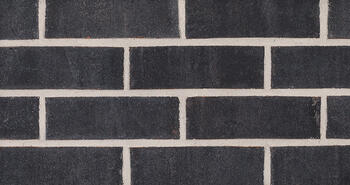
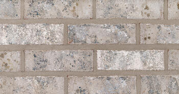
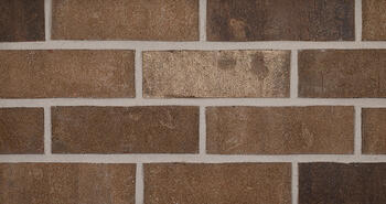
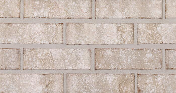
Klaycoat Brick
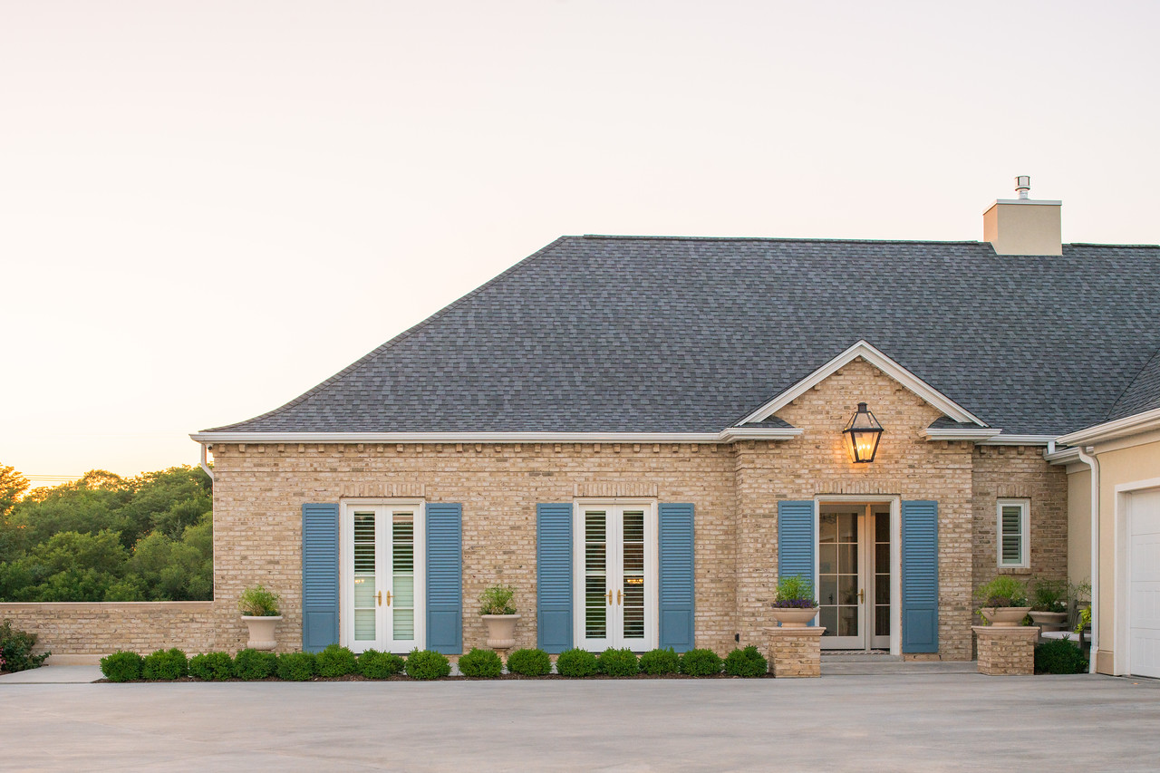
When you build with Glen-Gery Klaycoat®, color is more than just a finishing touch. It’s a focal point that takes any project from “okay” to “outstanding.” That’s inevitable when you have the opportunity to customize the color of your project in an unexpected way to meet any ask and exceed every expectation.
You May Also Be Interested In
We Can Help With Your Next Project
Discover the latest + greatest in design trends, industry news & pro tips from pros.
For all of your project needs, you’ll find everything you need at a Supply Center.
Let Us Know How We Can Help!
Gradient Brick Blends
Using Gradient Brick Blends in an Architectural Project
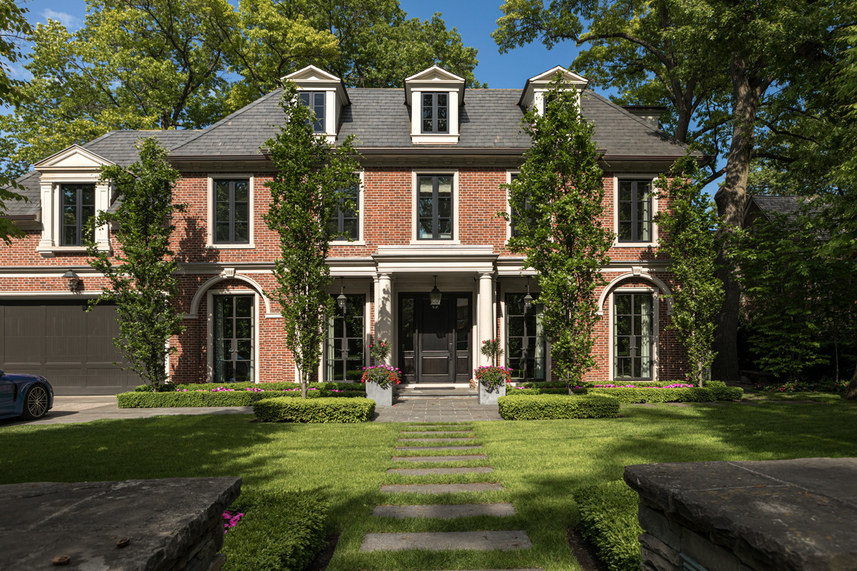
Brickwork is a timeless element in architecture that can create a distinctive character for any building. Incorporating gradient brick blends in an architectural project can add a unique aesthetic element. Gradation can be achieved through blending bricks of different colors, textures, or sizes. This technique can create a striking visual effect, such as a smooth transition from one color to another, or a subtle variation within a single color family.
In addition to aesthetic benefits, gradient brick blends can enhance the functionality of a building. For instance, blending darker bricks near the base of a building can provide better durability, while lighter shades at the top can reflect more sunlight and reduce heat absorption.
When laying the bricks, it's important to follow the manufacturer's instructions for the specific blend. Typically, these bricks are laid in a random pattern to achieve a natural look. The gradual color transition creates a sense of depth and texture, adding dimension to the project.
Using gradient brick blends can elevate any design, creating a unique and cohesive look. Whether you're designing a single story or a multi-level structure, consider incorporating this technique to add a touch of artistry and sophistication to your project.
|
|
|
|
You May Also Be Interested In
We Can Help With Your Next Project
Discover the latest + greatest in design trends, industry news & pro tips from pros.
For all of your project needs, you’ll find everything you need at a Supply Center.
Let Us Know How We Can Help!
Design Vault Ep. 7 Henhawk House with Sussan Lari
ABOUT THE ARCHITECT:
|
As a graduate of the University of Tehran's School of Architecture in her native Iran, Sussan Lari continued her studies in America by completing two master's degrees in architecture and planning from the University of Pennsylvania. She began her professional career with the Eggers Group P.C., Architects, Planners, Interior Designers, where she was the first woman to be named Vice President and stayed with them for 13 years.
After giving birth to her daughter, Sussan founded her own firm - Sussan Lari Architect PC - in 1992, jumpstarting the new company with corporate interior architecture projects in Manhattan. In time, Sussan's interest evolved and today Sussan Lari Architect is a full-service boutique architectural and design build firm that crafts custom residential and commercial architecture in the greater tri-state area. This change of direction brought about a change of personnel; a new team of well-trained, devoted, and detail-oriented collaborators capable of handling the required creative and technical challenges. Sussan was elected President of the Long Island Chapter of the AIA for the year 2000, and her firm is an ongoing member.
Sussan Lari Architect aims to design and help build functional, comfortable, and beautifully designed spaces for modern living. The firm prides themselves on maintaining a mindful collaboration with all their clients, while also accomplishing their goals within budget and on schedule. By implementing a multidisciplinary approach, every project encompasses the entire spectrum of design and the construction process. Through meticulous attention to detail and passion for creative design solutions, their work is a unique reflection of each client's needs. This year, Sussan is celebration the 30-year anniversary of Sussan Lari Architect PC. |
---|
ABOUT THE PROJECT:
This project was a gut renovation and major expansion of an existing residence. The existing structure was approximately 4,100 square feet of a Tudor style architecture. Sussan's client purchased the house mostly because of the size of the property and its location. What they ended up keeping was the dining room, as the client liked the architectural, plaster ceiling and its decorative elements. We also kept the living room and its fireplace with the brick chimney that stood tall above the roof. Everything else was eliminated including the cellars.
The new 13,300 square foot construction framed these two existing rooms and expanded in three directions. The revised second floor added height to the first floor, except for the dining room that remained with a lower ceiling height. This design outcome was a L-shaped structure with a multi-level first and second floor which added playfulness and provided much higher ceilings for most rooms in the house.
The gallery was maintained all along the first and second floors overlooking the internal garden where the pool is located. The house enjoys plenty of windows to bring in natural light and connect the inside to the outside. Although the house is a Tudor style design language on the outside with intricate brick design layering, stucco & wood paneling, the inside is completely open, expansive, bright, and modern.
An excellent combination for today's modern residences with a classical exterior and a delightfully modern interior.
Henhawk House
Sussan Lari Architect PC
View MoreTRANSCRIPT
00;00;00;03 - 00;00;05;13
Doug Patt (DP)
Let's go inside the vault. The design vault.
00;00;05;15 - 00;00;36;20
Sussan Lari (SL)
The idea become into doing a L-shape design, and because it was kind of long L-shape, it gave me the opportunity to create the design as there are certain components of structures together with the playfulness of the roof, which is important for Tudor style and also different height and introduction of stucco and introduction of wood paneling, framing, stucco and brick.
00;00;36;23 - 00;02;42;08
DP
This is my guest, Sussan Lari. I'll share more about her shortly. In this episode from the Design Vault we’ll highlight Sussan's project, Henhawk House. This project was a renovation and major expansion of an existing 4,100 square foot residence. The new home is approximately 13,300 square feet.
The home features steeply pitched slate roofs, multiple gables of varying size, light red brick facades and half-timbered elevations with stucco infill and light gray wood. The homemade brick is highly detailed, with soldier, diagonal and herringbone coursing. The design also features tall, narrow windows, elliptical masonry archways and red copper gable finials, all of which reference early English domestic architecture and of course, the Tudor style. Although the exterior of the house is a traditional design language, the inside is completely open, functional, expansive, bright and modern.
Hi, I'm Doug Pat, and this is Design Vault.
Today we're talking to Sussan Lari, AIA. Sussan is a graduate of the University of Tehran School of Architecture in her native Iran. Sussan continued her studies in America with two master's degrees in architecture and planning from the University of Pennsylvania. She began her professional career with the Eggers group, P.C. in New York, where she was the first woman to be named vice president.
Sussan founded her own firm in 1992. Her businesses have full service, boutique, architectural and design build firm that crafts custom residential and commercial architecture in the greater tri state area. Sussan was elected president of the Long Island chapter of the American Institute of Architects for the year 2000, and her firm is an ongoing member. Sussan Lari, Architect, P.C. is celebrating their 30-year anniversary.
So, let's get into the details. Welcome, Sussan.
00;02;42;13 - 00;02;43;12
SL
Thank you.
00;02;43;14 - 00;02;51;15
DP
So, Susan, tell us a little bit about your firm. Where are you located? What's the size of the firm and what type of work do you typically do?
00;02;51;21 - 00;03;43;22
SL
My firm, located in Village of Rosslyn in Long Island. It's about half an hour drive from Manhattan, is on the north shore of Long Island, Nassau County. The space that we occupy is a very old building that was built in 1796. And we actually are the very first tenant of that upper portion of the building. The building was used mostly for offices, for timber construction. And it's a landmark building.
The owner of the building eventually was changed and turned into medical offices on the lower level. And then the upper portion was like an office space and a magnificent space in the attic that has never been used.
00;03;43;25 - 00;03;47;25
DP
And the space worked out in terms of your size and number of people you have.
00;03;48;00 - 00;05;05;05
SL
You know, I always wanted to have a smaller firm. I am a bit of a control freak, a bit OCD with perfectionism. So fortunately, or unfortunately, applies to my projects as well. I need to be intimately involved in the entire process, not only design but also selection of material finishes, you know, detailing selection of the trades. So, I thought that we really wouldn't and shouldn't have many, many projects at once.
So, my intention has never been to have a very large office. So, we all kind of involve on purpose intimately with every single project going on in the office. I believe that if I get my staff involved in the life of the project, then they will be more interested to contribute and perform to their best ability and they’re all involved with the client. So, it's like we all together. The number of people working for me at this point are five. So, we are six of us altogether. And at this point and for a while actually majority of our concentration has been on residential projects.
00;05;05;07 - 00;05;09;03
DP
So, what is your role in the office? What are you involved with?
00;05;09;06 - 00;05;11;01
SL
I put so many different hats.
00;05;11;04 - 00;05;12;13
DP
I kind of thought so.
00;05;12;15 - 00;06;00;03
SL
It's bringing marketing and bring client in. Although I have help. But then interviewing, accepting the project, preparing fee proposals. Design is all mine. That's what I do. Although right now Riccardo from my office, who is actually on paternal leave, has trained to be very good designer as well. As much as possible, I could make it happen, I let him get involved to have his point of view and he's really getting better and better. Majority I would say the concept is mine, detailing is mine, the bricks should be on an angle is mine, the interior architecture is mine, furniture furnishing... So I do a lot.
00;06;00;05 - 00;06;06;01
DP
So, tell me, you do a lot of drawing by hand, a lot of sketching. Is that the way you pass along your information and the ideas?
00;06;06;04 - 00;06;17;20
SL
No. Actually, yes, I do hand sketch. I do hand sketch during schematic and when I would like to explain an idea is all hand sketch, but everything else is CAD.
00;06;17;22 - 00;06;20;03
DP
Okay, so what CAD system are you guys on?
00;06;20;10 - 00;06;57;29
SL
Your basic CAD. Actually, because we are too detailed. I checked all different advancements of CAD, and I kind of thought that what we have, which is really basic CAD, has been incredibly helpful for us to provide us the possibility to go detailed. We detail everything. Like our set of construction drawing is close to maybe 30 drawings, just architecture. And when it gets to interior architecture is another like 30 drawings. We detail like cabinetry and bathroom tiles, that kind of stuff.
00;06;57;29 - 00;07;04;16
DP
Yeah, you get into everything. So, let's talk about the Henhawk house. So, tell me how your office got the project.
00;07;04;18 - 00;07;07;05
SL
Well, as usual, they find us-
00;07;07;07 - 00;07;07;26
DP
Word of mouth?
00;07;08;03 - 00;07;36;26
SL
Word of mouth. And they came to us. And it's a young couple. Very young. And the house was - they fall in love with the land. Location is really a fantastic location. The tree lined boulevard type street in Long Island. The house itself was Tudor style, brick, relatively small. Zoning wise, we were allowed to build close to 8,000 square feet and the existing house was close to 4,400 square feet.
00;07;36;27 - 00;07;38;13
DP
So, there's an FAR there?
00;07;38;15 - 00;08;06;10
SL
Yes. Yes. Everything we do is full force zoning and rules and that kind of I've learned them really well as much as can be played with, we have learned it all. But the house had character. But the house was dim, like typically Tudor style houses from outside are just stunningly gorgeous piece of structure. And when you go in, it’s just sad, dark.
00;08;06;15 - 00;08;11;23
DP
I love the way you describe that. It's so true. So many Tudors really feel that way. Absolutely.
00;08;11;29 - 00;08;47;14
SL
You know, in a way, it gives this kind of fear of people to the Tudor because they think Tudors are supposed to be dark interior and that is not going to happen with my approach to design, because I like the style of Tudor and I don't like the style of sad inside spaces. So, it's bright and happy and is open, is spacious. You know, lots of windows. And in this particular case, the expansion of the house was extensive because I needed to keep a chimney.
00;08;47;21 - 00;08;50;00
DP
Was this a functional chimney or boiler flues?
00;08;50;02 - 00;09;09;17
SL
Yes, functional chimney. And then we wanted to keep a fireplace. We wanted to keep a chimney and they wanted to keep the ceiling - plasterwork ceiling of a dining room - so I said, okay, if we keep all those three, but we get rid of everything else and that's what we-
00;09;09;18 - 00;09;12;10
DP
Wow, Right. I'm sure the contractor loved that.
00;09;12;14 - 00;10;27;23
SL
I work with a contractor. I absolutely love him. I'll get to the stories of my contractors because we are very involved in the construction process. So, my knowledge of construction is very high. And the contractor on this job was incredibly knowledgeable man who loved to do stuff like that but didn't care much to deal with clients and with everything else, paperwork,
So, it worked perfect. The idea become into doing a L-shape design, and because it was kind of long L-shape, it gives me the opportunity to create the design as there are certain components of structures together, section by section with the playfulness of a roof, which is important for Tudor style and also different height and also introduction of stucco and introduction of wood paneling, framing stucco and brick, and also playfulness of a brick. I think we were good in accomplishing that because it has its playfulness, and although it is relatively large, but it is not overwhelmingly massive.
00;10;27;29 - 00;10;29;18
DP
Yeah, I'd say it's well scaled.
00;10;29;21 - 00;11;23;02
SL
It is small scale, right? And then at the end we realized that there's no way we could match the old brick. So, I know Glen-Gery very well, because if I ever have done any brickwork, has been Glen-Gery. And why? Because the quality of the material, and I get service. So, I am fussy enough to worry about the size and also worry about the color of the grout. And I want to have two samples of it made before I even decide what color bricks. So, a rep does that service for us. And due to color, we provide the color to what brick and between those is what I chose. And eventually – and I have awesome mason that are Italian and five brothers and they’re one better than the other. They're local. And they do a magnificent job. And also they built a good size.
00;11;23;05 - 00;11;25;18
DP
They did a mockup for you.
00;11;25;20 - 00;12;06;23
SL
Mockup. Absolutely. And one other thing that I was almost kind of experimenting on this project was that I love the style of Tudor on the outside. I don't like the inside. So that was one issue. Second issue, I like the playfulness of how we could create interesting textures and playfulness of the laying of the brick, but Tudor would allow me to do that because we are compartmentalizing pieces, here and there. Other styles don't do that. And then that herringbone style has to be compartmentalized. Right?
00;12;06;26 - 00;12;08;23
DP
Yeah. And between the boards, I think at one.
00;12;08;23 - 00;12;55;10
SL
And between the board would work. We shouldn't do too much of it because too much of accessory, not good. So it allowed me to experiment and do detailed work and also choosing of the color of the brick and the color of the stucco and the freedom I had in detailing and designing and working also with the roof and with the roofer - I’m friend with the roofer, I'm friend with the Mason man, I’m friend - and to make sure that we get eventually a beautifully detailed house on the outside. And then when it come to the inside, our life is modern. We are living in this time. Our space should be representing our era.
00;12;55;17 - 00;12;57;29
DP
Did you guys use any brick on the interior?
00;12;58;06 - 00;13;00;14
SL
Not on this project.
00;13;00;16 - 00;13;08;06
DP
What were some of the historical precedents we were talking about? Details. Were there any local buildings that were Tudors? Was this the only Tudor locally?
00;13;08;06 - 00;13;27;22
SL
Yes. Actually, no. No, it's not. In this particular street, there are many other brick buildings. Typically, I would drive out on and look at the center and say, ‘Oh, this is so gorgeous.’ And, you know, it's one more beautiful than the other one. But I think mine, right now, it's really complete, in good level.
00;13;27;26 - 00;13;42;27
DP
I love – I love it. It's so great. Were there any significant setback issues? So, we were talking about the size of the existing houses almost three times smaller. Were there a significant number of zoning issues other than FAR, setback things?
00;13;42;29 - 00;13;51;21
SL
Yes. The chimney that I wanted to keep, which was right above the fireplace, was outside of skyline exposure.
00;13;51;22 - 00;13;54;09
DP
Okay. There was a height restriction.
00;13;54;11 - 00;15;41;16
SL
Yes, we always have height restriction. In this case, I said this an existing building. This is not a new house. This is a renovation of an existing house. So, I'm allowed to keep the chimney. And that chimney the end up to really change the inside of the chimney and outside of the chimney and all the bricks and everything.
But we kept the height – now, the zoning, building department going to hear that – fortunately, we had no issue of the setback because we had plenty of space from the front of the house in Kings Point, the setback requirement for front yard is 60 feet and we had way more than 60 feet. It was deep enough that I was able to create a parking courtyard in front of the house and the garage. We have one two car garage on the upper level and then three car garage in the lowest level. The garage is actually coming further out from the front of the house, but I don't think we had any other zoning issues.
But one other feature of the house that I thought it’s kind of important, as I was driving around and see all these Tudor houses, Tudor is not a box. Tudor is never a box. Tudor span, and that is one beautiful feature of when these all expand. We had a lot of width. Plenty of available width. The size of the property was very large, and we had enough room on the site and I thought that if I could add an extra width to the house we’ll be introducing a brick wall extending from the garage and that will be the access from the front of the house to the garden.
00;15;41;18 - 00;15;45;06
DP
And then you did a series of small windows along the garage, correct?
00;15;45;10 - 00;16;03;14
SL
Yes, because a simple wall without any detail in the front elevation was not a good idea. If I can introduce fenestration into the wall and breaking it because this is, again, the style of Tudor.
00;16;03;16 - 00;16;08;21
DP
Did you guys get to do any new details on this project that you hadn't done in the past?
00;16;08;23 - 00;16;23;28
SL
Yes. That brick herringbone is new. The playfulness of the brick above the entrance hall in the front and back. Front and back are identical in what they represent, and we don't repeat ourself. Literally, none of our projects are the same.
00;16;24;00 - 00;16;29;11
DP
I love the red copper finials on the gable ends. Does that double as lightning protection?
00;16;29;17 - 00;17;19;16
SL
Yes. And our roofer is just a master roofer. Unfortunately, he retired after pandemic. We loved him. Just spend a lot of time together coming up with ideas. And he performed beautifully.
And the door - there's also some - another feature we kept many of the existing trees. Trees are valuable. Don't like to cut trees. Doesn't matter if the tree is close to the house or tree is in front of the house. What’s wrong? Tree wants to be where tree wants to be. So, it was a tree that was really beautiful and wouldn't end up to be right in front of that passage to the garden. I couldn't cut the tree, said ‘let it be.’ And actually, in some of the pictures, you could see that the tree is right in front of the passage.
00;17;19;18 - 00;17;28;18
DP
So, this is a traditional home, but this question is kind of top of mind for most people today. Does sustainability come up with your clients at all, and materiality that you guys are using?
00;17;28;18 - 00;18;51;12
SL
Not with the client, but with my – with me, my office. We always do that. I've learned that maybe I've been kind of lucky here and there, having people who really care about sustainability. Sadly enough, majority don't, or they do not necessarily connect building material to sustainability. So, my office does for years. We do it without naming it because then they're concerned about the cost.
There are many different areas that we could really think about building the quality of heating and cooling system, the energy conservation insulation system. Those I do with that saying. My clients often who would not be bothered with that. Selection of the windows, undoubtedly. Using windows with the UL rated that transform the least amount of light, not brightness, but UV into the house we do. When it comes to insulation system, all spray foam. This goes without saying in every project we do. Selection of the material, natural, as much as we can. Selection of materials that are not biodegradable. I fight for that, to not do it.
00;18;51;15 - 00;18;53;27
DP
Did your clients want to use brick from the very beginning?
00;18;53;27 - 00;19;14;28
SL
Yeah, because their house was already brick. So, I thought that they liked the house, they loved the ceiling of the dining room. So fine, that was. And then I said, what else do you like? “We like the fireplace.” Okay, I like the chimney, but they like the fireplace. Fine. What else? “Brick.” And I said, okay, because Tudor style is brick.
00;19;15;04 - 00;19;23;24
DP
Well, I'm thinking it's solved so many design challenges for you guys. I mean, you got to be really playful with brick, but it also solved a lot of problems.
00;19;23;26 - 00;19;39;20
SL
Well, with brick, needless to say, is an amazing material. And it has been used for centuries and centuries and centuries, and still doing well. So, I don't quarrel when it comes to selection of brick.
00;19;39;23 - 00;19;44;00
DP
Did your team learn anything interesting through the process of building this building?
00;19;44;07 - 00;19;46;08
SL
We do on every building, actually.
00;19;46;10 - 00;19;53;22
DP
Isn't that interesting? It doesn’t matter how long you've been practicing, every one of us seems to learn something new every - every job. More than one thing.
00;19;53;28 - 00;19;57;26
SL
Undoubtedly. Information constantly changing.
00;19;57;27 - 00;20;00;09
DP
Yeah, that's a good point. It really does. Yeah.
00;20;00;11 - 00;20;30;09
SL
And what is available in the market constantly change. I think we become obsolete if we do not pay attention to what's happened. If we become comfortable in doing the same thing on and on, then our curiosity also lacks. And then we become so proud in what we do because we are successful and we are, you know, making money and we made it and we repeat the same thing. That is kind of the end of creativity.
00;20;30;11 - 00;20;35;18
DP
Off subject, have you thought at all about A.I. and what it means for our profession?
00;20;35;20 - 00;20;59;05
SL
Yes. I kind of love the idea. Yes. And I know that so much of worries there is there of AI to replace human beings. At the end, we are using the AI either to our benefit or not, but I think the benefits that AI could do are so amazingly high.
00;20;59;07 - 00;21;00;18
DP
So, using it as a tool.
00;21;00;22 - 00;21;01;27
SL
Like everything else.
00;21;02;04 - 00;21;20;23
DP
Well, I just wonder at what point, how much control are we going to have over how we're using AI, how our clients who aren't coming to architects are using AI, whether or not architects will ultimately use it as part of their services? It's a huge can of worms, but it's definitely something I've been thinking about.
00;21;21;00 - 00;21;24;01
SL
Let me tell you something. When I was graduating from UPenn-
00;21;24;02 - 00;21;25;11
DP
I went to Penn, by the way, too.
00;21;25;12 - 00;21;26;15
SL
Did you?
00;21;26;19 - 00;21;27;21
DP
I did. For graduate school, yeah.
00;21;27;26 - 00;22;02;19
SL
Okay. So same with me, graduate school. When I was graduating, they had a lecture, a farewell lecture. And the lecture was kind of gloomy because now you're done, graduated. We're sending you off to practice architecture, but we want to let you know the number of percentage of American buildings being designed by architects – I don’t remember exact number, but it was between nine and 11 – and then they said, compared to European – that I remember very well – 45%.
00;22;02;19 - 00;22;03;14
DP
Wow.
00;22;03;16 - 00;23;39;10
SL
So, I left school knowing that. Then I was thinking that that is not the problem necessarily with architect, but the problem of American not know what we do and the importance of our presence for every project. And that is again and again and again, we need to somehow change that level of knowledge of public work, which I think AIA is trying to do the best of their ability to inform public as the importance of architect, because we are not a set of drawings.
If anybody thinks that our work is a blueprint, then they have no clue of the importance of architect in any project. And we should also never try to compare ourself or believe that builders have taken our spot because typically, especially for residential architecture, people go to a contractor sometime before coming to the architect, and that is because contractor has been available and present for years and architects have not been available and present.
And the majority of quality architects, they don't want to even go to residential architecture because to them is just not good enough. And they have left this vast possibilities. We have – our builders build these buildings, by not the fault of themselves, because they don't know better of whatever is left of the world of residential architecture in America is sad.
00;23;39;12 - 00;24;14;07
DP
Wow. What I like about your position is that it's very positive, right? You could sit there and say, you know what, we're done designing, AI is going to be able to do it. It's going to have access to every design in the world and it's going to take over the world. And I love your explanation of being in school and hearing that architects – and I think I heard the same thing, that they were only responsible for a very small percentage of what was actually being done out there – and the reality is you still have a job and I still have a job, and although our jobs may change, I think we're going to be busy for a long time.
00;24;14;08 - 00;24;59;13
SL
We're going to be fine. We're going to be fine. And I think is gradually shifting. If people are shifting toward being concerned about their well-being, if shifting about being concerned about their health, their eating habit, small percentage, but we are small percentage when it comes to using our services. So, I think architecture and our part of the work, which is the importance of aesthetic, this is something I cannot put more emphasis on than anything else. Even if you don't need my knowledge, fine. But then the contractor’s knowledge – yes, he has knowledge of construction and maybe knowledge of material, but doesn't have knowledge of-
00;24;59;13 - 00;25;00;23
DP
Doesn't have the aesthetic training.
00;25;00;26 - 00;25;01;22
SL
No.
00;25;01;24 - 00;25;04;10
DP
Well, Sussan, it's been really nice to meet you.
00;25;04;15 - 00;25;05;28
SL
Thank you so much.
00;25;06;00 - 00;25;09;21
DP
So where do people go to find out more about Sussan Lari Architect, PC.
00;25;09;21 - 00;25;14;24
SL
I have a website, sussanlariarchitect and Instagram.
00;25;15;00 - 00;25;18;04
DP
Very good. Well, thank you very much for being here. It was really nice to meet you.
00;25;18;05 - 00;25;19;13
SL
Thank you very much for inviting me.
00;25;19;15 - 00;25;20;28
DP
I love your house. It's beautiful.
00;25;21;03 - 00;25;24;10
SL
Thank you.
You May Also Be Interested In
We Can Help With Your Next Project
Discover the latest + greatest in design trends, industry news & pro tips from pros.
For all of your project needs, you’ll find everything you need at a Supply Center.
Let Us Know How We Can Help!
Design Vault Ep. 12 50 Nevins Street with John Woelfling
ABOUT THE ARCHITECT:
|
John Woelfling is committed to creating sustainable and resource-efficient designs, using an integrated and holistic approach that reduces impacts on the environment and positively effects the health and comfort of building occupants. He leverages his broad experiences working across project typologies, from education and recreation to healthcare and infrastructure, to inform his leadership of the firm's mixed-use residential projects. A recognized Passive House expert, John's focus on sustainable design practices is guided by proactive education of evolving green technologies and incorporating them into his design work.
He frequently lectures about affordable housing and sustainability, speaking at the Center for Architecture, AIA NYS, Urban Green and GreenBuild, Forum for Urban Design, Reimagine Conference, and the PHIUS Passive House Conference. John holds a Bachelor of Architecture from Virginia Tech. |
---|
50 Nevins Street
Dattner Architects
View ProjectTRANSCRIPT
00;00;00;02 - 00;00;05;14
Doug Patt (DP)
Let's go inside the vault. The design vault.
00;00;05;17 - 00;00;33;16
John Woelfling (JW)
We looked at that rectangle and where the opportunity was to expand the building horizontally, and then really started to figure out where the best units would be located, where the best apartment layouts would be in the existing building. It was actually a challenge. We were not going to change the fenestration where the windows are located or the size of the windows.
So that really dictated a lot of the apartment placements and the size. So I think we were pretty clever about putting all the like fundamentals and figuring out how the floorplan would come together.
00;00;33;23 - 00;03;17;20
DP
This is my guest, John Woelfling. I'll share more about him shortly. In this episode from the Design Vault, we highlight John's project 50 Nevins Street. 50 Nevins Street is located in downtown Brooklyn. It literally appears to be two buildings in one. The approach was to reinvigorate a century old building through gut renovation and addition, which provides affordable housing, housing for formerly homeless individuals and mental health services.
The historic site, with its new ten story addition, features 129 new apartments. The building was originally designed by famed Brooklyn architect Frank Freeman, opened in 1913 as a YWCA. In the early 1930s an extensive portion of the building was shaved off to enlarge. Schermerhorn Street and make way for the subway line. That adjustment resulted in an imbalance to the original Colonial Revival building.
The new couple design ascribes value to the existing building and helps restore the balance it had lost. The existing red brick building remains shorter with a classical cornice. The new building sits slightly taller, flush and adjacent with a recessed connector which visually separates the architecture. The contrast in masonry color, dark connector and stylistic changes to the forms and facades set the two buildings apart esthetically, though clearly their co-combined.
Hi, I'm Doug Pat and this is Design Vault. John Woelfling is a partner at Dattner Architects in New York City and holds a Bachelor of Architecture from Virginia Tech. John leverages his broad experiences working across project types like education, recreation, health care and infrastructure to inform his leadership of the firm's mixed use residential projects.
John is a recognized passive house expert. His focus on sustainable design practices is guided by proactive education of evolving green technologies and incorporating them into his work. John's committed to creating sustainable, efficient designs that use an integrated, holistic approach. He frequently lectures about affordable housing and sustainability. Speaking at the Center for Architecture, the New York State AIA, Urban Green and Green Build, Forum for Urban Design, Reimagine Conference and the Phius Passive House Conference.
So welcome, John. Nice to have you with us today. So tell us a little bit about Dattner Architects in New York City. Where are you guys located? What's the size of the firm and what type of work do you do?
00;03;17;22 - 00;05;20;11
JW
So Dattner Architects is a firm that's been around for close to 60 years. We are located in Midtown Manhattan, just like a ten minute walk from the studio, so it's nice and easy to get over here. We've been there for a little over a year and a half, but our offices have been in New York City for our entire life of the firm, we’re about 110 people now.
I just met with a few people and we're looking at hiring some more people. So it's a good time to be practicing in New York City and working on housing and the wide variety of work that my firm does. We do a mixed bag of cornucopia of project types. We do housing, which is what we're going to talk about today.
We do subway stations, we do marine transfer stations for garbage, we do a salt shed here or there, medical health care, schools, libraries, a whole mixture of projects. I'm going to talk about some of the advantages that gives us a little bit further on if we can.
One of the projects that you or maybe some of your listeners know is a project that's on the West Side Highway at Spring Street. It is a salt shed. These types of projects that you might normally see that are a salt shed are very utilitarian domes, and they just protect the salt from the elements. But our project, we did something kind of clever, which was we created this shell that was inspired by the crystal and shape of the salt. So it's this kind of crystal that sits along the water along the West Side highway.
So if you're going up and down the West Side Highway, you've probably seen this. Keep your eyes open for it now. But that's an example of how my office has this sensibility of taking these very civic things that could be very plain and very understated and look for those opportunities. And sometimes we hit a home run, sometimes, you know, we get on base.
But each one of those projects is a real opportunity to take a civic piece of architecture, which is what we do. We do civic architecture, and we look to make the city, the city that we live in the best that it can be. So I'm very proud to be part of the work that we do. It's a large group of people, as I said, 110 people. It's inspiring every day to be able to go into the office and work with such a great group of people.
00;05;20;14 - 00;05;37;25
DP
That's so great. I mean, you're doing exactly what you're taught to do in architecture school, right? You're taking advantage of the project at hand, you're being creative, you're being thoughtful, you're impressing the client, you're making beautiful things for people that live in the city. It sounds fun and it's a good time to be working. You said you're busy.
00;05;38;02 - 00;06;15;19
JW
Yes, we are busy. We've had some ups and downs. But I do think one of the advantages of our firm is that we have this mixed group of typologies. So, you know, when housing was like going gangbusters a couple of years ago, we were really busy and a lot of our work was housing. But as things have shifted over to more infrastructure, which is actually what we're seeing, we're seeing a lot more investment in infrastructure.
We're having those subway type projects, those marine transfer stations, those types of utilitarian transportation and infrastructure projects are taking over a greater percentage of our work. So we're continuing to stay busy. So the old adage of diversifying your portfolio applies to many, many things.
00;06;15;21 - 00;06;20;29
DP
So you are a principal in the firm. How long have you been there and what's your role in the office now?
00;06;21;01 - 00;08;13;19
JW
So I have been a principal there for 20 years. I've been practicing as an architect in the city for 30 years. So I landed at Dattner relatively early in my career and found it to be a great place to stay and work. So I've been there for that long. One of the things that I focus on now is our housing work, our housing studio.
As I mentioned a few minutes ago, the housing work has been a great source of workload in the past decade, 15, ten years. As that work became more and more important in the office, we needed to have leadership to take over and really guide that practice. And one of the things that me and others in the office have been focusing on is integrating really innovative, sustainable design strategies into our housing.
And this, I think, has its biggest benefit in affordable housing. The way housing often gets developed in dense urban environments like New York City is that it is the harder to develop sites that are most likely to be affordable housing because they are the less desirable sites, the sites that are either adjacent to a highway, adjacent to a subway, difficult geometry, a lot of rock, some sort of challenging situation, which thank you for the recognition that my firm and me personally are doing what architects are trained to do looking at these challenges and finding the opportunities.
So that's what we do. We often are faced with challenging sites that maybe are right near infrastructure that is really adding to pollution and environmental degradation. So this idea of sustainable, affordable housing I think is really in our work translated into environmental justice, taking people who might normally live in these underserved communities that have this infrastructure and a real inequity for environmental considerations and trying to make that better. And one of the ways we do that is through Passive House.
00;08;13;21 - 00;08;20;04
DP
So let's dig in here and talk about our building. Tell us a little bit about 50 Nevins Street. So how did your office get the project?
00;08;20;06 - 00;10;13;14
JW
So one of our clients, ICL, which stands for Institute for Community Living, and they are a not for profit organization that does just tremendous, phenomenal work in the city, serving really at-risk underserved people in New York City. They owned this building. They purchased it in 1986. As you mentioned in the intro, it was originally designed as a YWCA as an SRO, a single room occupancy building.
So all the rooms were like single bedded rooms. There was a common cafeteria and kitchen and common bathing facilities. So it was like really stacking people in. And this was like an old model of housing people that was, you know, appropriate at a certain time in the city's history. But not really contemporary residential standards, what we would expect today.
So that was kind of the history of this building. You also mentioned the shaving off of the north end of the building, which actually we suspected that through some research, but we didn't really get it confirmed until we got into the building and started doing the demolition and saw, oh, this is where they replaced this column with a different type of steel that was in the original building.
It was riveted steel. In the new portion it was rolled sections. We'd see the back up wall or actually the composite wall. And the original building was all brickwork. It was all bonded brick wall in the new building in the modified part that happened when they widened the street, it became a terracotta block back up with then the finished brick in front, the window details were different. So it was actually really interesting to have that kind of confirmation and see it once the demo all happened. The building has this legacy of being modified and I think serving the greater good, the widening of the street and the shaving off of 20 feet of the building was done so that there would be this greater public amenity of the subway station that would be improve the life of all New Yorkers.
00;10;13;16 - 00;10;18;24
DP
Yeah, interesting. It's all related. So what was the building next to your building?
00;10;18;27 - 00;11;33;13
JW
The building next to our building was a recently constructed hotel, which was a very different building type, superstructure type construction techniques, and much taller than the existing building as well. So it was a really dominating presence. So one of the things that we tried to do and I think we were pretty successful is kind of mitigate that presence.
It was just to the west of our site. But yeah, we wanted to kind of bridge that more contemporary with the traditional classic building that was retained on the site. The strategy that we employed for the redevelopment was to expand the building both vertically and horizontally. The horizontal piece was easy. You just, you know, you build next to the building.
There was a parking lot. Basically a service area for the existing building, which is, you know, very handsome pre-war building. But that pre-war building kind of vintage came with a lot of burdens or a lot of legacy issues that made the building more difficult to use as a contemporary building that needed to be handicapped accessible.
The systems were out of date really at the end of their service life. So we had to do some major kind of heroic things to this existing building to keep it.
00;11;33;13 - 00;11;34;14
DP
And you wanted to keep it?
00;11;34;21 - 00;12;03;18
JW
Yeah, absolutely. It was such a handsome building also, I've mentioned sustainable design, but one of the most sustainable things that you can do if you're doing a project is to keep an existing building, keep the shell, keep as much as you can. Now, obviously, you've got to like do some demolition and throw some materials away. But if you can keep that building out of the landfill, keep that building from having to be shipped to the landfill and all the energy that goes into that retaining that energy that was originally used to build the building, that's one of the most sustainable things that you can do of all.
00;12;03;24 - 00;12;06;09
DP
So tell me, is the subway system still there?
00;12;06;11 - 00;12;21;03
JW
Oh, yeah, yeah, yeah. It is. We don't quite feel it rumbling in the building when it goes by, but there were some really special supportive excavation considerations that we had to do. We had to be really concerned about settlement. So there was a lot of thought put into the foundations of this building.
00;12;21;03 - 00;12;22;27
DP
Yeah, the new foundations.
00;12;23;00 - 00;13;57;28
JW
So the new foundations were complicated. The existing building foundations were also complicated. When we did this vertical expansion above the existing building, I mentioned earlier the term heroic, and it really was heroic. I mean, when I look back on this, I think, Oh my God, what was I thinking? And we actually convinced somebody to do this. We convinced a contractor to do this.
We convinced our client, which, you know, there are great clients. I don't want to make it sound like I've deceived them, but it was a really courageous project to both undertake by all parties. In the existing building we built above, there was additional load that we were superimposing on the existing superstructure in that building. We had to brace one of the columns so that we could lower the footing and increase the size of the footing.
And the way we did that was and when I say we, I mean it's really the contractor that did this. We came up with the concept, but they executed it. There was a huge beam that was spanned from one column to another that supported this column temporarily, that we were going to lower the footing on, and they jacked that beam up and supported that column so that the existing footing that was undersized could be pulled out, excavated further down, and then a new footing could be introduced and an extension of the column.
So gutsy acrobatics to do this. And the way they tested whether that beam, a temporary beam that was put in, whether it separated the footing from the column, was they took a piece of paper and they slipped it between the footing and the base plate of the column to see if it was actually separated. So they wanted to test that to make sure there was daylight before they pulled out that existing footing. Phenomenal construction sequencing and logistics. It was a gutsy project I'm very proud of.
00;13;58;01 - 00;14;00;21
DP
So what were the project restrictions like for you guys?
00;14;00;26 - 00;15;33;11
JW
So there were a couple of restrictions. When we first started looking at this, we wanted to increase the density of the project because it was a rare kind of once in a building's lifetime opportunity to increase the amount of affordable and supportive housing that could be provided in downtown Brooklyn. So our client ICL, knew that this was kind of their one chance.
So we looked at a couple ideas, a couple of options, and to get to 129 units, we had to bend, maybe break the rules of the New York City zoning resolution. And the way you do that is you go through something called a ULURP. It's a process that involves community engagement. It involves talking to city planning, New York City city planning departments, and doing something that is not as of right.
The current zoning resolution and building code allow you to build certain things. As long as you get approval from the Department of Buildings, you can build those. But we needed to bend the rules here or break the rules to make this actually happen. So we went to the various city agencies, went to community boards and made this proposal to expand the building vertically, to increase the floor area ratio, the amount of floor area that you can build on the site.
And we were successful in that because I think a lot of these stakeholders recognized that this project was going to really make a difference to so many people's lives and be a community asset. So normally we've all heard the term NIMBY, not in my backyard. Normally. That's one of the things that we bought up against when we do these types of projects and there was some of that, but I think it was much more toned down because people recognized the benefit of this project.
00;15;33;18 - 00;15;37;18
DP
So did you guys have the building completely designed when you went to the people?
00;15;37;21 - 00;15;48;12
JW
No. We had the vision. We kind of had a good idea how many units were going to go into the building. We knew what the program was going to be. We had some of the renderings completed because that's really important to making that pitch to stakeholders.
00;15;48;18 - 00;15;51;24
DP
What about height requirements for you guys? What limited you?
00;15;52;00 - 00;16;15;09
JW
I'm going to try not to get too much into the weeds and the zoning resolution, but this is it actually falls into a limited height district in downtown Brooklyn, which we adhered to, but we needed the increased floor area. The height was somewhat limiting, but there were other limitations on the building as well. We could only add so many floors onto the existing building before we kind of maxed out on what we could really feasibly do with the existing foundations and the existing superstructure.
00;16;15;11 - 00;16;24;13
DP
So let's talk a little bit about the building plan. So the existing building is like a long rectangle. So what did you guys do with your additions?
00;16;24;15 - 00;17;55;23
JW
So one of the really critical things for affordable housing in most housing, all housing is efficiency. And the efficiency was really driven by the desire to maximize the number of units that we could put here so we could serve the most people. So we looked at that rectangle and where the opportunity was to expand the building horizontal lean and located our cores, our elevator and our stairs in a spot that worked best for that, and then really started to figure out where the best units would be located, where the best apartment layouts would be. In the existing building, it was actually a challenge. We were not going to change the fenestration where the windows are located or the size of the windows. So that really dictated a lot of the apartment placements and the size. New York City has something called light and air requirements for the apartments, you need to have a certain size window for a certain size room, and you can't go below that for both light daylight and ventilation.
So the existing building’s layout was determined largely not completely, but largely by the existing fenestration layout. And then we had more flexibility in the new building portion, but that was also a challenge because it was a very limited floor plates and it really had to integrate with the existing building. We had corridors that we had to figure out.
We placed the elevator in the inside corner where the two buildings meet, because that's a place where you can't really put apartments because there's no windows there. So I think we were pretty clever about putting all the, like, fundamentals and figuring out how the floor plan would come together.
00;17;55;25 - 00;18;01;04
DP
How did the apartment sizes compare from the old building to the new building? Are they exactly the same?
00;18;01;06 - 00;18;57;09
JW
No, it is dramatically different. The original SRO, the single room occupancy, I mean, the rooms were eight feet wide, ten feet deep. So really puny and not in any way contemporary or fair housing model for the residents that were going to come back. So we basically blew out all those interior partitions and relaid out the building interiors.
The original building was actually a double loaded corridor. And when I said below the corridor, I mean there's a hallway down the middle and it's got apartments on either side, fairly efficient way to do it. But it was such a narrow building and the site is so narrow that when we redid the building in this more contemporary model of apartments, we couldn't fit a double loaded corridor in there.
So it's really a single loaded corridor in the existing building. In the new building, we had more flexibility in the site dimension, so we were able to do a double loaded corridor in that portion. But it was, yeah, a real challenge to adapt the existing building. But as I said, you know, it's one of the most sustainable things you can do.
00;18;57;16 - 00;19;01;06
DP
Are the apartments a lot larger in the new building and the windows taller?
00;19;01;12 - 00;20;38;07
JW
I would say in the new building, no, they're not significantly larger. They're just kind of what they are. I think the windows are maybe a little bit taller, certainly wider. We wanted to have some affinity between the two buildings. We didn't want to have like completely different fenestration sizes, which really I think would be inequitable to the people who would move into this building.
But we did in many ways, we made the new building distinct from the existing building. You go around New York City or any other city that's been around for a while and you see these buildings that are historic and have been adapted. You know, there's a couple of ways you can do it. You can either be matchy matchy about it and try to replicate in new construction and new materials a very similar thing.
And that's usually pretty apparent. It's never seamless, even if you could make it perfectly matching, I just don't think that's genuine. I don't think it's a truthful representation of where we are in the construction and it's not necessary. There may be times when it's merited, but it shouldn't be your knee jerk reaction. It shouldn't be the starting point.
So one way is to be absolutely seamless about it. One is to put a cap on top of the building. But we wanted to make this building really tell a story about the history of it. So we basically wrapped this new piece of contemporary construction up in around the existing building and allowed it to kind of finish off the existing building.
You mentioned earlier some of the adaptations that have happened to the building that I think really compromised the original integrity of the design, the symmetry and the way the building ended. So I think we kind of rectified that with this new construction that comes over the top and helps finish the building in a way that I think looks more appropriate.
00;20;38;12 - 00;20;42;27
DP
So tell me about the cornice on the existing building. Is that new or was that there?
00;20;43;02 - 00;20;51;14
JW
That's actually a really interesting question. The cornice we thought from the street level. Oh, that's the original cornice. It looks very detailed and looks contemporary on the building.
00;20;51;16 - 00;20;52;11
DP
It's gigantic.
00;20;52;11 - 00;21;05;12
JW
It's gigantic. Yeah, it's probably four feet tall and overhangs three feet. It's yeah, it's enormous. But we got up there and when we started to do that demolition that I mentioned earlier, it's made of fiberglass. So it was actually done some time, I think in the…
00;21;05;12 - 00;21;06;06
DP
Sixties or so?
00;21;06;06 - 00;21;27;27
JW
I think it was actually in the eighties. I think after ICL originally bought the building, they did a couple modifications to make it better suit their needs, not to the extent that we'd most recently renovated, but they, I think, replaced the existing cornice with a fiberglass one. The fiberglass one is in great shape. We kept it. We like took it off where we had to for construction sequencing and logistics, but then put the thing back and just re-caulked it. It's done now.
00;21;27;28 - 00;21;40;09
DP
But it's a great cap to the existing building and it really sets the two buildings apart. And when you look at the additions, it all kind of makes sense. And that cornice I think does a lot to do that.
00;21;40;14 - 00;21;53;23
JW
Yeah, it's a very formal gesture, that retaining it and then allowing that to be part of this kind of bridge. In this reveal that you also mentioned earlier, the reveal is very intentional to help make that separation very visible and legible.
00;21;53;29 - 00;22;01;25
DP
So did you guys have to make many structural changes to the existing building? You gutted it and it's steel? On the interior?
00;22;01;25 - 00;22;06;18
JW
Steel frames, multi exterior wall. We did do window replacements.
00;22;06;20 - 00;22;08;26
DP
Changed the way the walls are insulated?
00;22;08;29 - 00;23;14;11
JW
We did, yeah. We did a spray-on insulation. I know there's some critique of spray on insulation, but it really was the right material for this because it gave us our vapor barrier and our improved insulation all in one shot. But yeah, we did that on the inside of the building. One of the principles of Passive House, which is a system to really decrease the building's energy requirements, you significantly drive down the energy loads in a building using the system.
And the way you do that is a high performance building exterior. That's one of the strategies, is you make a high performance building exterior, which is both your windows and your insulation and your continuity of the insulation and your air vapor barrier. So in historic buildings you're somewhat limited with what you can do with that continuous insulation because you've got your slabs coming in, the slabs are buried on the exterior wall or the steel, but there's thermal bridges that just can't be avoided in these buildings of this timeframe.
But we did the best we could. And on balance, with the insulation on the inside and the new building’s envelope, we were able to get a building that could easily comply with the energy code. So yeah, we had to insulate the existing buildings walls and that's how we dealt with that.
00;23;14;18 - 00;23;22;17
DP
You guys had to replace some of the existing brick. So talk a little bit about that and then tell us what kind of brick you used on the new addition.
00;23;22;20 - 00;24;41;25
JW
Sure. Yeah. The existing brick, we had to undo some sins of the past at lintels the repairs that were done previously. Not quite sure when they were done with maybe a little bit less sensitivity to matching the brick and the mortar. So that was some of the repair work that we did at the existing building. The existing building also has a base, a very formal base.
It's a very classical design to have that base. So we wanted to, that was another one of these affinity points that we wanted with the new building. So we created this base, which was a dark grounding brick that's a Glen-Gery product, it's a Black Hills velour. The velour is the finish on the brick. So that kind of established the base of the building.
Then above that, we did a much lighter, more contemporary brick, also a Glen-Gery product, White Plains velour. Again, the velour is the finish of the texture of the face of the brick, and we did similar coursing, the mortar is very different. The mortar in the White Plains is its own mortar. The existing buildings, mortar repairs were their own mortar, so they would match that building's texture and coloration.
But through a combination of the same brick size, the same coursing, and also picking up on that limestone detailing that's in the existing building we did kind of create this affinity between the two buildings. So they're definitely distinct from each other, but they're also kind of of a family.
00;24;42;01 - 00;24;48;23
DP
Yeah, it's a nice touch. It ties the two buildings together. So how long did this whole process take from beginning to end?
00;24;48;25 - 00;26;00;29
JW
That is a good question. So the ULURP is something that you don't normally undertake. The ULURP is a discretionary approval process, so that added about a year to the design time. So I would say it took about 18 months to design the building, and the construction of it was also really complicated. It took, I think, 30 months to build it, and that included demolition, it included the excavation, and a global pandemic.
So it was one of these projects where, you know, we had to figure out how to do this, how to work remotely, work with the contractor, with all these site safety considerations. So we were fortunate enough that in the city there was a program that allowed for affordable housing to proceed. So it was told to the Department of Buildings that this is an affordable housing project and they give you a special permit that you post on the construction barricade.
And that allowed us to proceed. Now, it doesn't mean that we could proceed business as usual. Before the pandemic, there were all sorts of hand-washing stations and protocols for staff to be, you know, separate. And we would show up on site, we'd have masks, we wouldn't walk between crowds of people. So the fact that it got done in two and a half years is kind of a real testament to the partnership between ICL, the contract and the design team.
00;26;01;05 - 00;26;21;21
DP
So you'd mentioned the unique construction detail with this steel column that you guys had to alter the foundation for. What about some of the masonry on the exterior? Were there any unique construction details that you guys had to come up with? For example, for the connector, how did you guys end up doing that? I mean, is it all pretty straightforward?
00;26;21;23 - 00;27;03;24
JW
Well, yeah, I guess straightforward is a real simplification of what's involved. But yeah, we had to figure out where the steel was going to go, where we were going to break that new steel versus the existing steel. There's got to be some tolerances for movement and construction tolerances. That bridge was really made through that recessed metal reveal that you see separating the two buildings.
So we made it easier on ourselves by doing it in that different material that allowed for a lot of tolerance. It could be pushed back 18 inches and if, you know, was 16 inches in one place and a little bit different on the other side, you couldn't really tell because it was a very different material. So I think we're smart about making our lives in the contractors' lives a little bit easier.
00;27;04;01 - 00;27;08;11
DP
And how does the new additions touch the building next to it?
00;27;08;11 - 00;27;12;07
JW
There is a seismic joint.
00;27;12;07 - 00;27;13;06
DP
Really? Is that pretty typical?
00;27;13;06 - 00;27;41;21
JW
It's pretty typical, yeah. And it's based upon the various heights of the building. For every 50 feet it's one inch. So I think we had a setback from the property line three inches because we were just over 100 feet. So for every 50 feet you got one inch. So if you're 110, you got three inches. So we had something called an MCO joint, which is just a squishy finished joint that you kind of stuffy in after everything else is up and constructed. And that allows for any sort of seismic movement in case there's an earthquake.
00;27;41;23 - 00;27;45;28
DP
So tell me a little bit about the Enterprise Green Communities Program.
00;27;46;00 - 00;31;03;17
JW
It is a program that any affordable housing project that is going to be using public funds needs to adhere to. It's a little bit like LEED, LEED is a very broad system. So Enterprise and LEED are broad. They talk about community connected communities, recycled materials, water usage, energy usage, healthy interior environments. So that system is really helpful and I think it helps there be a consistency through all of the affordable housing that's being built now that there is this level of sustainability that is not only about carbon, it's about water, it's about interior indoor air quality.
So that's a really important system. The Passive House system that I've touched on a little bit earlier takes one piece of that, the energy piece of it and really ramps it up. So Passive House is about investing in that building exterior. You have a high quality envelope with continuous insulation, continuous air barrier that allows for very little air to come in or out of the building.
And that continuity is also part of the windows. And the windows are usually high performance windows that are either triple glazed or just high performance glazing. And what that really allows the envelope of the building to do is to be almost like a winter jacket. I think a good analogy aside from the winter jacket analogy, is like a thermos, an insulated cup versus just the standard deli coffee cup.
Your deli coffee cup is going to lose the heat in the coffee pretty quickly. If you've got the thermos, it's going to retain that heat for a lot longer. So what that allows you to do in the building is retain interior internal heat gains. And the internal heat gains are lighting, appliances, people occupying the space. So those internal heat gains that you can gain passively and retain in the building allow you to really drive down those heating loads in the building.
So in a building built in New York City, similar to 50 Nevins on its scale and its size and its number of occupants, you can heat the apartment with a hand dryer, so you really drive down those heating loads. You've got to cool the building too. So that high performance envelope also helps keep that cooled air, that energy that's invested in the air, keep that inside the building.
It's not leaking outside the building. You're not getting hot, humid air bleeding into the building when you're exhausting the bathrooms and the kitchen. So Passive House is really taking the energy component of any affordable housing building and really ramping up the stakes and making it a much more high performance building. There's more to it than that. The mechanical systems need to be designed and balanced for that.
There's domestic hot water that needs to be taken into consideration, but it's an area of practice that we are really pushing for and advocating with our clients for not only just being democratic and equitable for the buildings and the environments that they're often located in, but there's also regulatory pressures that are coming down the pike. There's something called Local Law 97, which is going to fine buildings if they don't have certain energy performance, if they emit too many emissions, whether it's carbon or sulfur dioxide or whatever, there's metrics for buildings of certain types and their sizes. And if you are not meeting those standards, there's going to be penalties to pay.
00;31;03;19 - 00;31;04;26
DP
So that's coming down the pike.
00;31;04;26 - 00;31;42;01
JW
That's coming down the pike. I think 2025 is the first threshold or maybe it's 2026. But we're designing buildings now that are going to take a year to design, two years to build. So by the time they're operational, we're in Local Law 97. So we're advising clients to not put your heads in the sand on this. You know, a lot of people aren't doing this.
The intense heat that we've been feeling, the wildfires in Canada, the fires and migration, we're starting to see the stuff hit the fan. So our clients are reading the writing on the wall. Local Law 97. There is a Local Law 154 that's banning gas usage.
00;31;42;04 - 00;31;43;20
DP
Natural gas.
00;31;43;20 - 00;31;53;10
JW
Yeah, natural gas. And you've actually done something that I want to check you on. Yeah, sure. It's natural gas, but who told you it's natural gas? It's fossil gas. The idea of that, it's natural. Okay.
00;31;53;10 - 00;31;55;02
DP
I was distinguishing from propane.
00;31;55;06 - 00;32;17;11
JW
Okay, well, it's kind of all the same stuff. It's all carbon that goes into the atmosphere and affects our climate. So I don't mean to be a jerk about it. And I find myself kind of being programmed by certain, you know, sales pitches and how they want you to perceive these things. So, yes, there's a natural gas ban, however nice you want to say it. So there's all these regulatory pressures.
00;32;17;11 - 00;32;20;23
DP
When you say local law. So this is New York State, New York City?
00;32;20;26 - 00;33;06;12
JW
Local law is just New York City. There's state legislation that's also banned gas fired equipment. And California's doing a similar thing. So it's amazing how much the landscape is shifting under our feet. There's a building in New York City not too far from where we are right now that was designed six or seven years ago. And one of the really innovative, cutting edge technologies that they used was to use a gas turbine to produce all of their electricity.
There was a cogen plant, so on the top of the building on the 73rd floor, they've got a gas turbine. And I believe it's also producing domestic hot water for the building's use, which seems, you know, at the time innovative, were going to be more independent. But I can't imagine trying to propose that sort of strategy now. So it's really amazing how much the landscape is shifting under our feet.
00;33;06;14 - 00;33;12;19
DP
So you've been an architect for 30 years. If you could give your younger self some career advice, what would it be?
00;33;12;21 - 00;33;55;23
JW
Knowing what I know now, I wish I would have been more thoughtful about sustainability and how important that is, because I think the decisions that we're making now, we're only really going to see the benefits of that or the implications or the results of that down the road and when I think about how much carbon has been put into the atmosphere since, like I think 1992, I think 50% of the carbon that's in the atmosphere was produced I think since the nineties. So it's not climate change, global warming. It's often thought about as something that's occurred in over a century. And a lot of the legacy emissions were from the beginning of the industrial revolution, but it's really not the case. It's really in this compressed time frame that's in the last 30, 40 or 50 years.
00;33;55;25 - 00;34;02;22
DP
John, it's been great to have you here. Thanks for your time. Where could people go to learn more about Dattner Architects in New York City and yourself?
00;34;02;25 - 00;34;18;20
JW
It's really easy. We've got a website, Dattner.com, I think we have a good representation of our work there. You'll see that all of our work is basically in the city and we can ride the subway to get to our site. So it's a pleasure to have spoken to you today and glad to be able to share some of my experience.
00;34;18;23
DP
Thank you very much and great to have you here
You May Also Be Interested In
We Can Help With Your Next Project
Discover the latest + greatest in design trends, industry news & pro tips from pros.
For all of your project needs, you’ll find everything you need at a Supply Center.
Let Us Know How We Can Help!
Design Vault Ep. 11 Surf Avenue with Jay Valgora
ABOUT THE ARCHITECT:
|
Inspired by the industrial architecture in his hometown of Buffalo, from the grain elevators to the steel mills where his father worked, Mr. Valgora pursued his passion for architecture. Receiving degrees from Cornell University, Harvard University GSD, and a Fulbright Fellow to the United Kingdom, he gained valuable experience in firms from Boston to London. Finally arriving in New York City, he honed his experience at classic firms before founding STUDIO V Architecture, a practice dedicated to the reinvention of the city. Mr. Valgora’s work is defined by an extraordinary range of projects and scales, encompassing new construction, adaptive re-use, renovation, and interiors. His designs have been internationally recognized for engaging history, culture and context with innovative contemporary design: creating inspirational public spaces, encouraging diversity, restoring historic artifacts, and bringing new life to the edges and interstices of our city while reconnecting communities. |
---|
Surf Avenue
Studio V
View ProjectTRANSCRIPT
00;00;00;02 - 00;00;05;12
Doug Patt (DP)
Let's go inside the vault. The design vault.
00;00;05;14 - 00;00;33;10
Jay Valgora (JV)
So, it's very complex. It's two residential towers and it's mixed use. It has retail at the base with a series of astonishing amenities and public spaces that link them together, including a fantastic pool deck overlooking the ocean, overlooking the roller coaster, and a whole series of public spaces. Because, you know, there's a social life to a building, too.
00;00;33;17 - 00;02;02;09
DP
This is my guest, Jay Valgora. I'll share more about him shortly. In this episode of The Design Vault, we highlight Jay's project 1515 Surf Avenue. It is a two tower, 26 and 16 story residential building complex in Coney Island, Brooklyn, designed by Studio V Architecture. This street corner project will span 470,000 square feet and yield 461 units 139 designated for affordable housing and 11,000 square feet of ground floor retail.
The building facade is variegated white to cream colored brick, with the main building podium facing Surf Avenue, featuring a soaring ground floor elevation with several diagonal columns, its sloped roofline is further defined by a stepped series of wooden platforms the design team calls the vertical boardwalk. The building features curved glass lined balconies and amenity deck heated pool and green roof.
Residents have panoramic views of Coney Island Amusement Park and the Atlantic Ocean. The total outdoor space will span over 20,000 square feet. The building includes a fitness center, lounges, co-working spaces, indoor basketball court, handball court and accessory off street parking. When completed in 2024, the property will be the largest geothermal heated and cooled building in New York City.
00;02;02;12 - 00;03;17;08
DP
Hi, I'm Doug Pat and this is Design Vault. Jay Valgora is the founder and principal of the architectural design firm Studio V Architecture in New York City. Jay grew up in Buffalo. He tells the story that it was the steel mills where his father worked and the historic grain elevators of Buffalo that influenced him to become an architect.
Jay received his Bachelor of Architecture at Cornell University and his master's degree at the Harvard Graduate School of Design. He was also a fellow in the Fulbright program to the United Kingdom. At Harvard, Jay studied under Pritzker Prize winning Portuguese architect Alvaro Cesar. Mr. Valdora is on the forefront of urban design with nine projects on the New York City waterfront.
He works closely with entrepreneurs to create innovative designs and programs, collaborates with government agencies to address policy infrastructure, environmental issues and approvals, and is deeply engaged with communities through innovative public space design. Welcome, Jay. Nice to have you with us today. So tell us a little bit about Studio V architecture in New York City. Where are you guys located? What's the size of your firm and what type of work do you do?
00;03;17;11 - 00;04;07;23
JV
So Studio V is right in the heart of Manhattan. You know, we're right in the middle of the island. I like to say that we live in a city of four islands and a peninsula, and we're right in the middle on 32nd Street and Park Avenue. Actually, by the time you broadcast this or soon thereafter, we've even purchased a small building, which we're currently redesigning right now, and we'll be moving to 111 East 29th Street, where we've created our own studio, which is currently under construction.
I guess the only other thing I can tell you is that Studio V is really all about the people. We have a really incredible range of people that work with us. We're about two dozen, and so we really see ourselves as a boutique architecture firm, but we handle tremendously large and complex projects because we have a really wonderful team and very diverse clients and very diverse projects. So we really pride ourselves on doing things that are a little bit different.
00;04;07;26 - 00;04;13;20
DP
So tell us a little bit about the firm. When did you get started and what's your role in the office now?
00;04;13;27 - 00;04;57;04
JV
So I began the firm and founded it in 2006. So I guess we've been around about nearly eight years and I'm the principal and the founder of the firm, but I have seven senior staff. They collaborate with me on all the projects. It's really an open atelier. I intentionally always call it a studio. It's not really an office, it's not really a firm.
It has the whole atmosphere and character of a studio. We have no offices, we have entirely open spaces. We have huge collaborative areas. So my role really is to work with and inspire the great designers and talented architects with whom I work and to provide leadership. But really they play an essential role. It's not Valgora architects, it's Studio V, and the studio really comes first.
00;04;57;08 - 00;05;10;16
DP
It's really interestingly described. I haven't heard somebody talk about their office like that. So tell me a little bit about how you get your people to pull mostly from New York City? And do people hear about your office and they want to work for you?
00;05;10;20 - 00;05;59;16
JV
We have a really diverse range of people, but there's sort of a running joke in Studio V that isn't really intentional, but somehow it proves to be true. I would say that many of the people at Studio V come from two places. It's really not intentional. It's not a policy. But many come from the heartland of America. I myself grew up in Buffalo and I consider that really secretly to be part of Ohio, not New York state.
It's completely part of a midwestern kind of ethos. And many of our talented architects come from around the American heartland in the Midwest, but the other half come from all over the world, throughout Europe, Asia, South America. And so I'm very proud of the fact that we really are part of New York City and kind of represent the diverse talents that come from New York City. And yet I think we're also grounded in certain optimistic ideals that come from my upbringing.
00;05;59;18 - 00;06;08;03
DP
Well, it's really great to hear. So let's dig in here and talk about your buildings. So tell us a little bit about 1515 Surf Avenue. So how did your office get the project?
00;06;08;05 - 00;06;58;14
JV
Well, first, we really can't do great projects without having a great client. And LCOR is our client on this. And they approached us with the building and it was really a breakthrough building for us. So Anthony Tortora, who is the partner at LCOR, knew me from another firm at which he had worked before, and he decided he wanted to give us a try.
But they did a competition and they put us against some really other serious architects, and we were really proud of the fact that we were able to prevail in that. I think it's all about the power of our ideas. It's about the design concepts that we bring, but also about solving our client's problems. And I think Studio V is really about those two things.
It's about maintaining ideals and an optimism about what a great design could be, and at the same time solving our client's real problems about bringing a project in on budget and doing something creative that they can actually build and that meets their needs.
00;06;58;17 - 00;07;01;28
DP
So how many people were involved in the competition to get the job?
00;07;02;04 - 00;07;45;09
JV
There were a handful of us. I put a couple of my best designers on it. It was a paid competition, albeit a small amount. Yes. And so we were up against these other serious firms. And really, I'm sure we spent three times the amount, but I was determined to do something special for it. And also I was inspired by Coney Island.
The principal, the partner, Anthony, actually grew up near there and he really was committed to the idea of remaking this neighborhood and that also fit studio visit. Those were really interested in transforming communities, rebuilding communities. And Coney Island has an incredible history and past and yet has suffered terribly under urban renewal and other elements. And so now we see this as one of the signature projects that's helping reestablish this really important and historic neighborhood.
00;07;45;17 - 00;07;51;07
DP
So that's a great place to start. So tell us a little bit about the history of the location where this building is.
00;07;51;14 - 00;08;49;12
JV
So this is right at the corner of Surf Avenue there, these great street names in Coney Island. You know, it's between Surf and Mermaid Avenue, and it's between 15th and 16th Streets. As a matter of fact, it's right across the street from a roller coaster and sits right on the beach with stunning views of the iconic Coney Island Beach and boardwalk.
So to me, I don't know if I'll ever get to work on a site again that is next to a roller coaster overlooking the Atlantic Ocean with stunning views of the historic parachute drop. It looks diagonally right down at Nathan's Hot Dogs. And it's catty corner to the iconic cyclone. So really, it's a fantastic site. Historically, all of these elements that I just described were part of it.
And historically it was part of the whole Coney Island landscape. But by the time we got there, it was a parking lot. There was nothing there. And so really it's an opportunity on this major avenue that had so much historic importance in Coney Island to really help rebuild one of the essential centers of this community.
00;08;49;19 - 00;08;55;18
DP
Yeah, you must have been amazed when you got out there and stood on that property and looked out, thought, wow, this is going to be really cool.
00;08;55;25 - 00;09;17;26
JV
Even now that construction is going along very well and it's fully tapped out and they're adding all the facade elements as we climb up through the building. It's stunning the relationship it has to the Manhattan skyline, to the ocean, to these iconic architectural rides and amusements and buildings. It really sits in the landscape and kind of draws these elements into it in a way like no other site I've ever had.
00;09;17;28 - 00;09;21;24
DP
So what was the scope of the project? What were the client's programmatic requirements?
00;09;21;27 - 00;10;02;00
JV
So it's very complex. It's two residential towers and it's mixed use. It has retail at the base and one of the towers is market rate and the other is affordable. And yet they wanted us to treat them both with the highest degree of quality, with a series of kind of astonishing amenities and public spaces that link them together, including a fantastic pool deck overlooking the ocean, overlooking the roller coaster, and a whole series of public spaces.
Public spaces, meaning spaces for the residents to share because, you know, there's a social life to a building, too. And I think this is one of the key elements of the building that we were inspired by the social life of residential buildings in New York and how we could create spaces that would bring people together.
00;10;02;07 - 00;10;14;15
DP
So let's talk a little bit about the building design. So we already discussed the site. There weren't any unique topographic features raised, just a giant flat parking lot. Was it a parking deck or was it just a giant lot?
00;10;14;21 - 00;11;14;17
JV
It was an open parking lot, and I guess the geographic features would just be these iconic buildings and structures that surrounded it and the ocean itself. The ocean is one of the key elements that did really influence the project, though, because there's a topography to the project, even though the site was flat that responds to the ocean. And that, of course, is resiliency.
You'd mentioned earlier, Doug, that we do a lot of waterfront projects. And one of the things for me is that this sits in the middle of a vast floodplain and we're creating 461 new residences, and we're really at the forefront of dealing with resiliency and climate change. We're very proud of the work we do there, including pro-bono work.
So one of the things we had to do is elevate the entire building and yet still really engage the streetscape. So as a matter of fact, this led to the main design concept, the vertical boardwalk, the idea of elevating the building with a series of step platforms that protects it, and major storm events such as Sandy, and yet also creates a series of spiraling public spaces that work their way up through the building and create these stunning views of the surrounding landscape.
00;11;14;24 - 00;11;23;13
DP
So that's a good way to segue. Tell us a little bit about the project restrictions, the zoning codes, how far off the ground to the building have to be raised?
00;11;23;16 - 00;12;56;02
JV
Sure. So of course, like most buildings in New York City, it's an as of right building. So we worked within the existing zoning ordinance. And so in a sense, some of the massing of the towers was pre-established city planning had done a rezoning of this community a few years before, and that actually led to this development and has helped catalyze the transformation of Coney Island.
But then within that, there are certain requirements from FEMA and from flood requirements. But I'll tell you also that the client was very supportive of this. We exceeded those requirements. We didn't just meet the code, we added additional feet of elevation. We did three feet of free board. On top of that, we really pride ourselves on exceeding the code requirements.
As a matter of fact, after we finished the initial permitting of the building, the city amended the code partly in response to advocating that we had done in order to allow buildings to increase their height, to allow extra elevation for climate change and have that not count against the development because it's a positive thing to lift the building up.
The other thing we did that was also important though, is not just lifting it up, it's still engaging the street. So for example, at the corner of 15th Street and Surf Avenue, we created this great porch as the client had this idea that we really need to bring back the streetscape, the retail streetscape, and that would be a fantastic site for a restaurant.
So we created this wonderful porch that has multiple levels that actually allows it to engage the street instead of being too far elevated seven or eight feet up. That's only three feet up. And we allow that to flood in a storm event. But it doesn't go into the building. And that way we can have these series of stepped platforms and public spaces that activate the streetscape and bring Surf Avenue back to life.
00;12;56;05 - 00;13;01;23
DP
So how do you do that? How do you make these objects that can flood and yet they're still functional?
00;13;01;29 - 00;13;53;26
JV
So we really worked with a great team of people, the overall residential levels and all the habitable levels are well above the floodplain. So they're really up to about elevation 13, which is three feet of freeboard above. These are NAVD 88, which is the datum that's used in New York City. And then for the lower areas, really the lobby is accessible.
So we're using flood barriers there to protect one tiny small area, which is a grade which allows the full lobby to be accessible. But all the areas are elevated and then the retail spaces are also elevated. But we stepped it down with this outdoor porch, and that's designed very specifically so that the floodwaters can come in, but they won't enter the building.
They just enter this kind of lower porch level that really engages the street. There's also a parking garage and that does go a bit below grade, and that is allowed to flood. But it has special vents and special technical requirements for the materials that allow it to be flooded and to drain out. And that's the right way to do it.
00;13;53;29 - 00;13;57;10
DP
So tell us about the building plans. We've got two buildings out there.
00;13;57;13 - 00;15;41;24
JV
So the building plans were really interesting. And this is one of the things we did in the competition. It's a little hard to describe, but there are the kind of inside corners of buildings where it's difficult to put residences, the kind of the reentrant in corners when you have large, complex residential buildings, it's difficult because you can't put windows there.
And so we came up with a really, I think, creative scheme, and that's actually what helped us win the competition. What we did is we took the left over the dead spaces where you could put windows and we created double height amenity spaces, public spaces for the residents, and we created the coolest, craziest collection of these spaces. There's a media library with a basketball court overlooking it and an elaborate kitchen and a pool deck and a gym.
All these different elements weave together and overlook one another. So we took the kind of hidden corners and places that you normally can't use in the development. And we created instead vast, soaring two story spaces overlooking one another, creating this almost voyeuristic experience where one space in one activity overlooks another. We find today, too, in a post-COVID environment or whatever environment we're in now, that more people are living and working in more creative ways, sometimes they're working from home, sometimes they're going to work.
And we think the idea of having this fantastic residence right on the Coney Island beach, but then you can work within the building. We created many different spaces for people to interact socially, for co-working, for living, for entertaining. And so these staggered multilevel spaces work their way all the way up through the plan. And it's even kind of telegraphed under the facade with this series of folded plans that you referred to earlier that really bring you all the way up to the rooftop and to the pool deck. And so this was really the big move on the plan. And the client was so excited about that that they awarded us the project.
00;15;41;27 - 00;15;45;04
DP
So how long was the design process then?
00;15;45;04 - 00;16;36;15
JV
Overall to do a building of this complexity, the complete design probably takes about a year. One reason why I think this was also a great client is we really collaborated from the beginning. We didn't just do a design and then hope it would work out. We worked with them at every step with their marketing people, their technical people, their construction people.
We did budgeting throughout, which is really important to me. As a matter of fact, it's critical that if we're going to do a creative design, we have to work with the client in order to figure out how we're going to hit their budget exactly, which I'm very proud of with this project. For example, we have a whole series of highly sculptural elements that are made of GFRC, glass fiber reinforced concrete, and they really wrap around the brick elements, which we'll talk about a little bit later and kind of create these wonderful transitions.
These are very complex forms, and we really had to work closely from the beginning to make sure we could meet budgets. Same thing on the brick. We're using some really unusual and more expensive and more fine forms of brick and custom brick that we'll talk about. And we had to make sure that we could really work within budgets and yet maximize the impact and create something that would be really special that hadn't really been done in this neighborhood before.
00;16;51;25 - 00;17;02;12
DP
So that's a good segway to style choice and the style that your office works within and the style that you chose for this building. Can you tell us a little bit about that?
00;17;02;18 - 00;17;58;10
JV
Well, I believe I'm an unrepentant modernist. I believe that we live in an astonishing time in the 21st century when we're redefining so many things technologically, socially. So I believe very much in creating works that are of our time and that are contemporary. But I love to combine that with traditional understandings of urbanism, of the way people live within cities and materials.
So, for example, a project like this really combines both of those where we're really using first we're creating very unusual forms, complex shapes. We're working with special computer technology in order to model these. We're working with computer numerically controlled bills and robots to actually build components of the building. And on the other hand, we're working with Brick, which is one of the most ancient materials that we have, one of the most enduring and beautiful materials.
And I love the idea that we're combining these different elements together to create something that is both timeless and of our time.
00;17;58;12 - 00;18;06;26
DP
So you said design was about a year long after that. What about city review? And then ultimately it's still under construction right?
00;18;06;28 - 00;18;59;24
JV
So I would say the total design process to complete all the technical documents and we did this project in Revit, we did it to the highest technical standards and construction documents, which is really helpful to figure out the different components takes about a year overall for the full design, but really at the same time as we're doing that, we're working on the permitting.
And so the permitting was really ready to go right at the conclusion of that. And because the project was as of right as we were developing the final technical documents, we were already going through the process of doing permits and then obtaining the foundation permit and then moving directly into constructions that really allowed us to facilitate the schedule and go quickly.
I would say one of the challenges on the design, which is really one of its greatest features, is the geothermal, because that required a lot of planning up ahead and doing a geothermal project of this scale in New York was very difficult in the construction because it required coordinating all of the geothermal wells with the foundation elements and doing that right from the beginning.
00;18;59;27 - 00;19;02;25
DP
So whose idea was it to do geothermal?
00;19;02;28 - 00;20;13;23
JV
I have to give the client credit again, like we really do a lot of projects that address sustainability, and I was very excited to do the largest geothermal project in New York, but it really required the commitment of the client and they had a great partner in Eco Save who was the engineering and geothermal firm that actually helped develop the geothermal systems and also work out the financial models that would allow it to work.
So this was really a terrific thing, but the client gets the credit and that's really also due to the changing codes in New York City, which are so stringent that the client felt it was worth the investment in new sustainable technologies. Well, actually, geothermal is a very old technology, but applying it in new ways, in ways that aren't typically done.
One of the things I'm most proud of is the second largest geothermal project in New York today, after this one's finished, is called St Patrick's Cathedral. So really doing geothermal on this scale for a residential rental building is the bread and butter of New York City, that kind of makes up the fabric of neighborhoods for me as groundbreaking. And also one of the buildings is an affordable building.
So the fact that we could do that level of sustainable design and help combat some of the future issues we're dealing with energy and climate change with this kind of building, I think is the extraordinary thing.
00;20;13;25 - 00;20;33;07
DP
So you said that you brought in the contractor early, so as a high end residential architect, we typically bring a contractor in right after schematic design to take a look at the project and help us determine whether or not we're going to be even close in terms of price, did that help you guys working with the contractor early on?
00;20;33;14 - 00;21;24;10
JV
Absolutely. And again, L Corps had a partnership with LRC Construction, So they're the construction manager doing the job. And really we worked with them on a pre-construction basis closely with the client. You know, often it's described as sort of a three legged stool with architects, you know, the architect, the owner and the contractor and really if one leg of the stool doesn't hold up, you know, it falls down.
And so really all three of us worked together intensely from the beginning. And this was critical, for example, with some of the brick elements, because we wanted to work with this beautiful format called Roman Maximus, very unusual format. We really found that very compelling. It was something we wanted to do from the beginning of the job and we had to work out how would we meet budgets, what would the cost of that be, how would we integrate that with the other elements, how much of it would we use? And so we really worked out those elements of the pricing very early in the schematic phases of the design. Instead of waiting till the end.
00;21;24;13 - 00;21;28;01
DP
Did you ever think about using another material rather than rrick?
00;21;28;03 - 00;21;56;05
JV
You know, we looked at different things for the building and we looked at GFRC at first for the whole building. But I love the idea of brick because I think it's such a classic material and in the end we ended up doing a hybrid where the brick is the majority material for the building, which I think works very well.
And the GFRC elements, these kind of sculptural concrete pieces are sort of the transitional pieces around the front entries and around the main amenity spaces and public spaces of the building. So I think it's very balanced by having both of them, although brick is the main material.
00;21;56;07 - 00;21;58;20
DP
So how did you end up dealing with Glen Gary.
00;21;58;22 - 00;23;19;27
JV
So Glen Gary really was very special for the project because they had this really unique product we've been looking for actually for years before I'd even heard of Glen Gary, I loved Roman Brick for my own studies. Even as a student at Cornell and at Harvard, I would travel extensively around the world. I would travel through Europe, and I loved the old Roman brick, which of course is a longer thinner brick.
And I saw in contemporary brick manufacturing they were starting to return to that. As a matter of fact, for years I tried to use it and so few manufacturers would really work with it. Then we found Glen Gary was doing something even more special. It was a longer thinner brick, what they call Roman Maximus, if you will. It's even more elongated and there's something special about that proportion.
It doesn't just stack up in the way that regular bricks do, which is fine too, but it almost creates a beautiful surface. And then we also did the detailing which was very important, where we created deep reveals along the horizontal edges of the brick. It's an old trick that Frank Lloyd Wright used to use. And so by creating a raked joint at the horizontals, it kind of creates this beautiful texture, almost like corduroy, and that along with the long, thin proportions of the brick, gives it a kind of a beautiful surface quality that's much more monolithic and much more beautiful.
And so we use this material all around the base of the building in order to really accentuate that and create a very strong presence to the street.
00;23;20;00 - 00;23;22;05
DP
So you had a good mason from the get go.
00;23;22;11 - 00;23;33;08
JV
We had to work very closely with our Mason and work out all of the details. Let's just say that there were a lot of mockups and a lot of reviews in order to make sure that we would maintain the quality of the project.
00;23;33;10 - 00;23;40;07
DP
So did you do drawings in house? First of combinations of brick or colors or you worked most of that out in the field?
00;23;40;09 - 00;24;06;17
JV
We actually worked extensively on all of that, so we had to work out special brick shapes. We did do curved bricks because they're a series of curves throughout the project, which were critical and we had to do specials for that. We work closely with the technicians at Glen-Gery as well as with the masons in order to work out how to do the specials.
We also had a great facade consultant, Frank Seta & Associates who were really integral to helping us work out the different components of the brick, the attachment, the waterproofing. They're really terrific.
00;24;06;24 - 00;24;16;10
DP
Interesting. We had talked a little bit about geothermal and sustainability. Was that a larger issue for some of the wall systems, insulation, etc.?
00;24;16;14 - 00;24;30;23
JV
Absolutely. I mean, the building has a very, very robust energy envelope and again, as I say, helped us with that as well as we did full energy modeling with IMG Engineering of the building in order to make sure that it met and exceeded really all the sustainability standards. Absolutely.
00;24;30;26 - 00;24;34;23
DP
So you talked a little bit about Revit. How long has your office been on Revit?
00;24;34;25 - 00;25;44;26
JV
That is a great question, Doug. So really, I guess we probably did our first Revit project ten years ago, and it was pretty early for us. We've always embraced new forms of technology and always embraced tools that help us be better designers. But I would say in the last several years, we've really moved towards using Revit on all of our larger projects.
We don't use it on every project yet, but more and more, even in our own office building, even on our own studio building that we're building out now for ourselves, we're doing the project and Revit, so we're moving towards using it now on smaller projects as well as definitely on all of our larger ones. I have to tell you what I like about it, in addition to the technical aspects, the way it helps you with construction takeoffs, integrating different components in real time of the architectural drawings, having them refer to each other, updating drawings. But I love it as a design tool. And in this project where we had this whole series of really interesting, complex spaces, Revit was terrific for actually allowing us to really make cuts through the building and understand the relationship of all the different components, relationship of inside to outside, relationship of one space to another, relationship of one material and how it meets another. Revit was fantastic as a design tool and really helped us do this building in particular.
00;25;45;04 - 00;25;57;23
DP
Yeah, I would imagine clients. Well, I already know this. I mean, clients love looking at three dimensional renderings. They come in and or you send them drawings by email and they're blown away right? I mean, it's like the building's already done.
00;25;57;25 - 00;26;53;19
JV
Renderings are a big part of what we do. And it's interesting here we were talking a little bit earlier because to me, one of the things I'm impressed by is we work really hard to make the renderings reflect the final design, but it's almost impossible to convey ideas of color and lighting and in renderings. People often think they represent reality, but you can manipulate it.
One of the things we did in the renderings for this project was we really tried to convey the color and character of the brick, where you could really sense the warmth of it when the light hit it and how it changes color and becomes a little bit more neutral and shadow. And it creates a real modeling for the building in sunlight, which I think is really critical.
And something I'm proud of with the renderings that we did is I'm amazed as the brick goes on now, I can see that it really reflects exactly how the brick is operating and how it takes on different colors and textures in changing patterns of light. It's especially important on a site like this, which is open and facing south directly overlooking the ocean. So it really gets tremendous light.
00;26;53;21 - 00;26;58;00
DP
Did you guys end up with any masonry on the interior? Any brick on the interior?
00;26;58;02 - 00;27;51;25
JV
So I love the idea of bringing inside and outside together. And so there are a few key places where we brought the brick into the interior. Actually, in the lobby we're doing something very special where I brought the brick right into the inside and actually made it a major feature right behind the front desk, kind of the entry point and I even pushed and pulled that great Roman Maximus brick to give it fantastic texture.
And we lit it beautifully. We're working with Susanne Tillotson, a remarkable lighting designer who's going to light up the texture of that. We're going to put artwork there too, and we brought brick into a few other places in the interior. Also, it's at the rooftop space that we call the Skydeck, where it folds in and becomes the base for some of the seating.
There's an area that we call the living room with the kitchen that overlooks a giant garden over the parking garage. And we pulled the brick in there too. It's in a few places in the entry sequence, going up to the gardens from the lobby. So I like the idea of referring to the brick. It's mostly on the outside, but there's a couple of key places where it makes its appearance on the interior.
00;27;52;02 - 00;28;10;29
DP
Might be a dumb question. You do a lot of projects along the water. Of course it affects the materials and the choices you make, but is it a large consideration for you in most of the buildings that you do? I see a lot of wood on the interior at the front entryway here. What are you guys doing? Are you treating those materials differently?
00;28;11;01 - 00;28;42;01
JV
Absolutely. So it's very important when doing projects on the water that we have to address that it really probably affects other things more. It certainly affects our window specifications. It affects the coatings used on the windows, which have to be to a higher standard. Again, this is where FSA was a great help to us. Brick is a great material for the waterfront because it's really a rain screen.
Brick doesn't really stop the water. The water barriers are behind the brick, but the brick itself is so durable that it does really well in, you know, difficult environments such as Coney Island where we really have a maritime environment and a lot of salt in the air.
00;28;42;03 - 00;28;44;22
DP
So how big was the team that worked on the job?
00;28;44;24 - 00;28;51;07
JV
Gosh, it's hard to say because there were so many different people. I would say, you know, a dozen people. And then, of course, there's a really wonderful team of consultants that we worked with. So a very large number, probably 12 or 15 consultants who really played a key role. And then the client too. It was really a tremendous team and a really great group effort.
00;29;06;26 - 00;29;16;01
DP
So did your office or you in specific learn anything unusual or interesting along this journey of making these two buildings?
00;29;16;07 - 00;30;10;16
JV
You know, I learned things from every project. My favorite thing about my job today is that I feel like I'm certainly teaching a great deal and hopefully working hard too, if I can lead and inspire. But I find my younger staff are teaching me every day. They're showing me how they're using the technology, they're showing me better ways of doing things.
So I learned a tremendous amount in this. I certainly learned a lot about and I thought I knew quite a lot about brick detailing, doing special bricks, some of the special fabrication we're doing, the robotic fabrication with the GFRC. And to me, every project is really an opportunity to figure out how can we do that even better? How can we apply to the next job, how can we build our body of knowledge?
I also love the fact that all of our projects are different. Our real signature at Studio V is that each design is really unique to that site, that client. So for example, we're doing another building with this client now on a different site in New Rochelle, and it's a completely different look and feel, even if the program is somewhat similar.
00;30;10;22 - 00;30;23;20
DP
It must be reassuring for the client, right? Because they feel a lot more special because the building you're designing every time the program changes and the site changes, you change with that, right? So that must be great for them.
00;30;23;25 - 00;31;20;04
JV
Exactly. Doug I don't believe in the idea of like the architect as an agent where they kind of put their name on it even. That's why I said it's not Valgora Architects, it's Studio V, it's a collective of people. And to me what's really important is that we find a solution for each project. We definitely have obsessions and themes that I think work through our work.
For example, we were just in the Venice Biennale early this year and we're still up actually, it's up through November and we showcase this project along with four other projects. And so one of the themes of that show was called On Edge, where we talked about all of our work, which is about edges, gaps, interstices, kind of repairing the frayed edges of our cities.
And Coney Island is one of them, both literally and figuratively as a community, as well as an oceanfront site. And so to me, the idea of instilling a series of social spaces within that and yet kind of repairing the edge of this community, remaking Surf Avenue and really helping be an agent for transformation is really what our work is about.
00;31;20;07 - 00;31;28;17
DP
So you've been an architect for some time. If you could give your younger self some career advice, can you think of something you'd tell yourself many years ago?
00;31;28;19 - 00;32;50;11
JV
I guess I've certainly made many mistakes in my career, and although those have been things that I've learned greatly from. But the other thing that's driven my career is optimism. Where I would often go from project to project, place to place, city to city early in my career, I actually found myself going from San Francisco to London to Toronto and eventually ending up in New York.
And really I feel lucky about that. So I guess in terms of advice, I'm wondering if there was a kind of serendipity to that kind of an unplanned nature to that, and I would almost hate to interfere with that. I think the freedom that I had in my youth to try different things, learn from different people, live different places, was actually the most transformative thing.
So I guess I would say that to myself, but I guess I was lucky enough just to fall into that. Maybe some of it came from where I grew up because I guess I couldn't really stay in Buffalo when my dad worked in the steel mills when I was part of those industrial buildings. That was just at the point when that was all failing and they were getting ready to tear it down.
Now, the mill where my father worked is no longer there, but now my greatest inspiration is to go back and try to reinvent those communities. One of the things I'm most proud of is that I'm going back to Buffalo and doing work there now to bring back my hometown and to create transformative buildings there, including at the old grain elevators at Silo City are other projects in the heart of Buffalo, like where we're doing projects over in the Elmwood District, our wonderful historic district where we're doing a new building now.
00;32;50;13 - 00;32;57;07
DP
Wow. Well Jay it's been great to have you here. Thanks for your time. Where can people go to learn more about Studio V Architects and yourself?
00;32;57;09 - 00;33;23;22
JV
Well, they can certainly find us online at StudioV.com. They can find us at our Instagram site. And most of all, you know, if you're ever in New York City, we'd encourage you to come see us. Come visit us at our studio itself, which is going to be at 111 East 29th Street. Or visit some of our projects, such as the Empire Stores, one of our most iconic projects in Brooklyn that's been very popular with people. We'd really welcome to have people get in touch with us or please come by the studio.
00;33;23;26
DP
Thank you very much.
You May Also Be Interested In
We Can Help With Your Next Project
Discover the latest + greatest in design trends, industry news & pro tips from pros.
For all of your project needs, you’ll find everything you need at a Supply Center.
Let Us Know How We Can Help!
Design Vault Ep. 13 Smart Design Studio with William Smart
ABOUT THE ARCHITECT:
|
William Smart is the Founder and Creative Director of Smart Design Studio, established in 1998. His approach to design is holistic, combining both architectural and interior design with passionate attention to detail. Over the past 23 years, Smart Design Studio has delivered a wide range of projects ranging from large-scale master planning, cultural buildings, offices, workplaces to private houses and product design. Although varied in scale, the projects are united by an ethos of “Architecture from the Inside Out”. |
---|
Smart Design Studio
Smart Design
View ProjectTRANSCRIPT
00;00;00;02 - 00;00;05;17
Doug Pat (DP)
Let's go inside the vault. The design vault.
00;00;05;19 - 00;00;30;25
William Smart (WS)
The approval authority wants us to respect how it looks from the outside and how it integrates with the streetscape, with the materials of the area, which is predominantly brick with sawtooth roofs. And they also want you to kind of reinforce and retain the great character of the precinct. So to keep these big, large, open plan offices with sawtooth roofs, I feel as a designer, we nailed it. We really got the design exactly right.
00;00;30;27 - 00;03;09;28
DP
This is my guest, William Smart. I'll share more about him shortly. In this episode from the Design Vault will highlight William’s new Smart Design Studio building. The new Smart Design Studio is an innovative, sustainable and sculptural building with both new and renovated facades that sit within an inner city conservation area of brick warehouses. The design relates to the industrial buildings from the precinct.
While it makes a departure with a modern facade of tiles, galvanized sheeting, steel frame windows and dynamic forms of curling and curving brick. Structurally, a large portion of the building feels industrial with precast concrete slabs, structural brick roof vaults and steel. Environmentally, the naturally lit and ventilated studio collects its own water and generates its own power, creating a carbon neutral building.
In addition, large full length clear story windows enable natural light to enter the single industrial scale workspace. The Sawtooth roof trusses and a portion of the facades were retained with the exception of the offices on the western street frontage. That's where a narrow, highly designed apartment runs atop the length of the building. The apartment features four self-supporting offset brick, catenary vaults that allow light into the apartment.
Hi, I'm Doug Pat and this is Design Vault. William Smart is a fellow of the Australian Institute of Architects. He's also the founder and creative director of Smart Design Studio, established in 1998. The Office is a multi-disciplined design studio offering professional services and architecture, interior architecture and design. Over the past 23 years, Smart Design Studio has delivered a wide range of projects from large scale master planning, cultural buildings, offices, workplaces to private houses and product design.
Smart Design Studio’s buildings have received critical acclaim since its inception , SDS has received over 50 international and national awards for architecture, urban design and interior design. William was also the recipient of Indie Award’s Luminary Award. Williams taught and lectured across Australia, published written work and is an active participant in the design community. So welcome, William. Nice to have you with us today.
Before we get started, tell us a little bit about Smart Design Studio. So you're coming to us from about 16,000 kilometers away. So tell us where you're located. What's the size of your firm and the type of work that you do.
00;03;09;28 - 00;04;33;03
WS
Doug It's a real pleasure to be here. Our studio is located in Sydney, which is on the east coast of Australia, and it's a temperate climate, so subtropical. So like today's the middle of winter, the maximum temperature will be 18 degrees Celsius in summer it gets quite warm, reasonably humid, but not quite tropical. It's quite a nice environment.
I'll talk about that in more detail because we've tried to do a very sustainable project for our offices, but we've been running for about 25 years now and with 50 people and we think that's just the perfect size for us because we can do some large projects that run over many years and we can do some small detail projects that allow us to be more innovative or to get a level of detail to explore and develop.
And we love integrating architecture and interiors and view it as one and through our own way of working, we've developed a methodology which we call design from the inside out or architecture from the inside out. And so we try to think of our buildings from the interior perspective. First, what is the space we're making? How do the occupants use the building?
And then we work through from that perspective toward the outside of the building and try to build an armature around it that's responsible, sustainable, complements the character of the community that we live in as well and tries to synthesize all those things together. But the approach is definitely to build it from the internal spaces.
00;04;33;06 - 00;04;34;20
DP
So form follows function.
00;04;34;20 - 00;05;25;19
WS
Absolutely form follows function. But we also think you can be really powerful with form and you can develop emotive responses to form. So just in that idea of internal spaces, we think that in a really great building, and the best of ours achieve this, you take someone to a moment when they go, Whoa, this is amazing, this is beautiful.
And sometimes that's more than the functionality. It can be just an internal space where there's a staircase or a vista or place you go to that's a surprising experience. And I'm often in my mind imagining how an occupant or a user of the building will circulate through it, how they will walk into a room, what the transition of light is from outside, inside and from one room to another.
And how they go to this place and think, Wow, I wasn't expecting this at all.
00;05;25;21 - 00;05;27;03
DP
That's a beautiful description.
00;05;27;10 - 00;05;27;22
WS
Thank you.
00;05;27;29 - 00;05;33;06
DP
Absolutely. So I was on your website, pretty extensive. What type of projects do you guys take?
00;05;33;12 - 00;06;56;17
WS
Well, we've been running for 25 years now, and that means we've really grown the company into a place where we can be careful about the projects we take. So we are looking for projects where we can design the architecture and the interiors as one. And that's borne out of our philosophy of how we work. And we're also looking for projects where we can achieve a lot of detail, and that doesn't necessarily mean we need to use expensive materials.
We actually quite like inexpensive materials, things like the everyday brick is something we're in love with and how we use that is probably where the innovation starts. But we like to do architecture and interiors has one a lot of detail and work on projects from start to end so we can really achieve the details and in that we prefer to have a range of projects.
So at least half of our work are residential projects and they can vary from large apartment buildings where there's more complex of buildings down to small houses and everything in between. And then we also do a few commercial projects, cultural projects such as art galleries, or recently we finished Science Gallery in Melbourne, which is about the fusion of art and science in this new space.
And we use architecture to bring the two together and then we also tend to end up working on a few product design projects as well. So door handles, grip rails, other things going down into there. Very fine detail is something that we love doing concurrently.
00;06;56;24 - 00;07;04;18
DP
That's really cool. I have a lot of questions. We'll get to them in just a minute. So tell us a little bit about yourself. So how did you start Smart Design Studio?
00;07;04;24 - 00;08;50;03
WS
I started my own design studio in ‘98, so 25 years ago. And after graduating, I worked in France for a year and a half and learned about traditional ways of building. Following that, I worked for just over three years at Foster and Partners in London, which is a very big commercial practice and has built a number of buildings in the US.
And then I came back to Australia in ‘96 for the Olympics and I wanted to work on an Olympic project and I wanted to try living in Sydney because I grew up in the country, in Western Australia, in the outback, and I moved to Sydney to work on the railway station at the Olympic site. So I've gone from working on large projects and as that last project was nearing to an end, I felt this need to set up my own studio and do my own projects.
And I chose that name without having any projects in mind or in place. I thought I had something to say and I didn't know what it was, but I just felt I had a voice and I needed to create a platform to develop my own voice. And I wasn't getting that in working for other practices because I was channeling the voice of that practice.
So that's why I set it up and it's taken really sort of 15 years to find out what that voice is. I had things I liked I was interested in. There weren't always the budgets on the first few projects to achieve those things, but over time we've developed these interests in materials who work with the details, who work with the forms, the collaborations with other architects or engineers or other consultants and contractors, and have kind of come up with some buildings that are remarkable that people think and ask us, How did you do that? How was that made? How could you do all that? It seems unbelievable, which is great. I think that's what I wanted to do when I started this practice 25 years ago.
00;08;50;09 - 00;09;02;00
DP
It's great. I have some of the same questions for you today about your building. So clearly when you got started, your office was relatively small. You've grown to 50 people. What's your role in the office now?
00;09;02;02 - 00;10;17;06
WS
How I see my role is to kind of help guide a large team of people towards the great outcome. So we need to achieve. So my favorite thing is preparing drawings or writing specifications. I like that more than the other stuff that comes with running a company of this size and often there's a lot of meetings. But this morning I just was in an early morning meeting with some contractors about trying to nut out some key details that we couldn't let go of on a new commercial building we're doing.
And then the project architect that's running that's doing an amazing job, but at this moment needs me to come in and say to the contractors, this is the way it's going to be. We've got to document and develop in that way. So that's kind of how I end up steering things. And I work four days a week from Sydney and then one or two days a week out of town and on that day I try to sit down on the drawing board and not our new projects or complex projects, but I love that drawing time.
So I'm kind of like a person in the team that's almost like a coach that tries to help everybody get to the right place and at times I'll step in and lend a hand and at times I'll be working in the background, checking things and reviewing things and trying to help develop the direction of projects. But it's sort of like this really strong helping role that I've developed over time.
00;10;17;09 - 00;10;23;05
DP
I'm sure this varies, but how many projects do you typically have in the office running at the same time?
00;10;23;05 - 00;11;21;10
WS
I would say there's probably about 20 active projects at the moment and from that we would have three or four that are going through planning approval processes. And in Australia that's very slow. It takes probably a year for us to get planning consent on a project and they don't take a lot of work, but they take sporadic pieces of work.
So accounts who might come back and say change this time or work on that for a short while. So maybe five or six projects in those stages. We've always got a couple in preparing for planning. We've normally got a few in the documentation stage and then we’ve normally got half a dozen or even more at the moment that are under construction.
And some of those are very large projects that go over three or four years and then some of them are smaller ones. It might be a year or a year and a half, but it just naturally works out that somehow it's all fairly evenly spread between all the different stages, and it means that we can resource it well and improve on our systems and ways of documenting from the work we're building on site all the time.
00;11;21;13 - 00;11;41;15
DP
Well, it certainly sounds interesting for you because you get to bounce around on a lot of different projects at different stages in the process, so it sounds like a lot of fun. So let's dig in here and talk about our building. Tell us about the new Smart Design Studio. So how long have you guys been in your current location and before that, what was your original location?
00;11;41;18 - 00;14;32;23
WS
Before this, we were in an area in Sydney called Surry Hills, which is kind of a beautiful, quite central, historic part of town. And we moved to this new industrial area that's being transformed at the moment, halfway between the center of Sydney and the airport. And that means we're actually only four kilometers from the city center because our main airports very close to town.
What attracted us to this particular area was that we could get a very large piece of land at a relatively inexpensive price and build a studio where the whole of the team could work on one floor. And linked into that is a desire to not grow anymore. We've sort of arrived at 50, for us that’s the perfect size. We can do some large projects, some small ones, and control all of the stage as well.
So we do want to grow anymore. But we did recognize that from our last project and our last office that we needed to all be in one room and work from that space. So we bought an old warehouse building in a conservation area. And for us that means that it's not a heritage listed item, so you can make changes to it.
And quite extensive changes, but you've got to work within the character of the area and the approval authority wants us to respect how it looks from the outside and how it integrates with the streetscape, with the materials of the area, which is predominantly brick with sorted roofs. And I also want you to kind of reinforce and retain the great character of the precinct and to do that internally.
So to keep these big, large, open plan offices with sorted roofs. And that just worked perfectly for how we wanted to use that particular space. So we have an office of about 800 square meters just over. So it's almost 20 square meters per person. It's like a lot of room because we've had our own office before. We've understood what it is that we need and how we work and what the best range would be.
And I feel as a designer, we nailed it. We really got the design exactly right. So it's one big room which is about 20 by 20 meters. And then on the outside of that, we have four separate rooms, one for model making. One is a kind of breakout space, what we call the canteen. One is a materials library, and then the last one is the front of house and meeting room area.
And so the activities that need to be segregated from the main working space are on the outside of that, but within the same volume and then the central space is flooded with natural light and has a beautiful acoustic to it. So you can hear the sound of people talking, but you actually can't hear what they're saying. So it doesn't take your attention away from what you're doing.
It's a really great space to work in. And one of the interesting things is we make a lot of models, we do a lot of hand drawings. All the walls are pinned up with work, and then there's maybe more than 100 models in various states of completion or degradation, over time through the studio space. So you feel like you've walked into this creative space where work is being developed and being designed on the run.
00;14;33;00 - 00;14;51;25
DP
So I've always found that it's really hard to be my own client. And I'm kind of wondering, so you first lay out the programmatic requirements and as you start designing, did that evolve? Did the program change a little bit for you? What was a client like? Just kidding. And did you know right away what you wanted?
00;14;51;28 - 00;16;06;23
WS
I've done a few projects for myself now and I'm designing a couple more and I love working for myself. I don't find it hard being my own client. The only sticking point every time is budget. Actually, I always run over budget dramatically and have to find a way of making that work. But I love designing for myself and the main studio spaces who are designing it.
And in fact the whole building almost felt like it designed itself. I didn't even feel like I was designing it. It just felt like it all fell into place quite easily for us. Those projects are rare, certainly the minority, but this one felt like as soon as we drew something, it felt right. And then you just made minor adjustments along the way and it kind of sold together quite beautifully.
And I feel like in just about every area, we got it really right because we put so much thought into what is it we need and how much space do we need for these kinds of materials? And you know, when we have all the models, what do you want the clients to see when they walk around the studio?
We even thought about that tour through the studio and how we would walk prospective clients and consultants through the space and tell the story of how we work and who we are. There's so many layers to the design and we had time to think about it properly and do a good job. So I feel like we've got it right.
00;16;06;23 - 00;16;11;29
DP
The final design included an apartment. Tell us a little bit about that.
00;16;12;01 - 00;17;59;16
WS
This conservation area in Sydney, what the city wants is for this to be a hub of activity and for that to not be where people live. They want businesses here, they want makers, they want microbreweries, they want art galleries, they want live music. So they're kind of trying to develop that in this particular area. So they have prohibited housing, including apartments in this area except for a caretaker's residence they allow.
So we were able to get an approval to build a caretaker's residence on this site. And that's why it's called the caretaker's residence, because it was permitted under the planning consent. And it's where I live with my partner and my dog and these catenary shaped and structural brick vaults. And there's two big ones and two small ones and the big ones are about seven meters wide and 4.2 meters high.
And the small ones are about five meters wide and 2.7 meters high. And in between these vaults, they're offset from each other, we have these large sheets of glass, and it allows light to flood into the space. I think what we were trying to do with the project on many levels is to be something that was very responsive to this precinct.
So it was a positive contribution to the heritage area that we work in. And also we wanted to just have a bit of fun with the project and do some things we didn't know how. I've been dreaming of doing beautiful vaulted brick structures like you might see in Barcelona. I've been dreaming of them for a long time and I couldn't find a client that wanted to do it because we generally get to a sticking point, which would be a conversation a bit like, Tell us about your experience in doing this.
So I haven't done it before, but I know how I can work it out and then a clients would just get to a point where that's how I want to be your guinea pig. I don't want to test this for you. So we were able to do that with ourselves and it's actually a beautiful space to be in.
00;17;59;18 - 00;18;18;17
DP
It looks really wonderful. I'm going to stop you right there because we're going to come back to the vaults. Let's talk about the building design and we'll start with the basics. So tell us a little bit about the site now. It didn't look like there were any unique topographic features. Seemed pretty straightforward and there was a building on the property already. Tell us a little bit about that.
00;18;18;19 - 00;19;35;27
WS
So there's an existing warehouse here and the front strip of that building, which was where the offices and meetings had been adjusted so many times over the past 60 years that it had lost all its integrity. And we demolished that front seven meters and rebuilt that. And then we kept the rest of the warehouse, which was about 80% of the footprint, and restored that.
And that's where that big room is in our studio. And the front strip, which is seven meters wide, has a beautiful brick vaulted facade that almost looks as though it's peeling open the brick kind of curves outwards and leans downwards. And we worked out a way to lay bricks facing downward direction and peels up again the other way.
And at the top of that three story structure, we have this apartment building which is got the four votes that we spoke of before. And so what we tried to do with the project was to use everyday ordinary materials like galvanized roof sheeting and galvanized steel windows and a very simple brick. But to take these materials and do something extraordinary with them.
So my kind of beautiful sculptural shapes or to make beautiful load bearing brick vaults. So that was one of the primary objectives and that talks to the history of the area and really relates back in a very sympathetic way to the context.
00;19;36;04 - 00;19;45;16
DP
So you'd said it was a conservation area. Were the zoning restrictions challenging for you guys? And then was the building ultimately reviewed by a review board?
00;19;45;22 - 00;21;11;18
WS
Totally. It was very well received and mostly it complies with the planning controls that the biggest challenge for us was getting this caretaker's residence approved. But one of the great initiatives of the project also was we wanted to make all our own power, collect our own water, and reuse that on onsite to be a carbon neutral building.
And the city responded very well to that. And because Sydney's quite a hot climate in summer, we need some way of controlling the climate and really stopping the sun from coming into the spaces. So we designed this sustainable building where we don't have any air conditioning in the studio or the apartment spaces and it's just naturally ventilated. And we have underfloor heating which has got hydraulic pipes that extend and wrap around through the floor and in summer they work in reverse and I call the floor and that chill the space.
And in Sydney, which has relatively high humidity, we have to manage that carefully so you don't get condensation on the floor surface. But we do all that through a building management system, which is like a computer that opens, it controls the windows, it also controls blinds, it controls the fans, it controls how much water goes through the floor and what temperature and so forth.
And tomorrow is thinking about today. And it's managing all that quite beautifully, actually. It all works extremely well. And it's a real milestone. There aren't many buildings in Sydney that are comfortable to be in without air conditioning in summer. It's just so hot here in the summer months and humid that it's a real challenge to make that work.
00;21;11;20 - 00;21;24;00
DP
Yeah, I don't understand that. So it's natural ventilation, meaning windows or open air is flowing through the building. You've got to control the humidity on the interior. How is that done?
00;21;24;03 - 00;23;32;14
WS
So how it works is the building sets up about five different climate times of the year. One of those is extremely hot and extremely cold. So they're two different times of the year. And then you have temperate and then warm and cool and then the perfect temperature. So this time of the year is a cool time of the year.
And what happens now is the windows will stay closed all day and then around midday they'll open for an hour and change the air and they'll close again. So they have little motors that open and control them. They're called actuators. And at nighttime, the building opens up all year round for either two or 5 hours, depending on whether it needs to cool down or heat up or how much air we need to change.
So big volume space, you can do this because there's so much air for the number of occupants that you don't need to have the windows open all day long. If you had a regular office building, you've got to rethink that because you run out of oxygen and people start to feel sleepy and tired. So what the building does is it kind of breathes in a way and lets the oxygen in at nighttime and fills up the space with the fresh air.
And in the daytime, if it's moderate like springtime, the windows just stay open all day long and they don't open a lot. They only open about an inch. So you're not getting air running through at high velocity. You're just getting a trickle of breeze running through the space. And what often happens is the high level windows are normally open a lot to let the hot air out.
So we have an overheating problem more than a problem of being too cold and we've got to warm up the space. But today it would be all the windows would be closed. Now, as I mentioned before, we're trying to hold on to the heat. And then what we're going to try and do is just block some of the heat load to stop, particularly the eastern and western sun from coming into the space and overcooking the space.
The building design has less glass on the east and the west than you would normally see in most office buildings. And then our design thinking is about what you do with the light when it comes into the space. How do you reflect and bounce it and make a beautiful private atmosphere to be in without having a huge amount of glass that would lose a lot of heat in winter and gain a lot of heat in summer?
00;23;32;17 - 00;23;37;25
DP
Very interesting, very different than what we're used to here in the US for the most part.
00;23;37;28 - 00;24;32;03
WS
Yeah. So glass is sort of interesting, isn't it? Because you think of it as the way of bringing light into the space and it absolutely does that. But in another way it's a poorly insulated material compared to others. So if you think of it as a very thin sheet of plastic or cling film or something like that, then even if it's not getting sun directly on it, it's going to let the heat out or the heat in whichever one you don't want.
It's just going to allow the temperature to move towards what's on the outside, even if you don't want it to. So a principle that we have is to reduce the amount of glass in buildings. We try not to do buildings that are mostly glass, you know, in an office building to get at least 30% of the facade is solid, but we're targeting more like 50% solid.
And you have to be very thoughtful about the occupants of the building and the desire of the tenants to have a lot of glass in the spaces and how you're going to be really responsible with that as well.
00;24;32;10 - 00;24;57;21
DP
So let's go back to the building plan for a second so our listeners can imagine this. So you've got, as far as I understand it would be like a large square. The front end is a long rectangle, the series of stories and then the leftover, much larger rectangle is the workspaces. And then along that long front facing rectangle atop that is the apartment, am I correct?
00;24;57;27 - 00;24;58;16
WS
That's exactly right/
00;24;58;16 - 00;25;12;29
DP
Okay. So let's talk a little bit about the style choice now. So when you're walking in the alley in the back, you see one facade and you're walking along the main road in the front, you see a very esthetically different facade. Tell us a little bit about those.
00;25;13;02 - 00;27;58;20
WS
Yeah. So the laneway at the back, which is called Balaclava Lane, is the original facade of the building. And it's interesting when you walk through this precinct because what you see is the laneways are almost exactly as they were built in the 1950s. So you see rusty old windows, old timber, rickety doors, original brickwork that's never been painted.
And they're beautiful, they're just gorgeous to look at. And people who find them think they're incredible. And this is a little bit of an undiscovered area right in the center of Sydney. It's kind of remarkable. And then on the front street faces of the building, all of the people have gone and renovated them, I guess, every ten years and modernized them.
And so there's no good buildings left behind. They've done them cheaply, badly. They've kind of destroyed the integrity of the streetscape. So we saw an opportunity with our building was to leave the back as it was because it's so beautiful. And our work there was to make it durable, waterproof, more environmentally responsible, but not stylistically too different. And then on the front streetscape, we had an opportunity there to be quite expressive.
So we tried to do a modern version of the building opposite ours, which is the only one in our street that hasn't been renovated. And it's a classic sort of modernist style where you have very long horizontal steel frame windows, a kind of beautiful ribbons of glass in between those in a bit of a tower at the end.
And we almost mimic that design. But we did that in a way that was more nuanced to keeping that hot sun out in particular and giving the views out from the internal rooms that we wanted to see. So in the main meeting rooms, we needed to have solid walls in the spaces so we could pin up our work and control the light.
And then we have high level windows to let light into the meeting rooms and low level windows to look out to a garden that's on the street below. So when we worked from that idea of what the internal spaces needed to be, and then we married that with what the environment needed to do and then thought about the context, it led to a new building from the outside, which looks like very long strip windows.
And the positioning of those relates to the internal functions of the space. And then we tried to be creative and inventive and to take that everyday material being a brick and just to kind of push it to do things no one had done with it before in our minds. I mean, you have some amazing architects in America, like Frank Gehry, who's done incredible things with brick as well.
But we sort of thought there's an opportunity here to represent this era of technology and to be a design that came from the 2020s, for example, rather than something from the 1950s.
00;27;58;22 - 00;28;05;25
DP
So tell us a little bit more about this peeling brick facade. How did you guys make these partial vaults?
00;28;05;27 - 00;30;54;05
WS
All of the work is in sections and cross section, not in plan. So when you look at the building as a floor plan, they're all rectangular rooms on the inside. But in section we have a part of the facade that peels outwards at the top and sort of leans outwards. And we worked out a way to lay the bricks on top of each other almost at 45 degrees.
And we're able to do that with creating a small jig to lay them on. And then we laid up to three courses at once and then we'd have to leave it for overnight and then lay another three courses the next day. So it dried and then on the bottom part, we lay them over a steel frame and on that steel frame we had a curved sheet of metal, so they were laid onto that curve sheet of metal and then tied back using brick ties to that other element that that projected outwards.
So that's sort of what was done in construction. How we came up with that was to work collaboratively with our bricklayers and our engineers and just sit down at the table. And we knew who we wanted to build the project before we'd finished all the documentation. And so we were able to sit down with them at a meeting table.
And I kind of said, here's the vision, this is what we want to do, and this is how I thought you might make it. But I don't really know how to lay a brick. Can you help us with this process? And the builders we chose I experts in heritage construction and they also know a lot about engineering. So they were able to sit down with their bricklayers and myself and our structure engineer and we workshopped it together.
And in a few hours we worked out how to do that. And then they went away and did on their own. And what I've learned over the last 25 years of doing my business is that sometimes you need to monitor something very closely and sometimes you actually just have to let it go. And these bricklayers were so good and so careful.
And they loved this job so much that they just wanted to be let go. And I hardly had to do any supervision work at all in the project. It was just developed by them. And one day I remember they turned up on site and they said, William, we think we have to change your brick causing dimension, which I'd set at 51.3 millimeters.
They said, we need to change it to 51.4 millimeters. So that's the height at which each brick goes from one to an x one. And it kind of came out with this big bit of paper that looked at all the maps and showed me how that would work and how many bricks it would be. And then I just thought, if we're talking about 0.1 of a millimeter, then you guys don't let me at all, you are there, you really embrace the project.
So it was 100% a really strong collaboration project where they would come along and say, We thought we'd like to change this part. And this is our suggestion. And most of the time it just made it better. That's the best part of collaboration, I think, is when you enjoy the process and other people make the project even better.
00;30;54;07 - 00;31;12;01
DP
Yeah, for sure. I think I've asked every single guest we've had so far if they had trouble finding a mason, almost every one of them, I think every one of them so far said they did not have a difficult time. I know we've had some challenges over the years finding really talented Masons. It's a dying breed.
00;31;12;03 - 00;32;08;01
WS
This project was a wonderful opportunity for some of those bricklayers to really show their skills and to be proud of what they did, and they're really proud of it. The two bricklayers we had here related that was Gareth, who is over 70 years old, lies drick six days a week, loves doing it, and his son in law, Harvey, Harvey, married Gareth daughter and they've been laying bricks together for like 30 years or something incredible.
And they just really love this project. And I realized that as architects we actually have an opportunity to create buildings where the tradesmen can really shine. And what I believe is that if you kind of create the vision and the project, the people will come to it. You'll find the people to make it. There'll be someone who just loves the challenge of doing something that's not square and upright and the standard thing. They want to kind of do some experimental parts of the project as well.
00;32;08;04 - 00;32;17;03
DP
You said that you were thinking, Well, there's a lot of brick out here. I'd love to use brick. Were there any restrictions because it was a conservation area.
00;32;17;05 - 00;33;57;08
WS
Not explicit. I mean, the cities, it's quite merit based in its assessment, I suppose, because what they're saying is we want you to make a positive contribution to this area. I think if you went in, proposed something like an aluminum clad building, they would reject the plans, but you probably could do concrete or concrete block or maybe stone as well.
But it seems so logical in this area that it'd be made from brick. I've had quite a lot of experience in working with brick site over the years. I've started to understand how to do mortar joints really well, how to make it kind of work gymnastics so it can do more expressive forms and it felt like the right material.
And then for us it came down to the point of choosing exactly the right brick. And we have two types of brick in our building. One is called a dry press brick, and that's made about 60 kilometers from Sydney, so very local. And they're beautiful. They're white, they're in the space that I mean, now they're chalky, they chip easily, they have incredible material quality to them.
And because they're on the inside, we can afford to use these more softer bricks and look after them. Well, and then on the outside of the building, we used a very durable brick called La Paloma, which is made in Spain, actually. And we wanted to use a black brick on the outside of the building for a bunch of different reasons.
But in Australia we don't have the really good clays that make good black bricks, so we had to use the Spanish brick and I made a special profile for us. So they were able to customize it and they're just incredibly strong and durable and look beautiful with the trees and the landscaping that's in this area and marry perfectly with the building opposite that I mentioned.
00;33;57;10 - 00;34;16;12
DP
So let's get back to these unique vaults in the apartment. How did you build these? There's a series of them. I saw some photos. They looked like they were built in one location or perhaps moved or were they built at the spot they ended up in and also really unique shape, right? They're elliptical.
00;34;16;15 - 00;36;58;22
WS
Yes. They're all built in situ. And how we built them was pretty close to what we imagined at the start. So we made a catenary shaped false work curve. So like a hollow boat sitting upside down, we made a timber plywood form and then we literally put the brakes top of that form so that the mortar didn't leak out in between.
We didn't use regular mortar. We use two terracotta tile glue and we glued the bricks together so that there's no mortar joints. And if you’re laying them up down, that's a good way to do it, because you don't have that problem of the mortar leaking out in an uncontrolled way towards the inside face. We made the timber false work that was all CNC cut was put together without using nails.
We worked out that you could make this CNC machine work very hard for you and accented cutting is incredible force work because you can make it a perfect shape and it's really fast. They were all cut overnight, delivered in one day, all assembled within one week. So a very fast process. We laid the bricks across the top and then we put a thin layer of reinforcing mesh over the top of that and we sprayed it with 60 nostics of concrete.
Now, in that process, with all the bricks glued together and you have this concrete on the outside, the brick itself, in this catenary shape doesn't need any support. It will hold itself up. It is the perfect structural shape. And that shape can also be described by or represented by taking a chain and hold it at the two ends that slumps to a catenary shape in tension.
When you invert that and put that up the other way, it stays true to its shape, but it's all in compression and brick has a great material for compression. It's strong when the forces are loaded on top of it. And the person that made that famous is the Sagrada Familia Building in Barcelona uses catenary vaults everywhere. And Antonio Gaudí is the master of how those elements come together.
We laid bricks on top. We spread it with a thin layer of concrete, but we call shock crete. In Australia, it's a similar way to how you build swimming pools. They trialed that off and they left it to drive for a month and then after that we took it away. So the concrete in that system provides provide stability because you could imagine if you make this brick vault, then it's a bit vulnerable when you have kind of a strong sideways force, like a very large wind or a branch or a tree falling on it, it could all fall sideways and topple over and then take it away.
And it stands up beautifully in this place is kind of fun to do all that. We worked collaboratively with one of the local universities who helped with the CNC cutting. They wanted a project where they could talk about real life building within education programs, and they linked that into the software and how you would shape and develop it and how even patterned the bricks internally. It was all done through parametric software as well.
00;36;58;28 - 00;37;01;27
DP
So I'm curious, do the walls have to be insulated?
00;37;01;29 - 00;37;22;02
WS
So in that construction, we have brick on the inside, then we have this thin layer of concrete on the outside of that, we have a 100 millimeters thick insulation that you might only see in a courtroom. So it's rigid insulation, it's got silver socking it, it's very strong. And then outside of that, we have plywood and standing same galvanized roof sheeting.
00;37;22;08 - 00;37;23;04
DP
So you had to curve the plywood?
00;37;23;06 - 00;38;39;22
WS
Yeah, we curved the plywood and they were laid in strips that ran the length of the catenary except for in parts of it where we wanted to see this very thin edge. We use seven millimeters thick plywood and laid them in two different directions and glued them together. Gluing sounds like a horrible word, isn't it? Sounds like you're cheating in a way.
But if you think of it as adhesives, there's a lot of technology that's developed with very strong and durable adhesives now, so they can work well together and as I mentioned earlier, this space we're in now has no air conditioning in the space. It's a beautiful climate. There's a lot of thermal mass. So there's brick walls, stone floors, brick ceilings, effectively relatively small amount of windows.
So maybe 10% of the wall area is window. But it's a bright space because we carefully think about how the light comes into the space. So it is very comfortable all year round. We'll go through that week of very hot weather in the middle of summer where the temperatures soared to over 40 degrees and the humidity is up over 80%.
We go through that week of the year with a maximum temperature in the space would peak at 26 degrees. It's really comfortable. It works very well. It's a good illustration of that concept that a well insulated environment that has a lot of exposed thermal mass will be very resilient in hot weather as long as you keep it well insulated.
00;38;39;24 - 00;38;46;03
DP
It sounds like it. So how long did the process take then from design to completion for the whole project?
00;38;46;06 - 00;40;35;20
WS
The whole project was three years. So it was a year and a half to design and document and get planning consent. So while it was chugging its way through the consent authority, which is a very slow process in Sydney in particular, we were documenting the project and then it took us a year and a half to build. It was a wonderful experience.
I thought to myself at the outset of the project, here’s three years of my life and I've got to keep working at the same time to keep my business running. I really want to enjoy this and make it a special experience that I won't ever forget. So in doing that, I came to site with my dog every Saturday morning from seven and left at about two in the afternoon and spent a lot of time with the builders working through things, thinking about things, making sure we're prepared for the next week, and then did two site meetings a week on Tuesday mornings and Thursday mornings came down for a few hours each time and I got know every single person that was on the building site really well. So to that level where you knew where they lived, you knew what their family was like and developed a really strong kind of bond in the process. And many of these people have gone on to work on other projects, but we all know each other now, so friendships form in that process and I look back on it as a really wonderful time in my life where I kind of immersed myself in construction and it gave back more than I had to give it.
It taught me so much about building, about design, about opportunities with projects, about just if you have a vision, put it out there and just let the people come to it and let them do their magic. That doesn't always work perfectly for everybody because some people just don't want to do the hard stuff. They want to do the easy stuff.
But I feel like if you put it out there in the right way, then you will attract the people who want to do the really good projects.
00;40;35;22 - 00;41;04;18
DP
Yeah, it's my favorite part of the job is the people part. Actually, I love to draw, but I love going out into the field and meeting people and listening to them and asking them questions and really feeling out early on how they would solve a problem before I tell them how it's going to be solved because I'm always going to learn something.
So I completely agree with you. You had said that you loved to draw. Who did the drawing for this building? Was it you and a series of other people or and did you do the drawings in 2D and 3D?
00;41;04;20 - 00;43;25;05
WS
I led the team. For me, it was a personal project and that was my opportunity to have very strong and close leadership on every aspect of it, from the architecture to the interior design. In that interior design sort of realm, we custom designed about 13 new products for the project, from chairs to stools to grab rails to door handles to lighting fixtures.
For us, the product design stuff takes a lot of time, but it's very rewarding and we couldn't develop new product for it. But we went down to custom designing a whole lot of special things. We did the architecture and the interiors, and I led the design team. At its peak it was about five or six people working on the project during the documentation phase where in construction we had a full time architect plus myself and I was working actually about 40 hours a week on the project to kind of do all this, meetings and make sure everything was done properly. So I was probably not just a project architect, but a little bit of a developer, manager and managing the consultant to the council and other people in that process as well. And we drew it all in 2D software called Micro Station, and that was one of the last projects we did with that software.
We now use Revit for most of our documentation and we also used a little bit of software called Rhino, and we did a little bit of scripting for laying out pick patterns with that software, able to very quickly change the shape of the catenary and check the light coming into the space and very quickly change all that brick patterning, which is quite unique, sort of the bricks aren't light in a normal brick bound configuration.
They're laid where the offset is very close to the end of the brick. You get this beautiful rifling pattern of the vertical brick joints through the room. And so we used a bit of software for that, and then we made five cardboard models for the space. There was the early version which didn't have a catenary vault. It had a barrel vault in its roof.
And we made two other models of the apartment space and a few test models for the facade of the. So I've come to realize that the CGIs will kind of give you a perspective view on the space. A cardboard model will give you a three dimensional, very fast feeling of what the volumes are like. You see the light coming in.
It's a very different experience and we find that preparing a cardboard model with a CGI is the perfect way to describe a project to our clients. They love them.
00;43;25;12 - 00;43;38;10
DP
Before we move on to one or two other questions, I wanted to go back to sustainability for a second. We talked a little bit about the lack of HVAC system there. Tell us a little bit about the water savings system.
00;43;38;12 - 00;46;18;07
WS
So in an old warehouse building, we have a large proportion of roof to the floorplan. So the building here is just over a thousand square meters in its footprint on the land and more than 80% of that is a sawtooth roof which has tall windows facing south. That's our kind of not sunny side and then the inclined roofs facing pitching towards the north which is our sunny side in the southern hemisphere.
From that we collect all the water and push it into large rainwater tanks and then that's filtered and used for flushing toilets and for irrigating the property. So we have some irrigation pipes in the ground that drip feed the plants in the area in summer, able to harvest all the water and use that to be honest, we could have put much bigger tanks in because it collects so much water in heavy downpours, a subtropical area, you would kind of go through a month where there isn't any rain or two and then quite often have a big downpour where sometimes it will rain for a week without stopping.
So having bigger tanks is the next stage of the project. Actually, we're going to do the next stage, which is another building a few years on from now, and that building will have really big rainwater tanks in there because we can save it up even more for the future. That roof also allowed us to install 260 solar panels, which is about a 95 kilowatt solar farm system, and that generates in its own right more than twice the power that we need in our office.
And so we've set up a little network where we export the power to one of our neighbors and we sell them the power at the rate that they would buy it from the normal supplier. We just have a meter on it and we use that money to start to pay down some of the investment on this very large solar array system.
We also have a backup battery. So every day we fill up the battery and draw down that in the evening and some of that battery is reserved for backup power. If we were to have a power failure, it will help to run our server to shut down slowly and or things like that. We have a stage two for the project and a few years on from now we're going to build an even larger building on a neighboring site, which we also own, and that building will even be more sustained.
We're going to push this even harder. We've just launched our plans to the city to see if we can get approval for it, and it's being favorably received at the moment. But we believe there's a market in Sydney for spaces without air conditioning, with a lot of natural light, with natural ventilation and kind of a unique character that's not your average copper tiled ceiling tiled, sealed office building. I don't think people want that anymore, but we'll find out in the future.
00;46;18;09 - 00;46;33;14
DP
It sounds profoundly unique and profoundly valuable. I mean, that is incredible. So because you're not spending all this money on energy, you're generating enough power to run not only your building, but you're selling it the energy as well. That’s amazing.
00;46;33;17 - 00;47;54;14
WS
Our sort of energy system is quite advanced in allowing many different roofs of buildings in cities to have solar panels and then to blend that power with the power system of the city. So a lot of people have their own solar array systems. And if there's an excess, so a day like today, it's beautiful and sunny in Sydney and right now we would be making more power than we're using without doubt.
And what would be happening is the surplus power would be used to fill up the batteries and once they're filled up, that goes back into the grid for the city and the blend of power is distributed to other buildings in the area. We thought rather than doing that, we could firstly push it to our neighbors and then any top up power comes from the grid and any surplus power goes back into the great.
So it's the network set up to have these blended power sources and that makes a lot of sense because you really are producing the energy at the same place that you're using it. And a roof, for example, isn't a redundant asset in our mind. A roof should be used for, in addition to its performance to keep water out, it should be used to collect energy or to make green spaces for people and other animals like birds and bees to live in, in those spaces as well.
So we see that as an incredibly valuable asset to every building project.
00;47;54;21 - 00;48;07;14
DP
Very forward thinking, really interesting. So one of the last questions got for you, give me one or two things that you guys learned during the design, drawing and construction process on this job. What was new to you?
00;48;07;16 - 00;50;43;16
WS
One thing that I had thought about for a long time that this project absolutely cemented in my mind was this idea of bringing people to the table. So I spoke earlier about having our bricklayers and our engineers and the builder and myself come to the table and just say, Here's the vision of the project. I don't know how to lay bricks, but this is what I thought they might be like.
And they would say, Yes, it works like this, you don't know that. That was really successful. And we did that almost in every single building element. So we would do the same process for the windows, for laying the floor tiles, for laying the roof shading. I kind of lay out here, here all the drawings. This is what I thought about.
This is what we're working towards. Do you think this is the right way of working? And in that process, I got a lot of respect from particularly the tradesmen doing the work because that really happens within they often get told what to do and they don't get asked what their ideas are. And I also realized that it gave them an opportunity to be engaged with the project mentally.
So they felt invested. And for that the reward that we had was we got a higher standard of construction than you would normally see. We got people bringing their ideas to the project and we got friendly, smiling faces on a building site. So it kind of had this great energy about it. So that was kind of good. I've been trying to roll that idea out in our practice where we call them briefing meetings.
We sit down with a contractor before they start preparing their detailed drawings of how to build what they're going to make. And we tell them about the vision. And people are very, very receptive to that. So that's kind of one thing that I learned in the process. I suppose it ignited this idea that I have now that a part of our role is that we could create opportunities for people to shine like tradesmen, to really show their ways and rather than bricklayers as being borderline ordinary bricks in unremarkable buildings, you could do special things.
And the other one I've touched on as well as just I think if you have a vision, then you probably just can just go after that, go looking for the people to collaborate with you and find them and bring them all together so that it's been kind of really invaluable. And I feel like in that process and in collaborating, this always works this way, you need to get to say this is what we're going to try to get out of the project. And in other times you've got to be loose about it and let the collaboration evolve. The design I hate that is not what I want, but you've actually got to back off a little bit from that and listen to them and hear what they're trying to say, because that's what collaboration is.
It's two minds coming together to make something better than what one person could do on their own.
00;50;43;19 - 00;51;37;06
DP
Yeah, I always find when I ask somebody to give me their opinion or to tell me what they think the solution to a particular challenge is even if the idea they give me isn't something that I'd prefer. I always go back and think about it. And sometimes there are parts of that idea that I end up really falling in love with or liking a lot more than I did or incorporating somewhere else.
So I think as architects, we forget. We don't move beyond design all the time. We forget that this is a people business as much as it is about design and it's about money. So, you know, when we get out there in the field, we're working with human beings and to involve them in our jobs and make them invested in the thing that they're making, it ultimately makes a much better product.
So I think that's all very insightful.
00;51;37;06 - 00;51;40;25
WS
The process is way more enjoyable if you do that as well.
00;51;40;28 - 00;51;43;00
DP
Absolutely. My goodness.
00;51;43;03 - 00;52;28;13
WS
The part that comes to mind really for the project is longevity is something I really believe in and we've spoken a bit about sustainability in terms of energy consumption or collecting water, but another layer of sustainability is if you design things to last a long time, then you can make really big gains in projects. So we won quite a few sustainability awards, principally based on this idea of making way more energy than we use and not having air conditioning, which is a real hurdle to sell over in our environment.
The other thing I think is just if you make buildings last for 50, 100 years, then you know, all the embodied energy that goes into making them is really amortized over a long lifespan and becomes much less significant.
00;52;28;15 - 00;52;51;03
DP
Yeah, in college we hear a lot about timeless architecture, right? That's our goal is to make architecture timeless and it's so incredibly challenging to do just that. So I commend you guys on the building out there. It's really wonderful. So after all these years of being an architect or running a firm, if you could give your younger self some career advice, what would you say? What have you learned?
00;52;51;06 - 00;54;23;16
WS
What I think in architecture is that it's a very broad spectrum of opportunities. You could be really good at detailing or you could be really good at design, or you could be really great with clients and consultants and approval, in a way you’re so good with words. What I feel like is that there aren't many people who can do all of those things extremely well.
People tend to have an area that they're good at for people to excel. I feel like you kind of got to go with what you're naturally good and develop and grow that skill and become amazing at that. That's probably what there is to do now that can be architectural detailing, or it could be a type of building that you're interested, or it could be a place you get excited.
Like I get excited about incredible internal spaces. That's my favorite thing to design and that's sort of what I try to build is opportunities with our projects. How do we build these amazing interiors? For me, the outside is secondary to that. I always do the insides first and then come to the outside afterwards. That's my favorite thing. And then I kind of work on the things that I'm not very good at.
I find conceptual design really hard. It exhausts me. I put a lot of time into it. I set my standards very high, so I do it again and again and again. So I get it right. But once I've got the foundation right, it feels like a lot of our projects, everything falls into place. So the second part's much easier.
Okay. I guess in my advice, you don't leave the parts you're not so good alone, but you probably have to recognize where your strengths are and also play to those as well.
00;54;23;18 - 00;54;38;12
DP
Yeah, I always heard in business pick one thing and do it really well and ultimately you'll be successful. So that's a part of it for sure. So, William, it's been great to have you here. Thank you very much for your time. Where can people go to learn more about this Smart Design studio?
00;54;38;18 - 00;55;04;16
WS
Now Website SmartDesignStudio.com has a lot of information about the projects we've completed and our team. And then also just on Instagram, we kind of put a lot of work in to updating people on what's happening, what's currently happening. So that's @Smart.Design.Studio. There's a lot of updates on that side about who we are and how we're working on all the very current information. It's been a great pleasure to be on the podcast again. Thank you for inviting me.
00;55;04;18 - 00;55;24;12
DP
It was great to have you here, William, I learned an awful lot. The building's beautiful and the architecture your firm does is really quite wonderful. So check out the website.
You May Also Be Interested In
We Can Help With Your Next Project
Discover the latest + greatest in design trends, industry news & pro tips from pros.
For all of your project needs, you’ll find everything you need at a Supply Center.
Let Us Know How We Can Help!
Design Vault Ep. 14 Lorne Rose Architects with Lorne Rose
ABOUT THE ARCHITECT:
|
Lorne has a true passion for architecture and is inspired by his clients. He loves nothing more than delivering a family the home of their dreams.
Lorne lives in the Lytton Park neighbourhood of Toronto with his family. When he does have free time he loves to coach hockey, work in his garden and travel. Trips to Europe and Africa provide architectural inspiration and many subjects for his newest passion, photography.
|
---|
Tudor House
designed by Lorne Rose Architects
TRANSCRIPT
00;00;00;02 - 00;00;05;08
Doug Pat (DP)
Let's go inside the vault. The design vault.
00;00;05;10 - 00;00;25;28
Lorne Rose (LR)
They wanted a spacious two car garage with mudroom, and then they like to entertain. So a combined living room, dining room, and then a kitchen. They love to cook. And then a beautiful two-story family room. That's all done at hundred-year-old occupied a beautiful room that some people think looks like a small chapel.
00;00;26;00 - 00;02;37;16
DP
This is my guest, Lorne Rose. I'll share more about him shortly. Today, we're going to talk about Lauren's Tudor home in Toronto. The neighborhood has a number of esthetically diverse architectural gems from the turn of the century, including a traditional Tudor that served as inspiration. Lauren's Tudor home features a variety of signature Tudor brick patterns from diagonal and herringbone to basket weave.
The traditional half timber board work has been replaced with stone and a carved stone belt course that runs across the front facade, separates stone veneer at the base, a steep gable stance across all facades, giving it order and magnifying the Tudor style. The roof is cedar shingle and the overhangs are traditional. The rear of the house has a spacious covered porch with wonderful wood.
Details, and the opposite side features a carved stone entry and a large wood and glass front door. The front landscape is organized, yet slightly whimsical, with a U-shaped drive. The backyard, in contrast, has an oval shaped lawn area surrounded by garden walls, apple trees and a vegetable garden.
Hi, I'm Doug Pat, and this is Design Vault. Lorne Rose Architect was established in Toronto in 1995 as Rose Pegasus Architects Inc. In 2000, his firm became Lorne Rose Architects. Lorne had an idea long ago at the age of ten, in fact, that he wanted to be an architect. He eventually attended the Ohio State University, receiving his Bachelor of Science in Architecture and his master's degree from the University of Michigan. In his practice, Lorne prides himself as hands on and intimately involved in every residential architecture project that comes through the door down to the last detail.
Lorne’s firm has completed many projects, including work in the United States and Canada. Lorne lives in Toronto with his family. He also coaches hockey travels and loves photography. Welcome, Lauren. Nice to have you with us today. So tell us a little bit about Lorne Rose, architect in Toronto. So where are you guys located? Toronto? What's the size of the firm and what type of work do you do?
00;02;37;22 - 00;03;07;16
LR
First of all, thank you for having me. So we are a small critique firm, the architectural side. We are myself and two others. Right now we do have an interior design firm called Empress Design and have recently taken on my side partner who is going to be a partner at the architectural firm. So the architectural side right now it's three of us and that interior design side there is probably about seven, and that supports jobs counting receptions.
00;03;07;18 - 00;03;09;27
DP
And to do only residential work.
00;03;10;00 - 00;03;36;03
LR
We're known for our residential work, but we do do some commercial work, some community work in terms of residential neighborhoods. Oftentimes, it's my residential clients who ask me to do some of their subdivision work or commercial work for them. We are located in Forest Hill neighborhood. Our office is kind of unique. It's really just like a house, except in this case, the kitchen is on the third floor and offices basement ground in second.
00;03;36;05 - 00;03;46;25
DP
So tell us a little bit about yourself. Your original firm was started in 1995, then transitioned in 2000. Tell us a little bit about that and then your role in the office currently.
00;03;46;27 - 00;04;31;15
LR
So I made the job was turning 30. Just got pregnant with her first son and decided it was time to leave. The firm that I was at. Enterprise just set me up in business. Taught me a lot. Worked together with him for many years. He was specialized in new work, high rise work. But I specialized in the residential, and it's really my passion that's dealing with the clients hands on.
The turnaround of projects is a little quicker and not working on a condo for two years or less. So we sort of finally decided that he had no interest in the small residential, which was my passion. So we just separated the first store out of the same office and still I wrote to my new office about six years ago or so.
00;04;31;22 - 00;04;33;24
DP
He's still practicing architecture as well.
00;04;33;26 - 00;04;44;14
LR
Andrew has actually, I think, retired. Some of his associates have taken it over. That first couple, Rafael Augustus, and they're quite successful still friendly with him.
00;04;44;16 - 00;04;56;29
DP
That's great. Now, you had mentioned residential contracts. I'm always curious, most of the jobs that you take on residential projects, how long do they take from kind of start to finish Client walks in the door to they got the keys to the front door.
00;04;57;04 - 00;05;23;01
LR
Right. So typically, I'll tell a client the municipal process in here is quite long. So from the day they hire me to the day they put a shovel in the ground, could be anywhere from 6 to 12 months. Used to take 10 to 12 months to build a house. But since COVID hit, Toronto may be different than other cities that exploded here, we've never been more busy than we were during COVID.
So you're looking at 12 to 18 months to build a home here now.
00;05;23;08 - 00;05;31;11
DP
I mean, it's kind of surprising. As a US citizen, I always hear about how expensive Canada is. And Toronto's extraordinary, isn't it?
00;05;31;17 - 00;06;23;17
LR
It is extraordinary beyond belief. It's surprisingly the fourth largest city in North America. I've been wrong about everything. During COVID, we thought the market would crash. Interest rates were extremely low and people were just buying up homes. People were tired of their own homes. They would renovate or they would actually, surprisingly, they left their neighbors. They decided to tear down their perfectly good house because the cost of getting it aged what we have here called land transfer tax and buy a new home, a tax on new people, said, you know what, I love my street, my neighborhood.
I'm going to tear down this somewhat good home and build a new home. So the industry exploded it very, very expensive to build a house in Toronto because the trades had actually good for too long. It seems to be slowing down a little bit now. But as I said, I'd be wrong about everything. Sure.
00;06;23;19 - 00;06;24;04
DP
You're not.
00;06;24;04 - 00;06;26;20
LR
Alone. I'm not going to make predictions.
00;06;26;23 - 00;06;34;19
DP
Yeah. So today we're going to talk about a Tudor home project that you did. What was the year that it was built and approximately where is it?
00;06;34;23 - 00;07;10;21
LR
So it's in the neighborhood. It was 13 years ago that my clients are again. So we probably started it 15 years ago. It's in a neighborhood or a street that did not have many houses on it. The owner moved a block east. They elected a tutor house that they renovated and decided to do a new Tudor house on this lot.
Since that time, the street has exploded and there are probably six or seven houses under construction on the street, many of which I am doing, which is nice. I don't do also.
00;07;10;25 - 00;07;13;24
DP
So there was nothing on the property when you built that house.
00;07;13;26 - 00;07;30;29
LR
There was an okay Tudor style home in Toronto. Land is at a premium and people are buying perfectly good homes and tearing them down. The home that was there did not meet the client's needs, so tore it down and designed a new house.
00;07;31;01 - 00;07;32;24
DP
And how big was the lot and truck?
00;07;32;24 - 00;07;40;19
LR
So we go by frontage which is very different states. So it was a 64 foot lot by 175 feet.
00;07;40;22 - 00;07;45;21
DP
That 100 foot dimension. Is that the entire length or just the street front?
00;07;45;23 - 00;07;48;05
LR
175 feet long.
00;07;48;12 - 00;07;49;08
DP
Front to back.
00;07;49;09 - 00;08;07;00
LR
Yeah, 64 feet wide. The street is predominately 50 foot lots, so this is probably the widest lot on the street. Right. You went to other 60 footers decided. I think there's a few fourth graders. That's how we call them here. 50 footers for this region.
00;08;07;02 - 00;08;09;22
DP
What were the programmatic requirements for the clients?
00;08;09;24 - 00;09;42;03
LR
Most important things were a two car garage with that mudroom attached garage. Previous house, they had had a detached garage and they never park your car in the back. And as you know, we deal with a lot of snow here, clients. So shoveling the driveway, all that. And then people put junk in there in their garages. So they wanted a spacious two car garage with mudroom and then they like to entertain.
So a combined living room, dining room, the living room here is going a little bit to where a general over these days we're finding people are using them. You have the most expensive furniture and nobody sits in them. They sit in a family room or great room. This family needed a combined living room, dining room because they like to have dining parties, so they could expand their dining table into the living room.
Living room has a piano, just table. That's it. It's mostly dinner just to expand for family occasions, holidays where they host large parties and then a kitchen. They love to cook a great inventory. It's very five feet by 14 feet long, very well organized with an extra fridge, whole wall of spices and sauce charged space, and then a beautiful two story family room.
That's all done at our hundred year old time. There was a dream of the homeowner to do a room out of 100 year old, not a pine. So it was all party boards carved and played down to create a beautiful room that some people think looks like a small chapel.
00;09;42;05 - 00;09;44;08
DP
So how many square feet is the house total?
00;09;44;16 - 00;09;57;06
LR
The home is about 5000 square feet, four bedrooms for best two children. The wife was from the States, so they often have family ties to the business suite at all. Work lunch.
00;09;57;09 - 00;09;59;27
DP
That's awesome. A homework, lunches get used.
00;10;00;01 - 00;10;07;21
LR
It did before the kids moved out. And now she's fighting the headstone for doing some of his hobby work.
00;10;07;23 - 00;10;15;22
DP
So in plan. Then when I looked at the elevations of the building, it looks like a large rectangle set, Correct? Or is it way more complex than that?
00;10;15;24 - 00;10;38;17
LR
It is. The floorplan is garage on the left side looking at the home office across the front door and then the window that is the piano area in the living room. There's actually a garden shed at the back which is attached to the house strip and turn into a cabana the car in order to have a pool because they need it.
So it's a garden shed. They like to garden.
00;10;38;19 - 00;10;42;24
DP
So is the site completely flat? No. Unique topographic features.
00;10;42;26 - 00;10;55;08
LR
Pretty much flat. So much so that the homeowner had to do two huge drainage pits to ensure that drainage worked. The area has a lot of clay in the soil, so it doesn't drain that well.
00;10;55;10 - 00;11;04;18
DP
So this next question is going to be interesting because I'm sure it's at least a little different from the U.S. What were the project restrictions like zoning codes, etc.?
00;11;04;20 - 00;11;35;22
LR
There were variances to the bylaw. We were required to have five front side yard setbacks. We have four foot sideboard setbacks. The density in this neighborhood go by 35% of the lot area is what gross floor area we were slightly over. Not very common in the area to go over 35 is antiquated. Most homes are going to be few across the street.
We did renovation on a smaller block, but we were at 90%. It's not uncommon to get the variance for the density.
00;11;35;24 - 00;11;36;24
DP
And how many stories?
00;11;37;01 - 00;12;12;21
LR
Two stories lot of people thought it had for its story. It could have had a third story, but the family didn't need more space. The covered porch was another very important requirement for the family and served them very well during COVID. Like some parts of the United States where people worked as servants of the rules, Canadians, I can say, were quite observant.
So it was a great place. Covered portraits, heaters for entertaining in the fall. Even in the winter, on a warmer day, family could entertain outside with guests, nice barbecuing area, a dining area sitting here.
00;12;12;24 - 00;12;22;29
DP
So tell us a little bit about the style choice. You had said that the neighborhood had a Tudor style home that you really liked before you designed this one.
00;12;23;06 - 00;13;56;28
LR
Yeah, there were some Tudor, a lot of postwar architecture. Toronto is very much influenced by English architecture, especially at the time. But the home that was an inspiration for this one was a much smaller home for us. So village near where my office is, it was a much smaller home that had beautiful brickwork and the Midband was a homage to that house in Forest Hill, where you describe it, is it orange segment carving it would have been done out of wood on the original house.
These beautiful brick patterns which you would see on other homes or so village that really caught my eye. And nobody really replicates properly these days in addition of spores that were carved, details like that on the old Tudor homes from the turn of the century in the revival of these styles are always left out. So we really wanted to do it correctly on this home, and the homeowner spent extra money to do it properly and more authentic.
Subsequent to that, there were quasi replicas of this house that popped up. People chortle when they see something they like. We started emulating it, but I don't take it as a sense to take it as a form of compliment. I didn't invent anything here. I was borrowing from collecting borrowing details from architecture styles in Italy, and I do it with any style in modern or Georgian or French provincial.
I like to use the most authentic details that clients will allow us to afford.
00;13;57;00 - 00;14;02;20
DP
So was there ever any question then in your mind that this House could be something other than brick?
00;14;02;22 - 00;14;29;19
LR
There were examples that I looked at as well, where the second floor rather than brick, you could use some of these patterns in stone, but red brick was dear to the owners liking, and I don't think there was really another option in this item where the house is a stone skirt, the rocks around the house, but the rest of the house's brick.
And while many people do a out of all stone sites and red brick, it allowed us to tie to breaking all the way around the house.
00;14;29;21 - 00;14;39;07
DP
What I think is really pretty when you look at the exterior gables, the half timber construction has become stone. Talk a little bit about that and where have you seen that in the past?
00;14;39;09 - 00;15;13;00
LR
There were some examples I've seen in the city, but for the most part, even on a lot of houses, we knew that our Tudor will have a cornice, detail are winters are harsh or weather is harsh or summers are hot, sticky and we have extremes. The thought of painting wood timbers, half timbers every now and then was not something the homeowner wanted to do, so we suggested doing them out of stone.
There's no way. So we've done that a couple of times. Just to cut down on this. There are some parts that are would not allow this house the stone.
00;15;13;00 - 00;15;26;17
DP
Details on this home are absolutely stunning. This carved front entry left and right. They did this little custom rose after your name. Now, where did you find somebody that does that? I mean, unbelievable.
00;15;26;19 - 00;16;35;22
LR
Funny enough, little story about the limestone on this house. It came from Indiana and were horrible. What I learned during this house is that Indiana supplies great stone. But in the future, I would never let them cut the stone. We have some great stonemasons in Toronto. We actually had to have some of them fix up the stone that was originally carved in Indiana.
But nowadays we ship the blocks out from Indiana and everything is carved here. I learned that on this house. So we have tons of great carvers here. The guy who did this house is Romanian and he worked for a school back in a communist Romania. And so a lot of great talent from Europe. Toronto is a melting pot, as is Canada, people from all over the world.
So there's no shortage of great transport, although I shouldn't say that as they're aging those artisans, the children do not want to follow in their parents footsteps. So I hope it won't be a lost art. But that's where the C and C machines of today computers are allowing us to still allow for those carved rosettes.
00;16;35;24 - 00;16;39;26
DP
So did you have any challenges finding a good brick Mason No.
00;16;39;26 - 00;16;56;08
LR
In fact, shared signature digitally had always been one of the best masons in Toronto, and I asked to take care of during makes my hair usually mostly stone. He didn't really want to do the brick, but when he saw the intricate brick patterns, it grated your brickwork as well.
00;16;56;16 - 00;17;03;26
DP
So Lorne, we were just talking about the brick. Could you tell us a little bit about the color and whether or not it was a special mixture?
00;17;04;02 - 00;17;51;11
LR
Yeah, at the time I was dealing with a gentleman named Isaac Raposo from King Masonry. Now he had an idea. We worked with Isaac for years. It came straight out of the company's work that he was passionate about brick and Stone. So he said to me, Lord, I have this special brick that's being used in university states, and it's Glengarry brick, and it's 85% Shenandoah and 50% Colt 50 3dd It's been used at the university.
It had a nice tonal range, some fire bricks in there, so it wasn't all flat coloring, a great deal of variation on the brick. And I said, Great, let's do it. Isaac was instrumental in suggesting that Brick and other clients have used a similar mix.
00;17;51;18 - 00;18;01;07
DP
So were there any unique construction details using masonry or brick on the home? Anything that you had never done before? Anything that you do a lot.
00;18;01;10 - 00;19;27;06
LR
This was the first time that I used the stone boards at six feet to bring, and it was the first time, I believe, that these different brick patterns on a house. So it was challenging for the Masons. I remember calls about how do you want to do this? Even on the stonework, we had some smoother blocks, but I wanted them chiseled with different patterns on them, really authentic stuff.
I didn't want perfectly aligned joints. I wanted it a little bit. I called it messy, but when it's done perfectly linear, you can spend the money on a real stone. It doesn't look real because it's so perfectly laid up. Bellies were put on a lot of the stones chopping the edges off. It's a little bit of a mess.
Your joint, Chino. I like to call it a rock joint. I was particular about the laying of the stone brick and quite happy with the way it turned out. The chimneys are quite detailed with different patterns as well. And limestone caps. One of the things I like to do is put superior clay chili pots on jumbo ones. One of the details I loved in traveling in England and there would have many chimneys and different clay pots on top of each.
Normally on our homes we put two of the same. I wanted to do something a little more British and mix them up. So each chimney has two different pots on it just for fun.
00;19;27;09 - 00;19;42;15
DP
So when it comes to a lot of these details, brick coursing, etc., do you guys end up doing a lot of a variety of drawings, series of iterations, looking at different patterns and then go out into the field and look at examples that the Mason puts together? How do you guys do that?
00;19;42;22 - 00;20;03;08
LR
That sounds a little more romantic than how it actually happened. I do have some great books on brickwork that I get to reference, but it was more the Mason gene and I just sitting out there and discussing them and looking at what we could really do. Not quite as romantic as drawing it all.
00;20;03;10 - 00;20;11;15
DP
Yeah, but it's a little more authentic in terms of how we used to do things as architects, right? Walk out onto the site, you tell people what to do so.
00;20;11;17 - 00;20;21;15
LR
That Gino is up for the challenge. We laid them out on the ground just to verify. I had ideas of what I wanted, but we did actually draw on that.
00;20;21;18 - 00;20;26;27
DP
So when you drew the building, are you guys using CAD? Are you drawing in 2D or are you drawing in 3D?
00;20;27;04 - 00;20;49;23
LR
I'm a little bit of a dinosaur. I'm going around my office. Who doesn't use AutoCAD? We now use Revit as well. I know how to use it, but every time I come to the computer, that stuff, you get away with it. I have two very talented staff, one staff member with me 23 years. They sort of know how I think that makes the office much more efficient.
00;20;49;26 - 00;20;59;19
DP
So I'm sure Toronto has rules about energy efficiency. Was sustainability an issue when you built the home in terms of the wall cavities, etc.?
00;20;59;21 - 00;22;19;19
LR
There were some things that we did here differently. I think our energy efficiency rules came into play a little bit more after this House would interconnect. But one of the things differently down here, it's normally called psychiatrist's insulation in the walls. In this case, we did two inches of £2 spread foam against the plywood, more airtight and a higher insulation lets you go over four inches a spray for the added impact of going to six inches is not necessarily worthy.
So we did two inches a separate fall and then three and a half inches of fiberglass insulation to give us a little bit higher our value at the time the spray fall thing was relatively new. The building department wasn't sure if there was still a void, how to deal with it still needed paper barrier. You don't necessarily need it anymore.
We did a blended version and built it. Department accepted it, still liked the system. It was cost effective way to get the air tightness and fill the void. Insulation nowadays where champ moving more to at least one inch exterior insulation and air space. Then Brick, our next building code will probably make that mandatory. And that way you don't lose as much thermal value through the stud cavities.
00;22;19;22 - 00;22;28;06
DP
So I know you do a lot of homes. Was there anything that you or your team learned during the process of building this one, designing it and having it built?
00;22;28;09 - 00;22;53;19
LR
Yes. When you specify certain forgeries dressed, let the lumber yard use a different kind of floor choice. There is a few problems with that. But aside from that, things went relatively urban innovation at home and did a great job. One of the things we did that was unique here. I like skylights a lot, but I don't like looking through a skylight well and seeing the clouds.
00;22;53;21 - 00;23;19;21
LR
So we do these lenses, frosted lenses, they look great, except they can get irksome. So there's a mechanical room in the roof here. So through access, through the mechanical room, it's a little boardwalk where the homeowner can't actually open up a door and vacuum the box off of the skylight. Let's just get rid of this box and we'll have the box get in there.
But they do look up. You know, I see books. That's great.
00;23;19;21 - 00;23;28;25
DP
Very creative spoken just like an architect. So you've been an architect for a long time. If you could give your younger self some career advice, what would it be?
00;23;28;28 - 00;23;29;24
LR
Wow.
00;23;29;27 - 00;23;31;21
DP
We're always learning as architects.
00;23;31;23 - 00;23;40;27
LR
That's a great question. It's not an uncommon question, but I've never really thought about it. I'm passionate and love architectural history and I learned a lot from it.
00;23;41;02 - 00;24;13;09
DP
You know, when I went to college, architectural history was a class I had to take, and it wasn't something that I really enjoyed. And ultimately I ended up with a YouTube channel. And all I do, or most of what I did for many years is make videos about historical architecture, right? So you never really know when you're going to use that information and how passionate you might become about something would seem to me, looking at the breadth of the work that you've done online, that you've got a really nice historical background that you're utilizing all the time.
00;24;13;09 - 00;24;21;17
DP
And it would seem to me if I was the younger you, I'd say to you, Look, man, pay attention, because you're going to be using all this information someday.
00;24;21;19 - 00;25;35;13
LR
So it's interesting. It's an architecture school was great. And the worst part about architecture history, which I loved, was that it was an 80 year class which any college students thought was awful and it was like three times a week. And you'd go to this class tired as can be, and the first thing they do is turn off the lights and show you slides.
So it was hard to stay awake, but I never anticipated the stuff that I did see, which was influenced by Peter Eisenman, who was there at the time, was nothing traditional. And just like I say to anybody, architect, just pay attention to trigonometry. Yes, you do use it. Toronto's a very traditional city. If I had lived in another city, I might have done more modern architecture in my career.
Now we're doing a ton of it and I love it. But just like, you know, Picasso was a classical painter before he did, where he did the traditional architecture and studying the masters in scale proportion, that's the talent that somebody gave me that I can see a proportion. I learned it through architecture styles, and then you can apply that to any style.
So I think that's paying attention in those classes as hard as they were when the lights were really made a difference in my career.
00;25;35;15 - 00;25;42;10
DP
Lauren, it's been great to have you here. Thanks for your time. Where can people go to learn more about Lorne Rose, Architect Inc and yourself?
00;25;42;17 - 00;25;52;14
LR
Lorne Rose dot com And it's not a popular name in the United States. It's very popular Canada the sixties it's aloha Annie RC dot com.
00;25;52;17 - 00;25;53;28
DP
Are you guys on Instagram.
00;25;54;01 - 00;26;09;21
LR
We are. I have to say I'm terrible at social media and I should be doing more because a lot of Americans have reached out based on some of the social media I need to concentrate more on. Yes, I am on Instagram and learn search. So yeah, please look us up.
00;26;09;27 - 00;26;14;02
DP
Well, it sounds like you're very busy. It was wonderful to have you here. Thank you so much for your time, Lorne.
00;26;14;04 - 00;26;18;02
LR
Thank you for having me. It's fun.
You May Also Be Interested In
We Can Help With Your Next Project
Discover the latest + greatest in design trends, industry news & pro tips from pros.
For all of your project needs, you’ll find everything you need at a Supply Center.
Let Us Know How We Can Help!
Design Vault Ep. 15 650 Park Avenue with Christa Waring
ABOUT THE ARCHITECT:
|
Christa is a Principal at CTA Architects P.C. whose journey with the firm began in 1994 when she joined as a member of the technical staff. With a deep-rooted passion for sustainable design and a keen understanding of Building Code and Zoning issues, Christa plays a pivotal role in driving the office's environmental research and implementation of green technologies, including adherence to LEED and Certified Passive House design standards.
Christa has worked on some of the firm's largest projects, and she brings a consistent focus on sustainability to all of her work. The 90,000-square-foot, mixed-use Lower Eastside Girls Club/Arabella 101 was designed to LEED standards, and the Grand Street Guild moderate rehabilitation featured a 3,500-square-foot maintenance building with a seasonally blooming extensive green roof. Her recent projects include the award-winning exterior preservation of the cast iron façade at 54 Bond Street, and she recently oversaw the completion of the conversion of an illegal SRO into low-income housing for formerly homeless elderly residents on the Upper West Side. Her current workload includes the start of construction on a building rehabilitation project that is part of the New York State Energy Research and Development Authority's RetrofitNY pilot program.
In addition to her work as a Principal at CTA, Christa taught at Pratt Institute for a number of years and lectured for the New York City Urban Green Council and the Northeast Sustainable Energy Association. She is also a member of the New York City Department of Buildings Construction Requirement & Materials Committee and the New York City Energy Conservation Code Commercial Advisory Committee.
|
---|
650 Park Avenue
designed by CTA Architects
TRANSCRIPT
00;00;00;00 - 00;00;05;13
Doug Patt (DP)
Let's go inside the vault. The design vault.
00;00;05;15 - 00;00;28;26
Christa Waring (CW)
It's only exterior work. Right now, we've just mobilized to start the brick restoration. We had great assistants getting a perfect match to the original white glazed brick that they have there. You want to make sure when you're doing this much brickwork that your spackle is right, and it doesn't stand out in the end. And Landmarks approves the work very easily.
00;00;29;03 - 00;03;30;29
DP
This is my guest, Christa Waring. I'll share more about her shortly in this episode from The Design Vault. We highlight Christa's project in New York City, 650 Park Avenue. 650 Park Avenue is located in the Upper East Side Historic District, built in 1963 and designed by Emery Roth and Sons Architects. It's a 21-story apartment building with a white glazed brick facade and setbacks above the 16th floor.
The base of the building maintains the building line of Park Avenue. Recent façade examinations revealed a deficiency in the wall tie system that connects the face masonry to the backup concrete block masonry. CTA designed a program of facade repairs that include face masonry pinning in addition to the restoration of all shelf angles across the façades. The original construction features have finished glazed edge over all the window lintels, which has an impressive impact on the esthetic of the building. Thus, the project entails an extensive masonry rebuild where matching the existing brick is of paramount importance.
Hi, I'm Doug Pat, and this is Design Vault.
Christa Waring is a principal at CTA Architects, P.C. in New York City. She's been with the firm since 1994. She received her Bachelor of Architecture from Pratt Institute. She's passionate about sustainable design and has a keen understanding of building code and zoning issues.
Christa drives her office's environmental research and implementation of green technologies, which includes adherence to lead and certified passive House design standards. She's worked on some of CTA's largest projects, including the 90,000 square foot mixed use Lower East Side Girls Club, Arabella 101, and the Grand Street Guild. Her recent projects include the award-winning exterior Preservation of the Cast Iron Facade at 54 Bond Street.
She also recently oversaw the completion of the conversion of an illegal SRO into low-income housing on the Upper West Side. One of her current projects includes a building rehabilitation project that's part of the New York State Energy Research and Development Authority's Retrofit New York pilot program. Christa taught at Pratt Institute and lectured for the New York City Urban Green Council and the Northeast Sustainable Energy Association.
She's also a member of the New York City Department of Buildings Construction Requirement and Materials Committee, and the New York City Energy Conservation Code, Commercial Advisory Committee. So welcome, Christin. It's nice to have you with us today. So, tell us a little bit about CTA architects, P.C. in New York City. So where are you guys located in New York. What's the size of the firm? How long have you been around and what type of work do you do?
00;03;31;02 - 00;04;46;14
CW
Well, thank you for having me today. CTA Architects. We're located down in the Flatiron District, just a couple of blocks from the Flatiron. We have 60 plus employees at this point, including support staff. We do a variety of work in New York City. All of our work is focused in the five boroughs, frankly, mostly Manhattan. We do have Brooklyn and Queens, some in Staten Island, a couple in the Bronx.
But we originally started out in 1987 or so. We came into being around the time that the first facade laws came into effect. And so, it was something that we naturally fell into. And we have been doing that work ever since I've been there since 1994. Our founding partner, Doug Cutsogeorge was my professor at Pratt and hired me as an intern in my second year there, and I have been there ever since.
So, I was an intern. I typed envelopes that when we had typewriters, I fax things and then went out and did field measurements and climbed around on ladders and hung on scaffolds. And 29 years later, still there. And I've been a partner since 2014.
00;04;46;17 - 00;04;49;16
DP
Real quickly, tell me about these façade laws. What is that?
00;04;49;23 - 00;05;55;20
CW
You know, my business partner Dan, could give you, like, every single date and iteration, but I'll give you the gist, which is that terracotta fell off a building at Columbia University and that initiated a city response, which was at that time called Local Law ten, which mandated that all buildings over six stories have to be inspected every five years by a registered professional and a report submitted to the Department of Buildings.
So, at that point, all of the buildings submitted on the same day, February 21st, every five years, and as the law developed, it keeps developing based on things that have happened in the city. At that point, it was just the street elevation and you just had to look at it with binoculars. Now it's the entire building and you have to look at it from a hanging scaffold or a bucket truck. And depending on the construction type, you have to open probes through the face masonry to expose what's in the cavity.
00;05;55;25 - 00;05;59;20
DP
Wow. So, the incident at Columbia was that in the early eighties?
00;05;59;21 - 00;06;09;27
CW
That was in the early to mid-eighties. So first it was Local ten and then it was local Law 11. And now it's called the Façade Inspection Safety Program.
00;06;10;05 - 00;06;14;05
DP
So, it sounds like a good thing. They're now inspecting buildings for this very issue.
00;06;14;12 - 00;06;25;23
CW
Right. And now they broke up the buildings. There are three sub cycles, so not every report for every building in the city is due on the same day. So now it's broken up. So that makes it a little easier.
00;06;25;26 - 00;06;32;12
DP
So, tell us a little bit about yourself. So how long have you been a practicing architect and what's your role in the office as principal?
00;06;32;19 - 00;06;53;26
CW
I got my license in 2003, But, you know, obviously I was working for the nine years before that. Currently, as principal, I do a lot of things. I wear a lot of hats. I yell at contractors, I hold clients’ hands and bring in work and put out fires where I need to.
00;06;53;28 - 00;06;55;02
DP
Do you like your job?
00;06;55;04 - 00;07;08;05
CW
I do. It is challenging. It's a lot. You have to really want to buy into it and invest. My partners, I've been with them almost 30 years. They're family and it's a good place to be. They're good partners.
00;07;08;12 - 00;07;11;15
DP
That sounds like a really interesting niche market.
00;07;11;17 - 00;07;33;01
CW
It is. And it's funny because, you know, there are a few firms in the city that do this, and we all know each other, and then we all get offshoots from employees have left and hung their own shingle and proceeded to sell focus and exterior restoration work. I would say it's about 70% of our work is exterior restoration.
00;07;33;06 - 00;07;38;04
DP
Gotcha. Let's talk about 650 Park Avenue. So how did you guys get the project?
00;07;38;06 -00;08;21;11
CW
So, I think, like everything in my history at CTA, it was word of mouth. It's kind of a tangled web. So, we use a consulting engineer who was working on a project out and Garden City, Long Island, and they needed an architect. So, he referred me to the owner, and the owner liked us and then brought us on to some of the more buildings that he owns in Brooklyn.
And then they were going around and around with their facade issues at the building that he lives in. And so, then he brought me in over there. So, it was all this chain. I always say, you never know who you're talking to when you're going to run into them again, who they are, who they end up being. To you and professionally. So that's how we got brought into the building.
00;08;21;18 - 00;08;29;07
DP
That's really interesting. So, could you give us a little history of the location? So, what was there prior to 1963, if you know?
00;08;29;13 - 00;08;43;23
CW
I do not know what was there prior to 1963, but it is a typical white glazed brick building of that era with the wedding cake setbacks. Also, during that construction period, the kind of problems that you find typically in that construction.
00;08;43;26 - 00;08;50;06
DP
So, the scope of the project then was only exterior work. Do you guys too any renovation work on the interior?
00;08;50;13 - 00;09;05;21
CW
It's only exterior work right now. We've just mobilized to start the brick restoration and we are going to visit with landmarks, redoing the ground floor, the base of the building as well.
00;09;05;23 - 00;09;07;20
DP
So, the project is currently underway.
00;09;07;26 - 00;09;08;24
CW
It's just started.
00;09;08;24 - 00;09;09;06
DP
Just getting rolling.
00;09;09;06 - 00;09;11;04
CW
Just getting rolling. It's exciting.
00;09;11;11 - 00;09;18;05
DP
So stylistically, the setbacks on those building that's due to the new laws in New York City at the time.
00;09;18;09 - 00;09;21;25
CW
Yes, those were due to zoning.
00;09;21;28 - 00;09;35;22
DP
Project restrictions - so when you guys are working on an exterior facade, what are the rules of the road? How do you guys end up doing a project like that? I would imagine that the exterior is all scaffolding at some point. What does the city make the contractor do?
00;09;35;24 - 00;11;06;28
CW
Okay, so first we started this project with, I would say, upwards of a hundred probes through the face masonry to really define what the issues were, because there was some debate over the extent of the repairs that were necessary. So, I spent a lot of time on the scaffold in the summer of 2022 looking at all the probes and really identifying the same repetitive problem over and over again.
We're just getting mobilized with hanging the rigs and part of all that entails is we had to file drawings at the Department of Buildings to get our permits and landmarks. Landmarks has to approve first, and we had great assistance getting a perfect match to the original white glazed brick that they have there. You would be surprised at how many iterations of white glazed brick there can be, but you want to make sure when you're doing this much brickwork that your speckle is right and it doesn't stand out in the end.
And Landmarks approves the work very easily. We didn't have any issues. I submitted to them the chip that we had custom made for the building. So that was great. To mobilize, the contractor has to pull scaffold permits, so he has to file with the city to install hanging scaffolds. There was already a sidewalk shed in front of the building to protect the pedestrians on the street. It's a corner building, so a lot of sidewalk shed that's been there for a while.
00;11;07;06 - 00;11;11;19
DP
So, let's back up. How did they know they had a problem? There were bricks falling off the building.
00;11;11;26 - 00;11;24;06
CW
It originally came up in a small exterior restoration project before our time that someone identified that they had a problem, and then it just kept developing from there.
00;11;24;10 - 00;11;29;05
DP
And how many sides were that exposed? Two or three. I understand it's a corner. Does it have a back side?
00;11;29;10 - 00;11;35;18
CW
Actually, it's L-shaped in the back. It has a number of large façades. It has the two large corner facades.
00;11;35;20 - 00;11;39;26
DP
So, the building's L-shaped and plan to then open up to a courtyard and-
00;11;39;26 - 00;11;40;05
CW
It does.
00;11;40;06 - 00;11;44;26
DP
Okay. How long does the project then take? Start to finish on a building this size?
00;11;44;28 - 00;12;12;26
CW
So, we're looking at completion in February of 2025. So, it's going to be about a year and a half on the ground. We have to install all of the pins. We have to pin the face masonry back to the backup block, which is a retrofit wall tie and first they pin and then we're going to strip all the shelf angles above and below the shelf angle and address the flashing and repaint the shelf angles.
00;12;12;26 - 00;12;22;12
CW
And sometimes we'll have to replace some of the angles and rebuild the masonry. And we have some parapet work to do, parapets that are not in good shape.
00;12;22;14 - 00;12;35;16
DP
So just so I understand that. So, they put up the scaffolding. Then you end up spending a bunch of time out there. I would imagine your partners are also out there. What I'm getting at is who identifies the structural issue? Who's the expert? Is it the architect?
00;12;35;24 - 00;12;36;27
CW
Oh yes, I did that. Yep.
00;12;37;03 - 00;12;45;06
DP
Interesting. You then document those issues in drawing form, like two dimensional drawings or 3D drawings and present them to somebody.
00;12;45;11 - 00;13;13;02
CW
Yes. Two dimensional drawings and photographs. I think the photos really speak a thousand words on this one. I presented it to the board. It's a condominium, so they have a board of directors and we met with them. I went over what I saw and the resident manager there was also very helpful, and he understands the situation and saw some of the probes that were open, that were closer to the ground and could confirm what we were telling them.
00;13;13;05 - 00;13;25;13
DP
So, you put together a set of drawings and is that priced like a typical architectural set of drawings by a GC? Is it then bid out and the lowest bidder is chosen? What's that process look like?
00;13;25;19 - 00;14;52;03
CW
So, we put together a set of drawings and construction details because we had opened so many probes, there were no questions. A lot of times when you work on a building and there are no existing drawings, which is probably 90% of the time for us, you're making assumptions about how things were built in the period of the building, right?
So inevitably you open it up and there's a surprise, sometimes a minor surprise, sometimes not so minor surprise. But this one, because we had had so many probes opened, we were able to really pin down what was behind the wall. So, we put together elevations, construction details and written specifications. We put them out to bid like the architects having a niche market in exterior restoration in New York City, there are also contractors who are a niche market for exterior restoration in New York City.
So, we bid to five or six or seven of those guys, the majority of whom I've known for many, many years. You know, we all work on the same stuff, and they select the bidder. Because it's private, it doesn't have to go to the lowest bidder. You know, we usually have an interview process so that the board can meet the contractor and get their feel for if they're a good match, that they're going to be a good match with building staff. So we go through the bidding process and then the contract is awarded and they do all that legal stuff on the side that I don't have to worry about.
00;14;52;08 - 00;14;58;04
DP
So, you guys do two dimensional drawings, details, any 3-D stuff? Not really necessary.
00;14;58;04 - 00;15;00;03
CW
Not really necessary for this type.
00;15;00;03 - 00;15;03;21
DP
And how many people end up working on one of your projects like this one?
00;15;03;24 - 00;15;11;00
CW
So, on this project, it was myself, our project manager, Freddy, and his staff member Arefa.
00;15;11;06 - 00;15;24;25
DP
So, let's get into the details. How does this work? Like, how do you do what you're doing? Are you just replacing bricks in specific areas? Are you replacing entire facades? And what does that detail look like?
00;15;24;28 - 00;15;33;29
CW
So, in the scope that we settled on, we are replacing the bricks along every shelf, angled the building, and this building has shelf angles that every floor.
00;15;34;02 - 00;15;36;11
DP
Explained to us what that is, a shelf angle.
00;15;36;13 - 00;16;11;02
CW
This is a concrete framed building. So, it has a concrete structure, and a shelf angle is a continuous steel lintel basically that holds up the masonry at every floor and it's bolted back to the concrete slab at regular intervals. There are shims and bolts, and it holds the slab in there. It holds the brick at every floor, provides the gravity support, and the wall ties provide lateral support. So, the shelf angles that this building were in very good condition. There are a few issues here and there, but nothing terrible.
00;16;11;02 - 00;16;11;20
DP
They’re all steel?
00;16;11;25 - 00;16;18;08
CW
They are steel like three by three, 4x4 angles. Some of them were shallow. So, we're making them a little deeper.
00;16;18;14 - 00;16;20;04
DP
Were they galvanized or painted?
00;16;20;09 - 00;16;46;03
CW
The original ones were not. They were painted. But when we go back, we go back with galvanized and stainless-steel bolts, and then we replace the shims and the bolts, obviously. And where we find a length of deteriorated shelf angle, we will replace that. We have an allowance for that in the contract to deal with that because there were some areas higher up on the building where they get, you know, more weather exposure that we're in worse condition.
00;16;46;05 - 00;16;49;10
DP
Tell us a little bit about the brick. How did you get the matches?
00;16;49;17 - 00;18;25;21
CW
Fortunately, this building hasn't had any huge projects on it, so it was fairly easy to identify which white glazed brick was the original brick, which was good because there were maybe three different bricks on it, different color, white base. You know, one was a little pink, one was a little white, or some had a brown speckle, some had a fine speckle, some had a varied speckle.
So, because there are so many setbacks, we were able to go to somebody's terrace where there hadn't been any work high up on the building because at the base at stone. So, I'm not comparing it at the base of the building. We also walked along the sidewalk shed because that gets you up higher. And we selected - we were like, okay, this is the original brick.
And then I reached out to King's. They are brick distributors in New York City, and the folks there were super helpful and made me all sorts of custom samples and they have little brick chips and brought the brick chips up to site and went through everything with the resident manager and decided on our brick. And then you mentioned in your intro the finished underside of the brick at all of the window lintels.
So, when you have a shelf angle you don't see in the field of the masonry, you don't see the underside, the clay body of the brick. But over the lentils you can see like the little yellow clay body of the brick. And I really got into the fact that it was finished on the underside. I think it's just a little bit like a perfect little thing that I really liked. So, we asked for that as well.
00;18;25;23 - 00;18;29;11
DP
Is that like a space that's about a half hedge, three quarters of an inch wide?
00;18;29;14 - 00;18;43;10
CW
Yeah, it's about a half an inch. If you have the right amount of bearing. And so, they put the glaze on the underside. So, the Masons have to be aware, obviously, when they're rebuilding to look for that. I'm sure I'll catch some in the beginning before they get used to it.
00;18;43;18 - 00;18;45;13
DP
Is it going to be hard to find a good mason?
00;18;45;19 - 00;18;51;10
CW
We have the contractor on board, and he has good masons on hand, so I'm not very worried about that.
00;18;51;16 - 00;19;01;08
DP
So, did you guys learn anything interesting through the construction process, through the inquiry process, anything unusual, Anything you'd never seen before?
00;19;01;14 - 00;20;11;10
CW
Not anything I've never seen before, thank goodness. Because those are never good surprises. I was happy, given the lack of wall ties, that I was happy to find that the backup masonry was still in good condition. We didn't have to worry about the backup masonry because that can also be an issue. We decided to pin the columns, which I was surprised actually worked because I had never pinned columns before because you're pinning into the concrete.
So, when you do the retrofit wall tie, you can call the manufacturers rep and he'll come out and do a test. He'll drill in the wall tie, and then he has like a crank to see what the force is, to see if the tie actually holds. And I had originally planned to strip all of the column locations in the building and rebuild that as well.
But on another project of mine, we had had pull tests done for retrofit pins on that building and they went into the columns, and I was like, wait, what? I didn't think that could happen. So, we called them out. We had had him do the tests in the field, in the masonry before, but we had him come back and do the pull tests and the columns and the pins drilled right in. So, it was great news.
00;20;11;17 - 00;20;15;13
DP
So, these are columns on the exterior facade behind the brick masonry.
00;20;15;16 - 00;20;31;04
CW
Right there, directly behind one wythe of brick behind the masonry. So, the backup concrete block goes right to the column. And then if you were to take all the face masonry off the building, you would see a grid of the columns with the backup block in between.
00;20;31;06 - 00;20;38;00
DP
And all the residents there. Do they get to live through the construction process?
00;20;38;02 - 00;21;04;06
CW
They do...Yeah. It's never pretty. It's just not. I feel bad, but there is going to be a lot of saw cutting, which is dusty. There is going to be a lot of drilling, which is loud. So, I hope that people at 650 Park, if you're listening, maybe you go back to working in the office for a while. What we do is loud and not anything that anyone wants to have to hear all day long if they're home.
00;21;04;08 - 00;21;08;02
DP
Back to the building for a second. I'm really surprised there were no drawings.
00;21;08;03 - 00;21;13;06
CW
We did have some the building super. The resident manager had some drawings.
00;21;13;08 - 00;21;21;10
DP
Yeah. What's always amazing. I mean, to go back further than that, people-built buildings from so little information, right? I mean, it's crazy.
00;21;21;14 - 00;22;05;26
CW
Yeah. So, we didn't really find any wall details. We had elevation drawings and then there's always elevation drawings, probably some plans and lots of plumbing drawings and mechanical drawings, which I don't need and are never accurate because they never built it that way anyway. And it was sixty years ago. So, lots of things have changed. So, we did go through the resident manager's giant bin of drawings in the beginning and got what we could use and it was helpful.
I mean, it helped us locate all of the columns along the facade, right? We wouldn't have had that if we didn't have the original drawings. It would have been more of a guess. But like in this project I said was knock wood a lot of guesswork so far.
00;22;05;29 - 00;22;16;02
DP
Yeah. And you talked a little bit about existing conditions and drawings. Is that something that you still do, do some existing condition sketches when you're out there and then somebody'll draw it up for you or.
00;22;16;09 - 00;22;56;00
CW
Oh absolutely. That's part of the process. You know, I went to site one day with my notebook and my pen and the contractor said, well, the girl who came last time had an iPad. And I said, I don't have an iPad. I have a notebook and a pen. They tried to give me an iPad, but I'm just more comfortable sketching it.
I feel like there is a connection between pencil and paper that makes you understand what you're looking at and what you're drawing. I don't know. When you go to architecture school, you don't really know anything when you start. And I started to understand through drawing, and I went to school in the era where there was no computer drafting.
00;22;56;00 - 00;22;56;16
DP
Yeah, I experienced the same thing.
00;22;56;21 - 00;23;13;25
CW
Yeah, I feel like there's a real connection and I think, you know, a lot of times there's an assumption that the computer program is the be all, end all. Not that just a tool and people don't really sometimes don't understand what it is that they're drawing because the computer's creating the detail.
00;23;13;28 - 00;23;15;14
DP
They miss it in the learning process.
00;23;15;19 - 00;23;35;24
CW
Yeah. And because we do what we do, that's not something that they teach. They don't teach that at school. I actually didn't have to take construction documents in school because I got credit for my job because I was doing actual construction documents. I worked full time. I went to school part time. So, it took me a very, very long time to graduate.
00;23;35;26 - 00;23;37;09
DP
Wow, that's impressive.
00;23;37;11 - 00;23;37;22
CW
Yeah.
00;23;37;29 - 00;23;42;20
DP
Christa, was sustainability an issue for you guys when you took on the project?
00;23;42;27 - 00;24;46;20
CW
Unfortunately, with this project, given the parameters of the scope, we could not really accomplish the integration of additional insulation in the cavity or something to that effect, moving forward, but in our office, we really focus on the concept of maintaining existing buildings and doing rehabilitations as sustainable practice. We have a sustainability coordinator that we brought on about two years ago.
She's fantastic. She keeps us honest. She's always regulating things, making sure we're composting, taking things out of the garbage can and putting them in the compost. We did a full led switch over on our lighting in the office pushed by her. She's changed our specs, you know, she'll give me and my partner Dan markups on the specifications with suggestions and we integrate that into our specifications. We do have a sustainable component in every job and some jobs, we can take it to a whole other level.
00;24;46;27 - 00;25;03;03
DP
Yeah, it would seem to me that have to go to the interior, right, and rip out all of the plasterwork and drywall and then reinsulate. So, I'm curious, a building like that, it gets a new facade, but it's not going to really change the R-value of the walls and it's still probably going to be a cold building.
00;25;03;06 - 00;25;28;21
CW
Right, there is that. And then a lot of times people say, well, I can put in these super-duper windows. And I'm like, Yeah, but your walls are not insulated at all. And you have a PTAC unit, which is basically a hole in the wall. So, you have to look at the balance of how to accomplish what it is you need to accomplish. But we look at the materials and the VOCs, and the location where things are made as well plays into sustainability.
00;25;28;21 - 00;25;29;29
DP
Yeah, it is what it is.
00;25;30;00 -00;26;06;06
CW
Yeah. I was on the Energy Code review Committee, as you mentioned, the advisory committee, but one of the reasons I signed up for that is because it does not answer existing buildings to the extent that I think it should, given that it's the New York City Energy Code and there's still some gaps in there. But, you know, we're conserving these buildings, we’re restoring them, we're not tearing down and building new ones.
And so that's good for the environment. But then how can we make a realistic energy code that you can apply to all of these existing conditions that we can't just change?
00;26;06;09 - 00;26;09;13
DP
I think it's wonderful. It's something most people don't think about.
00;26;09;20 - 00;26;38;04
CW
They don't know. And I lectured for Urban Green on the Energy Code. I gave a scintillating seven-hour long lecture. I ran out of words, though, during COVID, I couldn't do it on a screen. So, I tell my kids I ran out of words because there are a lot of words, but I think even sometimes the people that I was lecturing to depending on, you know, like you said, a normal architecture firm isn't thinking about this stuff because they're not dealing with existing building. They're dealing with a plot of land.
00;26;38;06 - 00;26;59;27
DP
So, Christa, you've been an architect for some time. Based on what you know today about being an architect, do you have any words of advice for either your younger self or young architects coming up? Because what you do is a little different - the 70% of the work that you guys do - is really very different from what many architects end up doing when they get out of school.
00;27;00;05 - 00;27;33;04
CW
One word of advice is not to be too married to the thought of what you think you want to do and to try different things, and you might really find something that surprises you, that you do. I've found along the way I've done some projects I would never imagine when I was in school that I would do something like that, and I really enjoyed it.
When you go to school, you have a vision, I'm going to do this. I want to do this. And if you just open yourself up to different projects and you might find something that really makes an impression on you.
00;27;33;11 - 00;27;35;23
DP
Yeah. What clearly worked for you?
00;27;35;25 - 00;28;13;05
CW
Yeah. And to my younger self, I don't know that I have advised my younger self because I don't know how much I've changed, but I always felt like if you're doing what you enjoy and you're with people that you enjoy doing it with, then little things that might be irksome to contemporary youth don't really register. They're not important in the long run, and you have to see the big picture.
I mean, did I think when I was hired, did I think when I was 23, someday I’ll own the company? No, I didn't think that, but it happened. So you never know. Hard work and a lot of luck is what gets you where you want to be.
00;28;13;10 - 00;28;19;29
DP
Christa, it's been great to have you here. Thanks for your time. Where can people go to learn more about CTA architects and yourself?
00;28;20;02 - 00;28;44;21
CW
We have a website. It's www.ctaarchitects, all one-word dotcom where we showcase all of our finest work. Sometimes people look at our website and get a little, oh that's very fancy, but I always say it's your portfolio, it's your best, but there's everything in there. There's all this stuff that we do that doesn't make it to the portfolio level that's necessary.
00;28;44;24 - 00;28;46;15
DP
Well, thank you very much. Been great to have you.
00;28;46;19 - 00;28;51;09
CW
Thank you for having me. It was nice talking.
You May Also Be Interested In
We Can Help With Your Next Project
Discover the latest + greatest in design trends, industry news & pro tips from pros.
For all of your project needs, you’ll find everything you need at a Supply Center.
Let Us Know How We Can Help!
Design Vault Ep. 16 Z House with Shane Neufeld
ABOUT THE ARCHITECT:
|
Shane Neufeld, RA is an American architect and artist born in Brooklyn, New York, in 1982. He received his BA in Fine Arts in 2004 from Amherst College, where he studied painting and literature, and his masters degree in 2009 from the Yale School of Architecture. He is the founder of Light and Air Architecture, (www.landa-arch.com) a architecture and design firm based in Brooklyn NY. The firm’s work has been widely published, and completed projects include the Z House, Switchback House, Sterling Place, Skylit House and Nassau Street Loft. The office also focuses on issues concerning social justice, such as L/AND/A’s competition winning entry for the Trans-Atlantic Slave Trade Memorial in Richmond, Virgina.
After graduate school, Shane spent three years with Rogers Marvel Architects in New York, working on a variety of projects that focused on urban, residential, commercial as well as institutional architecture. Such designs include Pierhouse, a large-scale residential building to be completed on Brooklyn’s waterfront, SandRidge Energy’s amenities campus in downtown Oklahoma City, and RAMPed Up, a USGBC National Competition Winner for an affordable house in New Orleans. Additionally, he was a Project Architect at Christoff : Finio Architecture where he oversaw the design and construction of the Kentucky Museum of Arts in Craft in Louisville. Shane has also served as a faculty member at the New Jersey Institute of Technology School of Architecture. He is a Registered Architect in New York.
|
---|
ABOUT THE PROJECT:
The Z House (named for the shape of its stair) is a transformative renovation providing a different model for the urban, domestic experience. At the project’s center is a new “switchback” stair that integrates the house vertically and horizontally, carving out the existing structure in order to shape dynamic sightlines that connect inhabitants in new and exciting ways. The stair’s drama is heightened by the placement of large windows punctuating the rear façade, allowing the vertical space to open to the exterior - directing views from the stair, through the house, and to the yard beyond.
TRANSCRIPT
00;00;00;02 - 00;00;05;13
Doug Pat (DP)
Let's go inside the vault. The design vault.
00;00;05;16 - 00;00;20;14
Shane Neufeld (SN)
I think what was special about this project was that the clients were able to generate a lot of input that forced me out of my comfort zone, think about things in new ways, and take some of the systems and strategies I had in place, but to create something completely different than had been done before.
00;00;20;20 - 00;02;47;11
DP
This is my guest, Shane Neufeld. I'll share more about him shortly. In this episode from the Design Vault, we highlight Shane's project in Brooklyn, New York, called The Z House. The Z house, named for the shape of its stair is a renovation, providing a unique model for the urban domestic experience. At the Project Center is a new switchback stair that integrates the house vertically and horizontally, carving out the existing structure in order to shape dynamic sightlines that connect inhabitants in new ways.
The stairs drama is heightened by the placement of large windows punctuating the rear facade. These allow the vertical space to open to the exterior directing views from the stair through the house and to the yard beyond. Descending from the rear of the parlor floor is a smaller stair slotted between a steel guardrail and oak millwork. This connects the living room to the new horizontal additions below.
Here, the added square footage accommodates the kitchen and dining room in a single dramatic double height space that visually unites the rear yard and the parlor floor above. A green roof located above the garden level helps to buffer sightlines and cultivates a natural intimacy for the residents inside.
Hi, I'm Doug Pat and this is Design Vault. Shane Neufeld is an architect and artist born in Brooklyn, New York.
He received his B.A. in Fine Arts from Amherst College, where he studied painting and literature and his master's degree from the Yale School of Architecture. He is a registered architect and the founder of Light and Air Architecture and Design in Brooklyn. The firm's work has been widely published and completed projects include the Z House, Switchback House, Sterling Place, Skylight House and Nassau Street Loft.
After graduate school, Shane spent three years with Rogers Marvel Architects in New York, working on a variety of projects that focused on urban, residential, commercial as well as institutional architecture. Additionally, he was a project architect at Christopher Fernyhough Architecture. Shane is also served as a faculty member at the New Jersey Institute of Technology's School of Architecture. So welcome, Shane.
Nice to have you with us today. So tell us a little bit about Light and Air Architecture in Brooklyn, New York. So obviously you're located in Brooklyn. What's the size of your firm and what type of work do you do?
00;02;47;13 - 00;03;42;19
SN
It's great to be here. Thanks for having me. Our office is 2 to 3 people. It varies from project to project. We do mainly residential work in Brooklyn, although we have done apartments as well in the city. We're trying to get beyond residential for institutional projects, so we're very open minded about the kind of work we want to do.
But we see a lot of potential spatially, in particular with residential work and in townhouses here in New York. For us, the townhouse is rich with opportunities to explore, and in a city that tends to maximize every square foot, we kind of take a more artful approach where we want places that people want to spend time in rather than maximize.
And so we pursue clients and tell clients this off the bat so they know what they're getting into. And it's a different type of work in our mind than what new people normally see and people are used to.
00;03;42;21 - 00;03;44;11
DP
So how long has a firm been around?
00;03;44;17 - 00;03;55;15
SN
We were founded in 2017. I founded the office on my own house, the Switchback House, which was a derelict brownstone in Bed-Stuy, Brooklyn, and I used that as a starting point.
00;03;55;20 - 00;03;59;01
DP
So that's your home? Yes. Oh, that's so great. It's beautiful.
00;03;59;05 - 00;03;59;19
SN
Thanks.
00;03;59;25 - 00;04;01;28
DP
It must have been a great project for you.
00;04;02;04 - 00;04;28;12
SN
It was intense. I was working still at an office, so I was drawing the plans at night and eventually left my job to work on it full time during construction. It was an incredible learning experience. I hadn't really worked with Townhouse in New York before. I'd work on the Louisville Museum of Arts and Craft, which was a masonry building that would use steel. So I was familiar with the kind of means and methods are getting into, but not in Brooklyn itself.
00;04;28;14 - 00;04;32;13
DP
So you have a family and you all lived through construction.
00;04;32;16 - 00;04;45;05
SN
I actually had a loft in Bed-Stuy, what I call Home Depot Heights, which wasn't so nice at the time. It's loud, but we lived there at the time. My son wasn't born yet, so it worked for us.
00;04;45;07 - 00;04;54;03
DP
So tell us a little bit about the history of the location, the building. How long has it been there? Was it always three stories?
00;04;54;06 - 00;05;33;01
SN
Yeah. So with the Switchback House, my work got out there pretty fast and a young couple came up to me interested in exploring ideas of a new house for themselves that wasn't traditional, that had aspects and qualities that they saw in the Switchback House. And so they had purchased a derelict brownstone in Clinton Hill. It was two stories and a basement, so I guess that's three.
But it can be confusing, but parlor with one above. Basically it had a kind of 1960s faux concrete facade at the time. It was split up into multiple units. They had a big vision for transforming this house entirely from the get-go.
00;05;33;03 - 00;05;39;14
DP
So let's back up a little bit. So you explained how your office got the project. Did you know the clients?
00;05;39;16 - 00;06;31;22
SN
I did not. And so that's something that I've tried to be, you know, getting clients in architecture is very, very difficult. It's very much word of mouth. Obviously, people are spending lots of money. They want to work with someone they're comfortable with, someone they know will provide a product that they're happy with and that works. But it's a catch 22 at the very beginning.
Those connections don't exist. And so what I've really tried to do, and I think this originates from my background as a painter, is that I try to make work that's evocative and I want people to see the images. I want them to say, Hey, that's what I like, that's what I want, and kind of bypass a lot of the other stuff.
That's the hope at least. And so I think thus far I've been able to do that. And so they saw my projects online and had that reaction. And through a series of interviews and get togethers and walkthroughs, eventually they felt comfortable with me through other recommendations, obviously, as well.
00;06;31;26 - 00;06;36;06
DP
So what was the scope of the project? What were the clients’ programmatic requirements?
00;06;36;09 - 00;07;54;17
SN
That's pretty interesting as well. So I mean, there was this idea early on that we sketched of a kind of grand public floor on the stoop level. Basically, they knew they wanted to add to the building horizontally. We weren't yet sure about vertically, but the original building, it was wider than most townhouses, 22 and a half feet, but it was only 32 feet deep.
So the addition was necessary in order to function, basically. Then the idea of the living space on the parlor floor and with bedrooms above and originally, as I've done in other projects, I thought of the adult level on the second floor with the kids above. They pushed me to invert this, which created a very interesting programmatic and spatial result.
Basically with the vertical addition on the rear, you end up having a terrace on the top floor off the master bedroom. I think what was special about this project was that the clients were able to generate a lot of input that forced me out of my comfort zone, think about things in new ways and take some of the systems and strategies I had in place, but to create something completely different than had been done before.
So in that respect, when I first started this project, I thought about it as, you know, Switchback House 2.0. I like this idea of the Switchback as a typology that offers a multitude of spatial outcomes depending on the family's needs.
00;07;54;19 - 00;08;04;07
DP
So it can't be easy getting a new addition done in Brooklyn, right? I mean, what do you go through in terms of project restrictions, zoning codes, etc.?
00;08;04;10 - 00;08;27;29
SN
That's a very good question. I mean, luckily this building wasn't landmarked, so we didn't have to go through landmarks review. We were given kind of free range to do what we wanted. But a horizontal and vertical submission is significant. It requires an old one change of use. We went from a two family or three family to a single family.
It was significant time for approvals. We did not do SOE. We we didn't dig out the cellar in the rear.
00;08;28;02 - 00;08;30;18
DP
So the building plan, straight rectangle?
00;08;30;20 - 00;08;47;05
SN
It's actually staggered slightly in plan and the addition and that has to do with the lot line itself. So you can see that in the kitchen, the area where the sink and window are that that actually pushes out slightly beyond where the sliding doors are that defined the end of the dining room space.
00;08;47;11 - 00;08;48;12
DP
Do they have a backyard?
00;08;48;13 - 00;08;49;15
SN
They do.
00;08;50;39 - 00;08;52;12
DP
So they were encroaching on it when you put the addition on?
00;08;53;29 - 00;08;54;03
SN
Slightly but 30 feet to the rear is the code.
00;08;54;09 - 00;08;56;11
DP
So they still have a backyard. They've got room.
00;08;56;18 - 00;08;57;25
SN
Oh, yes, significant room.
00;08;58;02 - 00;09;04;27
DP
So how long did the planning process take? City Review design to construction? Like start to finish? How long were you on the job?
00;09;05;03 - 00;09;17;15
SN
Well, I started the project. I started designing think it was the end of 2018. It took about a year to get started and the project itself took another two years to finish. Year and a half. Two years.
00;09;17;15 - 00;09;18;07
DP
And pandemic.
00;09;18;11 - 00;09;34;10
SN
Yes, through that as well, through price increases on plywood and windows that took over a year to arrive, miserable at times. But a truly wonderful client who trusted us trusted the process, communicated well, and we really got through it together.
00;09;34;15 - 00;09;41;02
DP
Yeah, a common story for we architects. I mean, everything took longer, cost more. It was insanity.
00;09;41;09 - 00;10;38;09
SN
Yeah. I mean, I think what's really interesting for me about this project was that this addition that we had, we wanted it to feel completely different than the front of the building. We actually restored the front of the building to its original state, which was a cementitious or brownstone facade. Despite adding a floor, we made it look, appear as if that's the way it had always been.
So we were playing up this Jekyll and Hyde inside, outside contrasting relationship. And so the rear is this monolithic kind of earthy force in a way that appears entirely different from the front of the house. And there was a real desire with the large windows to bring light and air into the space, to feel continuous ness of the space between the inside of the building and the rear.
And I think that's really where the search also for the right brick came into play because we knew that whatever we did, which we wanted to be masonry on the rear also had to be that same masonry on the inside of the addition as well.
00;10;38;17 - 00;10;52;02
DP
So tell us a little bit about style choice. So the owners, did they just say right away, hey, we want to do something contemporary? They're looking at your project, the Switchback House, and they're thinking, this is what we want to do. That's why we came to you.
00;10;52;04 - 00;11;14;22
SN
To be honest, I always tried to actually sidestep away from conversations about style, but there was an idea from the get-go that they had seen our work. They wanted something in that vein. There was no conversations about whether something should be stylistically historical or modern or contemporary. There was just questions about where things should be, how they should function, and what material should be the outcome.
00;11;14;29 - 00;11;20;07
DP
Did the city dictate that the third story on that front elevation had to be a traditional aesthetic?
00;11;20;09 - 00;11;22;25
SN
Absolutely not. That that was a client driven.
00;11;22;25 - 00;11;23;16
DP
Client driven.
00;11;23;19 - 00;12;04;00
SN
Yes. And you know what? At first I thought, you know what? If the vertical edition was something modern, stepped back and those were ideas that I was really interested in to play as a counterpoint to the historical facade. But the client and I think to their credit, in the end, this idea of really disguising the kind of dynamism that was going on inside that the front played a more subtle, subdued role.
I really like that. In the end, the front door is a reference to their heritage. Actually, it's a mahogany lattice that references Geoffrey Bauer's work and some of the screens that he developed in his work. So there's suggestions of a kind of different world within, but it's very subtle.
00;12;04;02 - 00;12;10;15
DP
So tell us a little bit about the building restrictions. Was there an FAR? Zoning codes?
00;12;10;17 - 00;12;28;14
SN
Yeah, sure. So it's a 20 to by, I think a little under a hundred foot deep lot. So obviously you have to do your calculations. But no, we are not maximizing FAR, we're close, but not maximizing the envelope is, I believe, 50 feet on the street side. But we're not engaging any of those limits.
00;12;28;20 - 00;12;31;12
DP
You guys used masonry on the interior as well.
00;12;31;16 - 00;12;34;11
SN
We did. And those are full masonry bricks on the inside.
00;12;34;18 - 00;12;35;17
DP
So it's load bearing.
00;12;35;24 - 00;13;13;10
SN
Well, we're not using the bricks for load bearing purposes. It is a CMU all in the addition, but the bricks take up the three and five eighths inch width, which is I think really interesting. I think this is again speaks to the kind of work that we do is that we looked at tile products. I think Glen-Gery very makes tile products too of some of those bricks but we wanted it to turn corners.
We wanted it to move, we wanted it to appear fully authentic. And in the end, I think once we had reflected on all the products available, that using the same brick, the same finish was the right move. And with the 22 and a half foot wide lot, it really afforded us that opportunity.
00;13;13;12 - 00;13;18;29
DP
So tell us about some of the unique construction details that you guys ended up using on the project.
00;13;19;01 - 00;14;20;08
SN
This whole project, this whole house was bespoke. I mean, it kind of drove us mad how difficult it was. We were there almost every other day figuring things out. You know, my office is near Clinton Hill, so it's a five minute bike ride. And there were lots of things to consider constantly as the construction progress went on. But I think that one quality that we like to achieve in all of our projects is this notion of materials and volumes, kissing or abutting in very sensitive ways.
So knowing that if you want two finish materials to have a tolerance of, let's say an eighth of an inch or a 16th of an inch next to each other, one has to constantly move back from those materials and think about what's on the inside. So we worked with Henrybuilt on this kitchen. Henrybuilt produces very beautiful high end kitchens.
But I the architect am the verifying field for that if you can believe it we actually designed and dimension this kitchen before the masonry was built so the masonry that you see in the kitchen was actually designed to the specs of the kitchen.
00;14;20;13 - 00;14;22;16
DP
Wow, that is backwards.
00;14;22;21 - 00;14;38;26
SN
But I had to know where everything was. So we have the CMU in place. I had to understand the depth of all the materials where they would end up. And using that information we decided what the kitchen was, where it would be. And then I'm on the field supervising, making sure that the masonry is indeed where I think it will be.
00;14;39;03 - 00;14;50;06
DP
Yeah, I think it's pretty cool. It's pretty rare to see masonry on the interior of a building. You just referenced, there were other materials you guys talked about using for both the interior and maybe even the rear facade.
00;14;50;08 - 00;16;19;11
SN
The client, they had this dream of a masonry rear facade. I did too. I mean, it's what made sense. I mean, masonry is a East Coast material. It is something we see a lot here. The beautiful old buildings, you know, of the Northeast are made of brick, many of them red brick. And so that was a theme that came up as well.
The client did have a bit of a dream of this red brick facade, but knowing that this brick would live on the inside as well, esthetically, I felt that a red brick spoke too much of exterior use and would be a kind of too much of a contrast to the type of mood and space we were trying to create on the inside.
A lighter brick reflects light. It bounces light around. It doesn't present itself as a color so much as an opportunity for variations in tone throughout a space. There's so much light in this house that we kind of, after some time and looking at many, many different products in many Glen-Gery products, we decided that a white light cream colored brick was the right choice.
And then it came to question, Well, how do we get a white brick that has the texture that works both on the outside and on the inside, and doesn't force someone to see that as an issue in one way or the other. And so we went with, in the end, white velour, which we felt was this perfect middle ground of cream colored was not too white, was not too beige, not too reflective, not too matte, and had a wonderful kind of authentic handed texture to it that I think really helped the house out a lot.
00;16;19;13 - 00;16;23;21
DP
And used a slightly darker mortar. Right? So we didn't know it's brick.
00;16;23;21 - 00;16;39;26
SN
Correct. We tested it out. So that was a sense of do we want the lines to go away? That's always a question you know, architects deal with. I think we found something that wasn't too much of a contrast, but very clearly spoke to the manual craft that goes into putting brick walls together.
00;16;39;29 - 00;16;41;29
DP
So you guys have a green roof on this?
00;16;42;04 - 00;16;42;23
SN
We do.
00;16;42;26 - 00;16;46;11
DP
So sustainability was something you guys talked about?
00;16;46;12 - 00;17;13;21
SN
For sure. We have solar panels on the roof and a green roof, 100 square feet of green roof is required now of new construction in New York on residential projects. If you don't have solar panels, we kind of decided to do both. The solar panels actually came a little later on in the project, but the green roof is integrated into the addition, so that actually when one descends down the stair from the second to the first floor, they look out of a window that views out upon the green roof.
00;17;13;24 - 00;17;30;24
SN
And that green roof also, the intention is over time it grows, it's exotic, it falls down the facade. And so the idea of the brick as a kind of monumental monolithic material that as a counterpoint to the organic quality of the roof itself, our hope is that they really begin to work together in a lovely way.
00;17;31;01 - 00;17;34;05
DP
How much energy can they generate with the solar panels?
00;17;34;08 - 00;17;40;23
SN
Probably anywhere between 40 to 50%. You know, I think obviously in the winter, not so much, but in the summer a lot.
00;17;40;26 - 00;17;49;03
DP
Yeah, that's pretty cool. Let's talk a little bit about the architectural process, 2D 3D. Do you work in both? What are the programs you're using?
00;17;49;08 - 00;19;06;00
SN
Yeah, well, I'm an artist in the truest sense of the word. You know, I'm a draftsman and I was a painter in college. I still paint, I think, with a pencil and paper. I think through watercolors and painting. And that's how ideas begin to formulate in my mind. And so everything begins in a kind of old school way for me, it's kind of funny.
I like digital tools, but I think that I'm most creative on working directly with my hands. So I also think that's very exciting for clients. People forget that you're sitting at a table with paper and you're with a client, and to be able to communicate ideas through drawing is a privilege and it's fun.
And so that's how I begin the process. And then very quickly, we're moving to we use Rhino for all of our 3D design and a lot of model making. So our office, we have a 3D printer, we've created a hybrid process where, you know, as you can see in the photograph, our models have 3D printed components, wood components that are done by hand, concrete.
In a funny way, the models are a kind of precursor to the actuality of the house itself in that image. That's a quarter inch model there. It's a significantly large model and I think we use that with clients. They enjoy it. The model really offers a quality of light and experience that the renderings don't.
00;19;06;02 - 00;19;08;06
DP
Yeah, I was going to say clients love models.
00;19;08;09 - 00;19;12;26
SN
Yeah, they do. We don't charge for them, but we should.
00;19;12;28 - 00;19;17;04
DP
So you said you had two other people in the office working with you on this project?
00;19;17;11 - 00;19;35;07
SN
On this project, it was just me and one employee. You know, we worked together. Hands and hands, both of us. All hands on deck, figuring this out. I did most of the CA, Construction Administration, on this project, and I'm very hands on on site as well, drawing, sketching with builders, working directly with the foremen. And, you know, those are all things I really enjoy.
00;19;35;10 - 00;19;39;08
DP
So you're out on site every two or three days, which is wonderful?
00;19;39;15 - 00;19;43;11
SN
Or terrible, depending how you think about it. But in this case it was wonderful.
00;19;43;11 - 00;20;01;24
DP
Of course, I was just wondering, you know, you spend so much time with the GC and the subs. There's something you learn like every day. I mean, I feel like I learn an awful lot. I'm 54. I've been an architect for close to 30 years, and I feel like I'm learning something new, whenever I'm in the field that happened with his job or any other jobs?
00;20;02;02 - 00;20;44;15
SN
Yeah, I mean, I really enjoy it because it's really humbling. I mean, I'm not the type of architect who thinks they know the right answer all the time. I really approach my projects from a kind of artful spatial perspective, and I rely on the different trades and the experts that I surround myself with to help me through the process to get the project realized.
And so that means I have a trusting relationship with GCs as best as I can, that, you know, we work together. I take their advice. You know, I follow their lead at times to help resolve certain things that I might not know how to do. That's not frustrating for me. That's the best. And I like architecture because of that. Every project offers me a chance to learn something new and I find that challenge exciting.
00;20;44;17 - 00;20;53;05
DP
It's a great attitude. It's a humble one, and it's one most architects should have, right? We go out there and we can learn an awful lot from the people that are doing their job.
00;20;53;12 - 00;21;17;29
SN
Yeah, I mean, at some point I want to be in a position to maybe have a bit more knowledge. But I also think you can't be too trusting. I mean, there are moments when things aren't done right or mistakes are made that will realize in making the project not what it should be. It's hard to speak up at those moments and take agency, But yeah, it's a fine line. But all in all, I approach it through teamwork and being humble and listening to those around me.
00;21;18;01 - 00;21;21;07
DP
Did you guys end up using the Mason that you found right away?
00;21;21;09 - 00;21;30;20
SN
This project is pretty amazing in that the crew that we worked with did everything so the Mason was not someone subbed out. It was a crew of guys that did everything on this project.
00;21;30;22 - 00;21;31;29
DP
That's pretty unusual.
00;21;32;04 - 00;21;34;12
SN
Yes, maybe not as much in Brooklyn, but yes.
00;21;34;17 - 00;22;02;27
DP
So Shane, you're a young architect with a presumably long runway in front of you. Do you have any advice to young architects out there that are looking for projects and they're wondering, like, how does this work? You had said early in our discussion that in the very beginning it's really hard to find work. I mean, you've got to kind of wait for somebody to find you.
And how do you get your work in a magazine and then somebody finds it and then, you know, you're recognizable. It's a long it takes a long time.
00;22;03;00 - 00;23;29;16
SN
I have a lot of varied interest in my life. You know, I have a family, I paint, I do other things. Architecture, obviously is my career and it's what I want to do. But I think, one, it's helpful not to have all your eggs in one basket so that there are many things in life that make you happy.
And I think that helps and affords one with the patience that's needed to be an architect because a project from its beginning to its end to its publishing is five years even on a house, right? So that kind of patients you need, that can be really frustrating I think if you take a step back and think about it that way.
But it's just the reality. Working hard to get the images out there. I do believe I hate to say it, but the photographs are the medium by which our work is understood. It's very important to photograph your work with someone you trust in the way that you imagine it to be understood. I don't think people do that enough.
I work with my best friend is someone I grew up with who's my photographer, and it's very collaborative. We spend one day actually just in the house taking 500 shots. We then go through all of them, choose our favorites, revise, edit, iterate, and you know, then it's a two day shoot and it's a lot of work. We didn't hire a stylist or anything like that for this project.
This is us moving things around, using the client's furniture itself. This is all their stuff. And that's something I worked with the clients on as well. But yeah, just making sure that the project ends up looking recorded the way you intended to be. I think that's really, really important.
00;23;29;18 - 00;23;36;16
DP
So Shane, it's been great to have you here. Thanks for your time. Where could people go to learn more about Light and Air Architecture and yourself?
00;23;36;18 - 00;24;09;27
SN
Yeah, I mean, they should go to my website and look through the work. You can email me at Shane@landa-arch.com, or just search Light and Air Architecture. Either way, you'll end up at my website, and my website shows a selection of finished work and ongoing work. We have a really interesting townhouse that's in construction uptown on 95th Street.
Similar ideas, but completely different type of stair, all constructed out of steel offsite and being brought in more constantly, exploring different ways of thinking about the New York house. So yeah, feel free to get in touch.
00;24;10;00 - 00;24;35;12
DP
Well, thank you very much, Shane.
You May Also Be Interested In
We Can Help With Your Next Project
Discover the latest + greatest in design trends, industry news & pro tips from pros.
For all of your project needs, you’ll find everything you need at a Supply Center.
Let Us Know How We Can Help!
Design Vault Ep. 17 Westlake with Eric Pros
ABOUT THE ARCHITECT:
|
Eric has passionately dedicated his career to architectural design excellence. As Director of Design, Eric embeds himself with project teams and collaborates with end users to identify design opportunities and explore prospects for innovative solutions. As an educator, Eric has served as a professor at Kent State University teaching design studio and digital application courses and inspires future generations of designers through engagement and mentorship.
|
---|
ABOUT THE PROJECT:
Contextual Background
The quarter-coffer brick detail was developed for the new City of Westlake Senior Community Center to bring new life to a classic style. The City of Westlake, Ohio has adopted a distinctive Western Reserve traditional style of architecture. All public buildings throughout Westlake are comprised of a traditional sandstone watertable, a blended red brick veneer, and a pitched roof with reverse gables over their entries. Additionally, it was strongly suggested by the city that all buildings in Westlake incorporate the same “Olde Detroit” red/brown blend of brick in a standard modular size. Although the new building was encouraged to exhibit vernacular building materials and traditional forms, the articulation and arrangement of the building materials offered some flexibility and left room for creative intervention. The design team took on the challenge, choosing to re-imagine the standard running bond pattern of brick through the lens of an ancient roman ruin which has stood the test of time for over 2000 years.
Program Requirements
The Westlake Senior Center is a facility designed for an aging population to celebrate their lives, share stories and create new memories. The building needed to express the idea of timelessness and warm familiarity for the users. The coffered dome of the pantheon is often referenced as a precedent for many classic structures, and the design team looked to it for inspiration. The Massiveness of the form projects strength and stability, the volume of the space is welcoming, the light that streams through the oculus is inspiring, and the manner in which shadows spill over the coffered ceiling of the dome alludes to timelessness of the design. The passage of time is expressed in the pantheon by the light that enters the space through an oculus and streams natural daylight across the surface of the dome’s interior. Like the pantheon, the Westlake Senior Community Center affords its occupants an awe inspiring experience with an open air courtyard which brings natural light deep into the interior of the building, and a expansive volume on the interior where visitors are encouraged to linger around the perimeter of the courtyard.
Conceptual Expression
The exterior of the building however, is where the quarter-coffer brick detail expresses the strength and depth of the mass of the building. The coffered dome of the pantheon has been abstracted into a vertical pattern that repeats across the facade of the building in a rhythm of solid and void that exudes the same timeless sense of depth. The repeating forms of the detail establish a predictable rhythm that is modulated across the surface of the building from a 15’-0” high veneer on one side, and 18’-0” on another. The articulation of the brick detail allows for openings in the perimeter which not only are practical, but also support the pattern. Punched window openings allow light to enter the building around the perimeter and provide views out of the offices into the landscape where the staff can keep a watchful eye on the patrons as they come and go.
Contemporary Vernacular
In this way a very traditional vernacular material was used to bring contextual continuity to a new project, yet re-imagined in a new way which provides a much more meaningful experience for the users of the building. The awe-inspiring volumes on the interior of the building are echoed in the tranquil courtyard serenity garden. The dynamic sequence of experiences continues onto the exterior of the building where light interacts with the facade throughout the day while patrons play bocce ball, participate in yoga sessions, and make use of the extensive hiking trails that depart from the Westlake Senior Community Center.
Detailing the Concept
Looking to the Pantheon as a classic example of architectural beauty, the team decided to express massiveness and depth to the 28,000 SF building through a unique masonry detail. Making note of the solar paths on the site, the design team decided it would be unnecessary to construct the exterior of the building with symmetrical four sided coffers, Instead by using only ¼ of the coffer, the most expressive portion of the coffer that reveals the deepest shadows and details can be captured and repeated across the surface in a regular 8’-0” or 12’-0” module. Both modules permitting a 4’-0” wide window or doorway through the pattern without interruption. The exterior wall assembly is a structural steel bearing wall which allows for the masonry veneer to be deeply expressive without structural concerns. The design team allowed for a full wythe of movement in the wall to create deep reveals in the facade. To bring further movement to the surface of the building, the corner of the coffer is further expressed with a running bond brick pattern in a soldier brick orientation. These vertically oriented brick transition to a horizontal orientation as they turn the corner of the coffer. Using the standard 8” nominal unit, a ⅓ step in the masonry allows for the brick to gracefully turn the corner. The vertically oriented brick low in the wall expresses the verticality and expansive volume of the building, while the horizontal banding at the top of the wall maintains the buildings cohesiveness and brings closure to the facades’ composition.
Modularity
Although the texture that is generated across the face of the building appears to be intricate, the repetitive module of the masonry detail makes constructability of the system quickly repeatable and simple to construct on site. Using a jig as a template, the depth of the wall can be rapidly replicated around the perimeter of the building. The design team specified for a mock up wall panel to be constructed on site to work out any of the intricate details and serve as a reference for any tradesmen who are on site.
Sustainability
Although the Westlake Senior Community Center is not pursuing LEED accreditation, sustainable strategies were employed throughout the design process to ensure an environmentally sensitive response to the project. The single story structure offers natural light to every inhabited space within the building thanks to expansive glazing around the perimeter and a glazed central courtyard that permits sunlight to penetrate deep into the interior of the building. Specifying High efficiency mechanical equipment with LED lighting and a high performance envelope ensures that the building will have a minimal impact on the environment. The building’s response to sustainability doesn’t end with the building systems however, the skin of the building itself was carefully considered. The longevity and durability that masonry affords was of utmost importance to the design team. Because this building is designed to serve the citizens of Westlake for generations to come, a low-maintenance, long-lasting material was needed to provide this degree of longevity. Furthermore in a northern climate with perpetual moisture issues, buildings with a carefully detailed masonry envelope can perform for generations with little or no maintenance.
Conclusion
In this way, the Westlake Senior Community Center will serve as an example for the use of vernacular building materials in a contemporary cultural context to recall inspiring structures from antiquity that have inspired visitors for thousands of years.
Westlake Senior Center
Designed by DS Architecture
View ProjectTRANSCRIPT
00;00;00;02 - 00;00;05;10
Doug Pat (DP)
Let's go inside the vault. The design vault.
00;00;05;12 - 00;00;37;12
Eric Pros (EP)
The previous facility really just wasn't suiting their needs at all. They didn't have large gathering spaces. They didn't have places for fitness or any kind of wellness. So understanding all of those needs and trying to come up with a layout for the building that made all those spaces very obvious and making circulation to those spaces very easy. So we laid the building out as kind of a big donut.
So the circulation pass around the core. You can't get lost if you make a wrong turn, you just do a loop around the building and you're right back where you started.
00;00;37;14 - 00;03;04;27
DP
This is my guest, Eric Pros. I'll share more about him shortly. In this episode from the Design Vault, we highlight Eric's new City of Westlake Senior Community Center. The new City of Westlake Senior Community Center was designed for senior citizens. The building is quite large at 28,000 square feet, and the building typology is more and more familiar across the United States.
With that said, the design team used design restrictions as an opportunity. The City of Westlake, Ohio, adopted a distinctive Western reserve traditional style of architecture. All public buildings throughout Westlake are comprised of a traditional sandstone water table, a blended red brick veneer and a pitched roof with reverse gables over their entries. At the outset, it was strongly suggested by the city that all buildings in Westlake incorporate the same old Detroit red brown blend of brick in a standard modular size.
With these stipulations in mind, the finished building reimagines the standard running bond pattern of brick through the lens of an ancient Roman ruin. The team created a unique quarter coffer brick detail to make both the construction process repeatable and the facades uniquely textured. The resulting esthetic is innovative and quite elegant.
Hi, I'm Doug Pat and this is Design Vault.
Eric is Director of Design at DS Architecture in Cleveland, Ohio. He has a bachelor's and master's degree in architecture and MBA all from Kent State University. Eric has also served as a professor at Kent State teaching Design Studio and digital application courses. His focus at DS Architecture is creating accessible and inclusive design, which has led to numerous award winning projects and successful partnerships across the country.
He was recently awarded the American Institute of Architects 2022 Young Architect Award at the national level. He was included in the 40 under 40 class of 2022 by Building Design and Construction Network. He was also chosen as the 2022 recipient of the International Masonry Institute's Young Architect Innovator in Masonry Award. Welcome, Eric. Nice to have you with us today.
So tell us a little bit about DS Architecture in Cleveland, Ohio. Where are you guys located? What's the size of the firm and what type of work do you do?
00;03;05;03 - 00;03;31;16
EP
Thanks, Doug. It's great to be here today. DS Architecture is headquartered in Cleveland, Ohio, and we are growing to be 20 people. We're actually making a hire very soon. We're actually celebrating our 40th year in business this year. So David Summers founded the firm in 1983, and it's been growing ever since. So I've been with the firm for about 12 years now.
August was my 12-year anniversary at the firm, and it's just been really incredible to see the growth over that time and to be a part of it.
00;03;31;19 - 00;03;34;25
DP
Had you worked at any other firms before DS Architecture?
00;03;35;01 - 00;04;13;18
EP
Yeah, I had an opportunity to intern as a high school student for a small design firm out on the west side of Cleveland in Vermillion and learned a lot there. They were a little bit more of a traditional firm in hadn’t fully embrace technology, so even had a chance to draw by hand and run blueprints the old way.
So gave me a great background into the design profession. Then as I went into college, you know, I had an opportunity to intern at a couple different firms and get a good experience learning about the industry, learning about different typologies. When I graduated, the opportunity to join DS Architecture presented itself. I've been there ever since.
00;04;13;20 - 00;04;16;12
DP
So what's your role in your current position?
00;04;16;15 - 00;04;58;26
EP
I'm the Director of Design at DS Architecture. That means a lot of different things. I have some influence and some input on all the design decisions we make at the firm. Some projects I get a lot more involved with and run through some of that project management as well. On other projects, I'm a little less involved and just there to provide feedback or to be a sounding board for the team.
So every project is a little bit different. The Westlake Senior Community Center Project is one of those projects where I was embedded in the team throughout the entire project. So the interview process to the ribbon cutting ceremony, I was there for the whole step. That project presented a lot of opportunities for us. It was the right one to really get involved with. So it was a pleasure.
00;04;58;28 - 00;05;10;21
DP
It clearly did and I'm really looking forward to digging in here. So let's talk about the building. Tell us a little bit more about the new City of Westlake Senior Community Center. So how did your office get the project?
00;05;10;23 - 00;06;06;25
EP
So it's a public project. Obviously, our client was the City of Westlake, so we went through a typical RFQ process where we submitted our qualifications. We put together a great team for this project. We had two engineers that we partnered with quite often on these public projects. We also brought in a subject matter expert, a firm called Lifespan Design out of Cincinnati, to serve as our senior center design consultant.
So they have a wealth of knowledge on designing senior centers and all the details that go into that. So that team is the reason why we won. I think our passion for design and the team we had built really gave us a chance to win that one. So again, went through the interview process, was awarded the project. The City of Westlake was our client and we had the end users.
A win by anybody. Agad is the director there. So she was sort of our client in a way. But we're working with the City of Westlake is our point of contact.
00;06;06;28 - 00;06;10;23
DP
So you guys did not know the clients before you submitted the RFQ?
00;06;10;26 - 00;06;31;11
EP
That's correct. This was our first project with the city. Like so brand new client. That's part of the fun with the public projects. We always meet new people, and even though it's a similar project to maybe another community, every community has a different character. They have a different vision for how they'll use the space. So it's always a new relationship that we get a chance to build.
00;06;31;14 - 00;06;34;11
DP
So how far was the location from your office?
00;06;34;14 - 00;06;45;25
EP
Not too far. About 20 minutes. Just near west side of Cleveland. So there's a highway that connects the two pretty closely. So very easy to get there, and we're proud to be working in our community.
00;06;45;27 - 00;06;48;28
DP
Could you give us a little history of the location?
00;06;49;01 - 00;07;27;01
EP
Sure. The senior center is located in the recreational campus for the City of Westlake . They have a parking space that they've designated for the public to use. It has a rec center. It has baseball fields, pickleball courts, a fishing pond, even sledding hills. So it's a place for the community to gather. This project wanted to be a part of that overall campus, but have its own identity.
Before this, the senior center was located in an old golf clubhouse and it really wasn't suited to their needs, wasn't designed for the uses there. So they wanted to be a part of that overall civic campus. What have their own space?
00;07;27;04 - 00;07;33;05
DP
So the scope of the project is pretty obvious. Could you give us a little bit more about the client's programmatic requirements?
00;07;33;07 - 00;09;09;09
EP
Absolutely. Working with the senior center and understanding the users and the types of spaces that they would be using there gave us an opportunity to really get an insight into the daily operations of the senior center and learning all of the wonderful programs that they have. The previous facility really just wasn't suiting their needs at all. They didn't have large gathering spaces.
They didn't have places for fitness or any kind of wellness. So understanding all of those needs and trying to come up with a layout for the building that made all those spaces very obvious and making circulation to those spaces very easy. So we laid the building out is kind of a big donut. So the circulation pass around the core, you can't get lost. If you make a wrong turn you just do a loop around the building and you're right back where you started thinking about visibility and in views through the building from the building to the building were really critical for us. The wayfinding that we did for the project made it so that anyone who was coming to that building for any of the programs they have has a very clear path to get from the parking lot to the building and to the program safely.
We located the administrative offices right in the front of the building near where there is a drop off and clear view of the parking lot. So in Cleveland, our winters can be pretty rough and we wanted to make sure that there was visibility out into the parking lot in case a car were to get stuck or someone would have trouble getting from their car to the building.
So thinking about the views and that connection between the staff and the patrons was really critical.
00;09;09;12 - 00;09;19;18
DP
So let's back up a sec and talk a little bit about the site. It seems to me there were no unique topographic features for the building. The land is relatively flat other than the sledding hill.
00;09;19;18 - 00;10;09;18
EP
Correct. It's a very flat site and because of the users with possible mobility issues, thinking about making the site as level and as flat and is easy to navigate as possible was critical for us. We did introduce some landscape elements, some kind of mounting to provide some interesting views to the building, provide a little privacy from some of the other users in the recreational campus, and also to provide a bit of a buffer between this facility and the neighboring residences because it's in this park, we have a lot of activity on one side of the building.
On the other side, there are people's homes. So we wanted to make sure we were good neighbor. The nature of this building, it's not loud, doesn't stay open late, but we did want to make sure we had that proper separation between the uses here and people's backyards.
00;10;09;20 - 00;10;21;10
DP
And what about project restrictions? You've got the job. Now you've got to look at the zoning codes and building codes, etc. Anything unique or special regarding like ADA, for example?
00;10;21;15 - 00;11;16;20
EP
With this project, because we were designing for seniors that may or may not have mobility issues, we took ADA compliance very seriously and even went into more of a mindset of universal design where we didn't want to have any slopes more than 20%. We wanted to make sure that we had handrails around the perimeter of the building for someone who's walking, it may need to take a break between two locations.
So we really thought a lot about the types of people using the space, how to give them dignity while they're using it, and to make it a space where people feel comfortable. One of the biggest challenges is getting seniors to come out, connect, feel comfortable, create those relationships. And that was one of the challenges that this building had, was finding ways to make all that happen without making it look geriatric or like a senior home or a hospital, but having those features there when you need them.
00;11;16;27 - 00;11;24;23
DP
So I'm sure the city reviewed the design. How long did the planning process take the City Review and design and construction kind of start to finish?
00;11;24;25 - 00;12;37;02
EP
Yeah, that's a good question. The city was very involved as our client, obviously the city engineer, were our main port of contact, so they helped us through the process. They were there to sort of lead that design because it was a high profile public project for the community. We got a lot of feedback from the community, especially those that the neighbors that abutted the property had concerns and we certainly wanted to address all of those.
So the process was involved. We got a lot of feedback. We had many, many public meetings trying to find the right way to position it on the site, trying to find the right way to make sure respecting the neighbors, making the building visible. A lot of parameters there to navigate. Ultimately did we got through and even the style of the building was something that people felt very passionate about.
As you mentioned at the beginning, it's in this campus that has a Western Reserve style to it. We wanted the building to fit into that campus, but also have its own identity, and that gave us certainly a design challenge. How do we make something that feels traditional but doesn't feel too dated or has new energy in life, which is what the seniors need out of this building? So it was a challenge, certainly was.
00;12;37;04 - 00;13;36;06
DP
So the City of Westlake set up some restrictions, obviously, what material the buildings made out of, but they didn't say how to form those brick modules on the exterior. Correct? And so you guys decided we've got 28,000 square feet in the buildings, a giant donut. So we have these large facades and you're thinking about what the heck can we do with a building that most architects would simply probably not spend a lot of time thinking about these exterior elevations?
When I saw these photos, I got to tell you, I was blown away. This is a gorgeous series of details and it must have taken quite some time for the office to put these together. So let's talk a little bit about start to finish. Who came up with this idea and how did you guys start thinking about the fact that we're going to use an ancient Roman ruin?
And where do you go with that and how do you articulate that in the office and how many different passes did it take, etc.?
00;13;36;08 - 00;15;26;14
EP
Thank you for appreciating the challenge that that presented. As you mentioned, you know, we sort of inherited a kit of parts, the tools of the materials that we needed to use for the project. But as you indicated, how they come together is really what's interesting. As an architect, you can take a brick and detail that a number of different ways and get a lot of other results out of it.
Then what might be expected. So as you indicated, the Pantheon was sort of our inspiration for this project. The layout of the building is focused around this courtyard, which brings natural light into the building, makes it a focal point for people to gather. Even if the weather's not cooperating, you can still go outside and be under these covered canopies, so you can at least get some fresh air.
Enjoy the weather in Cleveland when it is appropriate to do so. So the Pantheon became sort of a inspiration for the overall way that the buildings felt, the way that light came into the space, energized that space, created a focal point and really made that volume inspiring. People that are familiar with the Pantheon, the most dramatic spaces when you get into that covered dome and you have the lake coming into the oculus in the way that light spills over those coffers is just incredible.
Every time you're there, the light looks differently. The shadows that are cast on those coffers are just truly inspiring. So we took that idea and instead of making it part of the interior, we express that on the exterior. So we took the idea of a coffer and developed a detail out of bricks that accomplished those shadows, the as light across the surface and detailed it in a way that we could get as much drama out of those details as possible.
So as you indicated, the quarter coffer we kind of took that coffer detail and took a corner of it and use that as the inspiration for the exterior.
00;15;26;21 - 00;15;32;17
DP
For those that are listening who don't understand what a coffer is. Could you describe that to people?
00;15;32;20 - 00;16;06;15
EP
Yeah. So a coffer, particularly in the pantheon, it's a concrete dome and these are recesses that are carved into that mass. The Pantheon has a series of kind of steps to their coffers too. So there's even more shadow, there's more depth to that material. And the massiveness of that concrete is really celebrated in that way. You can get a sense of how much depth and how much mass there is to that form.
And then the way that light interacts with that space just really energizes it and creates that dramatic effect we wanted to capture.
00;16;06;18 - 00;16;26;22
DP
If I recall correctly. So the coffers create a kind of structural grid. And there also the concrete is thinned out toward the center in order to make the concrete lighter so that it actually works. So it's a really interesting idea. I can't wait to get into how these masons and you guys work this whole thing out.
00;16;26;25 - 00;17;52;15
EP
But again, yeah, using the idea of the coffered dome as a way to catch light, in a way to show the passage of time, but also to create something that's massive and feels permanent and feels welcoming in a way too, because of the volume of the space that became sort of our inspiration for the exterior, we made many iterations on exactly how we can capture so depths out of an otherwise flat wall.
Some of the spaces of this building are large. There's an auditorium space that has a very tall volume of space, and we didn't want any windows on the exterior of that. So what do you do with an 18 foot high brick wall? We had some ideas. We had some great ideas on how to make some depth, how to make the building feel enticing, and to take light differently in the morning than it would in the afternoon.
The colors change as light conditions change across it. So we took that detail and wrapped the entire building with it. Once we came up with the one that we liked, we just used that module in a number of different ways. It gave us a chance to explore the depths of the wall. There's was only four inches from the outside base of the brick to the back, but the subtlety of how we either could build the brick or slope them and step them back gave us opportunity to get nuances out of the shadows that you wouldn't think were possible out of a four inch gap there.
00;17;52;17 - 00;18;02;29
DP
So there's a lot to talk about here. I guess my first question is, did you have to make the exterior walls four inches deeper in order to accommodate that four inch dimension?
00;18;03;01 - 00;18;43;15
EP
We did, yeah. We took our typical brick cavity of maybe an inch to two inches and pushed that to more like four inches. So we had the ability to still have that drainage plain, still have proper brick detailing, but we also then had that depth to work with. So the base of the building is a calcium silicate sandstone looking product.
And behind that we just had some for CMU to help build out that mass, the typical Western Reserve style, you'd see a sandstone base. We embraced that idea kind of let that be the place that everything else would be housed on and then use that brick to start to articulate the facade and explore that depth.
00;18;43;18 - 00;18;47;19
DP
So when you guys drew this, did you draw it in both 2D and 3D?
00;18;47;22 - 00;20;01;13
EP
We sure did. And in fact, we went a step further and actually built a physical model. We were still in lockdown from COVID at this point, so maybe had a little more free time on my hands than I normally would have. But I thought it would be a great opportunity to take our digital models, our sketches, some of our inspiration images, and actually build a physical mockup of what that detail could look like.
So I went on Amazon and bought some small little bricks that I think are used to build dollhouses or maybe model train environments and actually built it. I built a whole panel of the quarter coffer detail and I had fun with it. I learned some ideas about how to detail it more appropriately. I think the Masons laughed a little bit when I brought it out on site to show them what I was thinking, but I think they also respected the fact that I took the time to try to communicate our ideas in that way.
But we use building information, modeling software called Revit that helps us visualize the materials in our digital environment. But building it in a physical sense, gave us opportunity to really kind of see the way light shines on it in a real world. So we built it at one inch to a foot scale. So it was about two feet tall, not a small model, but they had a lot of fun with that.
00;20;01;15 - 00;20;22;01
DP
It sounds really cool. You know, one of the things that's really elegant about this detail, I don't recall how many steps are in the coffers at the Pantheon, maybe two or three, but this has many as a series of steps. And each one of those what's the distance on each one? A quarter of an inch or a half of an inch?
00;20;22;03 - 00;20;23;29
EP
It's about a quarter of an inch. Yeah, you're right.
00;20;24;02 - 00;20;26;18
DP
Yeah. So it's super subtle.
00;20;26;21 - 00;20;55;16
EP
Yes, exactly. And then certain points the day you don't even appreciate the fact that they are going up, other times a day when the sun's more an oblique angle, you get lots of shadow, lots of kind of linear lines that come out of that that completely change the look of the building and that's what we really enjoyed is from the morning light to the evening light, sort of subtle and soft.
And then by the afternoon you really get some stark shadows and some really striking depth out of that detail.
00;20;55;23 - 00;21;21;27
DP
What I love about this show is the guests that we have, they're architects, but they're doing what we're taught to do in school, right? I mean, that's really think about what you're doing. So another architect in my mind, most architects would take this project and do, as I said earlier, something very straightforward, right? They just take the easy way out and do a really simple facade. But you guys really thought through this to an absolutely beautiful detail.
00;21;22;01 - 00;21;22;13
EP
Thank you.
00;21;22;19 - 00;21;26;13
DP
So was sustainability an issue ever for the building's design?
00;21;26;15 - 00;23;32;11
EP
It was. We didn't pursue LEED certification for this project, but we certainly wanted to be mindful about sustainability, the longevity of this building, hopefully being in service for many decades. We wanted the building to be an asset to the City of Westlake and something that they can be proud of for the long term. So as I mentioned before, you know, accessibility users had to come first, but we saw it a lot about natural light.
For instance, how do we bring light into all those spaces in ways that enhance the user experience and avoid glare and make the building kind of energized in that way? So lighting was one of the really great tools that we used in this project to just flood the spaces with light in different ways that make the spaces more exciting and at the same time more sustainable.
We have a light harvesting, daylight harvesting system in the building. So if there's enough natural light to the exterior, the interior lights dim automatically. So in the evenings obviously the lights come back up to provide the lighting the way we needed to. You know, thinking about resiliency, Masonry is a wonderful product for public buildings. This building, as I mentioned, will be in service for 50 years, hopefully.
So throughout that time, we really hope that the bricks will serve them well and be a good investment in the future in that building. So the envelope of building behind the masonry veneer, we really invested in a fluid wall system that provides that thermal barrier that we need. We had a sheeting product that has a factory applied weather barrier, so the whole system came together great.
We had a rigid insulation continuous around the entire building and even filled the cavity of the metal studs behind it with spray foam. So we have a really tight envelope there. We have a lot of masonry in the buildings, kind of these two flanking bars that are mostly masonry. And in the middle of the building is very transparent, very open.
So we have a lot of glazing through the middle of the building. We found a glazing product that had high energy performance for us there to mimic the performance in the masonry.
00;23;32;14 - 00;23;41;07
DP
So you guys clearly learned a little bit more about using brick masonry. Have you guys used this idea again in other projects or something similar to it?
00;23;41;14 - 00;24;18;20
EP
That's a good question. We try to be unique. We try to have each project be a new challenge and a new opportunity to try to use Masonry in a new way. So in some ways we learned some detailing, we learned some constraints, we learned some construction methodologies that we've certainly taken forward. But I don't know that we'll use this exact same detail again.
I think we'll find a way to continue to innovate. For me anyways, I'd like to do something a little new. Each project. I think that's what architects can do for a project too. If we did another senior center, I think we would take a completely new look at it. I don't think we would try to replicate really anything. It's a new adventure.
00;24;18;25 - 00;24;24;17
DP
That's great to hear. Spoken like a true architect. So did you guys have any trouble finding a good mason?
00;24;24;19 - 00;25;45;08
EP
The contractor we worked with had a mason that was under their umbrella. They self perform masonry. So when they were building the project, they had a lot of questions and we had a lot of good conversations with them very early on. And really happy with the product. We got Mason's insight. They were passionate about their craft, they were excited for the challenge.
We had a lot of good collaboration back and forth. They were calling me throughout the day asking me, Are we doing this right or understanding what you're looking for? Or even, Hey, you know, we've got an idea that can make it even better. Or what about this? So having that energy, having that connection with the craftspeople that are doing the work I think is really important.
You know, a lot of times as architects, we do our drawings, they go out the door, somebody else builds it, and there's really never that opportunity to kind of interface with the folks that are actually doing that work. In this case, though, we built a great relationship. I'd be very happy to work with those guys again. They were wonderful.
They were even some younger apprentices that were on the job that I think had never really done any projects before, let alone something with this amount of care. So I think they learned a lot. I think the foremen on the job had a chance to teach a lot, so I hope they were inspired by the project and would move forward with a renewed passion for the profession.
00;25;45;11 - 00;26;01;27
DP
I hear a lot about how difficult it is to find people to learn masonry, so it's good to hear that there are people out there learning the craft. So back to the mock up real quickly. So you clearly did a mock up. Did these guys then do one giant panel for you before they got rolling?
00;26;01;29 - 00;28;05;16
EP
That's a great question. So the International Masonry Institute, first of all, they are wonderful resource. The people. There are just a wealth of knowledge and they're there to help you answer questions, help you work through details. So I engage with them quite often when we're looking at some of these details, it's always good to get a second set of eyes, or many of those people actually were Masons or worked in the trades in some capacity.
So they may have some wisdom on other means and methods of how to install that. But in this particular project we engage them and asked if we could build a mock up very early in the design process to test out some ideas. We had some thoughts about can we make precast lintels with bricks formed into a concrete beam to accomplish some of those steps that we had?
Could we run stainless steel rods through the brick cores and kind of build a structure that way? But we ended up doing a little more traditional lintels to accomplish that goal. But we did have a chance to explore those ideas. And so the great thing there they have apprentices that are coming through the training program that are available to help build mockups.
So as an architect, I get a chance to interface with the future of the masonry profession. They get a chance to work with an architect very early in their trainings and look at drawings and start to understand how to read drawings and how to interface with design professionals. So very thankful for that resource and it's actually very close as well.
It's only maybe a half hour away. So we had the Masons that were building the job look at some of the photos we did of the mockup. We had some diagrams of how those bricks could come together and we had the trainers out there at the center available to answer any questions about how big do our anchors need to be or how are we detailing the flashing at some of these connections or interfacing with the international Masons, who is just a wonderful opportunity.
I don't think they're sick of me coming out there yet and borrowing their apprentices. So I'll keep taking them up on the opportunity.
00;28;05;23 - 00;28;17;27
DP
Great to hear. So switching gears, Eric, you're a young and successful guy. Do you have any advice for young architects out there that's been helpful to you along your journey?
00;28;18;00 - 00;29;41;27
EP
Boy, how much time do we have? I guess, you know, for me, I think you brought up a good point earlier that sometimes the easy thing to do is kind of what's expected. We always have budgets, we always have schedules. We have all these constraints that seem to limit our ability to create and be creative and innovate on, you know, brick.
We used a modular brick unit and got a really different result out of it than maybe otherwise could have been possible. So I think it's important to remember what we passionate about and trying to find the time to make that a priority in the project. You know, the client didn't come to us necessarily and say we want a really cool brick detail. We want something that's different. We had to kind of convince them that this building is worth investing in. It's worth doing something a little bit different. It wants to have its own identity and it also wants to fit into the context from a couple thousand feet away. You wouldn't really notice some of those details as you get closer to the building and more intimate with the spaces, that's when you really start to appreciate some of the richness.
And the end users of the building are what it's all about. They're the ones that are going to this building, hopefully being inspired by the brick by the other details of the project. To me, that's what it's all about. So we certainly could have taken the easy road and just made it a flat brick wall. But we wanted to do a little better for those people.
00;29;41;29 - 00;29;50;11
DP
There are going to be people that want me to ask, Did it cost more because you ended up making the exterior detailing more challenging?
00;29;50;14 - 00;30;47;03
EP
I would have to say that the material cost was about the same. We still use the same quantity of brick as we otherwise would have. The labor that went into it, I think was a little more time consuming. So again, having that early opportunity to collaborate with those Masons explained to them the goals, explained to them that he once you do this detail, once it repeats around the building, figure out a methodology to accomplish this and then just keep doing it.
So they came up with some pretty interesting ways. It's always fascinating to see the Masons out there in the field working, but using plumb bobs and using some wooden kind of jigs to help establish some of those flat planes that are pushed in. How do we measure the corbels that are coming out? They had built some jigs that would help repeat that pattern, so they got innovative out there in the field as well and found some ways to speed up that process, but certainly was more time consuming than just your typical one on top of two.
00;30;47;09 - 00;30;54;12
DP
Yeah, but it didn't break the bank, right? I mean, it was something they thought, hey, let's just do this. And it was well worth it in my opinion.
00;30;54;14 - 00;31;27;04
EP
It took a little convincing. I had to prove to them that this effect, this detail, would be something that is worth investing in. And I think, you know, if more people were to put some challenges out there to the Masons and maybe help them make this more the norm, it wouldn't take quite as much convincing. But I think at the end of the day, the Masons went into it with a little bit of concerns.
They were a little unsure, but it was really awesome to see throughout the project. They really start to take pride in it and really get excited about the project. It was a great relationship.
00;31;27;06 - 00;31;34;05
DP
Eric it’s been great to have you here today. Thanks so much for your time. Where can people go to learn more about DS Architecture and yourself?
00;31;34;07 - 00;32;50;03
EP
We have our web site, DSArchitecture.com. We're located downtown Cleveland in Playhouse Square on the ground floor. So we actually have the model I was describing to you in our window there. So anybody is walking by downtown, Cleveland, pop by and take a look at it and some other fun details we've developed. Stop in. I'd love to talk with you more.
Just a quick anecdote, too. As I was talking earlier, you know, the end users of these buildings are really what it's all about. And someone who goes this facility in Westlake happened to be downtown, saw a logo in our lobby area and actually came in just to thank us. And in this particular detail, he was thanking us for is the way we built in some handrails into the walls of a donut kind of hallway that we built in it.
And you don't know that it's a handrail, It's a flat panel. It's kind of rounded top to it and a little bit of a recess. And again, it's to give people dignity. If you're walking from the classroom to the bathrooms and you need to take a break for a moment to catch your breath, you've got a way to do that that doesn't make you feel feeble or like you're meeting assistance.
And this gentleman just came into thank us for being that thoughtful. And, you know, it's those kind of details and those kind of moments that just really made this profession so enjoyable.
00;32;50;10 - 00;33;02;05
DP
Wow, great story. I can't imagine many architects get to say somebody stopped in to tell them how excited they were about a detail or about something about their building. I'm sure that made you feel great.
00;33;02;08 - 00;33;02;27
EP
It was incredible.
00;33;03;02 - 00;33;05;23
DP
Well, thank you very much, Eric. It's been a pleasure having you today.
00;33;06;00 - 00;33;09;06
EP
Thank you, guys. I appreciate it.
You May Also Be Interested In
We Can Help With Your Next Project
Discover the latest + greatest in design trends, industry news & pro tips from pros.
For all of your project needs, you’ll find everything you need at a Supply Center.
Let Us Know How We Can Help!