Favorites
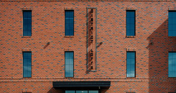
Design Vault Ep. 19 The Rogers Condominiums with Peter Miller
ABOUT THE ARCHITECT:
|
Peter Miller is a Partner of Palette Architecture, which he co-founded in 2010. He is a Director of the Executive Board of AIA-NY and a Design for Freedom Working Group member. Peter is a registered architect with 20+ years of experience focusing on designing and implementing innovative building systems and components. His notable projects include Grace Farms in New Canaan, CT; The National WWII Museum in New Orleans, LA; the Revitalization of Forest Park in St. Louis, MO; the Con" uence Master Plan of Missouri/Illinois; and NYC-HPD’s Small Lots Development Program. Peter’s work has won many design awards, including several AIA National Honor Awards and the Mies Crown Hall Americas Prize. His work has been featured in many publications, including Architectural Record, Elle Decor, Fast Company, Wall Street Journal, and the New York Times. Peter is originally from rural Indiana and is from a family of craftsmen, engineers, entrepreneurs, and tinkerers. He treasures the creative process of turning ideas into physical form. He is grateful for the privilege of making space for others and its effects on their lives. Peter holds a BS in Architecture from Washington University in St. Louis and a Master’s degree from the Graduate School of Architecture, Planning, and Preservation at Columbia University.
|
---|
ABOUT THE PROJECT:
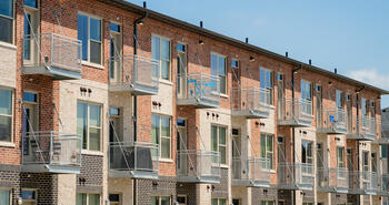
Three adjacent lots in Prospect Le# erts Gardens are the project site for a new eighteen unit multi-family mixed use building. The massing is largely driven by the desire to create a building that ! ts bridges between the existing neighboring three story brick walk-ups and taller multi-family buildings of the future. This is realized by the creation of two masses—one smooth and the other ‘chunky’. The smooth mass is understated, more closely relating to the scale of existing urban fabric, while the chunky mass sits atop and in contrast, articulated and expressive. The articulations of the chunky mass form unique outdoor spaces for each two or three bedroom unit, a necessary and desirable program in the age of social distancing. The ground $ oor has ample space for commercial or community facility tenants.
The Rogers Condominiums
Designed by Palette Architecture
View ProjectTRANSCRIPT
00;00;00;02 - 00;00;05;12
Doug Pat (DP)
Let's go inside the vault. The design vault.
00;00;05;14 - 00;00;30;13
Peter Miller (PM)
Gentrification is always an issue in New York City, and trying to deal with that in a responsible way as an architect is something we often think about. Some people, you know, have a problem with larger buildings, but we're not talking about towers. The most bulk is on avenue is where I think people are a bit more comfortable. And because we're bringing residential into the neighborhood, that's usually something that's appreciated.
Everyone in New York believes rents and housing prices are too high and we need a greater supply.
00;00;30;18 - 00;01;00;18
DP
This is my guest, Peter Miller. I'll share more about him shortly. In this episode from the Design Vault we highlight Peter's project 625 Rogers Avenue. 625 Rogers Avenue is the site for a new mixed-use building with a primary use of residential ground level, commercial and community facility uses with a below grade enclosed parking lot. The architectural design for the building divides the overall mass into two distinct volumes a lower and upper.
The lower is a rectilinear form that relates to historic buildings in the area. This volume is meant to create a more contextual streetscape and a friendly residential feel. In contrast, the higher recessed form is articulated to relate to the new character of the neighborhood. It steps back and recedes as it rises, making it more private and less visible from the street.
The lower form is brick, the upper is stucco, the lower is dark, the upper is light. A side yard is included along the south elevation for more daylight glass and a restaurant terrace. Hi, I'm Doug Pat, and this is Design Vault. Peter Miller is a partner of Palatte Architecture, which he co-founded in 2010. He holds a B.S. in architecture from Washington University in Saint Louis and a master's degree from the Graduate School of Architecture, Planning and Preservation at Columbia University.
Peter is a director of the Executive Board of AIA New York and a Design for Freedom Working Group member. He's a registered architect with 20 plus years of experience focusing on designing and implementing innovative building systems and components. His notable projects include Grace Farms in New Canaan, Connecticut, The National World War Two Museum in New Orleans, The Revitalization of Forest Park in Saint Louis, the Confluence Masterplan of Missouri and NYC HPD's Small Lots Development Program.
Peter's work has won many design awards, including several AIA National Honors Awards and the Mies Crown Hall America's Prize. His work has been featured in Architectural Record, Elder Corps, Fast Company, The Wall Street Journal and The New York Times. He's originally from rural Indiana and is from a family of craftsmen, engineers, entrepreneurs and tinkerers. He treasures the creative process of turning ideas into physical form.
So welcome, Peter. It's nice to have you with us today. So tell us a little bit about Palatte Architecture in New York City. So it was founded in 2010. Where are you guys located In the city. What's the size of the firm? What type of work do you do?
00;03;17;08 - 00;04;01;09
PM
So we're located in the, I like to say the Union Square area. We're on 16th Street and Sixth Avenue. We are 11 people in total, three partners and eight architects. The work that we primarily do is residential in nature. It spans from multifamily, residential in the mid-sized range. 50 dwellings is probably an average size for a mid-sized development to custom residential townhouse projects within the city and custom houses ground up outside of the city.
In addition to the residential work, we do a variety of other things early education is a big part of what we do. Preschools, daycares, things of that nature, and some other commercial projects spanning from retail to restaurants.
00;04;01;12 - 00;04;02;08
DP
How's business?
00;04;02;14 - 00;04;30;04
PM
Businesses up and down. You know, when you own your own business, it's always a rollercoaster. I would say we're busy. There is a lot of work being constructed right now. We have a lot of projects in construction. Design work continues to come in. It's not quite as strong as it was a year ago. I think interest rates are affecting particularly the custom residential side of our business, but the multifamily business continues to be booming. We stay busy.
00;04;30;07 - 00;04;31;28
DP
Has the firm grown?
00;04;32;01 - 00;04;52;08
PM
We try very hard to stay the same size. We have a team of people that we really like and we trust them. And I think a big part of who we are is the consistency within our office. So when times get slow, we find ways to keep those people productive, and when times are busy, they go the extra mile for us and they put in the extra work.
00;04;52;10 - 00;04;59;17
DP
So tell us a little bit about yourself. So how long have you been practicing and what's your role in the office as a partner?
00;04;59;20 - 00;06;10;10
PM
So I've been practicing since early 2000s. I attended Columbia University for graduate school and finished in 2006 and spent a better part of a decade working for well-known firms, doing international projects, particularly of like museums and high end residential. We formed Palatte Architecture. I had two business partners, John Sunwoo and Jeff Wanders, and then we met at Columbia in studio, and there was always an idea that we wanted to work together.
It took a while. We had our own careers in other firms for a while and came back together and formed the office in 2010, but it took a little while to get off the ground. Within the firm my role is partner. We are fairly equal. It's one of our core elements at Pallet architecture, the three partners. We have complementary skills, but we all can perform anything within the office.
Projects are organized where each partner is in charge of one, and then beyond that, we have some other roles. One of my roles is sort of business management and human resources, so I do that in addition to all the design work, the construction administration.
00;06;10;09 - 00;06;15;17
DP
All right, so let's dig in here and talk about 625 Rogers Avenue. So how did your office get the project?
00;06;15;19 - 00;07;07;25
PM
So this is with a client we've been working with for a while is a little bit of background on Palette Architecture. We really started this firm fairly early in our careers. As such, we didn't have as many connections. A lot of things started out as they do in sort of those classic ideas of architecture. You're doing somebody's bathroom, somebody's kitchen, and then you do a good job and you end up doing their house and eventually you work your way up.
So it's been that way. We met this client when we were doing a lot of houses and they were looking to turn a house into a residential building, a multifamily four. So it was to turn like a big townhouse into a four family. And so we did that project for them and we built a relationship that's led to, I think, ten different projects with them now.
And this is the latest one. And so they've grown in scale each time. And this one's, I think, 25 units.
00;07;08;02 - 00;07;14;29
DP
The project is considerable size. So give us a little history of the location and what was there prior.
00;07;15;01 - 00;08;17;11
PM
This is in the Prospect Lefferts neighborhood of Brooklyn. So that is on the northeast side of Prospect Park. We've done a number of projects in this area. The site before this was largely vacant, there was a couple of dilapidated houses in that area. It was mostly a small demo and clearing the project is near the corner of Parkside and Rogers Avenue.
Rogers is the major thoroughfare through the Prospect Lefferts neighborhood. We do not have the actual corner lot, which was kind of an unusual situation in terms of design. There is a small brick building on the corner that has a bodega in the ground floor. Adjacent to them there was an easement in place for them to have access to the back of their building.
So we have a minimum of eight feet that we needed to keep open between us in their building. So we ended up with a building that had two facades, even though it wasn't on a corner because of the easement.
00;08;17;13 - 00;08;22;24
DP
So tell me a little bit about the scope of the project and the client's programmatic requirements.
00;08;22;26 - 00;09;08;03
PM
So the scope of the project is largely multi-family residential. As with any case, working with a developer, you know, it's maximizing units and floor area for the residential use. However, because it's on Rogers Avenue, which is a major thoroughfare, there was an overlay for commercial. So there was a desire to try to put as much commercial in here as was viable in terms of sales. On the ground floor we have two commercial spaces. One is designed to be a restaurant and the other is a bit more flexible, likely to be more of a retail establishment. And then in addition, there is a small community facility space on the ground floor. There is a lobby also on the ground floor that leads up to the residential spaces. And there is five floors, two through six, that is residential apartments above.
00;09;08;05 - 00;09;12;03
DP
So building plan. Could you describe that on the site shape?
00;09;12;05 - 00;09;27;04
PM
Yeah. So it's L-shaped, I would say, with one of the major legs being across Rogers Avenue and the other leg running parallel to this easement that I mentioned before. And then there is a courtyard in the back portion of the L.
00;09;27;06 - 00;09;33;10
DP
So project restrictions, zoning codes. What were you guys dealing with out there other than the easement?
00;09;33;12 - 00;10;21;05
PM
One of the things that has generated a lot of our work in Prospect Lefferts Gardens is there was a zoning change probably about a decade ago that allowed for larger bulk in the area. So a lot of the buildings along Rogers Avenue and in other parts of the neighborhood, are suddenly getting a lot bigger. And in some cases you're seeing full tear downs.
In some cases you're seeing vertical enlargements. In our case, it was important to have this contextual approach that some of the smaller buildings were going to remain for decades and others were going to instantly become larger. So we wanted something the span between those. That meant having a form that followed the context of those smaller buildings. So it's larger up to a setback, and then it sets back at the height of our neighbors and then becomes something a bit more fanciful above.
00;10;21;07 - 00;10;28;09
DP
I'm thinking about the neighbors, right? And I'm thinking about the neighborhood. And you said these buildings are getting bigger. Is that driving anybody crazy?
00;10;28;12 - 00;11;09;05
PM
Oh, certainly. It's a mixed neighborhood and gentrification is always an issue in New York City. And trying to deal with that in a responsible way as an architect is something we often think about. And it's certainly an issue in this neighborhood as well. Some people, you know, have a problem with larger buildings, but we're not talking about towers.
The bulk has risen from like four stories to six or seven stories. So it's a bit bigger. The most bulk is on avenues where I think people are a bit more comfortable with it. And because we're bringing residential into the neighborhood, that's usually something that's appreciated. Everyone in New York believes rents and housing prices are too high and that we need a greater supply. So there isn't a lot of tension, I think, on that.
00;11;09;08 - 00;11;17;22
DP
What is the city do in terms of review, esthetics and building height? Is there an open meeting and you guys are just about to go into construction?
00;11;17;29 - 00;13;21;19
PM
We are in construction. We've been in construction for almost a year. The superstructure is in place. A lot of the interiors are framed out and the building is fully enclosed. At this point, we are about to clad the exterior, so we're pretty far along in construction in terms of the city's take on the shape and the zoning of the building.
New York City is fairly as of right city. If you are following the zoning code, zoning text in the building code, you can largely do what you want, but it is fairly constrained, especially if you want to maximize the floor area, maximize the amount of units. So you often find yourself into these rectilinear envelopes if you're trying to maximize, but there's room for play.
And I think that's really what we were trying to do with this lower mass, is to build that out, make it very tight and taut and follow the context of the neighborhood. It was a bit more challenging on our site because we also had to deal with this easement. And so the easement is a whole swath of the property that you can't use.
You're probably aware, but in New York City, the amount that you can build is a factor of the lot size. So the larger the lot, the more you can build. However, if you're not allowed to build on a portion of the lot, then that same amount of area has to fit into a smaller envelope and so it gets tight.
That's kind of what led to the L-shape, is that we couldn't simply do it in a bar building across the main avenue. We had to put some sort of extension on to the back. But we were fortunate that that extension could follow the easement. So we get a lot of natural light and air from that. It's not legal light and air, which I think people from New York will be familiar with, which is something is a requirement for all apartments.
But we were able to get that through our courtyard and through our rear exposure. And so this was really like bonus windows and bonus light and air that we could get because of the easement. In addition, this corner building is quite a bit smaller, so we are afforded a lot of wonderful views over the top of it.
00;13;21;21 - 00;13;37;24
DP
So tell us a little bit about the design process. I just typed in 625 Rogers Avenue and there's a nice website that comes up and there are some great three dimensional images there that tell me a little bit about the design process. How does that work in your office and how long did it take for this project?
00;13;37;27 - 00;14;19;02
PM
The design process is usually quite rapid in New York City. I would say the actual meat of the process, which is kind of something that a lot of times you learn in school, you spend some time, you make some models, try out a few renderings and you come up with something and then you say, Well, we're not going to do this part.
Let's change it like that. That part of like coming to a form and a floor plan was probably an 8 to 10 week process. And then, of course, there's many stages after that coordinating with structure and mechanical and doing all the fine details and then that sort of thing, Then that's probably another couple of months.
00;14;19;04 - 00;14;21;21
DP
So were the clients excited about the project?
00;14;21;23 - 00;16;41;07
PM
Yes, they do value design a lot and so they were quite excited about it. I think there was always a question of how were we going to deal with this easement? And I think they were very excited about this idea of this lower box that is contextual. We weren't formally contextual. I think that's also probably important to mention.
It is a black brick, so it's not your traditional New York red brick or yellow brick that you might find in there. It is a black brick, so it is meant to pop a bit. What was important to us as a firm was to make something that was formally contextual, didn't look bigger than the neighbors didn't look imposing.
We're not interested in a building that like sticks out like a sore thumb. I think a lot of architects think that you need to make something flashy in order to be noticed, and then for people to come and want you to design another flashy thing that wasn't necessarily what we were after. We wanted something that had a calm facade to it and felt a bit like the neighborhood.
But this isn't the early 1900s, like the context was built in, so we can't do exactly that. So we were looking for something that was formally similar but materially different. And so we went with this black brick along the lower volume. And then of course we had more area to use and we had to put it somewhere. So we set it back and we gave it more articulation.
It's a bit of push and pull of rectangular volumes above, but it's a very light color and the idea was always to be set back enough to where it wasn't initially visible. It was more of a second look sort of thing that when you see the building, you're like, Oh, that feels like the size of other buildings in the neighborhood.
And then when you look a second time, you’re like actually it is not. And what's going on up above is really articulated and interesting. And why did they do this sort of thing? And the reason why we did a lot of that on the upper volume was to create outdoor spaces. This was a project that was conceived during the pandemic and then finalized throughout that process.
There was a lot of interest in our office about making outdoor spaces, particularly private outdoor spaces, beyond the size of balconies, spaces that were more of room size so that you could actually spend time outside with others and you could work outside when the weather is good. So a lot of the articulation on this upper volume was about trying to create private outdoor spaces for each of the interior units.
00;16;41;10 - 00;16;45;07
DP
So were there any unique construction details throughout the project?
00;16;45;09 - 00;18;20;15
PM
Certainly. And we are talking about brick, I'm sure, today. So I think that has a lot to do with it. We've been finding that thin brick has been really advantageous to us throughout the process. New York City is all about every inch. Every inch matters. Real estate agents will tell you that. So the thin brick does afford us a thinner wall thickness, which allows every unit to be a little bit bigger, the sales area to be a little bit bigger.
So that's something we'd like to do. But what we found great about the true brick system, which is what we used, is that it's a mechanically fastened thin brick which affords us new types of details. When you see the classical full brick, you can do corbelling, you can have some bricks, project out from others to create shadow lines and other types of articulation, which wasn't initially available in thin brick because everything just had to sit inside of a tray and anything that projected out would become too much of a load and either pop out.
And so what we were really excited about with this thin brick system, the true bricks, is that we could have a variety of brick depths while still saving these inches. And so there was a lot of thought about that in terms of details. We used different depths of thin brick to articulate slab edges and also areas of pattern and texture.
So within this brick volume on the base, there are strip windows. In between each strip window. We do have a textured brick that creates a bit of interest. It creates a patterned shadow on the facade, and then that is all captured in between these sort of expressed slab edges.
00;18;20;17 - 00;18;24;29
DP
So could you go through a wall section for me? Exterior to interior.?
00;18;25;01 - 00;19;29;12
PM
So we have on the exterior a variety of different depth thin bricks that snap into the true bricks tray system, which is sort of like a channel shaped system that is then attached into a kingspan karrier panel. So this is sort of an all in one cladding waterproofing insulation panel. I believe it's an XPS insulation that's wrapped in a metal panel.
And these are tongue and groove panels that come together and they're flashed at their tongue and groove. So the metal panel on the outside acts as waterproofing, especially when the joints are flashed. Then there is this completely separated other metal panel on the interior, the separated by this XPS installations that provides your insulation and then that interior panel allows you to attach to the studs.
So there's no need for sheathing or waterproofing layer or another set of insulation. It's all in one. So we have that karrier panel and then that is attached to the stud. And then on the interior of the stud we have our finishes, which is general sheetrock.
00;19;29;14 - 00;19;33;06
DP
And the installation values of the walls?
00;19;33;06 - 00;19;36;24
PM
Two and a half inches. So I'm guessing that's probably about R 14.
00;19;36;26 - 00;19;46;17
DP
That sounds really interesting. And using thin brick, I mean it's a veneer like anything anyway, so whether or not you're going to use something that's three and 5/8 thick or it's a half inch thick, it’s still a veneer.
00;19;48;19 - 00;20;22;13
PM
100% agree. We live in a world now where energy code and sustainability issues are vitally important. And for the most part we know Brick classically is like a veneer as a cladding and a structural system, but it's just really not done that way anymore. It's mostly a cladding system now because we need to have this rain screen where where air can move behind the facade, and we need continuous insulation.
So if it's going to be mostly a veneer. Now I'm a fan of the thin brick systems because it saves you that extra couple of inches.
00;20;22;16 - 00;20;40;15
DP
Yeah, I totally agree. And you touched on this a little bit. Just back to the esthetics. So tell us about the style choice. The building is contemporary. When I read about the architecture you guys talked about as statically trying to work with the existing architecture in the neighborhood. Tell us a little bit about that.
00;20;40;17 - 00;22;28;22
PM
I think it's largely about scale. So as I mentioned, we are trying to create a datum that matches with the neighbor. In terms of height. I think the concern back to what you mentioned before is that people are going to feel like their neighborhood is growing rapidly and that it feels much more urban than it used to. And so that was really important to us in terms of context to make the scale feel as if they had always known this building.
Beyond that, we felt that Brick was an important choice. There's a lot of brick in the neighborhood. We felt that other materials might feel too distinct from the rest of the context. I don't think it's important that we try to look exactly like the neighbors because we're in a different era, a different technology. But there needs to be some tie to the way it is.
And it was also sort of important to us that the windows had some sort of gridded logic to it to match the neighbors. So there's a nod to that. Beyond that, we felt freedom to go a different way. And so we relied on sort of a color choice as one way to do that, to create this darker volume on the lower part would sort of emphasize the height of the building that it matched the others because it's so present in its darkness.
The other thing we liked about the darkness is that it made all the details a bit more subtle. It gave us a little more freedom to do things like these patterned bricks and these shadow lines that indicated that this was a newer building and that it has some innovative techniques and details to it. But wasn't flashy to the point of look at me and forget everyone else in the neighborhood.
00;22;28;25 - 00;22;39;02
DP
That's well explained. So when you guys did drawings for the architecture, for the construction process, all 2D, 2D and 3D, Revit, what are you guys working out?
00;22;39;02 - 00;23;05;06
PM
Yeah, well, Revit. Our office is 100% BIM. We are an office that was founded since 2010. So the partners, all the employees, we all grew up in this, so we're 100% BIM. We use Revit as our software. So everything is done in Revit from beginning to end. We found this really beneficial with some of our clients too, because we can get the visualizations a lot quicker and that just makes them feel comfortable.
00;23;05;08 - 00;23;16;07
DP
Yeah, clients love that. Yeah, for sure. So do you guys learn anything interesting through the design in what you're currently in construction process? Anything new for you as you've been working on the architecture?
00;23;16;09 - 00;24;17;03
PM
Well, let's see things that I would want to talk about. Usually the lessons are the things that like you didn't see coming or you feel like you could have control. I think one thing that we really learned on this project is moving to this Kingspan panel that I mentioned before is a new thing for our office. We're doing it on two projects or two simultaneously.
We knew a lot about the details going into it and we really believed in it and we love it, but our contractors were not familiar with it and so there was definitely a lot of lessons in how to communicate these details because a lot of them came in and were like, They see these new Legos for the first time and they're like, Oh, they must go together like this.
And then you arrive at a site and you say, No, actually you put that piece on wrong. It should be like this. There was a lot of back and forth and learning about how to communicate, when to come in in the process with somebody that hasn't used the technology before and really get them up to speed on it.
00;24;17;06 - 00;24;42;15
DP
That's funny, yeah, GCs love that when you walk out into the field and you tell them they're wrong. Yeah, sure. Before you go, Peter, you've been an architect for some time based on what you know today about being an architect, do you have any words of advice for your younger version of you, or maybe for some students or young architects that are just getting rolling?
00;24;42;17 - 00;25;03;01
PM
Well, that's a great question. It's easier for me to advise my earlier self than advise a generic architect in school, and I hope this advice applies for me. I was always an introverted sort of person. I come from a very conservative rural background and it took me a while to learn how to really speak my voice to people.
And I think in school there's this sense that your work is always out there for critique and that you should be careful about everything you do. I think I've learned over time that as long as you follow your own voice and your own beliefs, that those things will fall in place. And so I would advise myself, when I was younger, to not be concerned about whether or not your voice is going to land perfectly amongst your audience.
I think as long as you believe in it passionately and you talk about it strongly and you think about it all the time and you critique yourself, that that will lead to stronger work and it will lead to people wanting to see your work and interact with your work and make sure that it gets built in the way that you had always imagined it.
00;25;03;02 - 00;25;51;16
DP
Yeah, I think that's a really beautiful way of looking at things right that it will land in the right location. You're just responsible for finding your voice and expressing it as best you can within the framework of the work that you do. That's great. So, Peter, it's been great to have you here. Thanks for your time. Where can people go to learn more about Palette Architecture and yourself?
00;25;51;19 - 00;26;13;22
PM
Well, certainly you can go to our website, PaletteArch.com, or they can follow us on Instagram also @PaletteArch.
00;26;13;24 - 00;26;29;26
DP
Well, Peter, thank you very much. It's been great to have you.
You May Also Be Interested In
We Can Help With Your Next Project
Discover the latest + greatest in design trends, industry news & pro tips from pros.
For all of your project needs, you’ll find everything you need at a Supply Center.
Let Us Know How We Can Help!
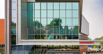
Design Vault Ep. 20 MarketPlace at Fells Point with John Hutch
ABOUT THE ARCHITECT:
|
As one of the founding partners and principal of JP2 Architects, John Hutch plays an active role in the professional development and awareness of sustainable design within the firm. He brings 30 years of experience leading the design process and employing project management with an emphasis on project delivery. His background in both the public and private sector provides a diverse experience to meet the needs of any project. John is a talented architect with an international portfolio of mixed-use projects which includes corporate, hospitality, retail, multi-family, and entertainment facilities.
|
---|
ABOUT THE PROJECT:
Located in Historic Fells Point, Baltimore, MD, these new urban lifestyle apartments feature open rooms maximizing exterior daylight and views. The bulk of the units open onto a private courtyard space complete with fire pits and water features. Many of the units are rehabbed historic buildings from the late 1800’s with large windows and unique special features. The apartment buildings have direct access to over 100 community retail and entertainment venues on the Fells Point waterfront. In addition to the private courtyards, the project also features a club room, lounge, fitness center, and secured parking for the residents.
MarketPlace at Fells Point
Designed by JP2
View ProjectTRANSCRIPT
00;00;00;02 - 00;00;05;08
Doug Pat (DP)
Let's go inside the vault. The design vault.
00;00;05;10 - 00;00;22;07
John Hutch (JH)
One of the missions was to continue to keep the character of Broadway, of Fell's Point through those storefronts and set back the building's mass so that it was not present or felt when you're walking along the sidewalk.
00;00;22;14 - 00;02;25;12
DP
This is my guest, John Hutch. I'll share more about him shortly. In this episode from The Design Vault. We highlight John's Project Marketplace at Fell's Point. Marketplace Fell's Point is located in historic Fell's Point, Baltimore, Maryland. The new urban lifestyle apartments feature open rooms that maximize exterior daylight and the views. The bulk of the units in the marketplace project open onto private courtyard space, complete with firepits and water features.
Many of the units are rehabbed historic buildings from the late 1800s with large windows and special features. The apartment buildings have direct access to over 100 community retail and entertainment venues on Fell's Point waterfront. In addition to the private courtyards, the project also features a club room, lounge, fitness center and secure parking for the residents.
Hi, I'm Doug Pat and this is Design Vault. John Hutch, one of the founding partners and a principal at JP2 Architects in Baltimore, Maryland. John has a Bachelor of Science degree in architecture from the University of Cincinnati. He plays an active role in the professional development and awareness of sustainable design within his firm. He brings 30 years of experience leading the design process of employing project management with an emphasis on project delivery.
He has a background in both public and private sector work, which provides diverse experience for all of the projects the office takes on. John has an international portfolio of mixed use projects which include corporate hospitality, retail, multifamily and entertainment facilities. So welcome, John. It's nice to have you with us today. So tell us a little bit about JP2 Architects, where you guys are located in Baltimore? What's the size of your firm? How long have you been around and what kind of work do you do?
00;02;25;14 - 00;03;00;16
JH
Great. Thanks, Doug. We are about a 20 person firm, and we're located in the Canton area of Baltimore, which is adjacent to Fell's Point, where this project is located. We founded JP2 Architects in 2006 and I have two other founding partners, Jamie Pett and Gordon Gaudet. The three of us have been working together for almost 30 years now.
When I moved here in 1995, I got to know the two of them and we've been friends and colleagues and now partners ever since.
00;03;00;18 - 00;03;02;12
DP
Wow, That's really cool. How did you meet?
00;03;02;13 - 00;03;19;23
JH
So we all met at the large international firm of our RTKL, and we were each in the commercial group. Although I tended to bounce around between groups, which gave me a diverse experience. But we were still young, rising up through the ranks and learning a lot.
00;03;20;00 - 00;03;23;19
DP
That's really interesting. Did you guys always know that you wanted to start a firm together?
00;03;23;21 - 00;03;54;10
JH
No. We each probably had different starting points. I'd say it was always my dream to start a firm and I can thank my parents for saying hold on, hold on, hold on, you need more experience. So when I moved here to Baltimore, met the two of them, I spent about ten or 12 years there prior to the three of us starting, and I couldn't ask for better partners.
We each fulfill a different niche and role in the firm and bring different experience and complement each other very, very well.
00;03;54;13 - 00;04;05;00
DP
That's wonderful for our listeners. Sean and I were talking before we got rolling here, and I used to work in Baltimore, Maryland for Zeiger Sneed. I guess I'm wondering if you ever ran into them.
00;04;05;06 - 00;04;11;06
JH
I haven't met them in person, but we still run into them every once in a while, competing on a project.
00;04;11;11 - 00;04;19;27
DP
I'm sure you do. I'm not sure how involved they both are in the firm at this point, but they certainly did something really wonderful in Baltimore.
00;04;19;29 - 00;04;37;14
JH
They have and they've won a lot of awards in the area. And why I plan to my roots here in Baltimore was because the design and architectural community is strong, thriving. It's a livable city. And I really love the passion that everybody brings to their projects and profession here.
00;04;37;17 - 00;04;45;04
DP
That's great to hear. So tell me a little bit about yourself. How long have you been practicing and what's your role in the office as a partner?
00;04;45;06 - 00;05;38;09
JH
Sure. So I graduated from Cincinnati in ‘91. That was probably not the best time to be graduating and looking for a job, but I struggled through those first few years gaining experience. And so when we started JP2, as I mentioned, as I think it's always been my dream to start a job. So a lot of the business planning, the oversight of the firm in general, my background is probably more design delivery heavy.
But I think one of the beauties of the practice we've established is that we have an amazing group here that all overlaps and has a terrific sense of projects and project management and design from beginning to end. So I will take on some master planning and some design roles, but I can tell you that my partners can draw circles around me.
00;05;38;11 - 00;06;22;00
DP
We talk a lot about this with our guests, our university experience. So you go to college and you learn about design, you know, structures and HVAC equipment and all those kinds of things. But you never really think about everybody's going to be good at something different, right? Or they're going to be good at a few things and then somebody else is going to be.
And so you really need that if you're going to have a partner, if you're not going to run your own office, you're going to have partners. It's really important to overlap. It's important to complement one another and then allow those people to do a good job in the areas that they're good at. Right? It's not something that anybody ever discusses in college. You get out and it becomes reality where you got to run a business and make money.
00;06;22;02 - 00;06;50;20
JH
Exactly. It's amazing how many hats and projects I may touch in a day, but having a team around us and having colleagues that I work closely with allows that overlap. What it does is it extends those initial ideas of a project and allows the whole team to be on board throughout the process so they know the vision, they know what we're executing when you go from a design concept to actually detailing a project and how to deliver it.
00;06;50;26 - 00;06;58;09
DP
So true. Okay, so let's dig in here and talk about Marketplace at Fell's Point. So how did you guys get that project?
00;06;58;11 - 00;07;58;06
JH
It's a wonderful, wonderful history. And we actually made contact through an ex RTKL employee who was in the landscape department and he got out of the design profession and started purchasing and renovating a lot of row houses here and Fell’s Point and Canton area. And he and another developer, David Holmes, the person I was speaking about is Dan Winter, and the two of them started realizing that they had properties near each other.
So that became a genesis amongst the two of them. They were pursuing a strategy of basically a garage with office above it, and it was seven or eight stories tall and the community fought them all along the way. And Dan, knowing that we had just started our practice and respecting our design skills, said, Hey, can you guys give me some advice?
Take a look at this. What should we do here? That was how we landed the project.
00;07;58;06 - 00;08;00;07
DP
And essentially the function changed?
00;08;00;09 - 00;08;51;22
JH
There you go. So I'd say I'm probably a frustrated developer because I love to look at something and say what belongs, what fits, and also how do you make it financially viable? The project, as initially conceived, wasn't penciling out from a financial standpoint, and it was a lesson of less is more. Why fight what should be here, which is a dense, residential neighborhood of two and a half, three and a half story tall row houses.
There are lot lines throughout, so we being old school, put pencil to trace and started sketching some ideas and they started to look at it and lo and behold, they started to peak their interest. They started to put some performance together and look at it and said, You know what, this works. That was a big change.
00;08;51;25 - 00;08;55;09
DP
Yeah. So the architect sold the developer in a way.
00;08;55;10 - 00;08;59;07
JH
Exactly. We brought an idea.
00;08;59;10 - 00;09;06;17
DP
Yeah, you brought in a great idea. So give us a little history of the location because you guys use some of the existing buildings, correct?
00;09;06;19 - 00;09;59;11
JH
That is correct. The site is fantastic. As you know, Fell’s Point is rooted in history going all the way back to the late 1700s and early 1800s. It's a waterfront community here on the harbor in Baltimore. And is known for shipbuilding sales, it's a port. So the establishments, bars, restaurants, all of that catered to folks who were in that industry.
Fell’s Point at the time, which would have been 2008, was what you probably hear about Baltimore, boarded up windows and storefronts. And a lot of these properties were not worth much. And so as Dave Holmes and Dan Winter were purchasing these, they had to have some kind of hope and vision that they could transform them.
00;09;59;13 - 00;10;05;18
DP
Okay. So tell me a little bit about the scope of the project and the client's programmatic requirements.
00;10;05;20 - 00;11;05;28
JH
Sure. The scope of the project, the buildings have historic storefronts, even though many of them, think about it is the 1800s, they were not historic, they were new. And so over time, they go through a transformation that was anything but historically sensitive. So one of the missions was to continue to keep the character of Broadway, of Fell's Point through those storefronts and set back the buildings mass so that it was not present or felt when you're walking along the sidewalk.
I'm starting from a massing standpoint to tell you about the program because the storefronts then would still be, and there's about 28,000 square feet of retail and and entertainment. And then there are in total, there are two blocks. There's one on the east side and one on the west side of Broadway. And they total 160 apartment units.
00;11;06;00 - 00;11;16;17
DP
I'm trying to picture what this looks like because we got some existing buildings down here and we do have some new architecture as well in plan form. What am I looking at?
00;11;16;20 - 00;11;59;23
JH
You're looking at like an amoeba. Unfortunately, apartment units don't like that shape, but the West block touches all four streets around it, so it almost has tentacles and reaches out. So along this storefront were basically 2 to 3 stories and we were able to do that and then set back. But the setback piece is more of a U-shape so that you didn't again have a mass of a building just lurking behind these.
You only had the ends of the U-shape. A lot of the use of brick and color and materials in that area was so that they felt like they fit in.
00;11;59;25 - 00;12;03;02
DP
So the retail space, is that all new architecture?
00;12;03;04 - 00;12;52;10
JH
It is. So the whole block has new storefronts, but they're restored. So they're restored to the historic significance. We went through many photos and did a lot of research. The Historical Society was incredibly helpful in that front. The depth of this storefront or what was behind those is new. When you go out into, say, the suburbs, you're used to a concrete podium with, say, four levels of stick frame construction above it.
That is essentially what we did in this project. We have a concrete podium that separates the retail use from the residential use above that's needed by code, but also makes laying out the apartments above much more easily.
00;12;52;12 - 00;13;03;09
DP
So let's talk a little bit about stylistic choice for the new architecture and then what you guys ultimately did to restore to the exteriors of some of these existing buildings.
00;13;03;12 - 00;14;21;23
JH
Terrific. Yeah, we had a good dialog with the Historic Preservation group here. One of the concerns is always when you create new are you competing or you're trying to match the historic facades. And we literally had on the west block two missing teeth that were non contributing and it was obvious they were not contributing to the historic fabric of the community.
So our challenge was how to blend in. And this is where Glen-Gery was incredibly helpful with the brick choices, the brick style and how we detailed it. So we went with a more simplistic detailing of soldiers and roll locks than a brick facade on both of the missing infill pieces. So you had a character that was still there but not trying to replicate, and that's how we worked on the Broadway facades. Around the perimeter, if you want to look, there are two alleys on either end of the buildings. Those are brick buildings. They fit in, but took the same approach where we use bricks so that it became part of the urban fabric without trying to mimic the historic aspects of the existing.
00;14;21;26 - 00;14;28;02
DP
Did Glen-Gery have bricks that matched the original bricks from that long ago? From the 1800s?
00;14;28;05 - 00;14;55;02
JH
No. But we had some that fit really well. There were molded bricks. We use the Catawba, which is a Cushwa line on the Broadway faces. In the back, we used 56-DD brick, which is more of a monolithic brick. So that one, it's still molded, but it was more uniform. So you did have a little bit more of a contemporary feel or use to the brick than you do on the historic facades.
00;14;55;05 - 00;15;10;13
DP
Interesting. So back to the planning process for a second. So you guys, you sit down, you do some sketches, you got some ideas, you talk with the developers, and then when did it turn into a project and how long did it take from beginning to end?
00;15;10;20 - 00;17;56;28
JH
How long do you have? I think the process started in early 2008. We started our firm in 2006, so this was a significant project for us. We worked very close with Dan Winter and Dave Holmes through this process. They had been working with the neighborhood groups, listening then what they want. So we took these bum wad sketches and floor plans and stuff like that, and then it started to become real.
And then we could start to put together some imagery of the facades. We could start to look at how we were affecting adjacent neighbors and start showing them a reduced massing than what was proposed before we started this project. And that started to win over some converts. And so that process and going through, which you may have heard in this area called CHAP, which is the Commission for Historic and Architectural Preservation, was that historic piece probably took a year.
So we were still in a design process for a good year after we started and then I'd say about another nine months to a year after that, we got into construction documents again, history, right? So now we're into 2009 and we all know what happened in that era with the real estate market. So we had finished construction documents as a recession, The Great Recession was happening and the thought process was, let's file for permit. So again, I'm glad you're sitting because it is a long story. I'll try to keep it somewhat short and there are details to fill in that are fascinating. We did file in 2009. It sat for years for a number of reasons. For one, they couldn't get financing.
You can imagine paying 2006, 2007 prices and then suddenly the bank takes a look at your property and says it's worth a 10th of that so you don't have equity in the project anymore. And so they were running up against hurdles for this. So the project sat and they were then looking for partners that could help with the project.
So enter Klein Enterprises and Dolben is out of Boston, Massachusetts, and Kline is a local developer here. So they came in and basically took over the project with a little bit of revisioning. So it was probably two years after that. And the construction wound up, I think it was 2012, 2013 when we finally had substantial completion.
So you're looking at four or five years.
00;17;57;00 - 00;18;05;18
DP
Yeah, that's a long time to hang with the project, especially when you're done with the drawings and then everything just sits here like, what am I going to do now?
00;18;05;19 - 00;18;44;19
JH
Right, right. It was interesting. I learned a lot about developers along the way as we took the plans, took the idea to a number of other developers to partner with. Some of them didn't want anything to do with the retail piece. They love the residential, but they don't do retail. And I think that's where this partnership and where it landed was a great fit.
Dolben has tens of thousands of apartment units. Klein, there's a lot of mixed use, and so they were not afraid and they know the neighborhood and started to have a vision for what they could create in terms of an atmosphere and a buzz in that part of Fell's Point.
00;18;44;22 - 00;18;57;22
DP
So back to construction. So you're under construction. Any unique construction details that you guys came across using brick or anything else, especially with all these existing buildings out there, right?
00;18;57;25 - 00;20;23;26
JH
It was probably one of the most challenging projects you’re going to look at. I'm sure you've talked to a number of architects that when you do an urban infill, it's a challenge. We touch over a dozen property lines on the west block and over a dozen on the east block. Each one of those neighbors needed to be notified.
You had to figure out how you're going to close the gap on those property lines, how you're going to flash onto other people's party walls. Essentially, as boring as the back of the place was. We had wall sections at every property line because each one was a unique condition on the west block, where we have almost 100 apartment units, we also have an underground parking garage.
So we have about 60 parking spaces underground and all the initial readings or that we have a water table. So here you're creating a bathtub, you've got a water table. And I think it was Hurricane Sandy that had a storm surge that pushed water up to that block as well. So now you're thinking, okay, how do I prevent water from above and below from filling this garage?
And so we had to create under-floor and remediation for the ground water as it swells and being able to pump it, that water table rises and lowers. So when it rises, you're pumping 24/7.
00;20;23;28 - 00;20;31;06
DP
So how did you guys resolve this? You're still pumping water out of there. When the groundwater rises up and it's like a bathtub that you built.
00;20;31;11 - 00;20;33;07
JH
Exactly. You are.
00;20;33;09 - 00;20;35;17
DP
Unbelievable. That's expensive.
00;20;35;19 - 00;21;07;07
JH
It's expensive. And again, you can imagine, I mean, now we're 12 feet below all the properties around us as well. So there was an incredible amount of documentation of the properties adjacent to this project. To be sure these 1800 structures don't settle, don't crack, and then making deals with each one of them that if that happens, we'll repair it.
So there was an incredible amount of liability on the contractor owner and architects and engineers as well.
00;21;07;09 - 00;21;30;06
DP
Wow. You guys have a real constitution. I don't think I could handle that. Just way too much responsibility. You know, interestingly, I did some work with Habitat for Humanity when we lived in Baltimore. And I remember these brick buildings, these row homes, they were crumbling. When the brick is that old, did you guys run into issues like that?
00;21;30;09 - 00;22;27;06
JH
We did. The interesting part of this was finding a right contractor that could deal with this. You weren't looking at a suburban stick frame guy. They'd look at it and were scared. So we needed somebody that had some chops. We ended up with Lendlease and they did a terrific job supporting the historic facades during this time. And so we had every ten feet, a steel column going up the front of the facade and then being supported laterally with other beams and huge cement blocks to keep them from falling as things were excavated behind it.
So it was painstakingly slow at that point. But then also the timing had to be right in order to get the concrete slab there to then reinforce and support those walls and to tie them back in to the concrete slab so that they wouldn't, you know, fall out or fall in.
00;22;27;08 - 00;22;52;19
DP
It takes a special kind of person and firm to do this kind of work, to be involved in that stuff. Architects do all different kinds of jobs, right? And this is one of them working with historic architecture. So what about drawings? What kind of drawings did you guys put together for the architecture? Was it 2D, 3D, lots of details? And then of course, you had to hire engineers and do drawings for the existing condition work.
00;22;52;25 - 00;24;05;19
JH
That's correct. And early on there's a bit of surveying that you do. I would say that it was also incredible working with a civil engineer, because if you think each one of these properties also has utilities coming in and out of it, making sure that we're staying away from all of these. So the underground piece of this became incredibly complicated. The three dimensional aspects, my partners and I are not old, but, you know, we still do a lot by hand. So a lot of the three dimensional stuff in order to get information out there quickly was by hand a lot of two dimensional facades around the project to see how it would relate to the adjacent properties. A lot of wall sections. This would have been wonderful if we had the technology today and, you know, have a drone or something scan the existing conditions in three dimensions. There was a lot of back and forth. Fortunately, it's only a half a mile from our office, so it could be down there in a heartbeat as soon as they discovered things during construction. And that was a vital way of solving some of the problems that came up because so many of them you can't anticipate.
You can only suggest a solution until things get uncovered.
00;24;05;21 - 00;24;14;11
DP
Yeah. Instead of getting in your car and driving a half hour, you walk right out onto the street and walk down the street and you can take a look at whatever challenge you face that day.
00;24;14;14 - 00;24;15;08
JH
That's correct.
00;24;15;15 - 00;24;23;27
DP
So did your team learn anything interesting through the design and construction process? That's a loaded question.
00;24;24;00 - 00;26;07;16
JH
It is. And I'd say, you know, even just this discussion, you can see I mean, all of these things are something new. And I think that's the beauty of the profession. As you mentioned, you work on so many different types of projects. And what I love about how we work as a firm that we don't have these vertical silos, we work across different typologies and bring that knowledge base to each project, which lends itself to something like this where you have mixed uses.
So the retail spaces on the ground floor needed to have If I'm going to put a kitchen in there for a restaurant, I need exhaust. That's got to go up through a couple stories of apartment buildings. So that kind of coordination, anticipating the needs of each component so that each of them stood alone and was able to be successful on their own rather than handicapping one.
One of the things we were not able to do is create what would be normal for a retailer today in terms of ceiling heights. We had to hit the second floor windows of the facades. So sometimes that meant that a retailer could only have maybe a nine or ten foot ceiling in there in order to get all the ductwork and lighting and everything else below the concrete slab.
I'd say what we really learned was from a design perspective, how to work with the community. I think that was the big success here, that we were able to revitalize an area of Fell's Point, bring life to it, bring housing for people, for more activity, and to do that successfully where the community was extremely happy with the end result.
00;26;07;18 - 00;26;24;04
DP
So I'm curious, some of these brick buildings, the existing brick buildings, how did you guys handle the new interior wall systems insulation and how did that work and did that decrease then the interior space? Because some of these buildings are probably pretty narrow.
00;26;24;09 - 00;27;18;17
JH
That's correct. Working with a different module that you're basically given was different and you ended up with almost a wall within a wall in order to get the proper insulation and which made for some unique conditions out the windows where you notice how, you know, like suddenly you've got a big inset that's about a foot and a half to the window.
There were some cases where we had to bump up the ceiling or bump down the floor a little bit where some of these windows were as as much as we tried. There were some things we just couldn't change. So this section is what was fascinating on these projects in that front facade along Broadway, we had to ramp down a couple of feet in order to get to the level that was needed for those apartments.
So it was both in section and then also horizontally in terms of laying out apartments that utilize the existing facades.
00;27;18;19 - 00;27;30;22
DP
Yeah, a lot of site specific challenging conditions. I can see why being out there, being in person was really important because every building's going to be just a little bit different.
00;27;30;29 - 00;27;31;28
JH
That's correct.
00;27;32;00 - 00;27;46;16
DP
Before you go, John, you've been an architect for some time. Based on what you know today about being an architect, do you have any words of advice for either your younger self or maybe young architects coming up in the profession?
00;27;46;18 - 000;29;02;11
JH
I'd like to just call it dumb luck, but I was really, really fortunate to land in a dream job in the late eighties, and it set me on a course for a career that was, this has been phenomenal and a journey. Going to the University of Cincinnati, having a co-op program was fascinating. Your third year, you're going to work for a firm for three months and nobody wanted to work in New York City.
And so I said, I'll go. And that firm happened to be KPF. So I cut my teeth in college with six months working at Kohn Pedersen Fox working on international high rise structures. That set me on a course that took me from there to Disney Development to the West Coast, then back to Ohio before I even graduated college. So I tell that story because that's my advice to folks.
Go for it. Don't be shy. Try to find a path that speaks to your heart. And you know, it's one of the beautiful things about the United States is you can travel, you can go to another location where the jobs are, where you want to be, where you fit.
00;29;02;18 - 00;29;07;04
DP
Well, that's a really interesting point. I think we forget that. I certainly do.
00;29;07;06 - 00;29;11;03
JH
Got a little international connection that reminds me of it quite a bit.
00;29;11;05 - 00;29;18;18
DP
So, John, it's been great to have you here today. Thanks for your time. Where can people go to learn more about JP2 Architects and yourself?
00;29;18;21 - 00;29;37;17
JH
Well, we are active on social media, so your normal spots of LinkedIn, Facebook and Instagram. Our website is JP2architects.com. And as with a lot of folks, we're looking for people to grow with us. It's an exciting time right now.
00;29;37;20 - 00;29;41;11
DP
That's a great little plug. Awesome, man. Well, it's been great to meet you, John.
00;29;41;17 - 00;29;51;29
JH
I'll do one more plug. Part of this project is an isolated corner of the 600 block of Broadway, and that is where Brickworks is located.
00;29;52;00 - 00;29;53;04
DP
Get out of town.
00;29;53;07 - 00;30;27;18
JH
So that is one of the main reasons we wanted to use this project, not only because of the incredible history and everything else associated with it. We thought for sure that corner was made for a Starbucks, a first floor and a second floor seating. But that is not going to happen in Fell's Point. Fell's Point is about local businesses, local restaurants and Brickworks Studio there is phenomenal. I love it. It is such a great fit and we love having them a resource that's just down the street.
00;30;27;25 - 00;30;52;07
DP
Yeah, it's kind of perfect.
You May Also Be Interested In
We Can Help With Your Next Project
Discover the latest + greatest in design trends, industry news & pro tips from pros.
For all of your project needs, you’ll find everything you need at a Supply Center.
Let Us Know How We Can Help!
Design Vault Ep. 29 29 Huron with Vicente Quiroga
ABOUT THE ARCHITECT:
|
Vicente is a project manager with over 10 years of experience and a diverse portfolio encompassing various building typologies, the restoration of historic structures, complex interior layouts, and both public and private work. He is currently managing the construction administration of 1 Huron—a 266,000-square-foot multifamily building with ground-floor retail and a generous package of high-end amenities located along the East River within Brooklyn’s Greenpoint neighborhood. Based on his involvement in the design of the project, Vicente has an intimate understanding of New York City's building codes and requirements related to waterfront development and building within flood zones. |
---|
ABOUT THE PROJECT:
The building is defined by 2 13 story towers connected by a shared lobby whose step forms narrow on the higher floors. The two tower massing maximizes unobstructed views across the East River, taking advantage of its exceptional waterfront location. Due to the building's location in a flood zone, Morris Adjmi coordinated closely with consultants to provide active flood protection solutions such as deployable flood barriers, temporary stairs, flood vents and flood resistant glazing at storefronts. Located within the building's podium, many of the Huron's amenity spaces fall within the design flood elevation, including the indoor pool. Flood resistant glazing within these spaces maintains transparency. The building's glass and steel towers reflect Greenpoint's industrial heritage, while the rough brick podium is inspired by the materials and scale of surrounding warehouses. The heavily gridded facade is comprised of a window wall system featuring I-beam profiles on the pillars.
TRANSCRIPT
00;00;00;02 - 00;00;05;10
Doug Pat (DP)
Let's go inside the vault. The design vault.
00;00;05;12 - 00;00;31;14
Vincente Quiroga (VQ)
We actually decided early on that we would adopt the one story podium and also set back sooner than we actually needed to. It increases the lighting there allows for breezes that blow through. It also allows for multiple outdoor terracing to happen. So those units that aren't particularly high and don't have the same views can step out onto your terrace and see the water.
And so really maximizes the value and effectiveness and the quality of those spaces.
00;00;31;16 - 00;01;05;23
DP
This is my guest, Vicente Quiroga. I'll share more about him shortly. In this episode from the Design Vault we highlight, Vicente’s project 29 Huron in Greenpoint, Brooklyn. The Huron is a mixed use multifamily 13 story 266,000 square foot building with ground floor retail and high end amenities. In order to account for the narrow site geometry and flood zone, multiple massing schemes were studied with an objective to maximize height and floor area distribution and prioritize views.
The building is defined by 2 13 story towers connected by a shared lobby whose step forms narrow on the higher floors. The two tower massing maximizes unobstructed views across the East River, taking advantage of its exceptional waterfront location. Due to the building's location in a flood zone, Morris Adjmi coordinated closely with consultants to provide active flood protection solutions such as deployable flood barriers, temporary stairs, flood vents and flood resistant glazing at storefronts. Located within the building's podium, many of the Huron's amenity spaces fall within the design flood elevation, including the indoor pool. Flood resistant glazing within these spaces maintains transparency. The building's glass and steel towers reflect Greenpoint's industrial heritage, while the rough brick podium is inspired by the materials and scale of surrounding warehouses. The heavily gridded facade is comprised of a window wall system featuring I-beam profiles on the pillars.
Hi, I'm Doug Pat and this is Design Vault. Vicente is a registered architect and project manager at Morris Adjmi Architects in New York City. He holds a Bachelor of Arts in Architecture from New York University and a master of architecture from the City College of New York. He has a diverse portfolio encompassing various building types, such as historic renovations, interiors, hotels, art exhibition spaces, educational facilities and high end residential buildings in the Northeast, the United Kingdom and Spain.
Vicente also has a broad and unique understanding of New York City's building codes and requirements related to waterfront development and building within flood zones. He's currently managing the Construction Administration of 1 Huron on a 266,000 square foot multifamily building along the East River in Brooklyn's Greenpoint neighborhood. Prior to joining Maurice and me, Vicente worked on public restoration projects for the New York City School Construction Authority and the New York City Department of Design and Construction.
So welcome, Vincente. It's nice to have you with us today. Now, for those of you listening who have not heard our interview with Michelle Wagner from Morris Adjmi during the first season. Vicente, could you tell us a little bit about the firm? So where are you guys located? What's the size of the firm? How long has it been around and what kind of work do you do?
00;03;38;11 - 00;04;12;25
VQ
We're based in New York City, near the financial district and Wall Street. We also have a New Orleans office as well, because Morris is originally from there. So we have a broad practice, decades of experience, really working first in New York, and particularly in landmark districts and contexts as well as broadening that to sort of a national practice and also very holistic practice involving urban design, placemaking architecture, interiors, furniture and art services.
The New York office is approximately 70 people, and I think we have about 10 to 20 people in the office as well.
00;04;12;27 - 00;04;18;07
DP
So how long have you been with Morris Adjmi? How long have you been a registered architect and what do you do there?
00;04;18;10 - 00;04;58;00
VQ
So I've worked for about six years there and I've been a registered architect for 12 to 13 years in practice. Prior to that, over 15 years of experience since graduate school. So my role is project manager and flex project architect position, just really responsible for anything and everything to do with the project from client management, coordination, staffing, everything, being accountable for the project throughout the life of it.
And this one in particular has been special because, you know, in a large practice you often inherit projects or people come and go. This project for me has been involved since day zero through completion, so it's very special to me.
00;04;58;07 - 00;04;59;16
DP
And how long has it been?
00;04;59;19 - 00;05;10;24
VQ
Started in 2018, so, you know, approximately five or six years. Some of that was due to the pandemic. There is some slow down pausing during that time where it would have sort of completed a little bit faster.
00;05;10;27 - 00;05;18;03
DP
So most architects at Morris Adjmi are with one project the entire way through and are working on other jobs at the same time.
00;05;18;09 - 00;05;31;02
VQ
Everyone's multitasking. I myself have about six projects actively in different stages of a construction administration or schematic and design development as well. We like to flex our brain.
00;05;31;05 - 00;05;33;02
DP
And how do you like being a project manager?
00;05;33;09 - 00;06;04;25
VQ
It's good. It's a very challenging role because you're juggling practical logistics as schedule and staffing and the finances, but you're also deeply involved with building the client relationship and trust and working with the team to get to the milestones of the project and deliver what you're trying to do, but also take a higher view and really emphasize what are we trying to do here?
What is the objective from a practical standpoint to meet their needs of the project, But also what is the design move? What's the inspiration? What are we trying to do and maintain that throughout the life of the project, which isn't easy?
00;06;04;27 - 00;06;08;14
DP
No, it's not. And how big is the team for the Huron Project?
00;06;08;21 - 00;06;41;06
VQ
It's ebbed and flowed. At some points you have ten people during extensive documentation process. During CA, I think we have about five people. It's particularly because it has extensive interiors. We've staffed sort of an architecture team as well as an interiors team, and then they also have taken on the furnishings and art for the project. So we have over 30,000 square feet of interior amenity with pools and meeting rooms and kids rooms, as well as some outdoor activities where we also collaborated with the landscape architects. So there's a lot of things going on.
00;06;41;09 - 00;06;43;06
DP
And how did your office get the job?
00;06;43;08 - 00;06;59;03
VQ
Well, we were selected from a RFP process with the client. They had tried to develop it into a different solutions in the past and weren't very happy with those studies. So they approached us in a feasibility concept phase to sort of see what they could do as of. Right.
00;06;59;06 - 00;07;00;27
DP
And did you guys know the clients?
00;07;01;00 - 00;07;27;12
VQ
We knew them. It's really our first project with them. We've heard of them before. The client is interesting in that they have a range of experiences of multifamily and hospitality projects in their portfolio and they're also client. That's up for a challenge. You know, the site dimensionally was challenged, the site conditions in terms of remediation of the industrial sites and also its waterfront access, those are all challenges to the design that they were up for.
00;07;27;14 - 00;07;33;25
DP
So tell us a little bit about the history of the location of the site. What was going on there before you guys got there?
00;07;33;28 - 00;08;39;17
VQ
The history of the site, you know, it's a long, narrow site. Our building massing is 100 feet in the north south direction. It's over 500 feet in the east west direction. So it's very distended and lengthened and narrowed. The original site was a one story warehouse, which was kind of the context of the neighborhood. I lived in that neighborhood many years ago, and that was the context.
The context is changing primarily because in a sort of Bloomberg era, there was a zoning plan, but then the 2008 crisis stalled those plans, and it took a while for that increased zoning and development to come to fruition. And so we were part of that increased zoning for the site. In terms of the massing, we wanted to take a sense of the character that was there and honor that.
Not all the projects that we see built really take that into account. And we were thinking, what is the context now and what was the context in the past? So we really thought about selecting a one story podium and selecting Brick as the foundation for that, and also being practical about the openings and where they're located.
00;08;39;20 - 00;08;45;24
DP
Right. So that's a good segue to my next question. So what was the scope and the programmatic requirements for the project?
00;08;45;27 - 00;09;00;14
VQ
For a residential project to build as of right and the emphasis for the target population would be families. So large units, lots of two bedroom and three bedroom units, a lot of outdoor access and the views because of its waterfront proximity.
00;09;00;17 - 00;09;25;13
DP
Yeah, the site is unbelievable. And you guys really take advantage of just about everything out there. It's a great project. So let's talk about the design. So first let's talk about the building stylistically. So to me it looks a lot like a very contemporary warehouse space, right? So there's lots of glass. It almost appears lantern like in the photos that I saw at dusk. It's beautiful.
00;09;25;16 - 00;09;53;28
VQ
The choice of materials was very specific. The neighborhood has a unique grid orientation to the world, and so it captures the light in the sunrise and sunset, in particular. The brick we chose to be a rough, molded brick with a dark mortar and the metal panel has a mica flake to it that captures the light and changes throughout the day.
So sometimes it looks orange and copper. Sometimes it actually looks bronze toned and it has a chocolate sienna undertones to it.
00;09;53;28 - 00;10;05;23
DP
I noticed that in the photographs that the metal definitely takes on a bunch of different colors. So let's back up a little bit. Let's talk about the project restrictions, zoning, any historical requirements for you guys?
00;10;05;26 - 00;10;56;16
VQ
So the site isn't within a landmark district, but as our office really emphasizes context in our practice. So even when there's not those kind of historical restrictions, we like to start there and say, what does it want to be? And so we actually decided early on that we would adopt the one story podium and also set back sooner than we actually needed to.
First, to take a cue from that one story warehouse context, but also how that kind of massing relates to the street and the experience of the street. It increases the light and air and allows for breezes to blow through. It also allows for multiple outdoor terracing to happen. So those units that aren't particularly high and don't have the same views can step out onto your terrace and see the water.
And so really maximizes the value and effectiveness and the quality of those spaces.
00;10;56;19 - 00;11;05;22
DP
So let's talk a little bit about the building and plans. I'm assuming it's along because the lots a long rectangle, the building matches that although it steps back.
00;11;05;24 - 00;11;47;08
VQ
It steps back immediately after the first story. The first story is about 17 feet in height. And so there are some very high ceiling experiences there, ranging from 12 to 14 foot ceilings within the amenities alone. And that also gave us the room to deal with some of the flood constraints as well. Being that the site is adjacent to the East River the predicted flood zones right now are anywhere from 5 to 6 feet above grade. So that was a challenge and a constraint early on where we had to coordinate. We certainly decided we weren't going to excavate because of the high water table. So some of the functions that you would put in the cellar, we put a grade, but we often had to elevate the critical services six feet above where you normally would place them.
00;11;47;10 - 00;11;54;05
DP
So I'm curious, when you're digging that close to the water, do you get a lot of water, a lot of groundwater coming in when you're creating your foundations?
00;11;54;05 - 00;12;22;21
VQ
Yes, you do. Yes. Early on there was a lot of pile driving very deep anywhere from I would say 30 or 40 feet down. And those piles were linked up with large caps, pile caps and then mat foundations at the towers. The slab itself, because of, you know, you have to think more like a boat or a bathtub.
The slab itself was anywhere from 24 inches to 18 inches thick at various points throughout it. And it has to resist uplift.
00;12;22;23 - 00;12;28;07
DP
That's really interesting. So when you're driving piles and there's a lot of bedrock, how do you do that?
00;12;28;10 - 00;12;47;14
VQ
The nature of the historic waterfront is often landfill, so a lot of it is just trash or sediment over 200 years people just dump things in the river and it created a new shoreline, which was often the case, as you see in lower Manhattan as well. So we knew that we were going to have to go deep to hit rock.
00;12;47;20 - 00;12;50;29
DP
So you're driving the piles then 25 or 30 feet.
00;12;50;29 - 00;12;51;18
VQ
Exactly.
00;12;51;18 - 00;12;52;09
DP
I got it.
00;12;52;09 - 00;13;48;10
VQ
Yeah. And another challenge relating to the waterfront edge is we had to deal with actually coordinate with a marine architect because the edge condition was failing and we needed to remediate it. So we coordinated a new driving a new sheet edge along the shore to create that. The site actually is interesting in that it has a natural cove condition that other areas along the waterfront don't.
And so we recreated that in the remediation. But we also worked with the landscape architect to create this. We're obligated by zoning that create a setback for public access on the site. So they really leaned into that curved cove condition that's set back and stepped it down to the water gradually from grade and incorporated eco concrete blocks that have various pockets that allow kind of tide pool action to happen.
And so we thought about breaking down the shoreline a little bit and not just a hard edge.
00;13;48;12 - 00;13;57;21
DP
It sounds really interesting. I mean, when somebody owns a piece of property like that and it's really sitting on debris, in many cases, it's kind of unusual.
00;13;57;24 - 00;14;34;06
VQ
I mean, we tried to find opportunities to maximize the value of the site. With the two tower strategy. We put lots of valuable floor area up high and took advantage of the views. We made double the amount of corner units that you could have by having a two towers. We also separated them over 100 feet apart so that the West Tower really gets out there in front of other buildings that it's alongside.
The East Tower is set back for the east to kind of get around other buildings that could obscure it. And we were actually surprised at how good the views are as it was being built. We knew it was going to be good, but it actually turned out to be better than we anticipated.
00;14;34;09 - 00;14;41;08
DP
It's really beautiful about the design as the corners are opened up then to become porches, right? Terraces, is that correct?
00;14;41;10 - 00;15;04;06
VQ
That's right. This is part of that is a response to some zoning constraints is at a certain height you also had to step back in multiple directions. And one of the things that we like to do is incorporate our balconies into the building facade and not just look like appendages. So we really took advantage of that setback rule and created these covered protected balconies.
Also, it's quite windy, so that coverage helps screen it a little bit.
00;15;04;08 - 00;15;08;14
DP
So an open terrace meets the setback requirements then?
00;15;08;21 - 00;15;09;04
VQ
Yes.
00;15;09;07 - 00;15;13;25
DP
Wow, that's really interesting. So did you guys max out the building height then?
00;15;14;01 - 00;15;36;14
VQ
Yes, we had a R six zoning. We were adjacent to R eight. So there's some taller buildings in the surrounding area. But we did try to sort of maximize it. Part of also with the flood zoning, when you have extreme water table situation, you are allowed to increase up to a certain height. So we were able to utilize the various zoning restrictions to our benefit.
00;15;36;17 - 00;15;39;19
DP
So how long did the building review take with the city?
00;15;39;26 - 00;15;57;14
VQ
Well, certainly just even the public park portion we started in 2008. It probably took a year and a half to two years alone. At the same time, we were overlapping with our design and documentation, so it probably took another two years to really finish all the documentation.
00;15;57;17 - 00;16;09;00
DP
So let's talk a little bit more about the parameters for the building materials and the use of masonry, which from what I can tell from the photos is at the base and then the circulation tower, is that correct?
00;16;09;02 - 00;17;40;06
VQ
The circulation towers are actually stucco with a color to match the metal panel facade. They were really thought of as almost like a concrete massing for the podium. We selected a Glen-Gery Brick that was a molded modular brick. It has orange undertones and some brown tones as well along its finish, and it's a bit city, and we specifically selected it for its character.
It has texture, it catches the light in an interesting way. It's a very practical brick. And so we tried to think about just in the same way that we thought about the rest of the massing and even some of the interior design elements is to marry a practical industrial esthetic that was indigenous to the neighborhood, but also elevated and make it a bit of a luxurious esthetic as well as a hybrid.
So we selected the brick, we selected a dark mortar and did simple moves with the design in terms of let the program and the adjacencies define where those openings wanted to be, because again, 500 feet, we weren't over doing the modulation of that. We really wanted it to say this is where the windows want to be based off of the function of the plan.
And when we knew where those openings would be, we also decided upon simple detailing, corbelling of 1 to 2 inches stack stretcher, bond patterns, soldier brick patterns, which would have been indicative of the kind of twenties, thirties or earlier warehouse context. You know, again, just trying to tie it back to what would have been if it had been built 100 years ago.
00;17;40;08 - 00;17;50;25
DP
Well, I noticed there's a really pretty detail where you're setting the masonry back from the facade to create a reveal for the headers and for some of these openings.
00;17;50;28 - 00;18;03;17
VQ
Yes. And it creates a lot of interplay of light and shadow along the facade. And that was always thought about, you know, how do you deal with such a long facade that would have a lot of opacity to it, but create interest in that opacity.
00;18;03;19 - 00;18;05;17
DP
So did you guys draw the building in BIM?
00;18;05;17 - 00;18;06;17
VQ
Yes.
00;18;06;24 - 00;18;07;29
DP
You guys work in Revit?
00;18;08;04 - 00;18;10;12
VQ
Yeah, we're predominantly a Revit office.
00;18;10;14 - 00;18;19;08
DP
So the studies that you did initially, did you guys draw the whole building in 3D and then show the clients and so they got to see the model? Or did you guys build a physical model too?
00;18;19;10 - 00;18;43;16
VQ
We always start with the Revit process because it has its advantages, sort of quick moves and early viewing studies as well as planning. We did some early models, for the sales we did a full scale model of the whole building as well as the interiors. There's actually a drawer that pulls out of the base of the model and you can see all of the amenities articulated, which is incredible.
00;18;43;18 - 00;18;51;25
DP
Again, I'm curious how large of a set does a project like this create? How many pages just for architecturals?
00;18;51;27 - 00;19;11;26
VQ
That was always a challenge for the documentation was the East West Towers had their own articulations. Between the architectural division and the supporting engineering divisions, we had four volumes of documents just on drawings alone, and I want to say the architectural volume was easily 100 sheets or more unto itself.
00;19;11;28 - 00;19;24;27
DP
Another detail I really like is the exterior facade. So you made the piers and to some extent the floor slabs as they’re exposed on the exterior. It's not really a slab, it looks like steel. It's a really pretty detail.
00;19;24;29 - 00;19;50;24
VQ
Yeah, it's a simple C channel profile that's in ACM, Aluminum Composite Metal panel, and it's an open range screen. We really worked with our facade consultants and structural to simplify the detail as much as possible and maximize the windows. You know, again, this project, by its site positioning and daylighting it wants big windows. So we wanted to coordinate that with slab covers and the column covers.
00;19;50;26 - 00;20;01;15
DP
So could you give me more of an idea of how that open rain screen works? I mean, when I'm looking at the exterior photographs does not look like a rain screen at all. I mean, it looks like an enclosed system.
00;20;01;17 - 00;20;35;18
VQ
The profile clips the slab edge and tacked on to a fin that is part of the window wall extrusion. And that sort of stabilizes the top and bottom relationship and sets the datum for every floor and at every joints we leave it open behind that paneled system is a mineral wall assembly and waterproofing behind that and at the open joints, we coordinated with the shops to return the finish and bend, partly to stiffen the profile, but also finish it off and create a sense of closure.
00;20;35;20 - 00;20;40;20
DP
And what would be the advantage of doing a rain screen versus doing a closed system there?
00;20;40;22 - 00;20;56;05
VQ
It was more practical from an installation and sequencing standpoint and also just maintenance, you know, tall buildings, having to deal with caulking and repairing it later. It's a challenge and you have to think about that for clients’ maintenance. You know, it's a real concern.
00;20;56;07 - 00;21;32;06
DP
Yeah. I'm just getting myself familiar with rain screens. I'm behind residential work and we did a rain screen for my most recent home in New York State and was a real education. It's such an interesting system and I would say I think I tested on it for some CE units that I took maybe a couple of years ago and I thought, Wow, this is a really interesting idea where the facade is actually wide open in some ways and water's allowed just kind of move through it, dry back out again.
You're eliminating a lot of challenges long term by using rain screens.
00;21;32;08 - 00;22;01;14
VQ
I actually have an extensive experience from my school construction authority days of working on rain screens that we often would take existing schools that are 100 year old buildings that were solid wall assemblies, and we found water infiltration. We would take back the finish to the back up and create narrow cavity drainage plains with brick or precast or GFRC elements.
It's definitely in my wheelhouse to work in that context.
00;22;01;17 - 00;22;19;29
DP
It makes perfect sense to allow a wall to dry out rather than capture water behind the facades. All right. But it took us hundreds of years to figure this out. Very interesting. So you guys drew the building in BIM. You have the 3D model. How long have you guys been working in Revit?
00;22;20;01 - 00;22;22;00
VQ
15 to 20 years at least.
00;22;22;03 - 00;22;34;21
DP
Again, I'm kind of curious as an offshoot to this discussion. When you hire people, do you hire people who do not know how to use Revit? Maybe they've used Micro Station or they use ArchiCAD or AutoCAD and then you train them.
00;22;34;28 - 00;23;20;13
VQ
It's ever more common for them to have experiences these days. I actually didn't know Revit when I started, and that was a learning experience for me. You know, it has its pros and cons, you know, if you're an old school CAD person, but I value its ability to, you know, you move a wall, it moves everywhere. You don't have to constantly track that element.
And also when we're doing design options for large complicated projects, thinking about, well, what if the window appears or this dimension or that dimension, we can iterate and quickly deploy changes, you know, especially this day and age where you're dealing with value engineering, they come back with bids, you say, it's got to come out of somewhere. It's an important tool to be able to pivot and retool the design, adapt the design to accommodate these requirements.
00;23;20;15 - 00;24;10;27
DP
It's a really good point for those of you who don't know what BIM is, it's building information modeling, so you're giving lots of information up front to building parts like walls and plan, for example. And initially, at least in my experience, it takes a lot longer to draw something in the beginning, but you've got all that information in there.
So Vicente is explaining that what happens is when you need to make a change, the change is really quick because you're just changing one thing out of a series of pieces of information that you've already kind of filled in. So BIM has really changed the business over the last 15, 20 years. So do you guys learn anything interesting through the design and construction process? Maybe something you'd never dealt with before in terms of details or dealing with the client or the?
00;24;10;27 - 00;25;39;01
VQ
GC Well, certainly that flood design is evolving. We came up with some strategies that even the rules have changed since we started this project. So it's constantly evolving target and some of the forecasted flood elevations have changed across time. So that's something that's an ever evolving discipline of knowledge and thinking about active systems versus passive systems. You know, this building relies on a mixture of passive and active systems, some that the building is set up or either elevated spaces or the wall assemblies set up to resist water, the force of water in other elements, it's relying on staff.
We're trained to deploy solutions that are either barriers or stairs to reduce that access throughout the building. And that's a big challenge with any project that's in a flood zone is egress, space planning services and also mitigating cost. The developer and the clients and the residents ultimately will want to experience these views. But those views are difficult if we're anticipating flooding.
Nobody wants to have windows that are six feet off the ground. We were selective in where we put our efforts and said these areas are going to have the views. We're going to coordinate flood resistant glazing there. The same thought process at the commercial retail and lobby. You know, the places that it mattered. We wanted to maximize the glass. In other areas, we dialed it back down to really use opaque assemblies to articulate the design.
00;25;39;04 - 00;25;42;16
DP
So I mentioned deployable flood barriers. What is that?
00;25;42;18 - 00;26;21;26
VQ
I think of them like Lincoln Logs. Well, there's a range of options out there, but they are often aluminum extrusions that gasket together and stack along channels and they'll go to whatever height that is necessary. They often have back bracing or steel or aluminum sections. Those elements either are built into the facade already or tie back into anchor points that really transfer the loads to the structure.
It's a very complicated interaction and coordination of the design that you want these facade protection elements, the superstructure and waterproofing, you know, it all has to work and it takes a lot of effort.
00;26;21;28 - 00;26;25;28
DP
So what happens to that barrier when there is a flood? Do they break away?
00;26;26;00 - 00;26;27;17
VQ
They resist. They act as a wall.
00;26;27;17 - 00;26;28;21
DP
Resist. Okay. Yeah.
00;26;28;22 - 00;26;39;05
VQ
Normally they're stored in a closet until they're needed. The idea is if you have notice of an impending storm or hurricane, then you would deploy them in advance of the storm.
00;26;39;05 - 00;27;06;01
DP
Thus deployable. Yeah. Interesting. So Vicente, you're a relatively young architect. I say that because at one time I was a young architect and I used to tell my students that you were considered young at 40 or 50. I'm now 55, so please don't be offended by my comment. But based on what you know so far, do you have any words of advice for your younger self or even young architects like yourself just getting started, Not just getting started, but getting started.
00;27;06;08 - 00;27;41;19
VQ
I think curiosity and a willingness to learn a variety of things. Architecture is an interesting creative discipline because there's a lot of rigor and science and technology and law backed up into that knowledge. But it's also trying to solve a problem. You have to really embrace the learning curve of that and learning things that you may not have mastery of, but your organizing, those various constraints and knowledge is into a solution.
And I think that's, if you're enthusiastic and go with it and embrace it, I think you get a lot out of it.
00;27;41;22 - 00;27;57;05
DP
Yeah, I totally agree. I like to tell people architecture is a field where you have to know a lot about a lot. It's as simple as that. So, Vicente, it's been great to speak with you today. Thanks for your time. Where can people go to learn more about Morris Adjmi Architects and yourself?
00;27;57;11 - 00;28;05;26
VQ
You can go to MA.com, our website. You can also check out The Huron Instagram. You can also visit the site. It's a beautiful building.
00;28;06;02 - 00;28;08;18
DP
Yeah, it's a great project. Well, thank you very much, Vicente.
00;28;08;22 - 00;28;12;23
VQ
Thank you.
You May Also Be Interested In
We Can Help With Your Next Project
Discover the latest + greatest in design trends, industry news & pro tips from pros.
For all of your project needs, you’ll find everything you need at a Supply Center.
Let Us Know How We Can Help!
Design Vault Ep. 27 389 Weirfield with Tom Loftus
ABOUT THE ARCHITECT:
|
Tom’s first exposure to working in the architectural field came from working in wood-frame construction. His passion for the industry grew, and he soon realized that as an architect he would be afforded more creative license to design structures that would have a lasting impact on the community. Tom brings over 14 years of project management experience to the team at Aufgang. Prior to joining the firm, he spent several years at various other firms in the city and Westchester County, where he gained experience leading the development of projects ranging from single family residential units to multi-family mid-rise structures and interiors. As Studio Director at Aufgang, Tom is a leader in all aspects of project development – from designing the beginning concept, to overseeing the project through the construction process to completion. He has extensive knowledge and experience in project management, schematic design, project design development, construction drawings, design quality, and project construction. He is also a leader in building and maintaining client relationships, managing team’s workloads, and client and consultant coordination. Tom is a firm believer in the powerful role that technology plays in design, and avidly follows the latest technology trends as inspiration for efficient and innovative designs. |
---|
ABOUT THE PROJECT:
389 Weirfield Street is a 12-story, 50,100 GSF rental project consisting of 66 residential units with 66 parking spaces, with 46 market rate and 20 affordable rate units, and including a common roof deck, library, half court, exterior seating, huddle rooms, café, and amenity room. This building was constructed along with 378 Weirfield St., located across the street. The amenities of both buildings are available to both buildings’ residents.
TRANSCRIPT
00;00;00;02 - 00;00;05;13
Doug Pat (DP)
Let's go inside the vault. The design vault.
00;00;05;16 - 00;00;27;11
Tom Loftus (TL)
So we really had to be mindful of availability of product and the budget. So this is what started driving us to start playing with different bonding patterns. If we stack the brick one way versus another way, if we do a running bond versus a stack bond versus a Flemish bond, how can we play around with our stacking patterns and try to make something unique?
00;00;27;13 - 00;02;46;23
DP
This is my guest, Tom Loftus. I'll share more about him shortly. In this episode from the Design Vault, we highlight Tom's 389 Weirfield Project in Brooklyn, New York. 389 Weirfield in Brooklyn is a 12 story 50,000 square foot rental project consisting of 66 residential units, a common roof deck, library and cafe. The building was constructed along with a second at 378 Weirfield just across the street.
The building features a very unique singular masonry facade we'll discuss today. The sole decorative facade is done in undulating rail like bricks, which is in a creative vertical design. The bricks are dark and called Ebonite Smooth. They protrude in patterns at equally spaced cadence as the facade climbs. The windows are set apart from the vertical masonry bands with frames of varying height, which capture the windows between the horizontal spans. The singular brick facade was a unique way of setting apart a building that might otherwise be much like any other.
Hi, I'm Doug Pat and this is Design Vault. Tom Loftus has a bachelor degree in architecture from New York Institute of Technology. He also has a certificate in business management from Cornell University and is a licensed architect in New York.
Tom's first exposure to working in the architectural field came from a job in wood frame construction. After a number of years working in Westchester County, he brings over 20 years of project management experience to outgoing architects. As studio director, he has extensive knowledge and experience in project management, schematic design, design, development, construction drawings, design quality and project construction.
He's also a leader in building and maintaining client relationships, managing teams’ workloads, plus client and consultant coordination. So welcome, Tom. It's nice to have you with us today. So tell us a little bit about Aufgang Architects in Suffern New York. So where are you guys located in Suffern? What's the size of the firm? How long has it been around and what kind of work do you guys do?
00;02;47;01 - 00;03;37;20
TL
Great, first and foremost. Thanks a lot, Doug, for having me on the podcast today. I'm really excited to be here. So we're located here in downtown Suffern, right down the street from the train station pretty close to central Manhattan. So our firm is about 50 people right now. We primarily do residential work. I'd say about 90% of our work is in the residential field.
We do everything from low rise to high rise buildings, primarily in the five boroughs. But we also have projects in the tri state area and a few scattered around the country as well. A lot of those projects are mixed use with commercial on the first, second or few floors and then residential apartments above. The residential work that we do ranges in everything from luxury condos all the way to homeless shelters and really a range of everything in between.
00;03;37;22 - 00;03;39;28
DP
So how long has Aufgang Architects been around?
00;03;40;05 - 00;04;19;22
TL
Outgoing has been around. I think we're going about 50 years now. Ari is the third owner of the company, and when I started, I worked together with Ari and our former principal, Hugo, and they partnered for a while and he had also taken over the firm from someone else. So probably in the early seventies, if I have my history of the firm correct.
We started in Rockland County doing small scale residential rehab work and grew in time and in size with our clients and our work type from one partner to the next, and really have kept our foot in our roots in residential and then grown laterally in the industry.
00;04;19;25 - 00;04;27;22
DP
Tom, tell us a little bit about yourself. How long have you been practicing architecture and your role as studio director?
00;04;27;25 - 00;05;16;29
TL
Sure. It feels like forever. Honestly, every once in a while I wonder, am I still really doing this? But I've been in the architecture field now just a little over 20 years, and I started working in Westchester County. Small scale wood frame, residential. It was a natural stepping stone for me. After I got out of high school, I thought I want to be a framer.
And after getting really tired of carrying three quarter inch plywood up a ladder, I said, Nope, time to go back to school and study architecture. And from there I worked at a variety of firms in Manhattan, in Westchester County, doing a variety of different work. And when I found this firm, the scale work that we were doing, the residential work, it tied into something I loved with my single family housing experience.
It kind of stuck and I ended up staying here for quite a while.
00;05;17;01 - 00;05;23;25
DP
It's a long time practicing as an architect. I kind of say the same thing about or to myself about how long it's been.
00;05;23;27 - 00;06;23;12
TL
Sure, I've really grown in the company here. It's been a fantastic partnership with Ari. When I started, I came in really as an assistant project manager. A lot of my experience was not relative to the scale of the projects we were doing, although in other firms I was working in a bit of a leadership role running point on smaller scale projects, so it took a little time to learn the ropes, if you will, in the different construction types.
And I've moved up into the role of studio director now, so I work very closely with our senior management and the rest of our senior staff looking at our workload, our resource management, project proposals, client relationships and really stay involved with the team from the very start of the project until close out to handle the day to day operations of the office as a whole.
Ari, myself and our controller meet frequently to talk about some of the more boring business side of things and then the more fun happens working with the architects on the day to day and the projects.
00;06;23;15 - 00;06;33;19
DP
So let's dig in here and talk about this very interesting facade of yours. How did your office get the project, or is this a project that the office created?
00;06;33;21 - 00;07;57;02
TL
Yeah, this was actually an interesting project that came at a time when everything started shutting down right at the start of the COVID pandemic. And we had a really good recommendation from a long time client that we had worked with, and we had met a new client remotely who was involved on the construction side of things, and we hit it off.
We started talking and it was the first time ever that I met someone virtually and had meetings like this on screens, and we were trying to build a new professional working relationship. So it was very unique in the way that the project started. And again, we do a lot of our work really based on recommendations. We really pride ourselves in building good relationships with our client base, and that's really how the project got started.
They had this unique property in Bushwick and if you know the area in Brooklyn at all, it's a lot of small scale row housing, if you will, maybe 3 to 4 storeys and there really aren't too many open lots. And in this particular project it was unique. There was a large portion of the lot that had an easement that couldn't be built on it, and it provided a good amount of air rights which allowed us to follow the zoning path to do a much taller building than you usually would see in this neighborhood.
Most of the buildings were very close together, and that's really how it started and how the project grew and how we ended up with a 12 storey building in the middle of Bushwick.
00;07;57;05 - 00;08;04;19
DP
So did you guys know right away that you were going to be able to make a tall building there, or did it take a little bit of examination first?
00;08;04;21 - 00;08;48;13
TL
It took a little bit of examination. Usually what we do as architects is we really try to help guide our clients to bring their projects to fruition. This is the property I have. What can you build? How much can you build? There are two different zoning parts you can follow, primarily three different zoning parts in New York City that will help you establish the bulk, the height, the size of the building.
So we'll study that first and foremost with our clients and present them the different options. And based on the geometry of this lot, when we saw the potential to get a little height on this building, be separated from the other surrounding residential buildings, it gave them a nice opportunity to have a building with some great potential for views in an otherwise low height area.
00;08;48;15 - 00;08;53;12
DP
So what was the scope and the programmatic requirements for the project once you got rolling?
00;08;53;14 - 00;09;32;03
TL
Typically and specifically to this project, our scope was everything from working with the development team to help them flush out the parameters of their funding program. So when you work with different agencies in New York City and in the state and you're following certain guidelines to provide certain square footages and distribution of units, we work right at the very beginning with them to help them find the right mix and size of units, right with the development team.
From there, we work through design and construction administration all the way until the close of the project. So we really gave soup to nuts services here. Full scope on the building.
00;09;32;05 - 00;09;48;24
DP
So let's talk a little bit about the building design stylistically. So you guys designed quite a unique facade, while the other three facades, from what I can tell from the photos, are relatively subdued. Tell us about the main idea behind this.
00;09;48;26 - 00;11;17;22
TL
First and foremost, we love Brick. Brick as an architect, for us, it's really a timeless material and it's a durable material and it fits in really well to so many different urban fabrics in so many different places. In my opinion, what made 389 unique was the timing that this project was happening. It was happening at a time where the future was uncertain.
We didn't know what was going to come of this pandemic. We had to be incredibly mindful of the budget. Many times we like to create building facades that are two different materials having a nice dialog or different color bricks. So we really had to be mindful of availability of product and the economics, the budget, and really try to come up with something that would be unique but be something that the client could achieve.
So this is what started driving us to start playing with different bonding patterns if we stacked the brick one way versus another way, if we do a running bond versus a stack bond versus a Flemish bond, how can we play around with our stack in patterns and try to make something unique? So that was really what started pushing us in this direction of going with a single color brick and then really focusing on how to find a challenge enough for the mason that they don't hate us and say these are architects of the worst.
Have something be achievable for them. But that also will give a nice unique context to the neighborhood.
00;11;17;25 - 00;11;24;28
DP
Were there any aesthetic reviews of the building before you guys got rolling with the city?
00;11;24;28 - 00;11;49;21
TL
With the city for this particular project, there were no agencies on the city or state side that had any reason to opine on the design. We were not going for any variances. We didn't really have to go to the community board, although we did not need their aesthetic approvals. It is something that we're always mindful of working within the urban fabric and how it's going to lend itself to the context of the neighborhood is always an important consideration of ours.
00;11;49;23 - 00;12;01;09
DP
So let's back up just a little bit. So the building plan, are we talking rectangle, square, relatively straightforward. Then of course, there's parking on the site. You had said that there was a portion of the site that you could not build on.
00;12;01;11 - 00;13;07;01
TL
That's correct. So for this particular massing to make this building work, the footprint was rather small. It actually made a very efficient floor plate with a very tight core of stairs, elevator and corridor, and then apartments around all sides of that. So it really became a very compact, high efficiency floor plate with very little loss factor. And it was something that we were able to just work all the way up the building.
So there were quite a bit of revisions back and forth, variations that we had worked on to find the right mix and balance of that to fit within the envelope. The same thing then translated to the facade a bit earlier we were talking about what did the design iterations look like there, through the whole process of finding the right solution and the facade design that we felt was the right match for this building.
We did digital 3D models, plenty of sketches and even on site mockups working together with the Masons saying, We know you can do this, we believe in you, please don't kill us. And did plenty of mock ups there to really work it out.
00;13;07;03 - 00;13;11;25
DP
Was it a challenge finding a good mason, or did you guys have somebody lined up right off the bat?
00;13;11;27 - 00;14;04;09
TL
I think that's really one of the keys. You have to have really good subs. So whatever the type of work you're doing in this case, the Masons, you need to have a good working relationship with them. And often it's the architect working directly with the general contractor. But in these cases we invited the Masons into the architecture meetings, we invited them into the AOC meetings towards the end and said, Look, let's work through some of these details.
Let's talk through it. How is this going to work? It wasn't incredibly complex or challenging, but we wanted to make sure that the person who was directing their team to install the Brick really felt confident that they could achieve what we were looking for. We never wanted to come out on site and say, This is all wrong. That's not what we want to do.
And I really think engaging with those professionals early on is important to try to get the end result that you're looking for.
00;14;04;12 - 00;14;16;20
DP
Yeah, we try to bring in a contractor at schematic design. Once we wrap up schematic design, we have them price the project. This is in high and residential work that I do. So single family homes.
00;14;16;22 - 00;14;33;09
TL
Right? And in this case we didn't have a mason lined up. We didn't have a recommendation. The developer slash contractor, they were one and the same here. They had already had an existing relationship with this Mason and we started just working with them early on in the process.
00;14;33;11 - 00;14;54;17
DP
So could you do your best to describe the evolution of the design of that facade and then try to describe the facade? I'm going to encourage our listeners to go to the Glen-Gery site and take a look at some of these photographs because it's really striking. I've never seen anything like it. It's a great idea. The clients must have been thrilled when you presented the drawings.
00;14;54;19 - 00;17;33;18
TL
Thank you very much for that. We've seen a lot of example of brick facade that has quite a bit of movement in it, and these brick facades more often than not, are panelized prefab, and that's a way that you can achieve quite a bit of movement with brick using this idea of this undulation and this movement in the brick as an inspiration.
That's what triggered us to start thinking about how a brick pattern, the stacking pattern, really might help us achieve what we wanted to do here. So if our listeners are familiar with Brick parents, which I hope they are, we're in a brick podcast, we utilized a Flemish bond pattern and a running bond pattern. So the Flemish bond pattern has a standard brick with the long face.
The following brick is then rotated 90 degrees with the short face and the pattern is repeated. Taking this idea of combining a Flemish bond pattern with a running bond pattern, we now have these bricks that are half size, if you will, square proportion to create the movement and the undulation throughout the facade. We detailed a Flemish bond pattern with a large number of running bond, then a increasing increment of Flemish bond and a decreasing increment to running bond.
So we took the pattern and as you got closer to the center of the pattern we created, you had a higher frequency of Flemish bond. And as you moved away towards the end of the pattern that moved vertically up the building, it was stretched out with more running bond. So that's a lot of back and forth with different bond patterns.
Ultimately, by having that Flemish bond brick, we then protruded it out from the facade in the center of the pattern where the Flemish bond patterns are stacked very closely together. The bricks protruded the largest amount. And then as that pattern was separated and pulled apart from top to bottom, the brick became closer and closer to the facade.
So we basically created a formula that the mason can follow. For every increment, the brick would step out a half inch further, and this is what gave the facade that undulation, as you move up the bricks, steps out and back in by using this bonding pattern. It also created a really dynamic shadow which was something that we really loved.
When the sun hits the building the right way, you get a really fantastic shadow where you have that brick and it just really, in my opinion, created a beautiful cadence that worked through that pattern.
00;17;33;21 - 00;17;41;27
DP
So it really does remind one of Braille. So how far what's the furthest protrusion for one brick?
00;17;42;00 - 00;18;01;07
TL
I do like that description of Braille. You instantly have an image in your mind of these protruding points that they create the pattern. The furthest protrusion is about two and a half inches at the center of the pattern. And then as it works its way down in half inch increments, it goes back down to zero and the pattern becomes flush.
00;18;01;10 - 00;18;20;02
DP
So you guys said that you worked on this in 2D and in 3D. I would imagine if you did some sun studies, you got a better sense for how much shade and shadow was going to be produced by these protruding bricks? Did you do the project in BIM? Is it Revit? Because I saw 2D drawings of this?
00;18;20;04 - 00;18;42;25
TL
Yes. It isn't Revit. It is a BIM project. While we were in the design phase, we actually used a few different softwares SketchUp and Enscape and Revit along with AutoCAD, and we really did a series of 2D sketches, 2D drawings and 3D studies, partial facade studies. Just to get a sense of how this all might look.
00;18;42;28 - 00;18;49;26
DP
And how many iterations ultimately did you go through? I mean, big iterations, like is it two or three or ten or?
00;18;49;28 - 00;19;42;12
TL
Once we just came to the conclusion that we need to stick with a singular color brick here in the front, I'd say we probably had about ten different versions. It's a slim, tall building with very large windows, really trying to maintain a nice modulation of those windows in that spacing, but also then maintain a standardized brick dimension. So for a long time we were playing around with the inches of the bricks so that we were at a half size brick or full size brick.
Should we use a stack bond and emphasize the verticality of the building? How often should we introduce a horizontal element so that it's not looking like a stack of pancakes, for lack of a better expression? So really, we had a good amount of iterations here until we got to the point where we really like the running bond, Flemish bonds.
00;19;42;14 - 00;19;58;19
DP
I like the way you describe that. From what I remember looking at these photos, the windows are framed out differently. So you have a series of windows which have an individual frame, and then at one point in the building, that frame actually wraps a few stories of windows, right? So you break up the facade that way, too.
00;19;58;19 - 00;20;26;03
TL
Exactly. Playing with the verticality of the building, we did group a series of windows, two windows stacked vertically, three windows stacked vertically and created a frame around those windows. And this helped take that 12 story building and just give it a little bit of scale as it moved up the building. So these groups have two vertical windows that are now framed together.
Then also had the movement of the undulating brick happening between them.
00;20;26;05 - 00;20;28;28
DP
You guys really thought through it. It's a real beautiful facade.
00;20;29;04 - 00;20;29;29
TL
Thank you.
00;20;30;01 - 00;20;34;06
DP
So how big was the team that worked on the project? Just a few people?
00;20;34;08 - 00;21;17;08
TL
Every project is staffed with a dedicated associate director who are all registered architects, a project manager, and then the support staff. When we were in the design phase, we had the project manager working together with one of our designers. So we really had a team of to playing around with this and then bouncing the idea back off of the associate on the project.
Then once we really ramped it up into production, we would stack two or three people on the project. As you get closer to submission deadlines and trying to get into the Department of Buildings to get permits done, we would build the team up. Usually there was always at least two people on the project that were always there from day one.
They haven't left the project and they stayed on from beginning to end.
00;21;17;10 - 00;21;26;09
DP
So how long did it take to build the building? I would imagine it was pretty cool watching that facade go up. First couple stories. You must have been thinking, Wow, man, this is going to be something.
00;21;26;12 - 00;21;51;29
TL
You know, the construction team, they did a fantastic job. They had a really good crew out there. And around 24 months, the building went up and then all the fine details coming out of the pandemic. It was interesting. There were certain trades that just took longer because of materiality, distribution chain, supply chain, availability of product, which threw little curveballs here and there.
But all in all, the sequence and timing was fairly smooth.
00;21;52;01 - 00;22;01;13
DP
So it seems like I learned something new every project. Was there anything that you guys learned while you were out in the field or doing these drawings or dealing with the client?
00;22;01;16 - 00;22;48;06
TL
There certainly was. You know, I had spoken about the Mason earlier on, and that was certainly a good lesson. Building a good relationship with your Mason early in the project is really important and I joke about it. Sometimes they look at the architect's details and think, Are these guys crazy? We're not going to build this. There's going to be a better way to do it.
And I think that was really the big lesson we took here, establishing that good relationship and also giving the tradesmen the respect that they deserve. They're installing the work. They know some of the nuances of how this gets installed and taking that into consideration, finding that common ground so that you don't bring your ego into the conversation and giving them that professional respect and you're going to get it back.
That was definitely a good lesson here.
00;22;48;08 - 00;23;16;16
DP
That seems like a lesson I've learned over and over again throughout my career. When you're young, you go out there and you think you know everything and you've got an answer for everything, or you're going to fake your way through it, or however you choose to deal with it. But as you get older, you realize that these people that you're working with, many of them have an awful lot of experience, and it would be a good idea to sit and listen to them and actually ask them questions rather than tell them what to do.
00;23;16;18 - 00;23;38;10
TL
That's right. And I always find that working with our up and coming project managers and our younger staff, it's always those lessons that you try to instill in them. It helps them understand how to build those relationships because this industry is built on relationships and if we can do that, we're going to navigate successfully through any project.
00;23;38;13 - 00;23;58;03
DP
Well, you guys have been around a long time, 50 years. Goodness gracious. That's incredible. Congratulations, Tom. You've been an architect for over two decades. Based on what you know today about being an architect, do you have any words of advice for your younger self or maybe some young architects working their way up the ranks?
00;23;58;05 - 00;24;13;16
TL
Yes, don't worry. It's going to work out, if you love it, stick with it. It's a long road. And just when you think maybe you should change your major, you might still be out of college 20 years and asking yourself, Should I change my major? If you love it, stick with it. It's rewarding.
00;24;13;19 - 00;24;28;05
DP
That's really funny. I feel like I've changed my major all the time.
My goodness. So, Tom, it's been great to have you here. Thanks for your time. Where can people go to learn more about Wolfgang Architects and yourself?
00;24;28;07 - 00;24;38;19
TL
They can go right to our web site at Aufgang.com and they can find all the information about us there. They can follow us on LinkedIn and Twitter and all the different platforms.
00;24;38;21 - 00;24;45;21
DP
Well, thank you very much, Tom. It's been great. And I encourage people to go to the site and take a look at this very interesting building. Thank you.
00;24;45;29 - 00;24;50;18
TL
Doug. I really appreciate it. It was great chatting with you here today. I had a great time.
00;24;50;21 - 00;25;18;12
DP
Awesome. Thank you.
You May Also Be Interested In
We Can Help With Your Next Project
Discover the latest + greatest in design trends, industry news & pro tips from pros.
For all of your project needs, you’ll find everything you need at a Supply Center.
Let Us Know How We Can Help!
Design Vault Ep. 33 Best Of International
In this episode we’re taking you on a global journey through some inspiring international architectural projects. Discover how these featured architects from around the globe are redefining designing in brick. |
Smart Design Studio
William Smart
H-House
Mateusz Nowacki
TRANSCRIPT
00;00;00;02 - 00;00;05;14
Doug Pat (DP)
Let's go inside the vault. The design vault.
00;00;05;17 - 00;00;30;21
Mateusz Nowacki (MN)
They grew up in small villages in southern Poland, where a lot of the typical houses there are just built out of, like, clay brick. One could look at that and say, well, that's really utilitarian and where's the cladding? But to me, I find that really interesting. I'm like, oh, that is the cladding. And how do we kind of represent that in a new way?
Hence, where we landed with the materiality of this project, which is a kind of smoked, darker tone sort of clay brick that ages really well and has this kind of grace and it's timeless quality.
00;00;30;27 - 00;02;13;21
DP
In this special series, we're unlocking some of the most powerful conversations we've had so far. We're connecting the dots, revealing hidden gems and unearthing insights that might have slipped by, all to spark your next big idea with brick. Whether you're looking for fresh inspiration or innovative solutions, this series is designed to fuel your creativity. So let's dive in.
Hi, I'm Doug Pat and this is Design Vault. Today, we travel around the world to examine the architectural vision behind three remarkable projects with insights from William Smart, founder and Creative Director of Smart Design Studio in Sydney, Lorne Rose, principal architect of Lorne Rose Architect in Toronto, and Mateusz Nowacki, architect and designer of the H House in Ontario, Canada. We’ll highlight various aspects of each project, including the architectural design process, construction challenges, and the thoughtful use of brick to blend modern and traditional esthetics.
When working on these projects, each architect faced the challenge of integrating modern design elements while honoring the character and history of their respective contexts. William Smart's Smart Design Studio, located in Sydney's inner city, stands within a conservation area of brick warehouses. William designed the building to reference the industrial roots of the area, while incorporating bold, modern design gestures. The curving and peeling brick facade creates a sculptural and dynamic presence, showcasing an innovative use of brick in a contemporary setting.
00;02;13;27 - 00;03;29;05
William Smart (WS)
So there's an existing warehouse here, and the front strip of that building, which was where the office’s meetings had been adjusted so many times over the past 60 years that it had lost all its integrity. And we demolished that front seven meters and rebuilt that. And then we kept the rest of the warehouse, which was about 80% of the footprint, and restored that.
And that's where that big room is in our studio. And the front strip, which is seven meters wide, has a beautiful brick vaulted facade that almost looks as though it's peeling open. The brick kind of curves outwards and leans downwards, and we worked out a way to lay bricks facing in a downward direction, and peels up again the other way.
And at the top of that three storey structure, we have this apartment building, which is called the four walls that we spoke of before. And so what we tried to do with the project was to use everyday, ordinary materials like galvanized roof sheeting and galvanized steel windows and a very simple brick. But to take these materials and do something extraordinary with them.
So make kind of beautiful sculptural shapes, or to make beautiful load bearing brick folds. So that was one of the primary objectives. And it talks to the history of the area and really relates back in a very sympathetic way to the context.
00;03;29;08 - 00;03;53;14
DP
For Lorne Rose, the Tudor home in Toronto was inspired by a traditional Tudor style house from the turn of the century, but with modernized materials and craftsmanship. Replacing the half timber board work with stone, Lorne created a more durable and refined facade, all the while maintaining the Tudor character through intricate brick patterns like diagonal herringbone and basket weave.
00;03;53;17 - 00;05;23;14
Lorne Rose (LR)
There were some Tudor, a lot of postwar architecture. Toronto was very much influenced by English architecture, especially at the time, but the home that was the inspiration for this one was a much smaller home near Forest Hill Village. You know, where my office is, it was a much smaller home that had beautiful brickwork. And the Mick band was a homage to that house in Forest Hill.
Way to describe it is an orange segment carving. It would have been done out of wood on the original house, and these beautiful brick patterns, which you would see on other homes in Forest Hill village that really caught my eye and nobody really replicates properly these days. In addition to the first floor, as it were, carved, details like that on the old Tudor homes from the turn of the century in the revival of these styles are always left out.
So we really wanted to do it correctly on this home, and the homeowner spent extra money to do it properly and more authentic. Subsequent to that, there were quasi replicas of this house that popped up. People are in Toronto and they see something they want to emulate, but I don't take it as an offense, I take it as a form of compliment.
I didn't invent anything here. I was borrowing from, I have selected borrowing details from architecture styles that I like, and I do it with any style of modern or Georgian or French provincial. I like to use the most authentic details that clients will allow us to afford.
00;05;23;16 - 00;05;48;21
DP
Mateusz Nowacki’s H House located in a suburban area embraced minimalism and functionality. The home's clean, modern lines are contrasted with the strong material palette, where brick serves as a key element in grounding the design. The use of brick in simple linear forms respects the suburban context, while emphasizing craftsmanship and architectural simplicity.
00;05;48;23 - 00;07;00;10
MN
From a style perspective, the house is certainly a deviation from them, like they used to kind of live in a house that was quite ornamented and detailed and things like that was a beautiful house, right? But I think them seeing me continue to work on projects and the kind of projects I was working on, it really started to kind of have an effect on them.
And me coming on home at Christmas and talking about how important natural light is and that kind of stuff. It really had an impact. So they saw that as something that they could kind of work with themselves in terms of how to approach the house. And then on top of that, we looked at references of Eastern European architecture that felt familiar to them in terms of their context, right.
So they grew up in small villages in southern Poland, where a lot of the typical houses there are just built out of like clay, brick and the clay brick is exposed, all the mortar’s exposed, so it's all load bearing. One could look at that and say, well, that's really utilitarian and reflective of the structure of the house and you know, where's the cladding?
But to me, I find that really interesting. I'm like, oh, that is the cladding. And how do we kind of represent that in a new way? Hence where we landed with the materiality of this project, which is a kind of smoked darker toned sort of clay brick that ages really well and it has this kind of grace and it's a timeless quality.
So we looked at those precedents as a reference in terms of where the style of the house itself went.
00;07;00;13 - 00;07;20;00
DP
Each project seamlessly blends modern elements with traditional craftsmanship. A strong emphasis on materiality and detail was evident in all three projects. William's use of brick in the Catenary Vaults of the caretaker's apartment is a striking example of blending contemporary design with age-old techniques.
00;07;20;02 - 00;08;36;08
WS
I've had quite a lot of experience in working with brick, so over the years I've started to understand how to do more joints really well, how to make it kind of work gymnastic so it can do more expressive forms, and it felt like the right material. And then for us, it came down to the point of choosing exactly the right brick and we have two types of brick in our building.
One is called a dry press brick, and that's made about 60km from Sydney to very local and they're beautiful. They're white to they're in the space that I'm in now. They're chalky. They chip easily. They have incredible material quality to them. And because they're on the inside, we can afford to use these more softer bricks and look after them well.
And then on the outside of the building, we used a very durable brick called La Paloma, which is made in Spain, actually, and we wanted to use a black brick on the outside of the building for a bunch of different reasons. But in Australia we don't have the really good clays and my good black bricks. So we had to use the Spanish brick and they made a special profile for us so they were able to customize it, and they're just incredibly strong and durable and look beautiful with the trees in the landscaping that's in this area.
And marry perfectly with the building opposite that I mentioned.
00;08;36;10 - 00;08;55;10
DP
So let's get back to these unique vaults in the apartment. How did you build these? So there's a series of them. I saw some photos. They looked like they were built in one location or perhaps moved, or were they built at the spot they ended up in? And they're also a really unique shape, right? They're elliptical.
00;08;55;13 - 00;11;18;16
WS
Yes. They're all built in situ and how we built them was pretty close to what we imagined at the start. So we made a catenary shaped false curve. So like a hull of a boat sitting upside down, we made a timber plywood form. And then we literally put the brakes on top of that form so that the mortar didn't leak out in between.
We didn't use regular mortar. We used a terracotta tile glue, and we glued the bricks together so that there's no mortar joints. And if you're laying them upside down, that's a good way to do it, because you don't have that problem with the mortar leaking out in an uncontrolled way towards the inside face. We made the timber false work that was all CNC cut and was put together without using any nails.
We worked out that you could make the CNC machine work very hard for you and the CNC cutting is incredible false work because you can make it a perfect shape and it's really fast. They were all cut overnight, delivered in one day, all assembled it within one week. So a very fast process. We laid the bricks across the top and then we put a thin layer of reinforcing mesh over the top of that.
And we sprayed it with 60 mil stick of concrete. Now in that process where all the bricks are glued together and you have this concrete on the outside, the brick itself in this catenary shape doesn't need any support. It will hold itself up. It is the perfect structural shape, and that shape can also be described by or represented by taking a chain and hold it at the two ends that slumps to a catenary shape in tension.
When you invert that and put that up the other way, it stays true to its shape. But it's all in compression, and brick is a great material for compression. It's strong when the forces are loaded on top of it, and the person that made that famous is the Sagrada Familia Building in Barcelona uses catenary vaults everywhere, and Antoni Gaudí is the master of how those elements come together.
We laid bricks on top. We sprayed it with a thin layer of concrete, what we call shock created in Australia. It's a similar way to how you build swimming pools. They dried that off and they left it to dry for a month. And then after that we took it away. So the concrete in that system provides stability, because you could imagine if you make this brick fold, then it's a bit vulnerable when you have kind of a strong sideways force, like a very large wind or a branch or a tree falling on it, it could all fall sideways and topple over.
And then you take it away and it stands up beautifully in this space. It's kind of fun to do all that.
00;11;18;18 - 00;11;32;21
DP
In Lawrence Tudor Home, the thoughtful arrangement of brick patterns and carved stone details brought a level of authenticity and timelessness to the project, enhancing the traditional Tudor aesthetic in a modern urban context.
00;11;32;23 - 00;11;58;16
LR
There were examples that I looked at as well, where the second floor, rather than brick, you could do some of these patterns in stone, but red brick was dear to the owner's liking, and I don't think there was really another option in the sides and the rear of the house there's a stone skirt that wraps around the house, but the rest of the house is broken while many people do a front end of all stone sites and red brick, it allowed us to tie the brick in all the way around the house.
00;11;58;18 - 00;12;08;02
DP
What I think is really pretty when you look at the exterior gables, the half timbered construction has become stone. Talk a little bit about that. And where have you seen that in the past?
00;12;08;04 - 00;12;39;26
LR
There were some examples I've seen in the city, but for the most part, you know, even on a lot of the house since we do that are Tudor, but we'll have a cornice detail. Our winters are harsh, or whether it's harsh or summers or hot, sticky. And we have extremes. The thought of sort of painting wood timbers, have timbers every now and then was not something the homeowner wanted to do.
So we suggested doing them out of stone. There's no maintenance. So we've done that a couple of times just to cut down on maintenance. There are some parts that are wood, but not a lot of this house.
00;12;39;29 - 00;12;48;00
DP
Matisse's minimalist approach to the brick design provided an understated elegance that complemented the home's modern design.
00;12;48;07 - 00;13;42;06
MN
Specifically, I remember for my mother when I said, you know, we're thinking about this kind of clay colored brick and something that looks really natural. She loved that idea. She really never understood why more houses in a kind of contemporary context didn't do that, at least in the context where they live, and to some degree, because the house, you know, in its design, in its formal and massing quality, it can appear really stark compared to its neighbors.
The materiality choices of it are meant to sensitize that approach. So this notion of really conventional brick is meant to appear familiar to kind of the onlooker or to the person that, you know, lives in that home. It has this really timeless quality to it. It's like, I can understand that house because it's made of brick. It's made of a conventional thing that I know that's been around for ages and has its conventional color.
That's the color that brick usually looks like. When you ask a child to draw a brick, they're going to draw you a red brick. Maybe with three quarters if the child is advanced enough. Right. There's this familiarity which helps make the architecture more digestible.
00;13;42;09 - 00;13;47;11
DP
So set up the building materials in general for us because the palette isn't just brick.
00;13;47;13 - 00;13;57;03
MN
Yeah. So the kind of two wings that ground the house at the base are a smoked Tudor velour modular brick. So it has this kind of rusty sort of clay color.
00;13;57;09 - 00;14;02;24
DP
And those colors I would use the word variegated right so we see a series of different colors, that red clay.
00;14;02;24 - 00;14;28;02
MN
Yeah. The specification of the brick itself has a variation in it. It's up to a good bricklayer to make sure they patronize it quite well. But a lot of that is just coming from like the brick. Looks like it's been smoked at its edges and some are more smoked than others, which is where you start to get that kind of differentiation.
And we like that a lot because the house has these really monolithic, large brick volumes. And so the kind of variation, the slight variation in the tone really helped to kind of break that monotony apart a little bit.
00;14;28;06 - 00;14;31;21
DP
Was it hard to find a mason, a good mason?
00;14;31;21 - 00;14;32;26
MN
Yes. It's always hard.
00;14;32;27 - 00;14;33;26
DP
It's crazy.
00;14;33;26 - 00;15;06;21
MN
Yeah. And so this is why, you know, as a studio, we think it's important to kind of collaborate with trades early on because they can help kind of understand or they can help kind of propose ideas about how to get the masonry right at these angles or at the cantilevers that we're proposing, things like that. And then the other materials, we're using a black standing seam metal above.
So conceptually, the volume that hovers above these two things floats. So metal felt more appropriate. And then we're using a composite wood system in between the windows. So that's meant to kind of be a homage to sort of old wooden shutters that kind of peel away from the window itself.
00;15;06;24 - 00;15;08;04
DP
Where did you find that?
00;15;08;07 - 00;15;23;08
MN
It's a product. I think it's based in the States, I can't recall. It's meant to be a veneer, but it's made out of wood fibers that are infused with like fiberglass and resin. Okay, so from a durability perspective, there's no means. So, and it retains its color over time really well.
00;15;23;13 - 00;15;29;04
DP
And you're using steel lintels over these large openings that you're then using this wood infill between the windows.
00;15;29;08 - 00;15;33;12
MN
Correct wood, the main one being the cantilever at the front entry of the home.
00;15;33;14 - 00;15;35;05
DP
So how did you pull that off?
00;15;35;08 - 00;15;54;06
MN
So you know we're looking at brick as a simple material. And it's execution that appears very traditional in the way that we're applying it. But we found moments where we could start to kind of give it a more contemporary execution. And the main one being that cantilever at the front entry, which is just upheld by steel beams that are cantilevered out and transforming their way back to kind of point lower.
00;15;54;06 - 00;15;55;24
DP
So they're tied back into the walls?
00;15;56;00 - 00;16;08;22
MN
Yeah. Correct. And that cantilever holds a terrace on the upper floor. So that dormer above the entry that opens out onto a south facing terrace that you can use. And even in the kind of cooler spring months, because the sun gauges that terrace quite nicely.
00;16;08;28 - 00;16;11;27
DP
Right. And that's a clear glass guardrail up there.
00;16;11;27 - 00;16;13;10
LR
Just a butt joint, no frames.
00;16;13;10 - 00;16;51;17
MN
No frames. Yeah. So that it just it kind of appears really minimal and visually to kind of carry on the notion of this house being an antithesis that's exemplified in this entry. Now, you know, just talking about it. So many of the houses in the context, you know, the entries are these large columnar conditions, you know, with very ornamented roofs and things like that meant to kind of evoke this kind of grandiosity.
And here I think we're trying to evoke a grand door, but we're doing so in a more nuanced way, layered elements, a kind of a structural acrobatic of this cantilever, the brick kind of enveloping you, your eye moving vertically towards that dormer. It's creating that grandeur, but doing so and using kind of tectonic architectural elements.
00;16;51;20 - 00;17;03;27
DP
Each project faced unique construction challenges. William discussed how his team worked closely with bricklayers and engineers to achieve the complex peeling facade and vaulted brick ceilings.
00;17;04;00 - 00;18;38;25
WS
All of the work is in sections, in cross-section, not in plan. So when you look at the building as a floor plan, they're all rectangular rooms on the inside, but in section we have a part of the facade that peels outwards at the top and sort of leans outwards. And we worked out a way to lay the bricks on top of each other almost at 45 degrees.
And we're able to do that with creating a small jig to lay them on. And then we laid up to three courses at once, and then we'd have to leave it for overnight and then lay another three courses the next day so it dried. And then on the bottom part, we lay them over a steel frame. And on that steel frame we had a curved sheet of metal.
So they were laid on to that curved sheet of metal and then tied back using brick ties to that other element that the projected outwards. That's sort of what was done in construction. How we came up with that was to work collaboratively with our bricklayers and our engineers and just sit down on the table, and we knew who we wanted to build the project before we'd finished all the documentation.
And so we're able to sit down with them at a meeting table. And I've kind of said, here's the vision, this is what we want to do. And this is how I thought you might make it, but I don't really know how to lay a brick. Can you help us with this process? And the builders we chose are experts in heritage construction, and they also know a lot about engineering.
So they were able to sit down with their bricklayers and myself and our structure engineer, and we workshopped it together. And in a few hours we worked out how to do that. And then they went away and did it on their own lawn.
00;18;38;25 - 00;18;50;17
DP
Lorne and his team also had to work closely with skilled masons to ensure the intricate brick and stonework met the high standards required to replicate traditional Tudor craftsmanship.
00;18;50;20 - 00;19;36;26
LR
At the time, I was dealing with a gentleman named Isaac Raposo from King Masonry. Now he had an idea. We worked with Isaac for years at King Masonry and other companies he worked at. He's passionate about brick and stone. So he said to me, Lorne, I got this special brick that's being used in university in the States, and it's Glen-Gery brick and it's 85% Shenandoah and 50% called 53DD that's being used at a university.
It had a nice tonal range. Some fired bricks in there. So it wasn't all flat coloring, a great deal of variation on the brick. And I said, great, let's do it. Isaac was instrumental in suggesting that brick and had other clients that have used a similar mix.
00;19;37;04 - 00;19;46;22
DP
So were there any unique construction details using masonry or brick on the home? Anything that you had never done before? Anything that you do a lot?
00;19;46;25 - 00;21;11;14
LR
This was the first time that I used the stone boards and so to speak, I have to bring and it was the first time, I believe, that I had these different brick patterns on a house, so it was challenging for the Masons. I remember calls about, how do you want to deal with this? Even on the stonework, we had some smoother blocks, but I wanted them chiseled with different patterns on them.
Really authentic stuff. Didn't want perfectly aligned joints. I wanted it a little bit, I call it messy, but when it's done perfectly linear, you can spend the money on a real stone. It does look real because it's so perfectly laid up. Bellies were put on a lot of the stones chipping the edges off. It's a little bit of a messier joint, you know?
I like to call it a rock joint. I was particular about the laying of the stone brick and quite happy with the way it turned out. The chimneys are quite detailed with different patterns as well, and limestone caps. One of the things I like to do is put superior clay chimney pots on jumbo ones. One of the details I loved and traveling in England is they would have many chimneys, and different clay pots on top of each.
Normally on our homes we put two of the same. I wanted to do something a little more British and mix them up. So each chimney has two different pots on it just for fun.
00;21;11;17 - 00;21;15;24
DP
For Mateusz, the design approach was driven by constructability.
00;21;16;02 - 00;22;29;25
MN
From a challenge perspective, I think the biggest one is one that surrounds the way in which I approach all my projects, which is buildability. With that, I mean, I try to find a way to create really interesting and engaging architecture using really conventional methodologies. So this is a stick frame house that limits its use of steel. And yet we see cantilevers and floor protrusions and things like that.
It's like, how do we get there if you're not building a full house out of steel and largely like my kind of interest in that was trying to make engaging and good architecture available to both clients and contractors at a better price in a way that feels more approachable from a building standpoint. And because with this house, my father being the contractor working on it, I knew inherently how he likes to build things and what his limitations are as a builder, I use that as a framework within which to start thinking about the design, thinking about the tectonics, thinking about really strategically where we're using more costly steel, where we were using larger expanses of glass, but also where we were tightening them up.
And so though the house looks like it's tectonically a lot more maybe complex than it looks, if you peel all of it back to the bones, it's no different than all the neighbors’, which are just typical conventional stick build houses with wood trusses.
00;22;30;03 - 00;22;34;19
DP
So a lot of thought went into, I would imagine how much this thing was going to cost?
00;22;34;21 - 00;23;21;28
MN
Certainly how much it was going to cost, and just the approach to how it was going to be built. So I remember, you know, when we were working through the construction documents on the project, having weekly conversations with the contractor and with trades that were involved from the early onset of how do we want to actually make this thing materialize?
How do we want to build this thing? Like, you know, how is this beam going to sit, what kind of post this is going to sit on and almost working through it with a really solid understanding of structural engineering, without going right to the consultant and asking him what to do. Like we had this really intimate relationship with how this thing was going to be built and in a way that sort of harkened back to the agrarian structures that it's influenced by.
Was the individual who owns that property is going to come in and look at the timber he has and build it himself. And we're sort of creating a modern interpretation of that approach in some degree.
00;23;22;00 - 00;24;20;15
DP
Reflecting on the design and construction of these three projects Smart Design Studio, the Tudor Home in Toronto, and the H House, several key themes emerge. Each project masterfully integrates traditional craftsmanship with modern design innovation. The architects William Smart, Lorne Rose, and Mateusz Nowacki emphasize the importance of collaboration throughout the process, working closely with craftsmen and construction teams to overcome challenges and bring their vision to life.
The use of brick as a versatile material is central to all three projects, whether it was to honor the history of a site, recreate the intricate patterns of a Tudor Revival, or enhance the minimalist esthetics of a suburban home, brickwork was reimagined to meet contemporary needs without losing its timeless appeal.
You May Also Be Interested In
We Can Help With Your Next Project
Discover the latest + greatest in design trends, industry news & pro tips from pros.
For all of your project needs, you’ll find everything you need at a Supply Center.
Let Us Know How We Can Help!
Design Vault Ep. 32 Best Of College Campuses
From iconic brick facades to cutting-edge design, discover how campuses blend tradition with innovation. Don't miss the chance to hear from top architects from HDR, BCJ, and David M. Schwarz Architects on what makes these spaces both timeless and inspiring. |
TCS Hall
Carnegie Mellon
Brendan Iribe Center
University of Maryland
Vanderbilt University
TRANSCRIPT
00;00;00;00 - 00;00;05;12
Doug Pat (DP)
Let's go inside the vault. The design vault.
00;00;05;14 - 00;00;25;16
Steve Knight (SK)
It's a very faithful rendition of what's known as Collegiate Gothic. It is very much in step with this long established tradition of higher education. And that goes back to the church in Europe and then institutions like Oxford and Cambridge. And then it comes over to the states with institutions like Harvard and Yale, who are doing very much the same thing.
00;00;25;16 - 00;00;29;00
SK
They were trying to identify with this established tradition.
00;00;29;03 - 00;01;58;21
DP
In this special series we’re unlocking some of the most powerful conversations we've had so far. We're connecting the dots, revealing hidden gems, and unearthing insights that might have slipped by all to spark your next big idea with brick. Whether you're looking for fresh inspiration or innovative solutions, this series is designed to fuel your creativity. So let's dive in.
Hi, I'm Doug Pat and this is Design Vault. Today, we explore the intricate process of college campus design with insights from Steve Knight of David M. Schwartz Architects, who led the design of Nicholas Zappos College at Vanderbilt University, Kent Suhrbier of Bohlin Cywinski Jackson, who oversaw TCS Hall at Carnegie Mellon University, and Simon Trumble of HDR, the lead designer for the Brendan Iribe Center at the University of Maryland. We’ll highlight various aspects of each project, including the architectural design process, construction challenges and the thoughtful use of brick to blend modern and traditional esthetics.
When working on college campuses, you often have to find balance to respect traditional campus aesthetics while incorporating modern design elements. Steve discussed the eclectic collection of buildings, including a range from Victorian to collegiate Gothic style at Vanderbilt.
00;01;58;27 - 00;02;59;08
SK
The campus itself, it's a really beautiful green garden-like setting. It does have the classification of being an arboretum because of the number of unique specimens of trees one finds there. The architecture is quite eclectic. Like most campuses, there's a kind of a historic heart of Victorian era buildings and some collegiate gothic buildings as well. And then it sort of evolves over time.
I think what's most interesting about the site is kind of a two-sided nature to it. So on one side is West End Avenue, which is a major East-West thoroughfare that connects with downtown Nashville, is sort of the public face of Vanderbilt. So the colleges were a real opportunity, just sort of enhance the university's image to the outward community.
And then on the other side, the opposite side is a very opposite kind of condition. It's a series of very low scale residential structures that house the Greek community. So several houses, each one is a fraternity or sorority. So we had to respond to very different contexts on each side of the building.
00;02;59;10 - 00;03;04;06
DP
Simon reflected on the neo Georgian influences at the University of Maryland.
00;03;04;13 - 00;04;17;19
Simon Trumble (ST)
The campus master plan has defined certain areas as historic and historic buildings that you need to stay within context with and other areas as moving beyond that historic into a we'll call it a new historicism, for lack of a better word, because this was the new gateway and because of where it stands, it was a building that was not fully confined.
However, we put on ourselves the fact that we are in a neo Georgian campus and how do we want to think about it? We've pushed the lines on that. But the handful of elements that come together from that in these neo Georgian buildings are always the white columns. We walk through our building, it's all white columns and there and then places those white columns go from standing very simply straight up to being pulled and leaning as they face the future and the future campus growth and that's kind of how we thought about it.
The brick is used, it's on the floor, and then it turns up the walls in places and it becomes the auditorium itself. And the auditorium spins, it's almost a rock in the river and the campus and the buildings spin around it. The landscape spins off of that rock. The auditorium is the anchor from which everything works.
00;04;17;22 - 00;04;23;24
DP
At Carnegie Mellon, Kent pursued innovative, yet contextually sensitive design.
00;04;23;27 - 00;05;36;12
Kent Suhrbier (KS)
The one thing that then really influenced the design of the building was meeting a kind of very wide floor plate that could accommodate sort of larger laboratory spaces, research spaces, in addition to lots of perimeter office and workspaces. And so we did two things to make that happen. We pulled all the core services for the building kind of to the west of the site instead of locating kind of building core in the middle of the floor plate in a traditional developer building.
This is an asymmetrical core where we pull everything to one side and free up the floor plate. We then cut a big connective series of stairs and interlocking spaces through the center of the building that bring daylight into the center of the building and kind of create a heart between all these various tenants. That also gave us some ability to have a relationship between all the tenants within the building so that they can see each other, experience what's going on with each other, but not be in each other's business.
Because this is a building where you have different research groups, lots of intellectual property that needs to be kept safe between both public and academic groups. And so lots of visual transparency with controlled boundaries.
00;05;36;15 - 00;05;38;25
DP
So the site, is it rectangular?
00;05;39;02 - 00;06;21;05
KS
The site was a much larger quadrant where we master planned for both this building as a sort of phase one, this 88 or 90,000 square foot sort of phase one. And then there's an idea of a connective plaza and paseo that would connect north south through the site. And then there's a phase two project that was developed kind of through a schematic level that's about 190,000 square feet that's adjacent.
It needed to be a very efficient plan. So it starts as a rectangle and then it begins to inflect and kind of reflect some of the views on the site in terms of beginning to bend and open to some of the view corridors and solar orientation that's on site.
00;06;21;07 - 00;06;24;15
DP
Each project sought to blend the old with the new.
00;06;24;17 - 00;07;47;20
KS
One of the challenges with this building was the area that we had to build was a long, narrow strip that runs north south, which then means we have long east and west facades, which from an environmental strategy is the opposite of what you want. And so we let that then start to influence the fenestration. And that's a little bit where this folded or triangular elements came from because we began to think, Look, we need something vertical that's going to shade the windows, right?
They happen just to the south of every window and this kind of code system that we created. And then how do we make them a shape that can catch the light so that as the sun moves around the building all day, it creates shade. But it also then can just be a plane that flashes with this kind of brightness at certain times during the day?
And so we started with the idea of the just the form, and that came out of, yes, the digital models, the physical models, getting everyone to buy into that as an idea. And then to be honest, the CM and the owner wanted to do those elements out of precast. They had it in their head that that was the right answer.
So, you know, instead of being too bullish about it, we said, well, let's mock up both. So we worked with technical folks on the bricks side to get the shape right and get pieces that we can mock up. And then we mock up and precast and everybody looked at it and said, The precast is terrible, let's do the break.
00;07;47;22 - 00;07;50;28
DP
And did you use steel lintels then for those parts?
00;07;51;00 - 00;08;33;19
KS
One of the things that was a great challenge. So the building continuous, we're leaving angles that everything is sitting on and we kind of stacked the deck against the precast because the precast had to hang from additional steel, whereas we were able to get the brick shape to stack just on the regular mantle. So it wasn't meant to be manipulative, but it was meant to be economic.
And we were able to come up with a way where we could keep the same material and offset some of the cost that comes from doing a custom. And these are large brick shapes. These are 16 inches long by about 9 inches deep. And so it's one shape, but it's a lot more substantial than a modular brick. But we were able to offset some of that by just how we were holding it up.
00;08;33;22 - 00;08;47;20
DP
Again, the brick really alters the scale of the building. I mean, I would imagine precast these massive panels on the facades versus doing these very pretty finely tuned brick masonry panels.
00;08;47;22 - 00;08;50;19
KS
I'm glad it ended the way it did.
00;08;50;21 - 00;09;14;02
SK
It's a very faithful rendition of what's known as Collegiate Gothic. It is very much in step with this long established tradition of higher education that goes back to the church in Europe and then institutions like Oxford and Cambridge, and then it comes over to the States with institutions like Harvard and Yale, who were doing very much the same thing.
They were trying to identify with. This established tradition.
00;09;14;08 - 00;09;27;07
DP
Really makes perfect sense. Absolutely. So were there any specific buildings that you can recall that you guys were looking at the tower? Looks like it could have been pulled from the facade from a church in Europe, right? I mean, sure.
00;09;27;07 - 00;10;15;08
SK
We're very eclectic in our approach. We spend a lot of time looking at examples in books. We try to visit places in person, and that was a really important tool at the outset of this project is we actually took members of the client team on a little whirlwind tour of residential college examples around the country. Some examples that we look to for the tower would be the Harkness Tower at Yale.
Slightly more atypical one that we did look at. It would be the Nebraska State Capitol. And I think one feature that we quoted from that one is towards the top of the tower. As it starts to step in, you'll see what we call a little lantern, a little limestone lantern on each of the four corners. That's a common type feature in this style of architecture. When you're creating a tapered tall form like this, We thought it worked very well.
00;10;15;11 - 00;11;09;28
ST
Really. Interestingly, there was a lot of discussion early on that we would go from rhino to construction straight forward. So there are bent and curved steel tubes. There was a lot of discussion with the contractor that they would literally do almost a CAD cam type of situation just using the electronic design drawings to go and construct the building.
However, they did more of a hybrid with that. So we have curved steel studs backing up that brick and those curved steel studs are designed straight from the computer, so then they are shaped and placed a more regularized steel frame, although it has some curvatures as well, also coming straight from the computer. And so those are brought together in order to then layout the auditorium and then to provide backup for the brick and then to work from there.
00;11;10;00 - 00;11;13;04
DP
Wow, what a great way to do it. The only way to do it.
00;11;13;11 - 00;12;34;03
ST
It's doable otherwise, but the reality is the time to do it today is not the same. And you would shy away from doing certain things because it will take too long. We have 22 different curves. You might break that down to five or four and you have two different corners and work from there with the gentler bend. It doesn't make sense, but when you see it in plan, the auditorium itself warps in order to allow the courtyards to re match up from the old computer science building to the new computer science, and then to have a staircase that wraps up to a second floor terrace from which you can access the second floor of the main building.
But you also have this garden space. Again, we talk a little bit about nature and the studies looking at the screen and then being able to go outside. In nature, we have three gardens, we have the great gardens, we have the rooftop on the second floor garden, and then we actually have another garden on the very rooftop called the Reese Park.
And that was a gift, so to speak, from Brendan Irib and Andrew Reece to their buddy who had passed away. And it's got a little gallery up there as well as the garden space then gives to the campus, now, one of the greatest views that they could possibly have, and that gets used all the time for donor meetings, special guests, what have you.
00;12;34;06 - 00;13;09;27
DP
A strong emphasis on craftsmanship and detailed design work was evident across all three projects, whether it was the intricate brickwork, the carefully planned facade systems, or the custom elements within each building. Attention to detail was crucial in achieving the final architectural outcomes. So I read that approximately 30% of construction materials were sourced locally. 30% of the building materials contained recycled content and 75% of construction waste was recycled or repurposed. Is that all correct?
00;13;10;00 - 00;13;48;28
KS
That is, even though we were again trying to work fast and economically there was still a mandate to make a building that was healthy and that would achieve a LEED gold certification. And so we targeted many of these things. And then in some ways with the materials, what we would do is target a combination of what are some of the really significant things, and then can we find local sources for some of the really big pieces of the building.
So the terracotta comes from just over the border in Ohio and the brick in this building is all brick from up at the Hanley plant. So 60 miles from here, just northeast of where I'm sitting now.
00;13;49;00 - 00;14;28;13
ST
And, you know, we have another layer in that brick facade, which is a sort of design element playing up, really showing algorithmic design work in there. It's almost like as if somebody break the bricks and they pull and they fall back into the wall. They almost look like they're falling out, wind blown and in movement. This is in the auditorium and it's a little design feature, really showing off algorithmic design.
You really wouldn't notice the fact that the curvatures has had to be figured out that way or the wood paneling had to be figured out that way. That doesn't show. But that this was a way of really showing and playing with the tool, but using regular brick.
00;14;28;15 - 00;14;30;16
DP
So none of the bricks were custom.
00;14;30;18 - 00;14;32;28
ST
None of the bricks are unbelievable.
00;14;33;05 - 00;14;36;01
DP
And how many different Glen-Gery bricks did you guys use?
00;14;36;04 - 00;15;27;05
ST
The original is a mix of three different bricks, but it's a basically a neo Georgian mix and it's the campus mix that they've had on that campus. The brick was a big debate because when we started to think about this sort of rock in the landscape, we played around with a lot of different materials and we were looking at metal, we were looking at stone, we're looking at precast.
There was other ways to think about it. We started to come back to a precast brick and we came back to regular brick masonry construction. Done the original way. We have some brick lintels up there that are about 3 to 4 feet. Big. Those were if you want really custom detailing to pull that off. But in general, it's the Georgian mix for the campus and it made sense to anchor the campus in its history, so to speak.
00;15;27;07 - 00;15;58;17
SK
Southern Indiana is limestone country, Indiana limestone. It's where the stone was quarried and it's where it is still fabricated. To this day. It is grand tradition. It goes back to the mid 1800s. It had its heyday in the early 20th century with when just imagine the proliferation of limestone buildings one finds in any great city in the U.S. And then it gradually tapered off from there after the war in particular.
But there are still a few very dedicated fabricator firms that do the what they call the cutting.
00;15;58;25 - 00;16;04;27
DP
It had to have been hard to find somebody with so few people doing this kind of this level of detail work.
00;16;05;04 - 00;16;17;24
SK
Well, there's one firm we've worked with on almost all of our projects.They're stil,l this is what they do. They are perfectly set up to do it, Bybee Limestone. We know them very well. We love them and they know us and they love us too.
00;16;17;24 - 00;16;37;26
DP
Yeah, it's stunning. So did brick solve any particular design challenges for the architecture for the client? I mean, you touched a little bit on the color, on the exterior and the feel of the architecture, right? We talked about the fact that you make this building all limestone. You got a problem. I mean, it's just a monolith.
00;16;37;28 - 00;17;42;03
SK
Yeah, well, it's a very warming material. It's a very appropriate in particular, the way it's used here for what is essentially a residential place. It's a very approachable, it's a very durable material. Obviously. And sustainability is very important. We think one of the most important aspects of sustainability is building very consciously using resources very consciously and very wisely, and building something that will hopefully be around for a very long time.
This building will be around for a very long time. We always want our buildings to have a really rich palette of materials, and that's true of the interior and of course, the exterior. So here the palette is a combination of brick, carved Indiana limestone and then an accent stone, which is called Crab Orchard. It's actually a stone that's native to Tennessee.
And we thought that was very appropriate to sort of weave in a local material that one finds in and around Nashville. The brick in particular is really interesting because we knew we didn't want a stark reed of just one color, right?
00;17;42;03 - 00;17;44;09
DP
Like if the building was all limestone?
00;17;44;09 - 00;18;06;02
SK
Was all limestone, right. And even within the brick itself, it's not just one brick. It's actually a blend of three bricks. And we did lots of mock up panels with the help of a very patient Mason in a very patient local brick distributor who gave us about an acre of their brickyard to do all these different experiments.
00;18;06;02 - 00;18;07;06
DP
Wow. That's so cool.
00;18;07;06 - 00;18;41;29
SK
We tried different blends and we ultimately settled on a blend of three bricks for the college, and then we further augmented that with what we call decorative bond detailing. So if you look closely at some of the details, you'll see brick that's fashioned into basket weave patterns, sawtooth patterns. What's known in England is diapering, which is creating a sort of a diamond checkerboard pattern.
And we use different bricks for that as well. They tended to be iron spot bricks that are really beautiful because they catch and reflect light in different ways depending on how the sun is hitting them.
00;18;42;02 - 00;18;58;04
DP
All three projects faced unique challenges during construction to control costs, while ensuring the integrity of the design can explain how significant design adjustments actually benefited both the project's budget and its aesthetic coherence.
00;18;58;06 - 00;19;55;23
KS
We would price kind of really almost every 2 to 3 months during design and in some cases make some fairly dramatic shifts in terms of what we were doing, whether it was restocking, you asked about zoning, the building could have been taller and actually started off a story taller and we kind of restacked it and made it more compact specifically to create some economies.
And then that had some opportunities for us too because we were able to create the kind of think tank penthouse on the top, which isn't a full floor. And then all of our mechanicals are kind of stitched into that from a massing standpoint. So we could get a lot of both economy, but also just this is a building that you see from across the ravine.
We didn't want to weave all the mechanical equipment and all these things kind of fully exposed up on our roof. So it was a way of really stitching it into the building and making it part of the intentional mass of the building instead of an accidental, no offense to our engineers, piece on top.
00;19;55;25 - 00;20;12;04
DP
Well, it's something that happens on most pieces of architecture. I mean, that's just where do the mechanicals go? Simon reflected on the challenges and debates surrounding the unique brick curvature of the Brendan Iribe Center’s auditorium.
00;20;12;06 - 00;21;15;00
ST
The curve on the brick was a lot of debate. When we worked on this early. We looked at an egg sitting in the landscape. We were thinking of that egg. The curvature is both in the bottom as well as the top and we spoke with a lot of brick experts on doing, I'll call it the counter curve, the bottom half of that curve.
And in that discussion we would have to use seismic anchors to really hold the back. And there was a lot of discussion about whether we really have to invite quibbling into this or if we could follow the curvature of the bill. At the end of the day, I think we chickened out just a little bit. We took it, I'll call it from the belly line straight down and from the belly line above as the curve.
Our thought was within the auditorium. We could light that bottom space, so we'd put a curved light at the base and really have that belly kind of light up. And so the egg would sort of glow from the base. We do have that at the top as well. It solved a lot of other little issues, as you say.
So it took the detailing down a notch.
00;21;15;02 - 00;21;27;07
DP
An innovative construction technique was used for the Nicholas Zappos College at Vanderbilt University, where the team found a clever way to streamline the installation of the building's ornamental chimneys.
00;21;27;10 - 00;22;03;14
SK
One of the details that makes the college's really fun and interesting are these ornamental chimneys that you find on the roof. And the contractor hit on a really interesting idea because in particular after the previous college where they did not do this, they elected to construct the chimneys on the ground wall and then hoist them into place with the tower crane that allowed them to advance construction on the roof without tying up a huge amount of roof area with scaffolding and preventing them from drying in the building. It was just a much easier erection process down on the ground.
00;22;03;16 - 00;22;06;19
DP
You just have boiler flues going through these things.
00;22;06;19 - 00;22;10;29
SK
They're vents, they're flues. So they do serve a functional purpose as well.
00;22;11;02 - 00;23;54;20
DP
I think that's a wonderful touch. You wouldn't expect to see these chimney masses on a building like that. They really kind of set it apart. Reflecting on the design and construction of the Nicholas Zappos College at Vanderbilt University, TCS Hall at Carnegie Mellon University, and the Brendan Iribe Center at the University of Maryland, several key themes emerge.
Each project balances tradition and innovation, blending the historical context of the respective campuses with modern design elements. The architects Steve Knight, Kent Suhrbier and Simon Trumble emphasize the importance of collaboration through the process, working closely with clients and construction teams to navigate complex challenges and bring their vision to life. The use of brick as a primary material in various forms, whether to echo collegiate Gothic tradition, create rhythmic facade patterns or blend into a neo Georgian context, showcases how this timeless material can be reimagined to meet contemporary re needs.
The overarching takeaway from these projects is the power of architecture to create meaningful spaces that honor the past while embracing the future, ultimately enhancing the academic environments they serve. If you'd like to hear more about each individual project, you can find links to the full conversations in the show notes. If you haven't done so already, make sure to subscribe so you don't miss the rest of this series where we revisit some of the most powerful conversations and unearth insights that might have slipped by all to spark your next big idea with brick.
You May Also Be Interested In
We Can Help With Your Next Project
Discover the latest + greatest in design trends, industry news & pro tips from pros.
For all of your project needs, you’ll find everything you need at a Supply Center.
Let Us Know How We Can Help!
Design Vault Ep. 31 Brendan Iribe Center with Simon Trumble
ABOUT THE ARCHITECT:
|
As a Design Principal at HDR, Simon has curated an extraordinary career spanning over 28 years, propelled by an unwavering commitment to capturing clear, simple, and audacious ideas and metamorphosing them into refined design solutions for intricate and technically demanding building types. He has played a transformative role in propelling the designs to unprecedented heights of excellence. By nurturing a culture of innovation and fostering boundless creativity, Simon has emboldened design teams worldwide to transcend conventional boundaries and achieve extraordinary outcomes. |
---|
ABOUT THE PROJECT:
The Brendan Iribe Center, on the campus of the University of Maryland, is a 215,600 square-foot, six-story instructional and research facility with complex, specialized labs that support augmented reality and artificial intelligence, robotics, programming and is also the home of the 300-person Antonov Auditorium.
The building encompasses an image of technological advancement while preserving it’s neo-Georgian heritage on campus with its unique use of brick and bonds patterns.
On the interior wall of the Computer Science and Engineer Center, the brick is conducted in such a divine way that it appears as if it’s moving. The pattern signifies movement and information flow, leading it to achieve forward-thinking and technological innovation.
The material selection of two popular Glen-Gery molded brick colors, Georgian and 53-DD, worked perfectly for the Computer Science and Engineering building to blend in a while standing out on campus. The Brendan Iribe Centers is an excellent exhibit of preserving tradition and history while finding creative ways to be innovative and popular to spectators.
Brendan Iribe Center
University of Maryland
TRANSCRIPT
00;00;00;02 - 00;00;05;12
Doug Pat (DP)
Let's go inside the vault. The design vault.
00;00;05;14 - 00;00;37;06
Simon Trumble (ST)
It was a building that was not fully confined. However, we put on ourselves the fact that we are in a neo Georgian campus. And how do we want to think about it? We've pushed the lines on that. But the handful of elements that come together from that in these neo Georgian buildings are always the white columns, the brick is used, it's on the floor, and then it turns up the walls and places and it becomes the auditorium itself and the campus and the buildings spin around it. The auditorium is the anchor from which everything works.
00;00;37;09 - 00;03;38;27
DP
This is my guest, Simon Trumbull. I'll share more about him shortly in this episode from the Design Vault, which highlights Simon's project, the Brendan Iribe Center for Computer Science and Engineering in College Park, Maryland. The Brendan Iribe Center for Computer Science and Engineering in College Park, Maryland, is designed for work in virtual and augmented reality computer vision, robotics and computing platforms.
The university describes the new building as a reimagined kinetic hub for the campus. The building is both inwardly and outwardly focused, connecting the university with a new innovation district and is easily visible from its prominent location. The dynamic building plan is comprised of two main components: a six story instructional and research space, and a 300 person auditorium joined by a connector.
The main feature of this building is a large glass facade characterized by an inventive curtain wall system that controls solar gain while creating the optical illusion of movement. Interestingly, the campus architecture happens to be deeply rooted in a classical neo Georgian architectural tradition. For this reason, Brick was used in a number of ways as common wall sections and knee walls, parametrically modeled wall patterns and as the main exterior feature of the Antonoff Auditorium.
Hi, I'm Doug Pat and this is Design Vault. Simon was educated in the United States, Mexico and Italy and holds a Bachelor of Design and Master of Architecture from the University of Florida. He's currently a design principal at HDR with a career spanning almost three decades.
His experience extends across an array of large scale technology, intricate projects that span the globe. Among the many buildings Simon has been involved with, he's been the lead project designer on jobs such as the Inova Center for Personalized Health Research Building in Falls Church, Virginia, the USACE’s Baltimore district East Campus Building Four in Fort Meade, Maryland. The USACE’s Baltimore District Defense Intelligence Agency Headquarter Annex Command and Control Facility in Fort Belvoir, Virginia.
And the project we'll discuss today, the Brendan Iribe Center in College Park, Maryland. At the core of his design philosophy lies the art of distilling complexity to its essentials. He's committed to capturing clear, simple and adventurous ideas, developing them into refined design solutions for technologically demanding building types. Simon is a registered architect, LEED accredited professional and a member of the AIAA.
So welcome Simon, it's nice to have you with us today. So tell us a little bit about HDR. Now I know it's a large office. Where is the office that you're located? What's the size of the firm? How long has it been around and what type of work do you do?
00;03;38;29 - 00;05;21;22
ST
HDR has been around since 1917. We're a very old engineering backed company and it started out in Omaha. The office I'm in, we like to call it the Washington DC office, but really we're in Arlington, so pre-Civil War, we would have been DC. At that time, in 1917, the engineering based company Hennessy, H.H. Hennessy was the leader of the office and it started out as a water and electrical service to that area of the country, grew from there to add civil and then architecture services around the thirties and then really bloomed in the fifties to around the time 1700 or so employees. Today we’re in countries around the world.
We're about 200 plus offices and I think about 12 and a half thousand employees with still the largest aspect of it being the engineering company, transportation, aviation, full services architecture is about 15 to 20% of the company. And in general, because of this engineering background, because of this engineering focus, we stick mainly to very technical, sophisticated engineering, heavy buildings, and hence why you see some of the work that we have.
It's a particular focus. Health care isabout 45%, 43% of the work we do in general. And then science and technology picks up about 20%. And then from there it's a plethora of different types of work, again with an engineering bias to that particular work.
00;05;21;24 - 00;05;32;20
DP
And yet these are really beautiful buildings. I drive by the Penn Pavilion once a week down in the city. You guys design that, right, that big red curvilinear building?
00;05;32;22 - 00;05;35;10
ST
Yes, that goes way back. Actually.
00;05;35;10 - 00;05;36;03
DP
It's stunning.
00;05;36;08 - 00;06;15;05
ST
Yeah. The office has really made a push over the last 20 years to bring how we think about buildings, the idea of buildings to the forefront. Because when you start thinking about the engineering aspects of building, it's very straightforward. These are the issues, these are the facts. Here's how we develop it. But when you bring architecture, you bring a bit of poetry to it.
How do we want this to operate? How do we want this to provide for the future? How do we want people to work within it? Iribe’s a great example of that, how that comes together, both for the campus, for the facility, and then, you know, for the client itself.
00;06;15;12 - 00;06;32;16
DP
Yeah, it's a beautiful building. So to back up a second here. So I said you've been practicing as an architect for almost three decades, but 30 years we kind of laughed about that. Tell us how you ended up at HDR and what kind of experience do you have before that? And currently at HDR, if there was a before that.
00;06;32;18 - 00;08;09;14
ST
It's an interesting story. I'd like to call myself a retread because when I came out of school I joined a company called Cooper-Lecky and Cooper-Lecky is fairly famous for having worked with Mylan to do the Vietnam Memorial. Kent Cooper was Saarinen's project architect on the Dulles Airport. So he comes through that lineage of things and they ended up doing the other one that people might know is the Korean Memorial.
They were the project architects doing that, again, coming out of Vietnam. That company got bought out by another company called CUH2A. CUH2A today became the sort of S&T backbone to HDR. So there had been a purchase there in between that time. I spent about five or six years with Smith Group here in DC. So it's interesting because all of that ties together, at Smith Group I was mainly focused on workplace buildings downtown DC, renovation down to the National Cathedral. There was an 18 car underground bus parking terminal. Another thing. So again, almost every engineering background type building for that, it's a beautiful installation. If you go there today, you have no idea that there's about 18 busses parked below ground there and 550 cars or so parked there.
So, you know, I come out of things like that. The Constitution Center, which was the renovation of the largest office building in DC, again with Smith Group. And then I came back to CUH2A which became HDR and have been here ever since.
00;08;09;16 - 00;08;10;28
DP
You're clearly enjoying it.
00;08;11;00 - 00;08;13;06
ST
Yes, but apparently I'm getting old.
00;08;13;09 - 00;08;19;16
DP
You don't think so until you look in the mirror in the morning.
00;08;19;18 - 00;08;21;00
ST
Right. Exactly.
00;08;21;02 - 00;08;25;10
DP
So let's dig in here and talk about the project. How did your office get the project?
00;08;25;13 - 00;11;20;02
ST
Well, so this is even a stranger one. The head of design for HDR Brian Kowalchuk had been called to come to the university. We had done the physics building on the university. I was the lead designer on that one as well. And they had a donor or possible donor in Brendan Iribe, and they wanted to talk through ideas for what's possible.
So Brian met with Brendan on and off for about a year, doing designs and talking through projects and design ideas for how to do a project and to get Brendan excited and focused on helping the university. At the time, this is back in 2016, Brendan then decided to give the university a donation to build this university or build a school.
He gave them a $31 million donation and Michael Antonoff I don't remember the number, but I think it was around $5 or 6 million also donated and it was about the time that interest then passed away from a bicycle accident. So all of this kind of came together. Brendan had been invited back. He had just finished designing Oculus goggles and was fresh off of selling this to Facebook in 2014 for the small sum of $2 billion.
And this is 2014. So the university, of course, very happy to talk with him, invited him back. He, Andrew Reisse came back to the university and took a tour and realized that this was the same computer science facility that they had gone to when they were students years ago. No difference, no changes, no upgrades. And matter of fact, he ended up using a restroom that was broken that they tried to stop him from using, but he needed to use the restroom.
He just couldn't believe the state of the facilities. And here Silicon Valley is drowning in money and in need of high quality students. So he and Andrew Reisse looked at each other and said, Well, how much can it cost to build a school? We should do something about this. And he was thinking $2 million or so, $4 million, but ended up giving $31 million and talking others into it when this all came around, everybody was so excited to do this.
The teachers had gotten together and donated $1,000,000. I'd never heard of this before. The teachers got together and pulled money. Brendon's mom put in a million or so out of her own pocket. He talked other friends into giving a little bit here and there, and when the state saw this, the state was very, if somebody is putting up money, they'll back it.
So they came in and this basically turned the wheels and made it all happen. And then the university found a site and that was really what kicked us off. Brendan wanted to bring Silicon Valley to the east. And how do you do that?
00;11;20;05 - 00;11;41;17
DP
Well, it's pretty impressive. You know, my wife went to school there many years ago and that campus needed a lot of work. This whole neo Georgian thing stylistically, you know, there was a lot to be done there. And recently we've had some friends’ children who are going to school there. And they said the campus is spectacular. When I saw the images your building, I was blown away.
I mean, they're really doing some beautiful architecture there.
00;11;41;19 - 00;12;43;15
ST
The architecture around that campus has really taken leaps forward, not just our building, but some of the other buildings are coming around there. We're sort of in the tech and innovation part of campus. They've designed different zones and they still have their historic core that neo Georgian architecture, fundamentally that underpinnings of neo Georgian still there. And that's affected our building as well.
How we think about it, white columns, brick walls. But what we did was sort of a blended reality. We've pushed and pulled these pieces together and we've created an inside outside that most previous neo Georgian buildings don't really have. You go to classrooms and then, you know, dispel knowledge to each other. But you can turn and look and you go from seeing the blackboard, so to speak, to seeing the outside, this is the old traditional way of teaching, used to sit under a tree and have a discussion.
So we go back to those times, even though today we're in VR headsets and using technology at a different level.
00;12;43;17 - 00;12;50;01
DP
That's a great analogy. So let's back up a little bit. Tell us a little bit about the site. How did they find room on campus for this building?
00;12;50;08 - 00;12;59;21
ST
Well, the university decided on the site at the front of the campus, and when they did, they said what we want to do is design a gateway building.
00;12;59;21 - 00;13;01;28
DP
Is this down on Route one?
00;13;02;00 - 00;16;41;06
ST
This is right off of Route one near the old guard gate. So there's a guard gate that has been moved into position previously. If you see the two in scale, one absolutely just devours the other, One said a person scaled, the other is a six story building with, you know, 16 foot floor to floor. It's in a 25 foot first floor.
So we're talking about a very large space. But they wanted to create a gateway to the campus. That was the charge from the university. The charge from Brendan was how do we unlock the emotion of these students? And then the charge from, so to speak, ourselves is how do we create a knowledge hub, a place where everybody wants to come, they want to stay, but they want to exchange information.
You really learn better one on one that you do sitting with the teacher. It's when you start teaching each other that you really learn. And so we're bringing all these charges together. The campus had given us an old parking lot site, the parking lot for the previous computer science building. It's still there, by the way, but the parking lot for that building.
And when we got the site, started looking at it and started to do designs across US 1 is a new innovation hub that's being built, sort of partnerships with businesses. And then the other side from our site is the old campus, the heart of the campus. So we kind of created a building that essentially was a line that bent from the grid of the campus, looking back into the heart of the innovation campus, looking to the new innovation hubs that are coming.
And that has basically a view to them. We call those the reset zones. These are almost free spaces, but they're knowledge exchange spaces that happen vertically up the building. And those two sides. One of the other things we did was towards that entrance of campus. The building rides us up. It does that for two reasons. It's on columns.
It floats above the landscape, but it's really two reasons for it. Half of that land they gave us is a flood plain, couldn't build on it. So we have a fairly large program and all of a sudden we have half the site, literally half the site. We had to be a little bit inventive about it. And so the core of the building sits over that flood zone and, you know, serendipity to that, that space is also one of the sort of gathering hubs that people come to. Now. It's almost like being under the shade tree. They use it for events that students break out into that space and that breakout space flows into the building where there is also a little bit of a stadium seating zone that just provides these different types of environments where people can decide where they want to go, how they want to focus and use it for different types of events.
The whole ground floor is designed to be explored and used for different scale either university events, private events, and it's used all the time on that floor too. But facing the gatehouse. So facing the entrance of campus, so to speak, are the High Bay labs. And those High Bay labs are in basically open glass areas. They've got robotics.
They're doing, say, unmanned aircraft type things. They've got huge doors. They can bring in vehicles, whatever they might be doing in those, there's about four or five of them and they're 24 hours a day. So at night, there are lanterns and guideposts for the campus itself and for the students to both come and see what's going on. But a reminder, the University of Maryland is doing things and going places. It's alive.
00;16;41;09 - 00;16;58;05
DP
So I'm curious. We'll talk a little bit about the building stylistically. So it's clearly contemporary. Did you have any directives regarding style when you got started? Did they say, Hey, we definitely want a contemporary building with all of these neo Georgian pieces of architecture around.
00;16;58;08 - 00;18;24;22
ST
The campus Master Plan, which is one of the better master plans I have seen and I've worked with. I'm sure there's some others, but it's quite brilliant, you can go download it for yourself. It's a great example of how to do things. Has defined certain areas as historic and historic buildings that you need to stay within context with and other areas as moving beyond that historic into a we'll call it a new historicism, for lack of a better word, because this was the new gateway and because of where it stands, it was a building that was not fully confined.
However, we put on ourselves the fact that we are in a neo Georgian campus and how do we want to think about it? We've pushed the lines on that, but the handful of elements that come together from that in these neo Georgian buildings are always the white columns. We walk through our building, it's all white columns in there, and then places those white columns go from standing very simply straight up to being pulled and leaning as they face the future and the future campus growth.
And that's kind of how we thought about it. The brick is used. It's on the floor, and then it turns up the walls and places and it becomes the auditorium itself. And the auditorium spins. It's almost a rock in the river and the campus and the buildings spin around it. The landscape spins off of that rock. The auditorium is the anchor from which everything works.
00;18;24;25 - 00;18;45;04
DP
And we'll talk about that in just a second. So I'm curious about the project restrictions. So you guys clearly had a flood zone issue. What were the zoning requirements? You talked a little bit about historical requirements and then the university versus the client. How did you guys work within all that and how long did it take to kind of meet all of those directives before you were building?
00;18;45;06 - 00;20;14;02
ST
So this is about a one year design process. So if we say we spend about a year in discussions to think about the building to really work through developing a program that made sense for both the building and the campus, and then to then develop and work with the site, because once we found out actually that it was half the site was gone, there was a lot of discussion of other sites.
And so we actually did some test fits and some design work for sites across the street, for sites in the green space that's there, argued heavily that we should not be touching that site, that green space should be seen as sacred to the campus. Everything should support it and surround it. And we came back to our site and had to think inventively about how to deal with this floodplain.
And I think once we started to anchor onto that, the two computer science buildings really working around a courtyard again, it's a courtyard that's blended into our building and it started to make a lot of sense. There were other issues: the power needs for the building, the water control, for the building. So there's a lot of other things that happen.
Parking areas got cut off, so circulation and access needed to be developed. But we went through all of these different challenges in isolation with the goal of creating the building where it is as a gateway and the building where it is in relationship to the other campus computer science buildings.
00;20;14;04 - 00;20;30;02
DP
So the building plan is really unique. And when I was reading about this building, it mentioned parametric digital modeling. So you clearly use computer modeling for the form of this building and plan. And then ultimately for at least one of the facades on the interior, one of the walls and the interior.
00;20;30;04 - 00;21;33;28
ST
We use it in a couple of ways. The brick itself is actually laid out using parametric tools. I'll explain that a little bit more. The brick on the Antonoff Auditorium, the plan arrangement, it's 22 different curves to make that elliptical shape for the auditorium. The auditorium shape comes out of some of the acoustic design for the room. So it's a visual classroom more than it is a traditional auditorium.
So there are huge screens up there. So the visual access, as well as the stadium kind of seating for that used a little bit. And I say just a little. The majority of that was used for the wall panels to design the wall panels that are inside, and those take cues, The University of Maryland's mascot is the Terrapin turtle.
And so the diamonds on the shape of the back of that turtle were used as a kind of kickoff cue for how we did the wall panels inside. That is a sort of Chevron shape that cascades curves and wraps around that auditorium on the inside.
00;21;34;04 - 00;21;45;18
DP
Wow. That's a really neat idea. So how does a contractor lay out a building plan with all of those ellipses? How does that work?
00;21;45;20 - 00;22;40;13
ST
Really interestingly, there was a lot of discussion early on that we would go from Rhino to construction straight forward. So there are bent and curved steel tubes. There was a lot of discussion with the contractor that they would literally do almost a CAD cam type of situation just using the electronic design drawings to go and construct the building.
However, they did more of a hybrid with that. So we have curved steel studs backing up that brick and those curved steel studs are designed straight from the computer, so then they are shaped and placed, a more regularized steel frame, although it has some curvatures as well, also coming straight from the computer. And so those are brought together in order to then layout the auditorium and then to provide backup for the brick and then to work from there.
00;22;40;16 - 00;22;43;19
DP
Wow, what a great way to do it. The only way to do it.
00;22;43;26 - 00;24;05;20
ST
It's doable otherwise. But the reality is the time to do it today is not the same. And you would shy away from doing certain things because it'll take too long. We have 22 different curves. You might break that down to five or four and you have two different corners and work from there with the gentler bend. It doesn't make sense, but when you see it in plan, the auditorium itself warps in order to allow the courtyards to re match up from the old computer science building to the new computer science, and then to have a staircase that wraps up to a second floor terrace from which you can access the second floor of the main building.
But you also have this garden space. Again, we talk a little bit about nature and the studies looking at the screen and then being able to go outside. In nature, we have three gardens, we have the great gardens, we have the rooftop on the second floor garden, and then we actually have another garden on the very rooftop called the Reisse Park.
00;23;44;14 -
ST
And that was a gift, so to speak, from Brendan Iribe and Andrew Reisse to their buddy who had passed away. And it's got a little gallery up there as well as a garden space, then gives to the campus now, one of the greatest views that they could possibly have, and that gets used all the time for donor meetings, special guests, what have you.
00;24;05;22 - 00;24;09;29
DP
So what was the CAD program that you guys used? Was it Revit?
00;24;10;02 - 00;25;15;12
ST
Our backbone for everything is Revit. On the design side, our backbone has become Rhino and then grasshopper scripting in there to do some of the algorithmic work that we have. So just getting back to the curvature of the brick, because we have a curve in plan, but we also have a curve in section, that brick is skinnier or together it's closer together at the top than it is in the middle.
It's a belly in the middle and so the layout, the curves, what we wanted to do is to not have a bunch of cut brick. And of course we have to have every 30 feet or so an expansion for the brick. And so the expansion is laid up, tied together with the curves, but tied together with the brick module so that the brick module is defined such that we have a half brick or a whole brick throughout those curvatures along the section.
So that's where using grasshopper scripting a little algorithmic work helps to do something that I don't think we could normally do without a tremendous amount of planning work.
00;25;15;14 - 00;25;27;11
DP
Yeah, I would imagine the coordination on the job was really something else. So how many people were on the team and you were clearly leading it? Were there a number of PMs or 1 PM or how did it work?
00;25;27;13 - 00;26;59;06
ST
There was a PM and an Assistant PM. We talked for a while about separating the main building from the auditorium itself. The auditorium was almost a project on its own, I think that got debated about above my pay grade and rejected. I still think it might have been the right way to go with about five designers, I would say working on the building, both interior exterior and the auditorium.
We have some specialty spaces within the building. We have about four project architects and three interior designers working on it. So what would we end up with there? 12 or 15 people or so working on the project fairly consistently and then pulling in some folks to help with a couple of gurus and scripting algorithmic design that really help.
And you know, we have another layer in that brick facade, which is a sort of design element playing up, really showing algorithmic design work in there. It's almost like as if somebody break the bricks and they pull and they fall back into the wall. They almost look like they're falling out, wind blown and in movement. This is in the auditorium and it's a little design feature, really showing off algorithmic design.
You really wouldn't notice the fact that the curvatures had to be figured out that way or the wood paneling had to be figured out that way. Doesn't show that this was a way of really showing and playing with the tool, but using regular brick.
00;26;59;08 - 00;27;01;11
DP
So none of the bricks were custom.
00;27;01;13 - 00;27;03;22
ST
None of the bricks are custom.
00;27;04;00 - 00;27;06;26
DP
Unbelievable. And how many different Glen-Gery bricks did you guys use?
00;27;06;29 - 00;27;59;24
ST
The original is a mix of three different bricks, but it's basically a neo Georgian mix and it's the campus mix that they've had on that campus. The brick was a big debate because when we started to think about this sort of rock in the landscape, we played around with a lot of different materials and we were looking at metal, we were looking at stone, we're looking at precast.
There was other ways to think about it. We started to come back to a precast brick and we came back to regular brick masonry construction done the original way. We have some brick lintels up there that are about 3 to 4 feet big. Those were, if you want, really custom detailing to pull that off. But in general, it's the Georgian mix for the campus and it made sense to anchor the campus in its history, so to speak.
00;27;59;26 - 00;28;07;20
DP
Excellent. So did you guys learn anything interesting or new? Was there something that came up for you that was like, wow, this is something I've never dealt with before?
00;28;07;22 - 00;29;11;25
ST
The curve on the Brick was a lot of debate. When we worked on this early. We looked at the egg sitting in the landscape and we were thinking of that egg. The curvature is both in the bottom as well as the top. And we spoke with a lot of brick experts on doing I'll call it the counter curve, the bottom half of that curve.
And in that discussion, we would have to use seismic anchors to really hold the back. And there was a lot of discussion about whether we really have to invite quibbling into this or if we could follow the curvature of the bell. At the end of the day, I think we chickened out just a little bit. We took it, I'll call it from the belly line straight down and from the belly line above as the curve.
Our thought was within the auditorium. We could light that bottom space, so we'd put a curved light at the base and really have that belly kind of light up. And so the egg would sort of glow from the base. We do have that at the top as well. It solved a lot of other little issues that you say. So it took the detailing down a notch.
00;29;11;27 - 00;29;17;05
DP
I'm sure. As you're talking about all this masonry, Do you guys ever have any challenges finding the right mason?
00;29;17;05 - 00;30;10;16
ST
I would say yes. What's happening today? I'll call it The Art of Work. And this is maybe a product of us as architects, us as a building system. We want less craftsmen and more builders, I’ll use the word we. The old days of craft is really moved to the factory more now than it is in the field.
We don't allow that in the field. We don't have control of it in the field. We're not sure about it in the field. And so I think finding brick masons who can do this in the field is a really difficult job. That's what scares us off from doing it more than anything else. And that's what drives the cost up a little bit more than anything else.
At the end of the day, it's a simple job. It's a job that requires precision. The precision part is what's difficult, not that the job is difficult.
00;30;10;19 - 00;30;32;13
DP
Very interesting. Yeah, I ask that of everyone. I think it's probably 75 / 25%. In my experience, it's really challenging to find a great mason, somebody that can do a good job. They don't need a whole lot of hand-holding. We put together some tests in the field and then we get rolling. It's not always easy. So I understand.
00;30;32;15 - 00;30;41;24
ST
Yeah. I think today that the notion of craft, those that do it are very, very special. Those that are carrying it on are in demand.
00;30;41;26 - 00;30;44;29
DP
Right? So you get the right mason, you got to wait for them and you got to pay for them.
00;30;45;06 - 00;31;31;14
ST
You have to wait for them and you have to pay for them. We tend to do it in smaller places than the whole building or the larger buildings, but I think that's the holdup in a sense. They want to dom they the masons, the mason company, want to do very straightforward buildings. They get in there, knock it out, and they go, But it's not Well, it touches us poetically, so to speak.
It's not what moves people. You know, at the end of the day, when we talk about sustainability, the greatest sustainable work is the work that's loved because people take care of it. The stuff that we toss away is because it's manufactured. It's simple, there's no caring, no love to it. And so we create that garbage by what we do, and that's something we should be very particular about. Think hard about.
00;31;31;17 - 00;31;55;04
DP
What I was just about to ask you for some wisdom, but it was right there. Well, the things that are done really well are taken care of. I love that. That is so beautiful. So you've been an architect for a little while. Based on what you know today about being an architect, do you have any words of advice for your younger self or even young architects just getting started in the business?
00;31;55;07 - 00;32;50;18
ST
Oh good question. When I started out, I wanted to be a car designer and I went to design school. And the design school I went to taught with principles of architecture. And so I fell in love with that aspect of it. I think today a lot of young people, there has to be a bit of a labor of love.
And I think what happens today a little bit is we think we have a degree and we think we've learned it and we haven't. You've just opened the door to possibilities. And so you need to be a consistent learner and go after it. You need some sort of love or some sort of passion to do that. And I think you need to find that and to find that growth.
You said, I've been in this business for 30 years. I have 60 or 70 more years of learning that I need to do. I know that there's so much more to learn and I’ll keep pushing.
00;32;50;20 - 00;33;00;07
DP
Yeah, that humility is really important in any business, but in this specifically, we have to be really good at a lot of things to be a good architect.
00;33;00;11 - 00;33;00;26
ST
100%, yeah.
00;33;00;28 - 00;33;08;11
DP
So Simon, it's been great to speak with you today. Thank you so much for your time. Where can people go to learn more about HDR and yourself?
00;33;08;14 - 00;33;33;25
ST
Well, I would suggest HDR Architecture. You can look up the Arlington studio if you'd like, but better yet, I think just look at the work that's done. There is a plethora of work that the company does, so HDRArchitecture.com would be where I suggest everybody to go can always type in my name Simon Trumble and you'll run into me so happy to talk with you.
00;33;33;27 - 00;33;37;12
DP
Your buildings. The HDR work is really stunning.
00;33;37;19 - 00;33;59;18
ST
I thank you very much. I think it's a big push that HDR has been doing. We're focused on improving what we do. We come at it as the HDR group. It's not so much about me or somebody else. We come here to serve our clients and to do something a little bit more than what they had thought possible.
00;33;59;20 - 00;34;02;12
DP
Well, thank you very much Simon. This has been great.
00;34;02;14 - 00;34;07;11
ST
Thank you, Doug. Appreciate it.
You May Also Be Interested In
We Can Help With Your Next Project
Discover the latest + greatest in design trends, industry news & pro tips from pros.
For all of your project needs, you’ll find everything you need at a Supply Center.
Let Us Know How We Can Help!
Design Vault Ep. 30 TCS Hall with Kent Suhrbier
ABOUT THE ARCHITECT:
|
Kent Suhrbier is a Principal in Bohlin Cywinski Jackson’s Pittsburgh studio. Kent’s approach to design values evocative environments that maintain a thoughtful sensitivity to the natural environment and the communities they serve. His work ranges from civic facilities and museums to centers for engineering and innovation, corporate headquarters, and university laboratories. The core theme to this diverse experience is his commitment to crafting spaces that define new paradigms, as has been the case on projects like the Frick Environmental Center and Carnegie Mellon University’s ANSYS Hall and TCS Hall. As a designer who cares deeply about promoting a more diverse, talented next generation of designers, he has a continuing role as an Adjunct Professor at Carnegie Mellon University. |
---|
ABOUT THE PROJECT:
Carnegie Mellon University built TCS Hall, which is a new academic building on Forbes Avenue at the western edge of its campus. The project aimed to allow for future expansion and create connections between the campus and the nearby community.
It was designed to accommodate both private and university users, providing flexible spaces for collaboration while respecting the need for privacy. The finished project, an 88,000 square foot LEED gold certified facility, was done in collaboration with Tata Consultancy Services. The building houses the Institute for Software Research, the Master of Science in Computational Finance Program, the Center for Business Engagement and the TCS Think Tank, all of which promote academic research, innovation and professional development.
The partnered brickwork drew inspiration from the original Horn Postle campus architecture, reflecting the economic significance of brick as a building material in Pittsburgh. This was combined with terracotta and glass to create a balanced, contemporary aesthetic. Various colors and coursing a brick appear across the elevations, such as running bond, stacked and soldier. The brick walls subtly undulate as they mix with flat, dark window bars that dance across the facade.
TRANSCRIPT
00;00;00;03 - 00;00;05;13
Doug Pat (DP)
Let's go inside the vault. The design vault.
00;00;05;16 - 00;00;44;27
Kent Suhrbier (KS)
The one thing that then really influenced the design of the building was meeting a kind of very wide floor plate that could accommodate sort of larger laboratory spaces in addition to lots of perimeter office and workspaces. And so this is an asymmetrical core where we pull everything to one side. We then also cut a big connective series of stairs and interlocking spaces through the center of the building that also gave us some ability to have a relationship between the all the tenants within the building so that they can see each other, experience what's going on with each other, but not be in each other's business.
00;00;44;29 - 00;03;45;00
DP
This is my guest, Kent Suhrbier. I'll share more about him shortly. In this episode from the Design Vault, we highlight Kent's project, TCS Hall at Carnegie Mellon University in Pittsburgh, Pennsylvania. Carnegie Mellon University built TCS Hall, which is a new academic building on Forbes Avenue at the western edge of its campus. The project aimed to allow for future expansion and create connections between the campus and the nearby community.
It was designed to accommodate both private and university users, providing flexible spaces for collaboration while respecting the need for privacy. The finished project, an 88,000 square foot LEED gold certified facility, was done in collaboration with Tata Consultancy Services. The building houses the Institute for Software Research, the Master of Science in Computational Finance Program, the Center for Business Engagement and the TCS Think Tank, all of which promote academic research, innovation and professional development.
The partnered brickwork drew inspiration from the original Horn Postle campus architecture, reflecting the economic significance of brick as a building material in Pittsburgh. This was combined with terracotta and glass to create a balanced, contemporary aesthetic. Various colors and coursing a brick appear across the elevations, such as running bond, stacked and soldier. The brick walls subtly undulate as they mix with flat, dark window bars that dance across the facade.
A cost effective approach was taken to create the rhythmic facade pattern using the logic of binary base code to develop the esthetic modules. Hi, I'm Doug Pat and this is Design Vault. Kent Suhrbier holds a Bachelor of Architecture from Carnegie Mellon University and is a fellow of the AIA. He's also a principal at Bohlin Cywinski Jackson’s Pittsburgh studio.
His work for them includes civic facilities, museums, centers for engineering and innovation, corporate headquarters and university laboratories. The core theme of his diverse experience is his commitment to crafting spaces that define new paradigms, as has been the case on projects like the Frick Environmental Center and Carnegie Mellon Universities ANSYS and TCS halls. His approach to design values, evocative spaces that maintain a thoughtful sensitivity to the natural environment and the communities they serve.
Kent has spent many years teaching the practice of architecture and is deeply committed to mentoring and nurturing the next generation of designers. He's currently an adjunct professor at Carnegie Mellon University. So welcome, Kent. It's nice to have you with us today. So tell us a little bit about balance, a Bohlin Cywinski Jackson studio.
00;03;45;02 - 00;04;30;09
KS
That's a pleasure, Doug. So we're a national practice with studios across the country. Our Pittsburgh studio has been here for little more than 45 years, and it's always been located in the center of downtown Pittsburgh. And similar to kind of all of our groups, works on a blend of typologies in terms of buildings. So we do everything from residential to multifamily.
But at the core of a lot of our work is our university buildings and university projects. And we've been fortunate in the Pittsburgh region to have a very long relationship with Carnegie Mellon that goes back to originally the software engineering Institute and then the Intelligent workplace. And then in more recent years, working on the work with ANSYS Hall and now TCS Hall.
00;04;30;16 - 00;04;36;22
DP
And this is a big firm. So you guys have studios across the United States. Where are they and what's the overall size of the business?
00;04;36;24 - 00;05;04;05
KS
We're not that large. We are about 100 people and we're located in studios in Seattle, San Francisco, Pittsburgh, Philadelphia, and Wilkes-Barre. We started in Pennsylvania. We still have a strong presence in Pennsylvania, but we also, over the years, have created quite a strong studio in Seattle. All the studios develop really about this idea of craft. And so each one kind of has settled in that nature in their place.
00;05;04;07 - 00;05;07;11
DP
So you've been an architect for some time over 30 years, right?
00;05;07;14 - 00;05;09;06
KS
Yes.
00;05;09;08 - 00;05;15;08
DP
Time flies. So tell us a little bit about your experience as an architect. Have you always worked for BCJ?
00;05;15;11 - 00;05;29;06
KS
I worked for BCJ early in my career and then went and had my own practice for a number of years while I was teaching and then had an opportunity to come back to BCJ in the Pittsburgh studio about ten years ago. And we've been at it ever since.
00;05;29;08 - 00;05;32;09
DP
And have you taught anywhere other than Carnegie Mellon?
00;05;32;12 - 00;05;37;18
KS
No. Lots of critiques and reviews, but most of my teaching has been based at CMU.
00;05;37;21 - 00;05;43;01
DP
So let's dig in here and talk about the project. So how did your office get the project?
00;05;43;03 - 00;06;30;02
KS
We were working currently with the university on ANSYS Hall. The university had gone down a path with a slightly different project. It was not working for the combination of the university and the private partner, and so they had decided to actually stop that project and take a different direction. And that's when we were brought in, which was a fantastic opportunity, but also meant that we were in the position of having to work very quickly because this was a project where once you change direction, everybody wants to hold the schedule, hold the original parameters for the work and the project.
And so that put some additional pressures on the work. But at the same time, I think really brought the team together to focus in a way that was actually really advantageous.
00;06;30;04 - 00;06;46;26
DP
That's interesting. One of the most important things we do as architects is manage the client's expectations, right? So you get that project and then you've got to say, Well, we're going to move very quickly as quickly as we can, but we're going to end up spending a little bit more time than you might think getting rolling here.
00;06;46;29 - 00;07;23;09
KS
Yeah, and there was certainly that in the planning and what I think it meant is some of the things happened in parallel. More things were probably run in parallel than you might do on a traditional project and process, which I think actually then allowed us a little bit of freedom to do some experimentation with the materials. We had a very good construction management partner who was on board at the same time we were, which on a project like this where you're moving quickly and you have a fixed budget is essential because every decision has to be made in the context of design, budget and schedule.
00;07;23;11 - 00;07;26;21
DP
So could you give us a little history of the location?
00;07;26;24 - 00;09;03;18
KS
Sure. The location of this, it really drove and I think opened this the opportunity for this project to kind of have the character that it does. As you stated, it draws on the traditional Horn Postle tan & buff brick that defines most of Carnegie Mellon's campus and its original. It's a campus that was developed around 1905 that was a design competition, essentially in a traditional Beaux Arts style.
And then it's evolved with a whole series of much more contemporary buildings throughout the 100 and some years since then. And this specific building is on a brownfield site. Pittsburgh is defined also by these very deep ravines. We have a very deep topography to the city. And so the site for this project is actually on the other edge of the ravine from the main campus.
It's sort of the first building of a new quadrant that is actually at the fringe, kind of between the edge of Carnegie Mellon and the University of Pittsburgh. They share a boundary between each other along this kind of eastern edge of Carnegie Mellon. And so what that meant is we could use the material to tie it to the campus.
But in terms of stylistic, but there was also this drive from both the university and from the private partner with TCS keys to make this something very nontraditional. So this was a task of how to use brick in ways that are not historic or traditional in any way. So leverage the material, but not necessarily alter the details.
00;09;03;20 - 00;09;06;15
DP
So the client knew this was going to be a contemporary building.
00;09;06;22 - 00;09;10;16
KS
They did. I think we were fortunate in that they were insistent.
00;09;10;18 - 00;09;19;01
DP
Well, they chose your firm. It makes perfect sense. So what was the scope and programmatic requirements for the project?
00;09;19;03 - 00;10;45;10
KS
So in your intro, I think you hit most of the stakeholders and there's even a couple more since then because there were some spaces that weren't even fit out when we were doing the building, but it needed to be a very kind of flexible, open floor play. The one thing that then really influenced the design of the building was meeting a kind of very wide floor plate that could accommodate sort of larger laboratory spaces, research spaces in addition to lots of perimeter office and workspaces. And so we did two things to make that happen. We pulled all the core services for the building kind of to the west of the site instead of locating kind of building core in the middle of the floor, played in a traditional developer building. This is an asymmetrical core where we pull everything to one side and free up the floor plate.
We then also cut a big connective series of stairs and interlocking spaces through the center of the building that bring daylight into the center of the building and kind of create a heart between all these various tenants that also gave us some ability to have a relationship between the all the tenants within the building so that they could see each other, experience what's going on with each other, but not be in each other's business.
Because this is a building where you have different research groups, lots of intellectual property that needs to be kept safe between both public and academic groups. And so lots of visual transparency with controlled boundaries.
00;10;45;13 - 00;10;49;09
DP
So the building plan, so the site, is it rectangular?
00;10;49;16 - 00;11;31;13
KS
The site was a much larger quadrant where we master planned for both this building as a sort of phase one that's 88 or 90,000 square foot sort of phase one. And then there's an idea of a connective plaza and paseo that would connect north south through the site. And then there's a Phase two project that was developed kind of through a schematic level that's about 190,000 square feet that's adjacent to it.
You know, it needed to be a very efficient plan. So it starts as a rectangle and then it begins to inflect and kind of reflect some of the views on the site in terms of beginning to bend and open to some of the view corridors and solar orientation that's on site.
00;11;31;16 - 00;11;40;23
DP
Right? So at least in the lower plan, if I recall the plans correctly, there's almost like a diagonal which is cut into that first floor plan. Is that correct?
00;11;40;25 - 00;12;00;14
KS
Correct, yeah. So we started off in with a simple plan. The way we would describe it is we almost want the kind of site forces the views, the kind of the way you move around the site to then begin to push and pull on something that starts very simple, but then can have some more complex geometry to it as it gets pushed and pulled.
00;12;00;16 - 00;12;11;09
DP
So that brings us to project restrictions. So what was the zoning like on this site? Were there any restrictions in terms of the height or the shape of the project? Setbacks?
00;12;11;12 - 00;13;07;01
KS
Yeah. I mean, I don't know any of us have found that magical site where there aren't those we'll all look forward to when we find it.
The site. Had a few issues and that it was a brownfield site. It was a former gas station site. So you can imagine the fun that brings to some of the initial site work. But that also gave us some opportunities to kind of take some parking in underneath the building once we had to kind of over excavate and clear out part of the site.
It's right on the side of the ravine. So from a planning standpoint, we could push the building kind of right up to the tree line and right against the side of a very steep hill that did take some really good coordination with the construction manager. And this is a group, Mascaro, who is regional here but does really a fantastic job and was willing to kind of cooperate on figuring out how then to stage essentially all the facade work while hanging off the side of a hill.
00;13;07;03 - 00;13;10;09
DP
So how long did building review take with the city?
00;13;10;14 - 00;14;12;25
KS
So this one was fairly to finish our zoning question, they're both related. The zoning restrictions on the site are more comprehensive as part of a kind of institutional master plan. This is one of the benefits of working with the university clients is they in some ways create their own zoning within their institutions. So there were some restrictions. The setbacks were predominantly this idea of being adjacent to the hill.
It's along a very busy city corridor. Forbes Avenue and this is an area where we wanted to pull out very closely to the street and kind of hold the urban edge. But we also then had to be very careful in how to do that. And you see, like in the plans, that is reflected by undercutting the lower story so that there's more pedestrian flow, more movement kind of at the lower level, and then pulling the upper levels two through four out towards the street and then again stepping back at the top to create an outdoor green roof and terrace That's part of the think tank at the top floor.
00;14;12;27 - 00;14;23;04
DP
So let's talk a little bit about what I mentioned in the intro. This idea of using binary code to design the exterior elevations. Am I reading that correctly?
00;14;23;06 - 00;15;52;10
KS
Yeah, it was part of it, although my computer science friends would probably tell me that our coding is terrible. But there was an economy to this building that we were also looking to maintain in terms of its budget. And so we were exploring ways where we could create a systematic language of parts for the exterior that could be very expressive but also be very predictable and very manageable in terms of the number of parts.
And so by kind of going back to binary and saying let's just focus on two modules and let's really just break this up over the facade and let's look at how that might then create a facade that's very articulated and very rhythmic, partially because on the inside of the building we needed to accommodate both open workspace, but we also needed to accommodate the potentiality for lots of enclosed offices.
And what we didn't want is a kind of fixed grid necessarily on this facade. This is a space in an edge that I think everyone early on just really wanted to have something that was a little bit more dynamic that would shift with the light. And that's kind of where some of the detailing came in later. So we started basically just saying let's create a, you know, in a and a be a zero and a one, and then let's look at how we can begin to map those over this facade in a way that you can have a very regular plan on the inside, but an exterior that is perhaps a little more articulate.
00;15;52;12 - 00;16;06;20
DP
So you have these modules that you're imagining on the exterior and once you had those parts, you take a look at the plan and the form followed the function of what was going on on the interior in a way.
00;16;06;22 - 00;16;10;05
KS
Yeah, those two in our world push and pull on each other.
00;16;10;07 - 00;16;14;19
DP
Of course. Absolutely. Ever since Louis Sullivan and before him.
00;16;14;19 - 00;16;17;12
KS
Yes.
00;16;17;14 - 00;16;37;18
DP
So let's talk a little bit about the parameters for the building materials. So I read that approximately 30% of construction materials were sourced locally. 30% of the building materials contained recycled content, and 75% of construction waste was recycled or repurposed. Is that all correct?
00;16;37;20 - 00;17;17;04
KS
That is, you know, even though we were, again, trying to work fast and economically, there was still a mandate to make a building that was healthy and that would achieve a LEED Gold certification. And so we targeted many of these things. And then in some ways with the materials, what we would do is target a combination of what are some of the really significant things, and then can we find local sources for some of the really big pieces of the building.
So the terracotta comes from just over the border in Ohio and the brick this building is all brick from the Hanley plant. So 60 miles from here, just northeast of where I'm sitting now.
00;17;17;06 - 00;17;45;21
DP
So the brick facades to describe them. So you've got these flat plains of brick masonry on the facades on various elevations, and then you have these almost triangular protrusions which occur across the facade as well. Did you guys do a series of three dimensional drawings in the office? Did you work in BIM software? Did you model this thing in 3D and then show it to the client and then ultimately mock it up in the field? How did that work?
00;17;45;23 - 00;19;37;22
KS
Yes, yes, and yes, we do work entirely in them and we use that for what it's really good at. We also build a lot of physical models. And so all these projects we will build a series of physical models of varying scales as well. And so whether it's studying the patterning and the kind of decoding of the facade, we would start there.
And then as we develop, it will increase the scale of some of these models. One of the challenges with this building was the area that we had to build was a long, narrow strip that runs north south, which then means we have long east and west facades, which from an environmental strategy is the opposite of what you want.
And so we let that then start to influence the fenestration. And that's a little bit where this folded or triangle other elements came from because we began to think, look, we need something vertical that's going to shade the windows, right? They happened just to the south of every window and this kind of code system that we created. And then how do we make them a shape that can catch the light so that as the sun moves around the building all day, it creates shade.
But it also then can this be a plane that flashes with this kind of brightness at certain times during the day? And so we started with the idea of the just the form, and that came out of, yes, the digital models, the physical models, kind of getting everyone to buy into that as an idea. And then to be honest, the CM and the owner wanted to do those elements out of precast.
They had it in their head that that was the right answer. So, you know, instead of being too bullish about it, we said, well, let's mock up both. So we worked with technical folks on the brick side to get the shape right and get pieces that we can mock up. And then we mocked up some precast and everybody looked at it and said, The precast is terrible, let's do the brick.
00;19;37;24 - 00;19;41;00
DP
And did you use steel lintels then for those parts?
00;19;41;02 - 00;20;25;00
KS
One of the things that was a great challenge, so the building was continuous. We're leaving angles that everything is sitting on and we kind of stack the deck against the precast because the precast had to hang from additional steel, whereas we were able to get the brick shape to stack just on the regular mantle. So it wasn't meant to be manipulative, but it was meant to be economic, and we were able to come up with a way where we could kind of keep the same material and offset some of the cost that comes from doing a custom.
And these are large brick shapes. These are sixteen inches long by about nine inches deep. And so it's one shape, but it's a lot more substantial than a modular brick. But we were able to offset some of that by just how we were holding it up.
00;20;25;02 - 00;20;39;05
DP
Yeah, the brick really alters the scale of the building. I mean, I would imagine precast this massive of panels on the facades versus doing these very pretty finely tuned brick masonry panels.
00;20;39;07 - 00;20;40;18
KS
I'm glad it ended the way it did.
00;20;40;24 - 00;20;46;28
DP
And so I'm curious about software. Just as an aside, you guys are on Revit?
00;20;47;04 - 00;20;48;10
KS
We are Revit based, yeah.
00;20;48;12 - 00;21;04;19
DP
We were talking before we got rolling that you had been on Mac. Now you’re PC. I don't know much about either. I'm on ArchiCAD and have been on ArchiCAD for 25 years. Where you guys on a different software before you switched over to Revit and therefore a different operating system?
00;21;04;22 - 00;21;36;20
KS
We for many years were MicroStation and then we were AutoCAD by fairly early on we drove into Revit for a good portion of our work. Being able to work three dimensionally is just so important. We do use a lot of rhinoceros or rhino where we nest that in our Revit models as well for more complex geometries, things like that.
And so actually when we're modeling whole brick facades, often we'll use some of these other solid modeling tools just because they're a little more flexible in terms of their conceptual work.
00;21;36;22 - 00;21;40;06
DP
So what was the size of the team that worked on the project?
00;21;40;08 - 00;22;07;16
KS
It would vary from a little bit over time. We work in a non departmental way where we pull the team together at the beginning of the project and our intent is that most, if not all of that team stays intact through the construction of the project. So a building of this type, we'd have maybe three or four people kind of fairly dedicated, partially to move very quickly from kickoff to construction was really only about nine months.
And so we had to hustle.
00;22;07;18 - 00;22;10;19
DP
So yeah, that sounds really squeezed.
00;22;10;25 - 00;22;37;07
KS
One of the things that we do plan on is we take a very active role through construction in terms of just staying very engaged in the process. We have a construction manager who's we've already been partnered with for a year. We will make sure that it's a very collaborative process through construction. Well, we do talk about the idea of craft, and craft for us is part design, part how we document but a lot of it is the things that other people are doing, which is putting the whole thing together.
00;22;37;09 - 00;22;38;16
DP
Was the project bid?
00;22;38;19 - 00;22;43;09
KS
It was a GMP, so they would bid packages of it as part of that.
00;22;43;11 - 00;22;45;17
DP
Does the construction manager help with that?
00;22;45;19 - 00;22;47;16
KS
They do, they manage that process?
00;22;47;19 - 00;22;59;11
DP
I'm completely unfamiliar with that process. I do high in residential and I haven't ever worked with a construction manager, although my peers have for certain. That's just not something I've been exposed to.
00;22;59;14 - 00;24;04;07
KS
It depends on the quality of your construction manager, but if you have a good one, you do have some ability then to manage costs kind of all the way through. We would price kind of really almost every 2 to 3 months during design and in some cases make some fairly dramatic shifts in terms of what we were doing, whether it was restacking.
You asked about zoning, the building could have been taller and actually started off a story taller and we kind of restocked it and made it more compact specifically to create some economies. And then that had some opportunities for us to because we were able to create the kind of think tank penthouse on the top, which isn't a full floor.
And then all of our mechanicals are kind of stitched into that from a massing standpoint. So we could get a lot of both economy, but also just this is a building that you see from across the building. We didn't want to leave all the mechanical equipment and all these things kind of fully exposed up on our roof. So it was a way of really stitching it into the building and making it part of the intentional mass of the building instead of an accidental no offense to our engineers piece on top.
00;24;04;10 - 00;24;22;28
DP
Well it's something that happens on most pieces of architecture. I mean, it's just where do the mechanicals go? So did your team learn anything interesting through the design and construction process? Something new for you guys? Something unusual?
00;24;23;01 - 00;25;18;05
KS
I'll start with the positive. We didn't do these large, full scale mockups, and especially when you have a design idea that is so systematic, right, where you're saying, Let's do this one thing and let's do it, we'll make two patterns and we're going to repeat it. The ability to kind of mock that up and debug it and get all the kinks worked out of it before you get up on that, hanging off the side of the ravine, was key, that was just an essential piece because as much as you think it through, as much as you model it as much as you are sure you have it worked out, the sequencing and the constructive ability always has one or two surprises for us. And so, you know, I think that was a really great part of the process. In many ways, it's an owner who's willing to say, Yeah, let's buy a mockup and let's have everyone try this before we get up on the building. That was a really essential one, just because we were able to kind of eliminate so many issues that repeat hundreds of times across its facade.
00;25;18;06 - 00;25;30;00
DP
So that's great. So, Kent, you've been an architect for a while, as we've established, based on what you know today about being an architect, do you have any words of advice for your younger self or even architects just getting started?
00;25;30;02 - 00;26;26;20
KS
There's maybe two things that I share with our group here that I still try to live by, and one is always stay curious, you know, if you can set out each day to learn something new, no matter how long you've done it, if it's a year or two years, 30 years, that's the best thing you can do. One to keep it engaging and to keep it what you believe in.
And then you're constantly improving. One of the things I used to ask of all my students and I still ask of all of our team here is I am good with everybody setting out to make every mistake once and as few as you can twice, because then you're actually learning. If you're trying and you're kind of stretching, you're going to make some mistakes and that's okay.
And that's it's a tricky profession to say that in. I get that right. But it's also, you know, when you have a studio environment, you have peers and you have all these checks and balances. So there's ways to do that. And we still practice that way where we set out to make mistakes, but we're out to learn.
00;26;26;23 - 00;26;36;08
DP
Yeah, I love that. I mean, hey, you can make mistakes. Everybody makes him make that mistake one time. Learn from it and don't do it again and do your best not to do it again, right?
00;26;36;08 - 00;26;41;19
KS
Yeah. Then we're going to have to talk.
00;26;41;21 - 00;26;51;15
DP
Well, Kent, it's been great to speak with you today. Thanks for your time. Where can people go to learn more about Bohlin Cywinski Jackson and yourself.
00;26;51;15 - 00;27;08;25
KS
Probably the best place to start is just at our website with most of our socials and everything else link through there. And we've got some blogs there and all kinds of current things that are going on with the firm where we're hiring some of our new work looks like and that's just. www.BohlinCywinskiJackson.com
00;27;08;27 - 00;27;11;20
DP
Well, thank you very much, Kent. It's been really nice meeting you.
00;27;11;25 - 00;27;16;19
KS
Likewise. So thank you
You May Also Be Interested In
We Can Help With Your Next Project
Discover the latest + greatest in design trends, industry news & pro tips from pros.
For all of your project needs, you’ll find everything you need at a Supply Center.
Let Us Know How We Can Help!
Design Vault Ep. 28 55 Brighton with Rob Clocker
ABOUT THE ARCHITECT:
|
Rob joined Hacin in 2014 and assumed the role of Vice President and Managing Principal in 2023, bringing 30 years of experience in award-winning renovation and new construction projects. During his time at Hacin, he has completed The Whitney Hotel in Beacon Hill, the IIDA New England award-winning IDEO Cambridge, Public Garden Townhouse, and Chestnut Townhouse 2. He is also managing the ongoing mixed-use development at 41 Berkeley Street. Previously a Senior Associate at Perkins+Will in San Francisco, Rob led the revitalization of a 26-story Art Deco office tower, the transformation of a historic hospital to apartments in the Presidio of San Francisco, and the P/A award-winning design for the Calexico Land Port of Entry. As an advocate for stewardship of the built environment, he has spoken publicly on adaptive re-use and sustainable design. Rob is a registered architect, LEED Accredited Professional, and member of the Ipswich Zoning Board of Appeals. He holds a Master of Architecture degree from MIT and an undergraduate degree in Architecture from the University of Virginia. In his spare time, Rob enjoys carpentry, travel and photography. |
---|
ABOUT THE PROJECT:
55 Brighton, a mixed-use commercial project located in the Allston, marks the completion of Packard Crossing, a multi-phase residential development from the Hamilton Company which provides new-build housing options in a densely populated area of the city. Completed in the spring of 2023, this project transforms a once-underutilized site that previously housed an Auto Zone and parking lots into a vibrant and sustainable addition to the community. Spanning nearly 100,000 square feet of finished space, with an additional 70,000 square feet allocated to structured parking, 55 Brighton seamlessly integrates with the surrounding context while addressing the community’s needs.
The project’s architectural concept embraces the reinterpretation of the rhythms and scale of the surrounding block while paying homage to the area's automotive heritage. The façade, with its distinctive fanned design, draws nostalgic inspiration from the winged tails of iconic 1950s automobiles, prompted by the adjacent historic Packard manufacturing facility. The brick detailing, meticulously designed to tie into the fabric of the neighborhood, adds a touch of warmth and familiarity while metal paneling on the top floor creates a dynamic visual contrast to further enhance the depth and character of the building's exterior. The façade design provides different visual experiences depending on the direction of approach along Brighton Avenue.
From the project's inception in 2015, the design team aimed to create a through-block connection, linking 55 Brighton with 83 Gardner, the initial phase of the development (completed by Hacin in 2020). Working in collaboration with Ground, Inc., the team created a pedestrian link through the block that promotes walkability and enhances the area's overall connectivity. By reinforcing the primary street edge with active retail, 55 Brighton contributes to the neighborhood’s bustling environment; the inclusion of 78 rental units contributes much-needed housing, particularly for the area’s large population of college students.
The Packard Crossing complex embraces sustainable design strategies and materials such as low-flow fixtures, solar panels, and ground water recharge, and 55 Brighton has targeted LEED Gold certification. The project's commitment to sustainability is further emphasized by the inclusion of newly planted trees, leaving the site with far more green space than previously existed. By replacing surface lots with 175 covered spaces, the project addresses the parking needs of the community and offers a visually appealing solution to the needs of future development opportunities.
Mirroring the architectural concept, the interior design of 55 Brighton was also carefully crafted to reflect vibrant streetscape patterns and automotive shapes and forms. The team selected materials and finishes that embody the project's goals and create a harmonious blend of functionality and aesthetics. The inclusion of Packard-inspired details honors the area's history and adds a unique touch to the living areas, grounding the space with its specific context and past.
55 Brighton
Featuring Oyster Grey Wirecut
See MoreTRANSCRIPT
00;00;00;02 - 00;00;05;13
Doug Pat (DP)
Let's go inside the vault. The design vault.
00;00;05;15 - 00;00;36;09
Rob Clocker (RC)
This collection of blocks has several landscaped alleys to help connect people from front to back. So having pedestrian connections through the block were an important part of the planning of the project. The project itself is a fairly typical four and five stories of housing overtop of a parking podium kind of housing project, which you see all over the country.
But we had hoped to blend it in with the neighborhood, of course, and so had to find ways to tie it together.
00;00;36;11 - 00;03;34;04
DP
This is my guest, Rob Clocker. I'll share more about him shortly in this episode from The Design Vault. We highlight Rob's project, 55 Brighton Avenue in Boston, Massachusetts. 55 Brighton is a mixed use commercial project that marks the completion of the Packard Crossing housing development in the Allston neighborhood of Boston. The building transforms a once underutilized site that previously housed retail and parking lots.
Transform the site into a vibrant and sustainable addition to the community. The architecture pays homage to the area's manufacturing heritage. The design concept reflects the vibrant streetscape patterns and automotive detailing. The building contains nearly 100,000 square feet of finished space, with an additional 70,000 square feet allocated to structured parking. The project reinterprets the rhythms and scale of the surrounding block, while paying homage to the area's automotive heritage.
The facade, with its distinctive folded fan like design, draws nostalgic inspiration from the wing tails of iconic 1950s automobiles. This design move prompted by the adjacent historic Packard Manufacturing facility. The brick details tie into the fabric of the neighborhood and add warmth and familiarity. While metal panels at the top floor create a dynamic visual contrast to the brick facade.
The complex embraces sustainable design strategies and materials such as low flow fixtures, solar panels and groundwater recharge. Hi, I'm Doug Pat and this is Design Vault. Hi. Rob Clocker holds a master of architecture degree from MIT and an undergraduate degree in architecture from the University of Virginia. Previously a senior associate at Perkins and Will in San Francisco. He's now a vice president and managing principal at Hacin, an award winning interdisciplinary architecture and design firm in Boston.
With 30 years of experience and award winning renovation and new construction projects. Rob's worked on buildings from office towers to land ports of entry. During his time in Hacin, he completed the Whitney Hotel in Beacon Hill, The IIDA New England award winning ideas. Cambridge Public Garden Townhouse and 55 Brighton Avenue. He's also managing the ongoing mixed use development at 41 Berkeley Street.
As an advocate for stewardship of the built environment, he's spoken on adaptive reuse and sustainable design. Rob is a registered architect, LEED accredited professional and member of the Ipswich Zoning Board of Appeals. So welcome, Rob. It's nice to have you with us today. So tell us a little bit about Hacin Architecture and Design firm in Boston. So where are you guys located in the city?
What's the size of the firm? How long have you been around and what type of architectural and design work do you do?
00;03;34;07 - 00;04;42;16
RC
Thank you, Doug. It's really great to be here with you. Hacin is, as you mentioned, an interdisciplinary design firm where 35 people we take the word interdisciplinary pretty seriously. We have architects, we have interior designers, we have visual and graphic designers. And we think of that because as a concept driven firm, we like to take the idea of the design all the way from the outside of the architecture to the inside and throughout to the entire experience.
The firm is located in the south end of Boston, which is one of Boston's many historic neighborhoods. It was founded 30 years ago by our founding principal. David Hacin started at his dining room table and gradually built up to the 35 people we have today. And all that time has been in the South end. So in some sense, we're a neighborhood architecture firm.
In another sense, we think we've learned how to build buildings and do design in places that people love in ways that they recognize. We like to joke that the buildings we build are ones we ourselves are going to have to live with ten, 20, 30 years from now.
00;04;42;19 - 00;04;47;03
DP
So you were at Perkins and well, for a little while and then ultimately found Hacin.
00;04;47;05 - 00;05;36;12
RC
It's a little bit of a convoluted story but yes, those are the facts. My career trajectory had me moving across the country four times to California and back to Boston, and I did each of those moves twice. But the last time when I was in California, I worked with Perkins and Will, and that experience was quite formative in terms of some of the things we may be talking about today because we were an outgrowth of another local firm in San Francisco, which did a lot of adaptive reuse work.
And in that role, I was able to learn surprisingly quite a bit about Brick, even though we were in San Francisco, where you don't think of that as a building material. And there's quite a bit of historic architecture out there, as you might imagine. So learning to work in that context set the stage for some of the projects I do today.
00;05;36;15 - 00;05;47;25
DP
So you've been Hacin how seen relative to all of the other things that you've done in the practice of architecture?
00;05;47;27 - 00;06;31;12
RC
My current role, which is relatively new one, starting as of last year, I'm managing principal of the firm, our founding principal, after 30 years, and a lot of growth, decided that it would be a good idea to get a new batch of principals. So we have five of us now, in addition to David Hacin and as the managing principal.
My job, of course, is to try to help us stay focused on the business side of the practice, which, as you may know, as an architect, isn't the most fun part. However, it does matter tremendously, and I like to think of it as fundamental to helping us do the great design work we do, because ultimately, if we don't do good business work, we're not going to be able to do great design work.
00;06;31;15 - 00;06;37;25
DP
So true. So let's dig in here and talk a little bit about the project. How did you guys get the work?
00;06;37;27 - 00;07;38;12
RC
Sure. As with many projects in Boston, it's a very much relationship based city. This owner, the Hamilton Company, is old company and one of the largest landlords in Boston founded by Harold Brown. And in that very neighborhood that the project exists, we developed a relationship with them and they reached out to us specifically because they understood that we knew how to fit new buildings into existing neighborhoods, as well as to help owners like this company navigate the sometimes complex approvals process, which you find in many East Coast cities.
And Boston is certainly one that has its web of interested parties in every project. The Hamilton Company, however, because of being a longstanding company, has very good relationships with the neighborhood, with neighborhood association owns as well as the city. And so it was a good partnership in coming up with a design that would appeal to a lot of different factions.
00;07;38;14 - 00;07;45;19
DP
So tell us a little bit about the site, the history of the location, what was there and what you guys ultimately built.
00;07;45;21 - 00;08;45;14
RC
This site, which is an area called Packard's Crossing, which is so named because originally it was a location of a Packard car manufacturing plant, is a mixed use site. It has a lot of Boston rowhouses that go further down the street from our location. But the location of the particular project did have some of those more industrial uses.
And in the more recent years it had been transformed somewhat into parking lots and some low rise retail in ways that weren't necessarily sensitive to the neighborhood. As it happens, one of those buildings was the owners primary headquarters, and so it was a very near and dear to them that they do something on this site, which was good.
And because this was their headquarters, they owned numerous properties that adjoins. So they undertook a master planning process with us to think about how they could not only develop a 55 Brighton but 83 Gardiner, which is nearby and tie it all together in a sensitive way.
00;08;45;17 - 00;08;51;19
DP
So what was the ultimate scope and what were the programmatic requirements for the project? The building you designed.
00;08;51;21 - 00;09;52;29
RC
The program for 55 Brighton, on the face of it, is a fairly straightforward program. It's 77 rental units, a housing and parking garage for that housing as well as retail that would line Brighton Avenue, which is a mixed use street. The more interesting or maybe effective overlay of that program is that this collection of blocks has several landscaped alleys to help connect people from front to back.
The streets in this neighborhood aren't necessarily as frequent as some city streets are. And so having pedestrian connections through the block were an important part of the planning of the project, as well as part of the approvals for the project. And the project itself is a fairly typical four and five stories of housing overtop of a parking podium kind of housing project, which you see all over the country.
But we had hoped to blend it in with the neighborhood, of course, and so had to find ways to tie it together.
00;09;53;01 - 00;10;20;18
DP
Yeah, it's an interesting building. So you guys had to do a bunch of things with the architect. Sure. You used a lot of masonry out there, various colors, but the brick patterning and specifically stylistically the building facade as it sort of peels away in a number of locations. Very interesting. So the building's contemporary, particularly the cantilevered folding panels, and yet you utilize brick and various traditional patterns and colors.
So tell us a little bit about that.
00;10;20;21 - 00;12;26;05
RC
Sure. Our approach to the design of the facade, especially on Brighton Avenue, was the kind we take to many of our projects, which is to look carefully at the context. We look at not only what's built today, but what was built in the neighborhood previously and of course, like many of these traditional neighborhoods, there's a strong rhythm of bays and of brick along the street, which on one hand we wanted to pick up some kind of rhythm, but on the other hand, we certainly didn't want to just mimic it.
That's always the challenge we have as designers is how do we build something for today in a neighborhood from yesterday? So what we chose to do in this case, as you mentioned, is we peel the brick facade back in a regular rhythm of bays, which echoes those bays further down the street. But we do it in a way that isn't just your traditional symmetrical bay.
It lifts the facade apart in a sense. So when you're looking at it from one direction, you see a rhythm of brick bays. When you look at it from the other direction, it looks like a number of vertical metal turrets that are more reflective of what you see beyond because in that direction you're looking towards downtown, where you see a lot of the towers of downtown Boston.
So that was an important design aspect as well that you had a different experience of this building from one direction than you do from the other. And then one other aspect of that design choice has to do with how brick is used today. We no longer build load bearing brick walls. There's a lot of reasons for that, as much as we love them, but there are many, many load bearing brick walls in Boston.
So when we peel these elements back, we're just using face brick cavity wall construction like you see on all contemporary construction. But we wrapped it around, so it's the thickness of a load bearing wall, but you can still see that it's suspended in there. It's a little bit of a tongue in cheek acknowledgment of it's both symbolic of a load bearing material, but also it's being used in a way that's contemporary as a way to clad the building and give it a sense of identity.
00;12;26;08 - 00;12;37;26
DP
So let's back up just for a second. I always like to ask the architects about the project restrictions they had in regard to zoning or historical requirements. Could you talk a little bit about that?
00;12;37;28 - 00;12;45;19
RC
This project, like everywhere in Boston, as I mentioned, we have a robust approvals process for any larger projects.
00;12;45;19 - 00;12;50;06
DP
I like the word robust, it's very respectful.
00;12;50;13 - 00;13;49;06
RC
All the intentions are good. Sometimes it can become complex. Of course, this project is larger than would have normally been allowed by the underlying zoning, so it went through this process to approve a larger building and part of those approvals then have a lot to do with review of the design to make sure that the design is going to mitigate the scale of the building fit into the neighborhood in ways that we hope we've been able to be successful here, and that also there are elements to the design which contribute to the neighborhood, which gets back to some of those connections in the landscaping that I mentioned.
And as it happens on top of the rear of the building on one level, up on the parking is an extensively landscaped courtyard which is made for the residents of the building. So to this approval, we of course, had to meet with neighborhood groups. We had to go through numerous public hearings and we think we reached a place where all parties felt like there was a good compromise with this building.
00;13;49;08 - 00;13;51;14
DP
So was there a historical review.
00;13;51;20 - 00;14;02;26
RC
In this particular neighborhood? Interestingly enough, there was not a historic district review. This piece of Boston, although it has a lot of buildings from long ago, is not a designated landmark district.
00;14;02;28 - 00;14;27;09
DP
Interesting. Yeah, I thought the notion of showing this facade as it peels away as a thick masonry wall, this kind of tongue in cheek reference to historic architecture is really interesting. A great idea. Tell us a little bit about the building and plan. It looks like a giant rectangle, and yet you've done an awful lot with the facade and the undulations in the forms.
00;14;27;11 - 00;16;39;13
RC
That's one simple thing about the building is that the site is a rectangle, which we don't get a lot of those in Boston. So we were excited about that. But the housing portion component is an L-shape because as you know, with multifamily housing, there's a dimension which plays itself out really well. The rectangle of the footprint of the building has to do with the parking.
So the front of that is lined with retail on the building lobby. And then above that is the two lengths of the L-shaped housing. What we did with that then is to articulate those different volumes. That's also where we turn to the brick patterning to identify the different areas of the building. And we had to do this though, within some constraints of course, because this is a rental building and the owners wanted to keep the housing reasonably affordable.
So all of the brick we use is actually just standard modular brick, which means it's the kind of brick that we love because it's easy to lay out. It creates an eight inch by eight inch grid on the building and to be creative with modular brick, we had to do things like turn the brick on its side, create soldier courses and find ways to push the brick inward and outwards to create shadow lines.
And one of the aspects of these fins on the front of the building that we've been talking about is that they actually curve outward from the main facade. But we wanted to achieve this curve without buying any special bricks. And when the contractors did their mock up and brought it out in the sun, everybody to our horror, recognized that it was creating all kinds of jagged shadows because the bricks were rectangular and they were trying to create a curve in order to help them with that.
We actually went back to our drawings. We laid out the coursing of those brick courses and created them some full sized brick causing diagrams, which the Masons then used. They relayed out the mockups and it came out looking smooth. And this was one of those cases where what we love about Brick is it depends so much on the Masons and their desire and skill to make things work.
And that back and forth really, I think made the building much better.
00;16;39;16 - 00;17;04;29
DP
So let's start with the parameters for building materials. When you guys got rolling, did you just decide, Well, Boston's got a lot of bricks, so that's what we're going to use for the majority of the building. And then talk a little bit more about some of these coursing tapes that you use, because I did see some soldier coursing.
I saw some regular type of courses. And then, of course, there are all kinds of strategies to create shadow lines in the facade underneath the windows, etc..
00;17;05;01 - 00;18;17;23
RC
Yeah, the decision to use brick, as you say, dug was a pretty foregone conclusion. We were working in a block where all of the existing buildings, the historic buildings were brick, and it's the kind of material that really helps bring identity to the building in a way that people feel like fits with Boston. This was an idea that sometimes we fight as designers, we think we want to do something new in this city that's all made out of bricks.
But I think over time we've come to recognize that the fact of Brick in Boston is one that's time tested. It's one that brings identity to the place. And so we accepted it fairly quickly and then set out to figure out, well, how do we create different proportions, different forms, and articulate the building with these bricks as well as bring different colors to it.
So it's not all just red brick. We did use a much darker brick for the base of the building, which helps ground the building helps those bays feel like they're floating up above. And then in the courtyard we use some yellow brick, which is not what you see from the street. It gives you some variation for the expression of the building and also brightens up that space.
00;18;17;25 - 00;18;24;20
DP
Could you tell us a little bit more about the coursing types and the strategies to create shadow lines in the facade?
00;18;24;23 - 00;19;10;10
RC
Yes, we were constrained to using just regular shaped bricks. One of the coursing techniques we used was to help with the rhythm of the windows of the building. With housing, you get repetitive windows because we want to use the same kind of windows and we have repetitive apartment units. However, we wanted to create some different scale to those windows, and we use this by creating brick panels which frame some of the windows and help the windows appear to create larger patterns on the facade.
And in these brick patterns, we simply stacked the bricks and then pushed every other brick inward by about an inch, which created this nice textured shadow line, which gave it a little bit of depth similar to the depth the window had. That was one of the techniques we used to help give the building some life.
00;19;10;12 - 00;19;28;08
DP
So it's also interesting you guys ended up doing mock ups, which we all as architects end up seeing in the field an awful lot of times when we're using a lot of masonry or when things get complex. How did you do the drawings? The architectural drawings, were there 3D, was it BIM modeling, was it 2D?
00;19;28;10 - 00;20;38;26
RC
On this project, like many of our projects, we have both a design model and then a construction model. So early on we built the building and sketch up that lets us study forms colors fairly quickly and do variations to help dial in some of the aspects of the building which are going to be most conducive to the design as well as lets us be flexible with some of the city approvals processes when different requirements are brought up around the design development phase, though, we certainly built the same model in Revit and that becomes the actual construction model and Revit is where we really get into the brick detailing.
We don't draw every single brick, although we sometimes like our clients to think we're doing that. We use a combination of patterns on the surface of the model, which are very accurate to the brick module with certain areas where we will go in and manually layout the coursing because we know it needs to work in a certain way.
And so we do love using these tools. They really help us make sure that what we draw is what the Masons are going to be able to build.
00;20;38;28 - 00;21;01;25
DP
Yeah, I was really surprised when I was looking at the photographs, the peeling facade, if you will, these fan like projections. There was one photograph I looked at and you can actually start to see the curve the way the brick is manipulated in the facade. So it's not a hard line. I did not expect that when I saw that photograph.
That must have been really interesting to see worked out in the field.
00;21;01;27 - 00;22;01;22
RC
It was very interesting to see worked out in the field. That curve, however simple it seemed to us, was actually somewhat difficult for the Masons to achieve. They did do a mock up of that curve, which was not successful initially because when they laid out that mock up and put it in the sun, we saw immediately that the corners of the bricks were shadowing over top of each other, that they were struggling to make sure the crossing was smooth.
And so we went back to our drawings and we laid out each course a brick for them and printed a full sized drawing of that, causing to have them give that a try because we use the geometry of the curve to lay out where the corners should fall. Then when the Masons used that template and rebuilt the mockup, it actually came out quite smooth, which is the result you see today.
And we're actually kind of excited because that's a 20 degree change in plain between the face of the building and those projections, and it's achieved in two and a half courses of brick.
00;22;01;25 - 00;22;03;16
DP
My gosh, that's incredible.
00;22;03;19 - 00;22;08;04
RC
Flat bricks too. So we didn't have to buy curved bricks, which nobody likes to do.
00;22;08;06 - 00;22;16;15
DP
Did you do that by making the radius larger for that curve rather than having a smaller radius? Am I understanding that correctly?
00;22;16;17 - 00;22;37;28
RC
It was almost simpler than that. The radius didn't change. It's just which parts of the brick touched the radius needed to be adjusted because the Masons were having the corners and the flats of the bricks that were of course with each other overlapping in a way that cast shadows. And if we just moved those back, the shadows faded away.
00;22;38;04 - 00;22;44;01
DP
Very cool. So how many people were on the team working on the building over time?
00;22;44;03 - 00;23;10;16
RC
From the start of the project, we had just a couple of people. We had our project manager, Jeff Brown, as well as a couple of junior designers helping with the various models and presentations. By the time we got to CDs, there were five of us putting the drawings together and then for construction it was down back to just two of us getting through the various needs of the construction site.
00;23;10;18 - 00;23;14;23
DP
And how long was the process start to finish, including reviews.
00;23;14;25 - 00;23;42;12
RC
These kind of projects, tt's always interesting to answer that question because we've been working on this site with this owner for over ten years. This project was in the queue to it's the biggest one on the site, but it was one of the last ones we did with them. So the early ideas for it were probably seven or eight years ago.
But by the time we started the actual design, that took a little over a year and a half, then the construction took about two and a half years.
00;23;42;14 - 00;23;51;03
DP
So I love to ask architects if there was anything interesting through the design and construction process that you guys learned that was kind of new to you?
00;23;51;05 - 00;24;55;27
RC
Yeah, I think this project probably one of the more interesting and challenging but creative aspects of the project is that this client is their own developer and their own contractor. They are the ones who both financed the building and built the building, but they did hire us to design the building and of course hired the subcontractors to build the building with them.
But there were many times when you're working with a client who is building their own buildings that they are in a hurry because they figured they know what they're doing and they want to move forward and so very often we would find ourselves kind of rushing to stay, keep up with them. And what I think was an important lesson for us or something we were glad about is that we did take the time to do a really strong set of drawings during the design phase so that every time the client tried to get ahead of us, we had a good set of documents to help them not get into trouble.
That's not always the case. Sometimes clients will hurry you through the design with the thought that during construction you can figure out some more of the details.
00;24;56;00 - 00;25;00;24
DP
So the project wasn't bid out then to a contractor or it was?
00;25;00;27 - 00;25;11;02
RC
The project was not bid out to a general contractor because the general contractor was the client. However, they did bid out all of the different trades, including the masonry trades.
00;25;11;04 - 00;25;15;01
DP
So it was an extraordinarily thorough set by the time you guys were done.
00;25;15;08 - 00;25;19;17
RC
We did have a very strong set of drawings which always makes us happy and protects us.
00;25;19;19 - 00;25;32;24
DP
Makes things a little easier down the road. So, Rob, you've been an architect for a while. Based on what you know today about being an architect, do you have any words of advice for your younger self or even young architects coming down the pike?
00;25;32;27 - 00;25;56;13
RC
Sure. I think one of the pieces of advice I have learned over the career is it really matters to trust in the simplicity of design and to keep things basic. You may think, as I did as a young designer, that you need to add a lot of ideas and things like Brick are boring. But actually if you just stick with the basics, you can come up with quite an elegant solution.
00;25;56;15 - 00;26;33;06
DP
Yeah, I always find that interesting, this idea that when you have limitations or parameters, many times young people think, Well, I'm not going to be able to do anything creative inside of this notion that things should be simple or minimal in some way. And yet I think that is the key to creating things that have never been done before.
Perhaps I love this idea that when I'm given lots of restrictions, I still have to be, I still want to be creative. So I think that ties a little bit into what you just said.
00;26;33;09 - 00;26;54;11
RC
I completely agree. I think something else we find about trying to stick with the basics is very often when you're trying to tell a story and come up with a concept which other people can understand, you really have to stick to the story and stick to the basics. And so these rules were made for a reason and they're really great to flex and learn from.
00;26;54;14 - 00;27;03;24
DP
Well, Rob, thank you very much for being with us today. And thanks for your time. Where can people go to learn more about Hacin Architecture and Design and yourself?
00;27;03;26 - 00;27;21;20
RC
Thank you, Doug. It's been a great pleasure to be here today. And you can go to www.Hacin.com to learn about us or come to Boston's South End. And we're always happy to give people a tour of both our projects and a lot of the great historic architecture in Boston.
00;27;21;22 - 00;27;27;28
DP
Well, thanks again, Rob. Beautiful project. Congratulations. And we'll see you around Boston.
00;27;28;01 - 00;27;31;10
RC
Thank you, Doug.
You May Also Be Interested In
We Can Help With Your Next Project
Discover the latest + greatest in design trends, industry news & pro tips from pros.
For all of your project needs, you’ll find everything you need at a Supply Center.
Let Us Know How We Can Help!
Design Vault Ep. 21 Brick of Chicago with Will Quam
ABOUT THE ARCHITECT:
|
My name is Will. I live in Chicago, I’m an architecture photographer, architecture writer, and researcher. And I love bricks.
|
---|
TRANSCRIPT
00;00;00;02 - 00;00;05;12
Doug Pat (DP)
Let's go inside the vault. The design vault.
00;00;05;14 - 00;00;30;24
Will Quam (WQ)
The Fulton Market area, I think, is the place where some of the best brick architecture in Chicago is currently happening, because it's a place where you have a lot of these historical buildings and you have a lot of people coming in there building offices, residences, restaurants, and they want to make it feel like it's part of that history.
And so they're using brick. And then you have a lot of architects who are really pushing the limits on what they're able to decoratively do with the brick.
00;00;30;26 - 00;01;42;04
DP
This is my guest, Will Quam. I'll share more about him shortly in this bonus episode from the Design Vault. We talked to Will, an architecture photographer, writer, researcher and man who was fascinated with brick.
Hi. I'm Doug Patt and this is Design Vault. Will Quam lives in Chicago. He's currently writing a book for the University of Chicago Press on the history of brick architecture in the city.
He documents brick as a way to pay more attention to the world around him and encourages others to do the same. He believes it's been like learning a whole new language and a means to discovering great texts hidden in the buildings that surround him in his own words. Everything built is designed and has impact, good or bad. It's easy to walk by something like a brick building and pay it no mind.
But the world is so much more interesting when you ask the question, What is that and why is it the way it is? Above all, he believes nothing is boring and everything can be interesting and exciting, even bricks. So welcome Will, it's nice to have you with us today.
00;01;42;07 - 00;01;43;29
WQ
Thank you so much, Doug. It's great to be here.
00;01;44;02 - 00;01;50;09
DP
So tell us a little bit about where you're from and how you became so interested in brick and brick architecture.
00;01;50;16 - 00;03;52;24
WQ
I became interested in bricks through a very circuitous route. I am from Saint Paul, Minnesota, originally, which is a good brick town, a smaller brick town. I studied theater, I directed, I did set design. I acted, and I moved to Chicago originally to be a theater teacher, and that's what I did for about nine years. I taught middle school theater.
I taught afterschool programs, in school residencies. I wrote and directed plays with middle schoolers. The great thing about that work, besides just, you know, it was so fulfilling working with kids is my work brought me all over the city in the suburbs of Chicago, and Chicago is massive. The south side of Chicago alone is the size of Philadelphia.
And so coming from a place like Saint Paul, it was an introduction to a much larger built world. And so through my work, I was, you know, on the north side in the morning, the south side in the afternoon, the west side, in the evening, the suburbs the next day. And going around Chicago, you start to see that there are these very repetitive building types, the bungalow, the two flat, the courtyards style, the apartment hotel, and they're all made of brick pretty much exclusively.
You get some stone, you get the very occasional wood, but brick is the defining material. And I started to notice that it was the brick and specifically the face, the bricks on the front of these buildings that made them all unique. And they weren't just these red rectangles that I'd always thought of a brick as being. There's texture, there's color, there's pattern, there's usage.
And so I started taking pictures on my phone. And then one day in the basement of a theater where I was running a middle school theater camp, I started Instagram and posted them and people started asking me questions. And so I said, Well, I better research this, dove down the rabbit hole and then seven years later, here I am.
It's become my full time job, taking pictures for architects and suppliers and engineers. And then I lead these brick tours to such a natural spinoff of my earlier work. Taking that excitement and giving it away. I think that's the biggest thing about my work is I'm not trying to gate keep anything. I don't have a background in this.
I'm just a very passionate learner. And then on, my goal is just to give everything away in the most interesting and exciting way possible.
00;03;52;26 - 00;03;55;08
DP
Do you ever think to yourself, I should have been an architect?
00;03;55;14 - 00;04;36;20
WQ
I'm very lucky in that my great grandfather was an architecture journalist and instilled a lot of that in my dad. My great grandfather's the great John Entenza, who did the case study houses. I never met him, but my dad knew him well. So we grew up going on a lot of architecture tours, a lot of historic home tours.
And really the importance of the built world was instilled to me as a young man, but it was always something I thought, you know, I would just enjoy. And maybe that is I'm very lucky that I grew up playing trombone and singing in choirs, and I went to space camp and I was encouraged to have all these very multifaceted interests by parents who had these very multifaceted interests as well.
And so I was very lucky to be able to feel like I could explore things.
00;04;36;25 - 00;04;58;26
DP
It sounds really cool. I mean, it's almost like you're walking down the street and you see a building and it's made of brick, and it occurs to you, you get this thought like, Hey, that's kind of cool. I wonder why that looks like that. And then the next day gets a little more important. The next day gets a little bit more fascinating, and all of a sudden you've got this interest in something that sits so far outside of your wheelhouse. In a way, it's amazing.
00;04;59;02 - 00;05;37;16
WQ
Exactly. You know, it starts with somebody asking, What's that pattern? And me, I guess I'll look on Wikipedia and then I'm emailing a brick dealer, and then I'm finding books on the history of brick architecture to the point where now last week I spent a whole day at the University of Illinois Library reading through old copies of the brick and clay record from the 1970s.
And what makes it so great in Chicago, too, is you truly can walk down any street and you'll find great brick architecture, any residential street anywhere in this entire city. And the city is so big and changing so much so constantly that you can go down the same street again ten years later and you can have so many new things to discover.
00;05;37;19 - 00;05;41;03
DP
Yeah. As an aside, have you been to the Monadnock Building?
00;05;41;10 - 00;05;42;19
WQ
Love the Monadnock Building.
00;05;42;26 - 00;05;59;14
DP
Right? When I was in architecture school and I learned about that building and the fact that the base is six feet thick of brick masonry as the load bearing structure. The first thing I did when I got to Chicago was go to that building. I'm I just couldn't believe it. Right. It's amazing.
00;05;59;17 - 00;06;40;15
WQ
It's an unbelievable it's one I found has such lasting power as well as I interview architects. So many times, I'll ask them, what's your favorite brick building in the city? And I'd say 50% say the Monadnock Building. It's so honest with its material and so inventive at the same time. You know, one of the things as I've looked at it and photographed it, I've noticed is there's no hard lines on the building.
It's all using this molded brick made by the Chicago Anderson Brick Company. You get the sort of the plinth that rises up and then curves into the building and that it's not a sharp edge from a brick to another brick that's turning; there's a rounded brick to bridge that gap at every point. So the lines are kept incredibly smooth throughout the whole thing through this really intentional use.
00;06;40;17 - 00;06;41;27
DP
Yeah. Now, how about the cornice?
00;06;42;03 - 00;07;31;18
WQ
Oh, tremendous. Every piece of that was intentionally planned that way. There's nothing was done on accident, and that's still true today. You know, one of the things I try to push back on a lot is, you know, in my work, I'm a lot of times focusing and studying and photographing historic buildings and they're amazing. But people sort of feel that permission to say, oh, well, we just don't make them like we used to.
And there's only crap being made today and it's just not true. There's a lot of really amazing buildings being built today. The way we make them is different. The style we make them is different, but that's because so much has changed in the materials we use, making things efficient, making labor safe. And there's a lot of really great design out there that if we just say we don't make them like we used to, we neglect the work that architects and designers are still doing today with the same intentionality they were doing in the 1890 and the man was built.
00;07;31;25 - 00;08;38;20
DP
Well, it's a great segway. So we're going to talk about a few pieces of architecture today, two Chicago pieces and one New York City and then maybe some other buildings. So let's dig in here and learn a little bit more about brick architecture. First, let's talk about the Chicago Park District HQ Building by John Ronan Architects in Chicago.
The Chicago Park District headquarters is a 78,000 square foot building comprised of headquarters office space for the Chicago Park District Staff and Field House on a 17 acre park. The headquarters building is a two story circle in plan, with two courtyards. The building has a unique facade with individually curved metal panels, curtain wall glazing and a light brown brick facade with brick patterning.
An interesting fact that Will points out about the building, and in regard to the brick masonry set, the bricks used are all Chicago common bricks which were made locally. So Will, let's start out with that. Tell us a little bit more about the bricks of this building.
00;08;38;23 - 00;12;56;07
WQ
Yeah, they're made of Chicago common bricks which are the bricks made locally in Chicago and most cities in the 1800s and for part of the 1900s were producing their own brick, both common brick and face brick, face brick being the nicer, more intentionally made brick used on the fronts of buildings and common brick, the cheaper stuff to go in the guts.
What made Chicago unique is that we only made common brick. Our clay, which we had in massive abundance thanks to this glacial lake that you cover all of this dry land in Chicago, Lake Michigan used to extend far over what's now dry land. The still waters of that lake allowed all this clay to settle, but all this other stuff settled in that clay as well.
The perfect mix for making bricks. But it made bricks that were, frankly to those architects of that era, very ugly. They weren't predictable in any way. The levels of mineral in them were really varied, but one batch might come out yellow, one brown, one pink, one red, all these chunks of limestone in them. But the clay was right there and it was super cheap to make.
And so we made a ton of that and threw it in our buildings. But then we would import other bricks, nicer bricks from Saint Louis or Milwaukee or Pennsylvania or Texas to put on the fronts of buildings. But Chicago kept making these common bricks, and we made a massive amount of them. In 1871, the year of the Great Fire of Chicago, Chicago produced about a hundred million of them a year.
And part of what makes the timing of the fire so good, a little ironically, is that the year of the Fire, 1871, the Chicago brick industry had really finished mechanizing pretty much by that year. And so when the city burned down, the city was in, the brick makers of Chicago were in a unique position to help rebuild the city out of brick.
So that fire code, a new fire code could be met in a way that other cities like Boston, Boston's burned down several times because they kept having to rebuild out of wood. Chicago had this local brick making machinery to make it possible to rebuild with brick. So the year the fire reproduced about 100 million of them a year.
Ten years later, Chicago was producing 200 million of these a year. And by 1916, Chicago was producing just shy of 1 billion common bricks a year. And that's the year Chicago actually surpassed the Hudson Valley of upstate New York, which provided all the common brick for New York City. By 1916, Chicago's producing more common bricks than the entire common brick area of New York City.
About 11% of all the brick made in the United States in 1916, face brick or common brick was Chicago, common brick and more by about 100 million than all the brick made in Missouri, Wisconsin, Iowa and Indiana combined that year. So we made a ton of brick in these surface plants all over the city, and we kept it all local for the most part.
And so you go around Chicago into alleys and sides of buildings, and this is the brick that you see, this messy looking brick. And it was always covered up because it was considered too unpredictable, too ugly. But what happened was, starting in the 1960s, as we're entering this era of bright glazed bricks or these sort of sleek, smooth, sort of noisy and modern bricks, you get a generation of architects who start to be really drawn to the antique accidental look of these bricks, the variation on them.
This is the time as urban renewal was sort of ravaging Chicago, when all these buildings are being torn down all over the place and people start to save these common bricks and put them in new buildings because they can add the sense of antique ness and age to buildings in a way that a modern market and this new market of reclaimed brick is born.
And then by the 1982, when the last Chicago common brick manufacturer shuts down, there's suddenly this massive market for these reclaimed bricks. First for an antique look to a building in the seventies and eighties as people are really drawn to these earth tones, browns and rough sort of creamy whites of brick. But then today, especially, and in the case especially of this new Chicago Park district headquarters, these bricks, they've embodied carbon in them and so they get you a lot of lead points and they're much more eco friendly material to use.
And so you start to see a lot more use of this reclaimed material because of the way it ties in to a greater focus on ecological buildings. And it's perfect for this building. It's a gorgeous building sitting on this massive park and having this really earthy brick that's full of color variation, full of all these stones, full of all this stuff.
It makes it feel like it really is growing out of the park and a part of the park rather than a lot of park buildings that feel like they’re just placed down into the park.
00;12;56;09 - 00;13;07;03
DP
So I'm curious, just to back up, why did Chicago stop producing common brick? Was it because brick masonry was no longer load bearing? We were using steel and iron.
00;13;07;10 - 00;15;23;04
WQ
Yes. So Chicago and the country stopped using common brick, mostly after the Second World War when cavity wall construction became prominent. Concrete block is just a lot larger and a lot cheaper. In 1952, in Chicago, a 77 square foot wall of Chicago commons would cost about $120 to lay parts and labor. The same size wall out of concrete block was about $45.
And so this cost savings were huge. As labor then became more and more expensive and concrete became more and more affordable, people started moving away from the common brick. Then what happened is in 1970, Congress passes the Clean Air Act, forms the EPA and brick plants all over the country are putting tons of sulfur dioxide and ozone and smog into the air.
And for a lot of those companies, it was not too difficult to get into compliance. You know, you have a big beehive kill or tunnel kill, and you could put a scrubber on your vents and start to clean up your operation. These common brick manufacturers, by that point, there were just two left in the Chicago area. They were using what are called Pskov kilns, which basically you take a bunch of unfired bricks, make them into this massive pile with channels running through it.
You cover it in fired bricks and set it on fire from the inside. It's a super cheap way to make bricks that don't need to look nice but are effective. But the comparison I like to make is a traditional kiln works like an oven. You take your turkey, you put it in the oven, you close the door, you turn it on.
A Pskov kiln that the Chicago commons were made in. You take that same turkey, you put it on your countertop, you stick a gas jet in the butt you cover it in deli meat and light it on fire. It's a lot more messy. It does the same job, but it's a lot more messy and it's a lot harder to clean up.
And so the Chicago common plants looked at the economics. They were losing market share. They looked at the clay. They had left the Illinois brick company in Blue Island decided, we've only got about three years clay left or just shut down. And then they looked at the environmental impact. One of these companies in Muncie, Indiana, on days that they were burning there were certain intersections you just couldn't drive because they were so smog filled. To the credit of the American beer company who was in that last company, they spent tens and tens of thousands of dollars trying to find ways to come into compliance and to make it a cleaner operation and continue this business.
But it ultimately just wasn't economically viable.
00;15;23;10 - 00;15;34;11
DP
So back to the Chicago Park District headquarters building, did you ever read anything about why John Ronan Architects ultimately used common brick for the exterior of New York?
00;15;34;14 - 00;16;42;04
WQ
Yeah. A friend of mine supplied those reclaimed bricks for him. A big part of it was that environmental impact using that embodied carbon, using a local material, not needing to create any new emissions through the creation of material, and also the fact that it's a reclaimed material taken from demolished buildings nearby. It's taking that local material and using it for a local purpose, making it something more true to that place.
Then a different kind of imported brick. And John Ronan is an architect who really loves brick and has used brick in really creative ways. In Chicago, he did a high school at South Shore International Academy where he was very specific about these different colors or slightly different tones of brick, sort of a creamy white and a little bit more of a beige and figuring out exactly where he wanted these bands to go on the building.
He had a house on the north side that uses these super long format bricks in a really interesting way to enliven up this very geometric or rectilinear facade. So someone who's super intentional about brick and so the Park District headquarters is another example of him using brick in that really intentional way.
00;16;42;07 - 00;17;36;17
DP
Yeah, the building's really unique and it sounds like a very thoughtful office. So next, let's talk about McDonald's HQ in Chicago. The architect of record was Gensler. When I sat down to do a little bit of research online, I really couldn't find a whole lot of pictures which describe this building. There are many exterior pics that are kind of further away shots.
The interior photos that I did find on a variety of websites, really quite stunning with wood clad interior, gracious curves and a very contemporary feel. The exterior is also quite interesting. The building almost seems inverted with a steel and glass base and square glass curtain wall openings framed in brick above. So these brick frames are really actually quite beautiful.
And you sent me a couple of photos of these. Let's talk about those.
00;17;36;20 - 00;19;44;07
WQ
Yeah. So it's a big steel and glass building, but it does have these large brick frames that surround two stories of windows each. It's all precast thin brick made by a company in Germany. And to get to the importance of what that brick is on the building and why it's there, I think it's important to talk about the neighborhood it's in.
It's in an area called Fulton Market, part of the West Loop of Chicago, which a lot of people have probably heard of as sort of Chicago's new restaurant and tech hub. It was an area of meatpacking and warehouses and manufacturing for many, many years. In the last 15 years, it's become this massive area for some of the best restaurants in the city.
Google has a building there now, and so it's full of all these big brick buildings, these big old brick warehouses or storage buildings with large windows. And so I think it's so wonderful that this new steel and glass building made the intentional choice to embrace that brick material. But the other thing I love about it is that we talked about with Chicago common brick brick is no longer really being used as a structural material in the United States.
And so buildings like this that take that nature, that brick is no longer a structural material. They take it and use it instead as a purely decorative material. And I think they do such a wonderful job on this building because it's the thin brick that runs around these windows, sort of blue ish and golden and orange colors with a rolled edge and a little bit of sort of a knock or sort of bumps and stuff on the face of it.
It describes this herringbone and zigzag pattern through these spandrels and these mullions that run along the building in a way that serves no structural purpose at all. But it is beautiful to look at and tie in through the use of that brick. It ties it into the neighborhood. I think that's just such a wonderful thing to do at a time when a lot of new construction and here I've said earlier, there is a lot of great new construction, but there is a lot of construction that's using brick and really uninspired ways it's just slap at a bunch of structures up on a wall or between windows. And so to see a building like this, a really prominent building in a really prominent location, in a historic location, I love that they're using brick in such an interesting way.
00;19;44;09 - 00;20;03;15
DP
Yeah, I'd love to see the studies in the architect's office for all of these or for the variety of brick patterns where you get soldier coursing. You've got stacked herringbone, as you stated, you almost have something that looks close to a Greek key as well. It's really quite beautiful and the color is stunning in the sun.
00;20;03;22 - 00;20;29;01
WQ
It really is. I captured it in those photos I sent you. It faces the north side of the street. And so you get this beautiful raking light on it in the summer evenings and in the shadow, it's still got this sort of lovely warm orange to it. So it really is very present and there's so much going on.
It's the sort of thing where you look at it and you trace it along and you to start to, like you said, start to find all those little details, different details scattered throughout the brickwork.
00;20;29;08 - 00;20;54;03
DP
You know, it's really nice too. It's almost as though they're expressing the structural system on the exterior with these super tall piers which frame these windows. One starts to think, okay, well, maybe the structural steel system is hidden within that. I don't know whether or not that's actually the case, but it does remind one of an industrial building in Chicago 80 or 90 years ago, right?
00;20;54;09 - 00;21;49;09
WQ
Yeah. And those are the buildings that surround it there. And another little twist. I like that they idea is that those brick frames are not surrounding every single window or they don't run on every single story that you do get these big frames that surround two or three stories I can't quite remember. And so it still gives it this very light feeling, this very open feeling, while having that strong brick tie into the neighborhood.
And the Fulton Market area, I think is the place where some of the best brick architecture in Chicago is currently happening because it's a place where you have a lot of these historical buildings and you have a lot of people coming in there building offices, residences, restaurants, and they want to make it feel like it's part of that history.
And so they're using brick and then you have a lot of architects who are really pushing the limits on what they're able to decoratively do with the brick. And the McDonald's was a pretty fairly early example of that. But there are many more that have come in since they're in the area.
00;21;49;11 - 00;21;58;24
DP
That's an interesting point. So early McDonald's structures across the United States, do you know if they utilize brick pretty heavily?
00;21;58;26 - 00;23;58;26
WQ
You know, I've researched this. I have emailed with a fast food historian to find some answers. So, yeah, the early McDonald's drive ins were clad in ceramic tile, whites, bright whites, bright red, and then they made a very intentional choice. In 1975 or so, they did a big redesign sort of as the baby boomers who were driving there are now buying homes.
And what they did was they started putting these dark brown bricks. They redesigned their restaurants using this very dark, earthy brick and adding that classic McDonald's double mansard roof. And this is the era when like Wendy's ads for solariums, the restaurants become these very earthy buildings. The first one of those was in Matheson, Illinois, in the south suburbs.
And that was the time too where McDonald's actually built their first corporate headquarters in Oakbrook, Illinois, designed by Dirk Lohan. Mies van der Rohe's grandson, like those restaurants, is a building very much, it's covered in this wonderful sort of earthy iron, spotted brick and surrounded by a manmade lake and all these trees and very much engaging with nature at a time when they're trying to push away from that kind of bright colors, machine age, looking stuff into a more earthy thing.
And then you get into the 1990s and McDonald's does another major rebrand, adding these sort of pastel colors or a lot of painted white brick that I think a lot of people my generation are familiar with as well. And then now a lot of those McDonald's, they've torn them down. They've rebuilt them using smooth grays and blacks and whites.
And so McDonald's, you can really follow you know, one of my big passions is following how people have used brick throughout every decade of history that you can look at a building and based on the color, the texture, the use of the brick to tell when it was built and McDonald's in specific is a great way to do that.
You can look at the restaurants and see how they've changed the restaurants, and that gives you sort of a bellwether of how ideas about what purpose bricks should serve has changed. That's a very long answer to say, yes, McDonald's has used a lot of brick in their restaurants throughout the country.
00;23;58;29 - 00;24;08;04
DP
The building is really interesting because it's also kind of flipped, right? I mean, so the base should be masonry and the upper portion should all be glass and windows.
00;24;08;07 - 00;24;41;18
WQ
I hadn't really noticed that until you brought that up. It is pretty unusual in that way. It's about a two story big steel and glass expressed base story within the brick rising up above, and I don't know why that choice was made, but it is pretty striking and it creates maybe a much open feeling based story. And the base story, they have a restaurant where you can order, you know, all the traditional McDonald's things, but you can also they have a rotating list of items that you can get at McDonald's around the country. So you can get sometimes like a curry burger or something like that that they'd have in McDonald's, India, or I guess it wouldn’t be a burger, a curry chicken sandwich.
00;24;41;25 - 00;24;43;02
DP
The McRib, maybe.
00;24;43;02 - 00;24;46;12
WQ
Yeah, the McRib. All year long. Who knows? We can dream.
00;24;46;15 - 00;25;57;18
DP
Oh, you know, can dream. Oh, that's great. The final building that I'd love to talk about is the Grand Mulberry in New York City by Morris Adjmi Architects. I got to meet Morris Adjmi in the city. We talked a little bit about the Grand Mulberry that evening. The building is absolute stunning. It's incredibly creative. This is paraphrased from their website.
So traditionally, Italianate tenement buildings featured a tripartite white facade that consisted of a base, middle and top with different details and brickwork. The Grand Mulberry facade consists of banding at the building's base, pediment windows at the middle and arched windows and a cornice at the top with coin details defining the base. While the facade pattern is traditional, the application of the hand molded domed bricks is modern, the molded bricks representing an offset window pattern to the real ones.
The red orange color pays further homage to the red brick buildings found in the neighborhoods. So this building is really unique, not only because of its aesthetics, but because they used some custom brick.
00;25;57;20 - 00;28;13;22
WQ
Yeah, it's one of my favorite new brick buildings in the United States and one that I had on my radar for a long time. And I took a trip to New York this summer specifically to go photograph several buildings, and it was one of the first ones I hit because it's just such a striking building and I think a perfect use of brick as a modern material in a couple of ways.
One is that color, that beautiful reddish orange color, and talking about, you know, the history of what kind of bricks are people using in areas and those Italianate tenement buildings, that was an era where they were using this very smooth pressed red brick, and that was sort of the predominant material. So first, that color pays homage and two, like I mentioned before, embracing the brick as a decorative material in an age when it doesn't need to be structural anymore, it could have very easily just been a red brick punched opening building, but then using those specifically hand molded bricks to create that design on the building is such a simple, yet unbelievably inventive way to create design across the facade.
It reminds me a lot of one of my favorite buildings here in Chicago. There's a church, many Chicagoans, they know it. It's Saint Stanislaus Kostka. It's right next to the expressway. It's a big brick church right next to the expressway that you've probably driven by. It's built in 1881 for what came to be the largest Polish Catholic congregation in the country, maybe even the largest Catholic congregation in the country at the time.
It's a huge church made entirely of Chicago common brick. So using the cheapest brick they had available. But what the architect, Brooklyn based architect named [Patrick] Keeley, did, the front of the building, the main central window is very small and it's got wood tracery. But he took that common brick and by pushing it out and turning it created this much larger arc that surrounds it with smaller round sort of bull's eyes and these bands of densely and creates on the facade just through the movement of the brick, the illusion of a much grander central window, a much grander central design using that same material.
And I'm seeing the Grand Mulberry. That's what it immediately ties me back to, it's using that same material in just a slightly different way to create the appearance and the remembrance and the reminder of something different all through the use of the same material, but just in a slightly different way.
00;28;13;25 - 00;28;54;06
DP
Yeah, the building essentially has two facades, right? It has a facade that's made out of brick, and then it has a facade or a facade that's articulated in brick and then the real facade with glass and metal windows. It's a really creative piece of architecture. You know what I love? There are some really great shots of this building online from further away and up above, and the building matches all of the other architecture and yet is completely set apart.
It's like this little wonderfully articulated orange red cube which sets itself apart and yet kind of fits into everything around it. It's a really wonderful building.
00;28;54;09 - 00;30;25;04
WQ
It absolutely is. And the other thing I want to praise about it is the use of those hand molded bricks. They could have done any other sort of thing. They could have, you know, done a projecting header or something to create that design. But again, in this era when brick can be sort of freed as a purely design detail and it is a ceramic material that is made of earth sculpted by people and fired in fire.
We see more and more these days projects taking advantage of specifically that hand process. There's a couple projects here in Chicago, a couple of homes like in Lincoln Park that are using these sculpted hand sculpted bricks that brick companies have these artisans who will take that same material and apply this more sculptural treatment to it in all sorts of different ways, and bring the handmade process back into the fold.
You know, you don't have to get rid of your extruded modulus, but we now have the ability to use brick more decoratively. And let's bring a little bit of the handmade process back into it. And I think that's what is so great about this tool. Also, one of the thing is it could have been so easy for them to have those two facades line up the real and the false.
And it's just so spectacular to me that there is that offset, that offset to them also that the building has you know, it's this tripart, the tenements, but they're sort of the two pushed together and then there's it's almost as if another one kind of got built in later with a thick party wall. Again, it's not a perfect repetition of the same form over and over again.
It looks more realistic to how the city would have organically been built.
00;30;25;07 - 00;30;28;00
DP
Well, you talk just like an architect.
00;30;28;02 - 00;30;32;26
WQ
Listen, I'll take it. I'll take it. This is what you get if you don't have hobbies for many, many years.
00;30;32;29 - 00;30;40;02
DP
That's great. So I know you give tours. Do you do any teaching? Because you'd be an amazing teacher if you're not already.
00;30;40;08 - 00;33;10;13
WQ
I appreciate that. Yeah. So I don't do any teaching. I have taught photo classes and I have given a lot of talks with groups on the history of brick architecture, both for you know, architecture classes but also for things like various interest groups. But then I give these tours. I started about five years ago. A friend of mine who runs a great tour company here in Chicago called Chicago for Chicagoans basically slipped in my DMs and was like, You've got to do tours, you got to do it.
And I was like, okay, I guess I will. It's been perfect. I love doing it. It takes advantage of the teaching background I have. And like I said, I'm a guy who I like to see things and I like to tell people about them. I never want to and similar, you know, I do all this research for these two words using all these databases and newspaper archives and things.
And whenever anybody asks me how I do my research, I just can't wait to tell them I don't want to keep anything. I want you to be able to do all this research and dive into your own things as well. And the great thing about the tours is, you know, when I first started them four years ago, they were very solely brick focused.
You know, I'm teaching you about rowlock, soldier, shiner and all these things, but now as they've grown to eight different neighborhoods around the city and hopefully ten by next year, I treat brick as the beginning. If I can get you excited about a brick, I can get you to look closer at anything. You're going to look way too close to the brick, but you're also going to see the other ways in which the built environment or even the invisible environments change our city.
And Chicago's this amazing city because it has so much history and so many generations of history with 77 official neighborhoods. All of those are Brooklyn sub neighborhoods, and all of those have had several different generations of people and stories there. So every single place you go, you can find all this depth to dive into. If I can give one of my favorite examples that ties to brick when I tell people about Chicago common brick, you know, I talk about these clay pits that were all over the city.
There's a big one on the north side here. There's three small clay pits, these three small companies, and by 1900 they had formed into one large company, mining one big pit. By 1915, they moved out to Blue Island in the south suburbs. The city bought that pit from the city, filled it with garbage to get it back to ground level, paved it over.
And in 1929, they built Lane Tech High School on top of it, which is one of the largest high schools in the country and one of the most prestigious high schools in Chicago. It's this huge, beautiful gothic revival, high school built on this former clay pit that you wouldn't even know was there. And that's a wonderful example of all these things that are just hidden all over Chicago.
And you really don't have to look too hard to find them.
00;33;10;16 - 00;33;44;17
DP
Well, it's been a real pleasure to have you here today. You know, as much more than any architect or architectural historian about the subject of brick. And you're incredibly intelligent and articulate and what blows me away is that you do talk just like an architect. So it's been a real pleasure to have you here before you go, you're a guy with many varied interests.
Do you have any advice for someone who's passionate about so many things or maybe just about one thing and doesn't really know where to start?
00;33;44;23 - 00;34;22;16
WQ
I mean, I would say it can be hard. It can be difficult to start, but just the thing to do is start small and start somewhere. I'm someone who very much once I find something I want to know about, I can get way in my own way of like, Well, this can be too hard to learn everything, so it's not worth it.
You start somewhere. You know, for me, it was Wikipedia. It truly was just Wikipedia. And I started getting answers to questions. And then I start getting more questions. And that let me keep asking more questions and keep getting more answers and keep getting more questions and more answers. So I think it's just choose to start in a way that is simple and accessible to you and to dive down as deep as you can.
00;34;22;22 - 00;34;37;24
DP
Yeah, I think what's challenging for most people is they overthink it and wonder where everything's going. And it would seem to me that your experience has been so organic that it's worked out for you in many ways that you never really anticipated it.
00;34;37;26 - 00;35;09;21
WQ
Exactly. And something that is also really important to me is saying when I don't know the answer to something, you know, if someone asked me a question I don't know, just saying I don't know, because I think so often the instinct is to if you are want to be an expert in something, to try to pull things together, to create an answer to something you don't necessarily know.
But I think from my teaching days and working with kids and young people, it's so valuable not to do that, to be able to admit when you don't know the answer. And that often will lead people to their own curiosity and finding those answers for themselves. And then you can go off and do your research, too.
00;35;09;28 - 00;35;17;11
DP
Will, it's been great to have you here. Thanks for your time. Could you tell us about your websites and how people can find you?
00;35;17;17 - 00;35;53;22
WQ
Yeah. So my website is BrickofChicago.com. And that's where I have information about, you know, you can learn about brick bonds, you can learn about the history of Chicago common brick and my tours and I make a calendar as well and my website WillQuam.com, and that's for my architecture photography work.
I take pictures for architects and engineers and landscape architects and all sorts of people and organizations are around Chicago, so you can see my work there. And then I'm on Instagram, @bricksofchicago, posting different bricks from around Chicago, and then my travels every single day.
00;35;53;27 - 00;35;54;17
DP
Thanks, Will.
00;35;54;24 - 00;35;59;14
WQ
Thank you so much. It's been a delight.
You May Also Be Interested In
We Can Help With Your Next Project
Discover the latest + greatest in design trends, industry news & pro tips from pros.
For all of your project needs, you’ll find everything you need at a Supply Center.
Let Us Know How We Can Help!