Favorites
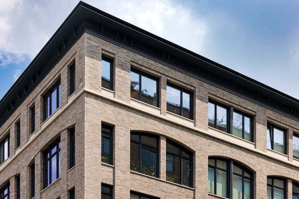
Klaycoat Brick
When you build with Glen-Gery Klaycoat®, color is more than just a finishing touch. It’s a focal point that takes any project from “okay” to “outstanding.” That’s inevitable when you have the opportunity to customize the color of your project in an unexpected way to meet any ask and exceed every expectation.
You May Also Be Interested In
We Can Help With Your Next Project
Discover the latest + greatest in design trends, industry news & pro tips from pros.
For all of your project needs, you’ll find everything you need at a Supply Center.
Let Us Know How We Can Help!
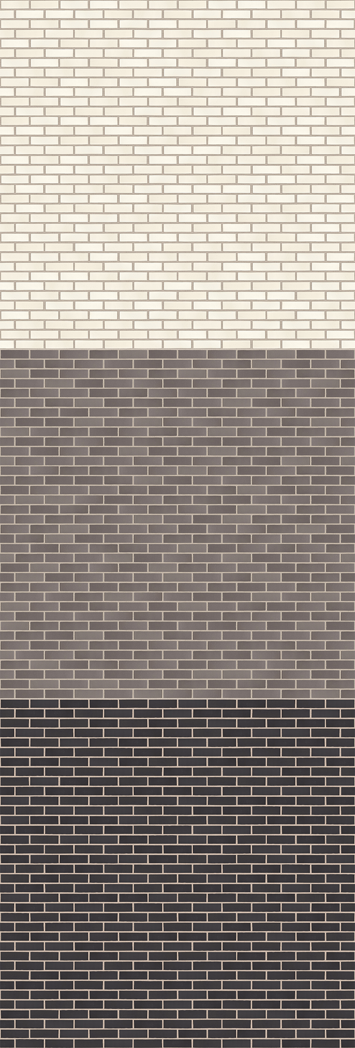
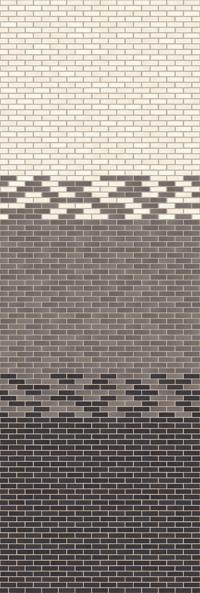
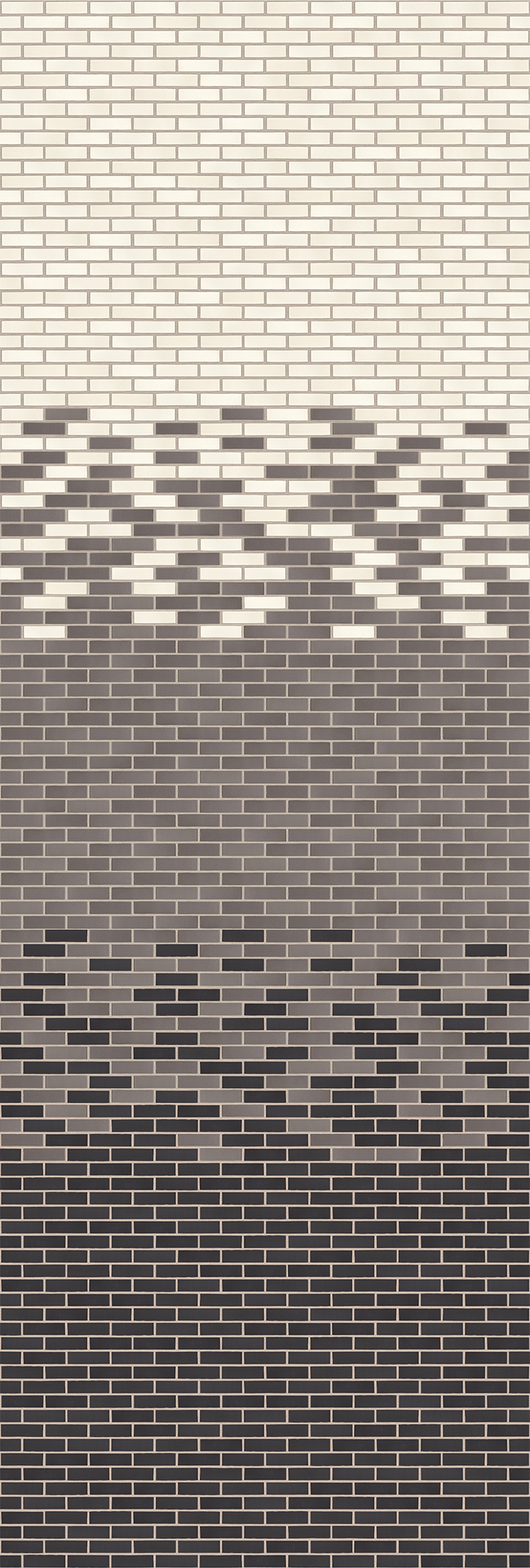
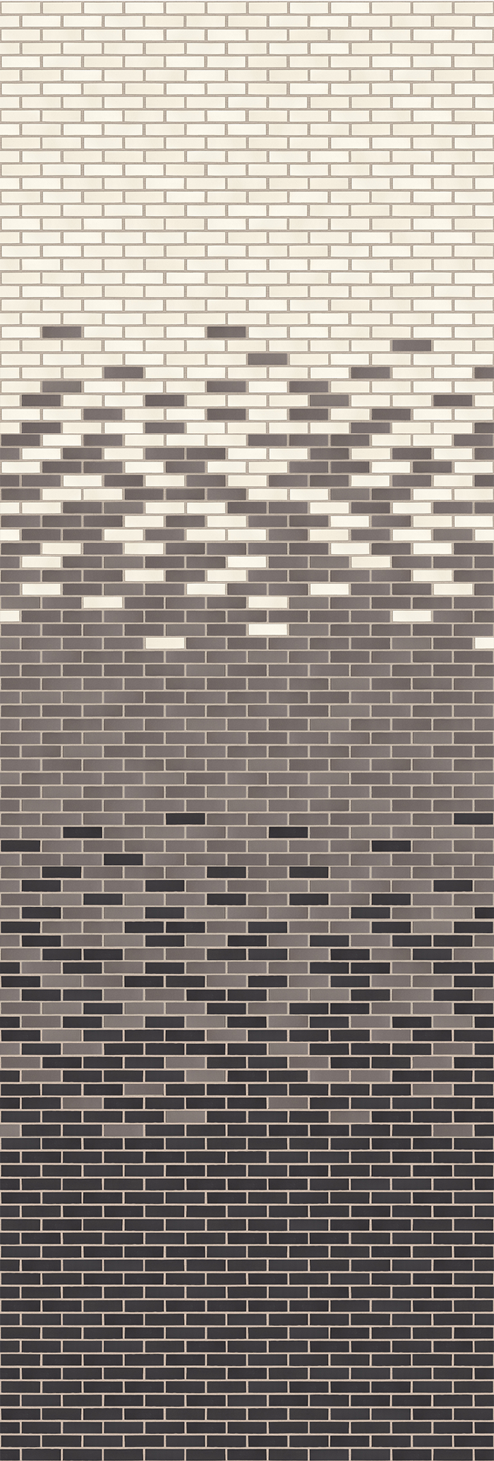
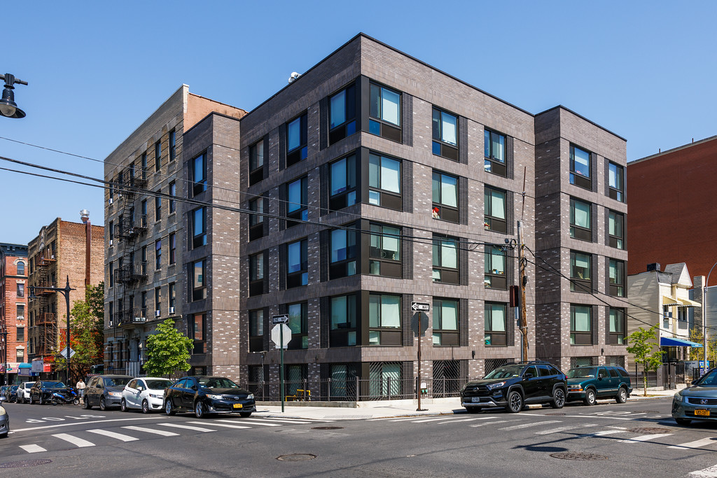
Gradient Brick Blends
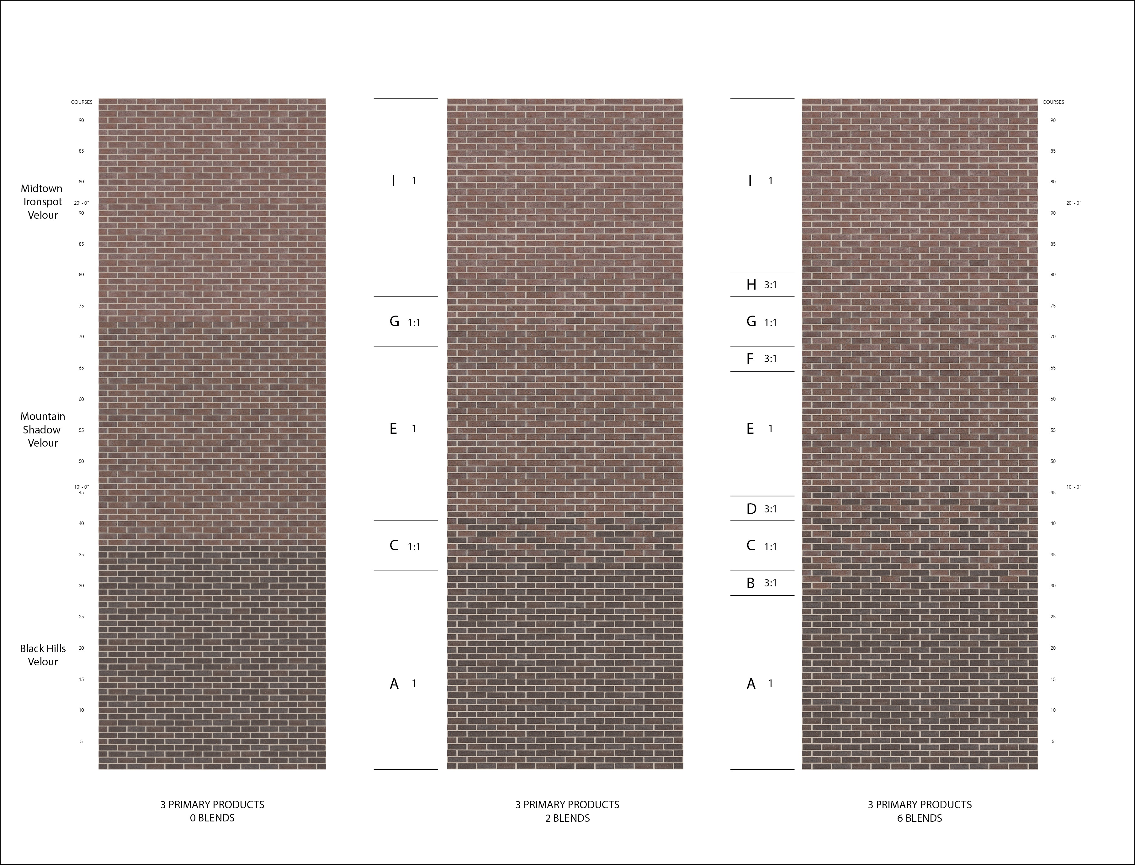
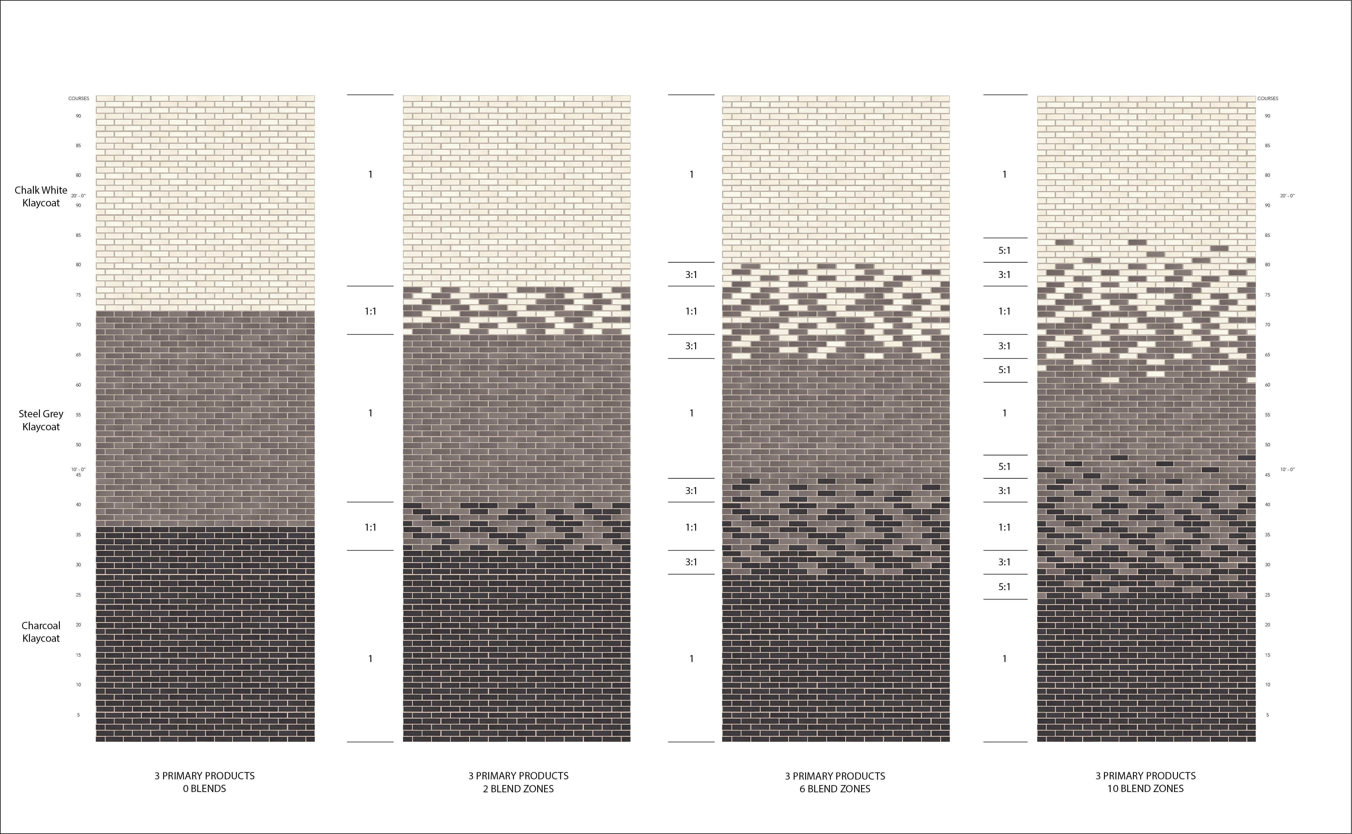
Using Gradient Brick Blends in an Architectural Project
Brickwork is a timeless element in architecture that can create a distinctive character for any building. Incorporating gradient brick blends in an architectural project can add a unique aesthetic element. Gradation can be achieved through blending bricks of different colors, textures, or sizes. This technique can create a striking visual effect, such as a smooth transition from one color to another, or a subtle variation within a single color family.
In addition to aesthetic benefits, gradient brick blends can enhance the functionality of a building. For instance, blending darker bricks near the base of a building can provide better durability, while lighter shades at the top can reflect more sunlight and reduce heat absorption.
When laying the bricks, it's important to follow the manufacturer's instructions for the specific blend. Typically, these bricks are laid in a random pattern to achieve a natural look. The gradual color transition creates a sense of depth and texture, adding dimension to the project.
Using gradient brick blends can elevate any design, creating a unique and cohesive look. Whether you're designing a single story or a multi-level structure, consider incorporating this technique to add a touch of artistry and sophistication to your project.
|
|
|
|
You May Also Be Interested In
We Can Help With Your Next Project
Discover the latest + greatest in design trends, industry news & pro tips from pros.
For all of your project needs, you’ll find everything you need at a Supply Center.
Let Us Know How We Can Help!
Design Vault Ep. 35 Best Of Mixed Use
 |
In this episode we’re exploring the Best of Mixed Use Styles. Discover how brick plays a starring role in creating dynamic spaces that blend residential, retail, and commercial elements. From vibrant urban centers to innovative suburban developments, this episode highlights the versatility and beauty of mixed-use design. Tune in for expert insights and creative inspiration that bring communities to life. |
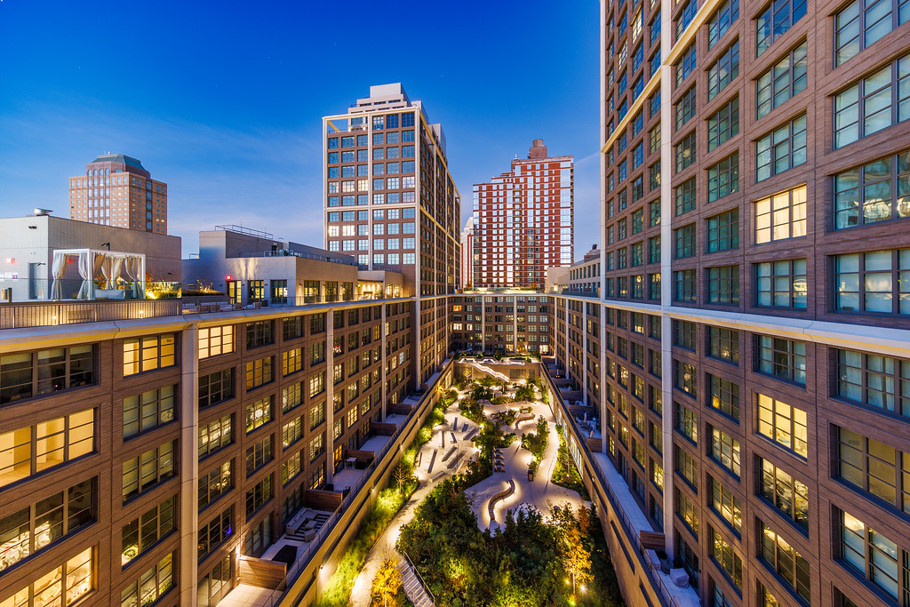
Front + York
Michelle Wagner
Morris Adjmi Architects
Gansevoort Row
David Kubik
BKSK
Park + Elton
David E. Gross
GF55 Architects
TRANSCRIPT
00;00;00;02 - 00;00;05;10
DP (Doug Pat)
Let's go inside the vault. The design vault.
00;00;05;12 - 00;00;33;19
JI (Jeremy Iannucci)
So the site's essentially just a rectangle. It's the size of a full city block. So the way that we've organized the buildings around the site is in this U-shape, where they start up in the northwest corner. Move around down West Street and then below, creating a U that opens up towards the water. We try to open up the view corridors from the building and leave as much view towards the water and towards the horizon from the rest of Greenpoint as we can.
00;00;33;22 - 00;02;07;13
DP
In this special series, we're unlocking some of the most powerful conversations we've had so far. We're connecting the dots, revealing hidden gems, and unearthing insights that might have slipped by. All to spark your next big idea with brick. Whether you're looking for fresh inspiration or innovative solutions, this series is designed to fuel your creativity. So let's dive in.
Hi, I'm Doug Pat and this is Design Vault.
Today we explore mixed use developments, a type of urban design that integrates multiple uses such as residential, commercial, cultural, institutional, and entertainment into one cohesive space. Mixed use projects aim to create vibrant, interconnected communities by physically and functionally blending these diverse components, often prioritizing pedestrian friendly environments. This bonus episode highlights three remarkable mixed use projects from past episodes, emphasizing insights from architects Jeremy Iannucci, John Zimmer, and Vincente Quiroga.
We'll explore the architectural design process, construction challenges and the thoughtful use of materials, particularly brickwork, to bring these complex developments to life.
Jeremy Iannucci discussed One Java, a residential project in Greenpoint, Brooklyn. This ambitious development balances sustainability, affordability and marketability with cutting edge features.
00;02;07;19 - 00;02;36;27
JI
The site's 200ft in the North south and then between West Street and the East River around 600ft, with 40ft reserved for a waterfront esplanade. We actually pulled back even a little bit further from that, and it's located right on the waterfront in Greenpoint. There was recently a rezoning that allowed for a whole redesign of the waterfront, and our project is one of the earlier projects in that redevelopment.
00;02;36;29 - 00;02;42;19
DP
So could you give us an idea of what the scope of the project is and the programmatic requirements?
00;02;42;26 - 00;03;03;06
JI
So it's a residential project of around 834 units, encompassing a total of around 800,000ft². This also comes with a series of amenity spaces, a series of retail spaces, as well as that waterfront park and also a collection of rooftop amenities in greenspace.
00;03;03;08 - 00;03;10;03
DP
So let's talk about the building design. Stylistically, were you guys borrowing from anything locally?
00;03;10;05 - 00;03;35;06
JI
We like to think that the entire project comes from the community around it. We looked at a series of precedents in the Greenpoint neighborhood historically, and Greenpoint specifically on the waterfront, to inspire the way that we detail these facades. We have a collection of different brick styles that help to break up the massing of the building, different articulations, as well as material bricks with the two precast towers.
00;03;35;08 - 00;03;40;11
DP
So what was on the site before you guys ended up building the new architecture?
00;03;40;13 - 00;04;04;25
JI
Previously, there was a two story warehouse on the site, and it really was kind of a beautiful space in its own right before. We got the chance to tour around, before it was demolished. And I think walking around really inspired us just with these qualities of light and materials and things that were really native to the waterfront before all of this redevelopment.
00;04;04;28 - 00;04;14;08
DP
And the project, as I said, very large. Could you tell me a little bit about the zoning requirements and any challenges you guys had in terms of planning?
00;04;14;10 - 00;05;11;19
JI
So the project is as of right. It follows the zoning guidelines. The lot itself is actually split up into two different zones. So towards the inland it's mostly low rise. We had a height cap of 65ft with portions that were allowable to go up to 100. And then towards the waterfront. The zoning actually got a little more complicated where there were a few different conditions that you could meet.
It opened up these different paths for how the building could be formed. One path was a one tower scheme, which would bring you up to 360ft. And then the other was actually a two tower scheme where if one tower made it to 200ft, the other would be allowed up to 400ft. We took advantage of that in order to move more of the mass to the waterfront.
It helped gradually declined building back into the fabric of the community, and it provided more waterfront views.
00;05;11;21 - 00;05;19;14
DP
John Zimmer shared insights on The Lively, an 18 story tower in Jersey City's Powerhouse Arts District.
00;05;19;17 - 00;06;12;23
JZ (John Zimmer)
The Powerhouse Arts District in Jersey City is so named because there is a somewhat iconic powerhouse there. It had been an industrial area that was targeted for redevelopment, and they had design standards for the entire district that were meant to maintain that character. Not necessarily industrial, but loft style, focus on the arts. The entire district has a strong focus on the arts, which is part of the reason we have the black box theater in The Lively.
It's experienced a lot of new development over the course of the last decade, and it's pretty great today. When I first started going over to the powerhouse ten years ago, I'd get out of meetings and the sidewalks would be deserted, and today it feels like Brooklyn. It feels like the East Village. I mean, it is incredibly, for want of a better word, lively.
So it's a great neighborhood now, and it's all happened in the last decade. It's an exciting thing to have been a part of, honestly.
00;06;12;26 - 00;06;20;01
DP
This mixed use development includes retail spaces, a black box theater, and residential units.
00;06;20;03 - 00;07;17;00
JZ
180 residential units. Lennar is one of the biggest home builders in America, but they were mostly doing suburban subdivision work. They got into the urban markets. I can't tell you exactly one, but they were still a little bit new to it. When we took this project on and they were ambitious, they wanted to be at the absolute top of the market for a residential building in Jersey city.
And obviously, as any developer does, they wanted to maximize rentable square footage and get the most bang for their buck. And they had this requirement for the black box theater. You know, the project came with this with its approval, but it got a zoning bonus for having the theater in the base of extra height. It was a give back to the community that was written into the zoning, and we always knew it was going to be a theater, and we always knew it was going to be for a nonprofit arts group.
And that arts program as part of the building was in the DNA of the project from the very beginning, and informed a lot of the decisions moving forward became part of the personality of the building throughout, not just the theater itself, really.
00;07;17;03 - 00;07;23;18
DP
Vincente Quiroga discussed 29 Huron, a two tower development in Greenpoint, Brooklyn.
00;07;23;20 - 00;08;40;15
VQ (Vincente Quiroga)
The history of the site, you know, it's a long, narrow site. Our building massing is 100ft in the north south direction. It's over 500ft in the east west direction. So it's very distended and lengthened and narrowed. The original site was a one story warehouse, which was kind of the context of the neighborhood. I lived in that neighborhood many years ago, and that was the context.
The context is changing primarily because in a sort of Bloomberg era, there was up zoning plan, but then the 2008 crisis stalled those plans, and it took a while for that increase, zoning and development to come to fruition. And so we were part of that increased zoning for the site. In terms of the massing, we wanted to take a sense of the character that was there and honor that.
Not all the projects that we see built. Really take that into account. And we were thinking, what is the context now and what was the context in the past? So we really thought about selecting a one story podium and selecting brick as the foundation for that, and also being practical about the openings and where they are located. The emphasis for the target population would be families.
So large units, lots of two bedroom and three bedroom units, a lot of outdoor access and the views because of its waterfront proximity.
00;08;40;18 - 00;09;05;15
DP
Yeah, the site is unbelievable and you guys really take advantage of just about everything out there. It's a great project. So let's talk about the design. So first let's talk about the building stylistically. So to me it looks a lot like a very contemporary warehouse space right. So there's lots of glass. It almost appears lantern like in the photos that I saw at dusk.
It's beautiful.
00;09;05;18 - 00;09;34;00
VQ
The choice of the materials was very specific. The neighborhood has a unique grid orientation to the world, and so it captures the light in the sunrise and sunset, in particular the brick. We chose to be a rough molded brick with a dark mortar, and the metal panel has a mica flake to it that captures the light and changes throughout the day.
So some times it looks orange and coppery. Sometimes it actually looks bronze toned and it has a chocolate Sienna under glass to it.
00;09;34;07 - 00;09;42;01
DP
Each project faced unique challenges. 29 Huron is situated in a flood zone requiring innovative solutions.
00;09;42;04 - 00;10;20;28
VQ
The first story is about 17ft in height, and so there's some very high ceiling experiences there, ranging from 12 to 14ft ceilings within the amenities alone. And that also gave us the room to deal with some of the flood constraints as well. Being that the site is adjacent to the East River, the predicted flood zones right now are anywhere from 5 to 6ft above grade.
So that was a challenge and a constraint early on where we had to coordinate. We certainly decided we weren't going to excavate because of the high water table. So some of the functions that you would put in the cellar, we put a grade, but we often had to elevate the critical services six feet above where you normally would place them.
00;10;21;01 - 00;10;27;26
DP
So I'm curious, when you're digging that close to the water, do you get a lot of water, a lot of groundwater coming in when you're creating your foundation?
00;10;27;27 - 00;10;56;08
VQ
Yes. You do. Yes. Early on there was a lot of pile driving very deep anywhere from, I would say 30 or 40ft down. And those piles were linked up with large caps, pile caps, and then mat foundations at the towers. The slab itself, because of, you know, you have to think more like a boat or a bathtub. The slab itself was anywhere from 24in to 18in thick at various points throughout it, and it has to resist uplift.
00;10;56;11 - 00;11;01;27
DP
Well, that's really interesting. So when you're driving piles and there's a lot of bedrock, how do you do that?
00;11;01;29 - 00;11;21;04
VQ
The nature of the historic waterfront is often landfilled. So a lot of it is just trash or sediment. Over 200 years, people just dump things in the river. And it created a new shoreline, which was often the case, as you see in lower Manhattan as well. So we knew that we were going to have to go deep to hit rock.
00;11;21;10 - 00;11;25;28
DP
So you're driving the piles then 25 or 30ft in?
00;11;25;29 - 00;12;21;29
VQ
Yeah. And another challenge relating to the waterfront edges we had to deal with actually coordinate with the marine architect because the edge condition was failing and we needed to remediate it. So we coordinated a new driving a new sheet edge along the shore to create that. The site actually is interesting in that it has a natural cove condition that other areas along the waterfront don't.
And so we recreated that in the remediation. But we also worked with the landscape architect to create this, We're obligated by zoning to create a setback for public access on the site. So they really leaned into that curved cove condition that's set back and stepped it down to the water gradually from grade, and incorporated eco concrete blocks that have various pockets that allow kind of tidepool action to happen.
And so we thought about breaking down the shoreline a little bit and not just a hard edge.
00;12;22;02 - 00;12;31;12
DP
It sounds really interesting. I mean, when somebody owns a piece of property like that and it's really sitting on debris, in many cases, it's kind of unusual.
00;12;31;14 - 00;13;07;28
VQ
I mean, we tried to find opportunities to maximize the value of the site with the two towers strategy. We put lots of valuable floor area up high and took advantage of the views. We made double the amount of corner units that you could have by having a two towers. We also separated them over 100ft apart, so that the west tower really gets out there in front of other buildings that are it's alongside the east tower is a setback for the east to kind of get around other buildings that could obscure it.
And we were actually surprised at how good the views are as it was being built. We knew it was going to be good, but it actually turned out to be better than we anticipated.
00;13;08;00 - 00;13;14;27
DP
It's really beautiful about the design as the corners are opened up, then to become porches, right? Terraces. Is that correct?
00;13;15;00 - 00;13;34;04
VQ
That's right. So as part of that is a response to some zoning constraints. At a certain height, you also had to setback in multiple directions. And one of the things that we like to do is incorporate our balconies into the building facade and not just look like appendages. So we really took advantage of that setback rule and created these covered, protected balconies.
00;13;34;07 - 00;13;44;23
DP
The Lively was also situated in a flood zone, requiring solutions such as deployable barriers, elevated critical systems and flood resistant glazing.
00;13;44;25 - 00;14;09;02
JZ
The unique topographic feature would be that it's below the 100 year flood elevation. That's always a big deal. And the sidewalks there, I think are about five feet above sea level. So flood protection resiliency, ground floor uses. How do you enter the building? How do you avoid nuisance flooding when it's not a 100 year storm? Those were all big aspects of the design of the ground floor or the pedestrian experience.
00;14;09;05 - 00;14;10;16
DP
So breakaway walls?
00;14;10;23 - 00;14;40;01
JZ
There are deployable flood barrier systems designed in. So the flood elevation is seven feet above the sidewalk. In the event of a massive tech, a hurricane Sandy kind of thing, they would deploy these flood barrier systems. I don't know if you're familiar with them, but they keep them in storage and they come out and they both enter the building, or they spread them around the building.
They can be self-supporting, and they have to be deployed in a certain amount of time because it's an emergency response system. So a big part of all the projects in this area.
00;14;40;06 - 00;14;44;17
DP
And what about zoning codes? You had mentioned you had a height issue.
00;14;44;19 - 00;15;27;12
JZ
Yeah. So the building got, I think, 65 additional feet for having the black box theater in it. That was one zoning aspect. You can see the cantilever here over the sidewalk. There was a sidewalk widening requirement in the zoning. So that made it obviously challenging. You've got 17 stories of residences coming down over a cantilever that allows the sidewalk to be wider at the base.
That was an interesting challenge. There's a little bit of parking in the building that came from the zoning. So obviously some structural challenges there as well. Whenever you're putting that many residences over the top of a parking garage. The second floor here that you see through the window, that is also designated art space in the zoning also requirement.
00;15;27;14 - 00;15;32;26
DP
So I don't do tall buildings. How many extra floors to 65ft get you?
00;15;32;29 - 00;15;59;27
JZ
I think it was basically five because the top floor is an amenity space, rooftop amenity, which was specifically permitted by the zoning bonus. I think it really made the building, the massing and the expression of these mid-range buildings is a little bit tricky. They're not as tall as they want to be to be a tall building, and they're not as low rise as they want to be to be a low rise building.
And I think the extra stories really help to give it a little bit more verticality. It's a better piece of architecture for it.
00;16;00;02 - 00;16;03;22
DP
So tell us about the building plan. You said there's a sharp corner.
00;16;03;24 - 00;16;47;10
JZ
Yeah, very acute corner. There's two lot lines and it has a corner lot. So right where you have your corner window with two exposures, there's a very acute corner and I can't remember the actual degrees. But anytime you have a building it's not just the corner that's a problem. In fact the corner isn't really a problem. You may not be able to put a sofa in that corner, but the corner per se is not a problem.
It's kind of a cool room to be inside of, but what it means is that the apartments on each of those two different streets are on different geometries. And so if you're going to have a rectilinear apartment on streets that are at such different geometries that all crashes into each other at the corner and at the corridors and at the courtyards, so it becomes very challenging to plan buildings that feel sensible and projects that have this kind of site.
00;16;47;12 - 00;16;59;02
DP
The narrow, irregular site of The Lively, demanded creative massing strategies to optimize space while meeting zoning requirements and maintaining contextual sensitivity.
00;16;59;05 - 00;18;01;13
JZ
From its get go. There was never any question it was going to be a contemporary building. As far as where we drew our inspiration from and what we were looking at, you know, I mentioned the difficulty, the massing for these midnight buildings. I think the gathering together, the window openings into these vertical slots helps to emphasize the verticality of the building.
We have this prominent gold portal for the black box theater and the building entrance, and that became an idea that we repeated throughout the facade frame, these moments on the facade. And I think generally we try to be pretty rigorous about how the facades are designed. Obviously you've got structural continuity, but then you've got what always happens in residential design is you've got living rooms that are one width and you've got bedrooms that are a different width.
And so a strictly rational grid is probably not going to serve you well for a residential building the way it does for a commercial building. So you're often trying to find a way to manage that. If your interest is fundamentally and having a kind of rigorous and rational facade, you're trying to find a way to manage those partitions hitting the wall.
00;18;01;13 - 00;18;19;27
JZ
And what does that mean? And at the same time, I think creating a facade with movement and interest and dynamism and that play on the facade, I think was always an important part. And you could say it is part of the emphasis on the arts and the theater and dance, but also obviously just an interest in creating something fresh.
00;18;19;29 - 00;18;28;25
DP
At One Java for the project prioritized views and thoughtful use of materials which elevated the design and ensured long term durability.
00;18;28;28 - 00;18;56;15
JI
So the site's essentially just a rectangle. It's the size of a full city block, and on three sides on the north, the east and the south, we have streets. And then the west side is the waterfront. It's the East River. So the way that we've organized the buildings around the site is in this U-shape where they start up in the northwest corner, move around down West Street and then below, creating a view that opens up towards the water.
00;18;56;18 - 00;18;59;18
DP
So it's really all about the views, which it should be.
00;18;59;20 - 00;19;14;19
JI
Yes, it's something that it needs to be on the waterfront as well as it is about the views back into the neighborhood. We try to open up the view corridors from the building and leave as much view towards the water and towards the horizon from the rest of Greenpoint as we can.
00;19;14;22 - 00;19;24;13
DP
So tell us a little bit about the material choices. We've got a series of different materials and colors there. What were the decisions behind that?
00;19;24;15 - 00;20;16;04
JI
The building massing itself is broken up into five unique buildings, and out of those we have two towers that are precast, and those are the buildings on the waterfront. And then inland, there are three different buildings that range from ten stories to six stories. And those three buildings are brick, and that we really wanted to draw back from a lot of our inspirations in the Greenpoint community.
There's no shortage of brick precedents there. There's beautiful buildings such as The Astral, which is this queen in red brick terracotta building. There's Saint Anthony's Church, which is red brick and limestone trim. It's really beautiful, striking building. We looked towards kind of the history of the waterfront, those manufacturing industrial buildings, and used that precedent to define these brick colors, these three different brick buildings.
00;20;16;06 - 00;20;44;28
DP
So interestingly, the facades. So we've got the shorter or we've got the less tall architecture, which are brick buildings, and the facades are a series of what I'll call punctures with spandrel. It looks like spandrel brick in between each one of these vertically in between each one of the window openings. Correct? Yes. So how many studies did you guys end up doing to decide what these facades looked like?
00;20;45;00 - 00;21;23;17
JI
Everything kind of melded together. At some point, it's hard to break it down into a number because it was just this completely iterative process where we'd look at something, we'd make a model, we draw it, we'd look at it again, we'd make another model, we draw it. And this evolved from the concept, schematic designs all the way through to the construction document development.
This idea of the different brick details that actually came from wanting to streamline the project. So we use the same details on each of the brick buildings, but we remix them in each one. We use them in a different order to create a different identity for each of these.
00;21;23;19 - 00;21;40;29
DP
I think what's really interesting about these facades too, so you separate them facades into squares or rectangles, and then they have this very well. It looks subtle in elevation from far away, but it's actually a very large construction joint in between each one of these square rectangular panels. Correct?
00;21;41;02 - 00;21;56;02
JI
Yes. We use that construction joint and we overemphasize it. We use this double soldier coursing reveal tool as a way to further break up the massing and kind of imply this subdivisions within the buildings.
00;21;56;05 - 00;21;59;01
DP
And how deep is that, is that one brick thickness?
00;21;59;04 - 00;22;00;20
JI
It's two inches.
00;22;00;20 - 00;22;11;11
DP
Two inches. It's nice because when you look at the facade, I mean, it looks quite homogenous. But if you look at it a little bit more deeply, it's separated into these squares and rectangles. It's very pretty.
00;22;11;16 - 00;22;30;20
JI
Yeah. That's the effect that we really want to go for in terms of how this fits into the fabric of Greenpoint. We like the idea of there being this large scale massing that breaks down and continues to break down the closer you get, and it relates to more of your scale relative to the way that you're viewing it.
00;22;30;22 - 00;22;52;26
DP
You know, as an aside, what's really pretty, the red brick that you guys use there, there are a lot of lighter bricks in that facade, and so it makes it look almost pink in color, but you get up close to it and you can see a lot of variations in these colors in the red colored brick, a lot of like I'll call it value, but it's light and dark red brick.
00;22;52;29 - 00;23;57;04
JI
For that facade we're using a blended brick, and we wanted that to echo some of the red brick buildings that you already see on West Street, on the waterfront. That was kind of our launching point for coming up with this brick palette. We knew that there was going to be a red brick building. We knew that it was going to be relative to those warehouses.
And then the other two bricks were kind of an offshoot that based on how we wanted to frame this story of the building as you move around the site. So to the north, there's a lighter brick. It's something that we see as a little more modern. We try to keep the tones of the brick and mortar and the sills and other materials a little more homogenous.
And then on the flip side of that, on the southern street of the building, Java Street, we wanted to use something with a bit more variation. We wanted a higher contrast between the ground and the brick, a higher variability within the bricks. And that's something that we saw as a little more nostalgic to some of those worker housings and the smaller buildings that you begin to see as you move more inland.
00;23;57;07 - 00;24;41;16
DP
These mixed use projects demonstrate how brick and thoughtful architectural design can serve as a bridge between the past and future. By blending functionality with design, each project contributes to its community while addressing practical and esthetic goals.
Jeremy, John and Vincenet emphasize the importance of collaboration, innovation, and a deep understanding of site context in achieving these outcomes. Ultimately, these developments showcase how mixed use projects can create vibrant, connected urban environments, enriching neighborhoods through thoughtful integration of diverse uses and attention to detail in design and execution.
You May Also Be Interested In
We Can Help With Your Next Project
Discover the latest + greatest in design trends, industry news & pro tips from pros.
For all of your project needs, you’ll find everything you need at a Supply Center.
Let Us Know How We Can Help!
Design Vault Ep. 34 Best Of Tudor Styles
 |
In this episode we’re exploring the Best of Tudor Styles. From charming brickwork patterns to steep gables and half-timber accents, this episode dives into the timeless elegance of Tudor architecture and its modern-day inspirations. Discover how this classic style continues to influence design and why it remains a favorite among architects and homeowners alike. |
Henhawk House
Sussan Lari
Sussan Lari Architect PC
The Tudor House
Lorne Rose
Lorne Rose Architects
TRANSCRIPT
00;00;00;02 - 00;00;05;18
Doug Pat (DP)
Let's go inside the vault. The design vault.
00;00;05;20 - 00;00;38;03
Sussan Lari (SL)
The house had character. Typically, Tudor style houses from outside are just stunningly gorgeous piece of structure. And when you go in, it's just sad. And that is not going to happen with my approach to design, because I like the style of Tudor and I don't like the style of sad inside spaces. So it's bright and happy and is open, is spacious. You know, lots of windows.
00;00;38;06 - 00;02;41;18
DP
In this special series we’re unlocking some of the most powerful conversations we've had so far. We're connecting the dots, revealing hidden gems and unearthing insights that might have slipped by. All to spark your next big idea with brick. Whether you're looking for fresh inspiration or innovative solutions, this series is designed to fuel your creativity. So let's dive in.
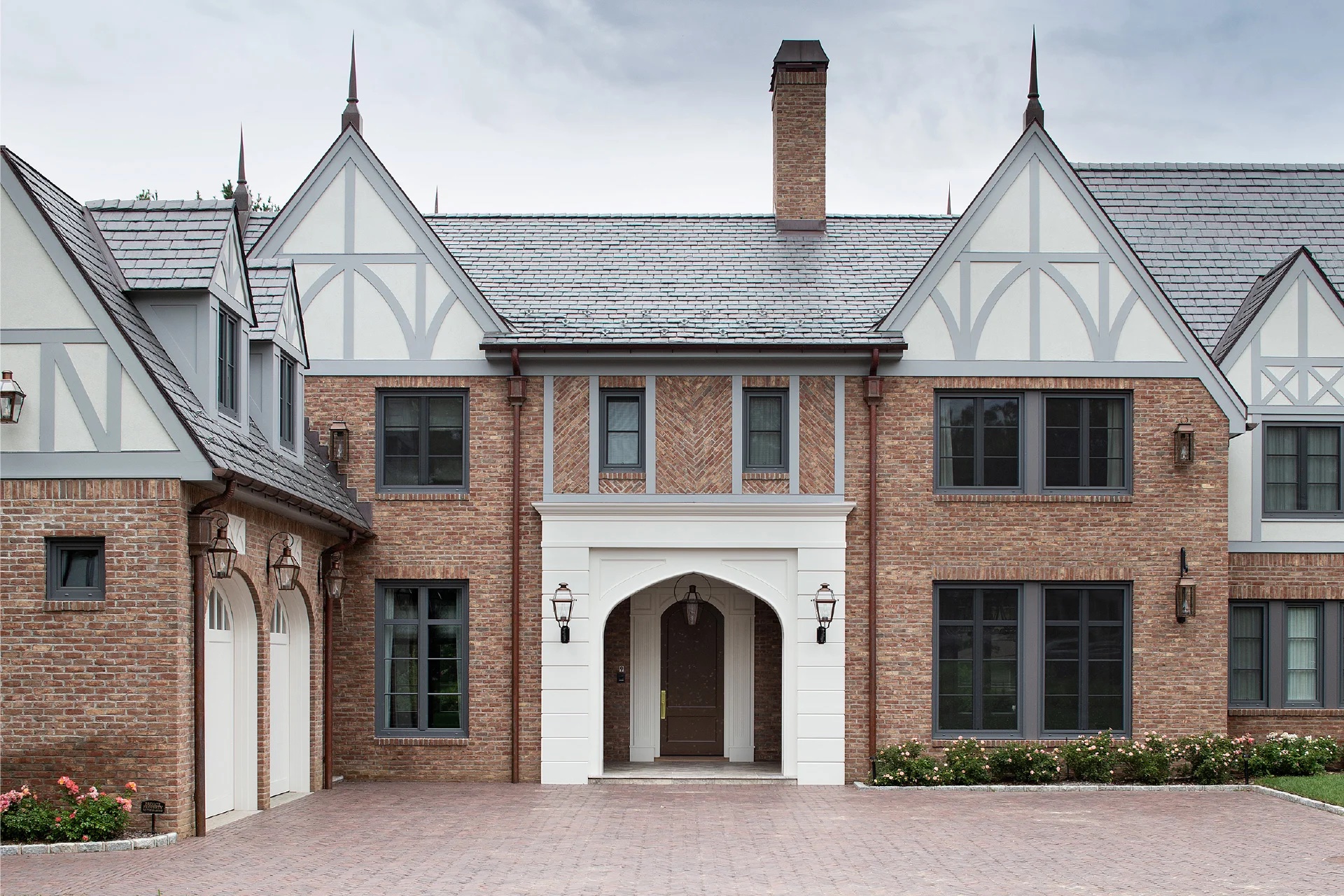
Hi, I'm Doug Pat and this is Design Vault. Today we explore Tudor style homes with insights from Peter VanderPoel, of VanderPoel Architecture, who designed the geometrically inspired Guildford Court in McLean, Virginia, and Sussan Lari of Sussan Lari Architect PC, who transformed the Tudor style Henhawk house in Long Island, New York. Tudor architecture is a style of British design that emerged between 1485 and 1558, blending decorative Renaissance elements with the Gothic tradition. Recognized for its steeply pitched roofs, half timbered facades, ornate brickwork, and distinctive chimney treatments.
Tudor buildings often feature large, grouped windows and intricate details. While exteriors highlight rich textures and patterns, interiors are known for wood paneled walls and plasterwork ceilings, creating a blend of medieval charm and early Renaissance sophistication. In this bonus episode we’ll highlight various aspects of Peter and Sussan's project, including the architectural design process, construction challenges, and the thoughtful use of brickwork to create Tudor style homes that bridge tradition and modernity.
Both projects reflect a deep respect for tradition while incorporating innovative design solutions. Peter VanderPoel’s Guildford Court responded to the steep, angular site with a unique three axis geometry inspired by the hexagonal forms of Frank Lloyd Wright's Hanna house.
00;02;41;21 - 00;04;28;05
Peter VanderPoel (PV)
The lot as it looks in plan, in the site plan, it kind of looks like the state of Georgia and the Atlantic coast of Georgia was just a little bit to the northeast of Florida is what's on the cul de sac. So there's a very small entrance circle for the cul de sac, very small entrance onto the site, and then very steep as it goes up in the back.
And then these two angles that almost describe 60 degrees from the two property lines that go away from the cul de sac. And so my first inclination was, well, that's almost 60 degrees. And so a hexagonal plan would work on a lot like that. So then I started looking at precedents for that. I know Frank Lloyd Wright had done the Hanna house in California.
It was based on the hexagon. He had done a whole series of projects based on geometry. So I had looked at those, but it was through that less hexagonal forms and more towards three axes rather than we normally think of two axes that x and y. But this now has these 120 degree rotation that with a hexagon you have three axes that are involved in describing that geometry.
And that was essentially the same geometry we had on that site. So that became the basis for the design. And then with three geometries, we've got three programmatic elements of getting the cars on and off the semipublic and then the private. And then we also have this dramatic rise in height. So we could also do the same thing vertically.
We have the garage at the lowest level so the cars can get on easily. The semipublic now faces the street on this very narrow frontage, and then the private is up highest and essentially resting on top of the semipublic block and runs back. But because the site is so steep, it touches ground. It's a grade at the back of the property, even though it's sitting on top of the lower level at the front.
00;04;28;07 - 00;04;34;24
DP
The design uses distinct programmatic zones, private semipublic and garage spaces.
00;04;34;26 - 00;06;57;14
PV
Well, one is getting the cars on and off the lot. They can't, just the nature of cars, they can't be going up and down hill. So we need to get them on the shortest route and the lowest route, so that if you think about the site as a state of Georgia, the Florida border line was where the cars came in. The semipublic face, the cul de sac.
It addressed through there. And then we had stairs going up this series of stones, because one of the concerns was, that's a long way up to get to that first floor, just because it's so steep. So we have these stones on the site that are shifted. So you're sort of walking across these lily pads and then a diagonal that goes up and then a set of stairs.
So there's a variety of experiences moving towards the front of the house. We also have the office portion now is right inside the front door. So if someone in the house decides to set up office there, they have a client come by. They don't have to go into the main house, just in and out the front door, take care of business and then from there a few more steps go into the main house.
So that opens up and a very large open space. There's the fireplace, dining, living, kitchen are all in that area. And then behind the kitchen is sort of the pool deck area for showers and changing and so on. And then there's a large circular stair that's the pin. So if you think about the semipublic and the private, they splay out at 120 degrees.
And the stairway is the pin that holds us together to do that rotation. So there's a very large grand sculptural stair up to the second level, and it comes up between the master bedroom and the additional bedrooms, so that when you move towards the cul de sac, you're now in the master bedroom suite that is like this big diving board looking over.
It's a tremendous site, as I said, was very challenging. But being in that master bedroom and looking out over the trees away from the site, it's a dramatic view going the other direction there. The other bedrooms that I said eventually gets back to grade because it gets so steep in the back and then there's also the stair continues down.
So there's a family room in the basement, a large television there as well. And then on the other end we have that same rotation with the garage, and that's a much more modest stair coming from the garage into that living space. But it's based on those three axes and those two hinges to turn it on to the site, both in plan and in section.
00;06;57;16 - 00;07;19;03
DP
These zones are further emphasized through the vertical layering of the building, rising with his site's natural topography. In contrast, Sussan Lari's Henhawk House expanded a 40 100 square foot Tudor home into a 13,300 square foot estate. While maintaining the scale and charm of the original architecture.
00;07;19;05 - 00;07;38;15
SL
Location is really a fantastic location. The tree lined boulevard type street in Long Island. The house itself was Tudor style brick. Relatively small zoning wise, were allowed to build close to 8000ft², and the existing house was close to 4400ft².
00;07;38;16 - 00;07;40;04
DP
So there's an FAR there.
00;07;40;07 - 00;08;08;02
SL
Yes, yes. Everything we do is full force zoning under rules. And that's kind of what I've learned them really well. As much as can be played with. We have learned at all. But the house had character by the house was dim like, typically Tudor style houses from outside are just stunningly gorgeous piece of structure. And when you go in it's just sad, dark.
00;08;08;05 - 00;08;13;18
DP
I love the way you describe that. It's so true. So many tutors really feel that way. Absolutely.
00;08;13;20 - 00;08;49;05
SL
You know, in a way it gives this kind of fear of people to the Tudor because they think Tudor supposed to be dark interior and that is not going to happen with my approach to design, because I like the style of Tudor, and I don't like the style of sad inside spaces. So it's bright and happy and is open, is spacious, you know, lots of windows.
And in this particular case, the expansion of the house was extensive because I needed to keep a chimney.
00;08;49;11 - 00;08;51;21
DP
Was this a functional chimney or boiler flues?
00;08;51;21 - 00;09;10;09
SL
Yes. Function to me. And then we wanted to keep a fireplace. We wanted to keep a chimney and they wanted to keep the ceiling has to work ceiling of a dining room. So I said, okay, we keep all those tree, but we get rid of everything.
00;09;10;12 - 00;09;25;03
DP
Her design emphasized the playfulness of the Tudor esthetic, with its steeply pitched roofs, half timbered facades and intricate brickwork, all modernized with a bright and open interior that reflects contemporary living.
00;09;25;06 - 00;10;01;28
SL
The idea become into doing an L-shape design and because it was kind of long L-shaped, it gives me the opportunity to create the design, as there are certain components of structures together, section by section, with the playfulness of the roof, which is important for Tudor style and also different height, and also introduction of stucco and introduction of wood paneling, framing stuccos and brick, and also playfulness of a brick.
00;10;02;01 - 00;10;22;28
DP
Brick played a pivotal role in both projects, not only for its durability and timelessness, but also as a design tool to express texture and detail. At Guildford Court, dark brick veneer was used for the semipublic zone, creating a visual contrast and grounding the structure within its suburban context.
00;10;23;00 - 00;10;53;28
PV
There's fiber cement boards for the bedroom space, and then the semipublic was, a brick, and then the garage was, I think there's a wood on there. So we have a couple different faces. There's a brick facade for the semipublic. I think there's some brick as well on the garage, and we also brought some of the brick inside in the living spaces.
We wanted to have a variety of materials to represent because everything's now being divided into threes with the garage, semipublic, private spaces.
00;10;54;01 - 00;11;00;14
DP
So tell me a little bit about why you guys chose to use brick, in particular, the dark brick.
00;11;00;16 - 00;11;16;21
PV
The dark brick. That was not my selection. I did not select the colors on that element, but it would also be contrasting. You could see the dramatic change in color because as I said, it's about these three elements. And so they read differently every way you cut it.
00;11;16;21 - 00;11;23;19
DP
It, you know, would seem to me that you chose to use brick as a differentiated design element, right? Right.
00;11;23;21 - 00;11;34;07
PV
It's also very common in this part of the country. In an old town, Virginia, and just all up and down the East Coast. Brick was the way to do durable construction and still is.
00;11;34;09 - 00;11;38;10
DP
Are there any houses around this one that are masonry as well?
00;11;38;14 - 00;11;57;13
PV
Yes. So the houses that were there in the neighboring lots, most of them were split level with a lower with brick on the first floor and siding on the second floor. The houses that have come in their place, the two I can think of are stucco, but there's a lot of brick in the neighborhood.
00;11;57;15 - 00;12;07;19
DP
The brick was also introduced in interior spaces such as the fireplace surround, blending the exterior and interior seamlessly.
00;12;07;21 - 00;12;23;02
PV
There's brick for the fireplace surround, which is the left photograph there. And there were also two trees on the site where we ended up pulling those up, but the contractor had those milled and used them for the trim. The wood that's above the fireplace there is from those trees.
00;12;23;09 - 00;12;24;22
DP
Do you remember the species?
00;12;24;24 - 00;12;27;25
PV
My recollection will be black locust, but I'm not sure.
00;12;27;28 - 00;12;40;15
DP
I was going to ask you what some of the historical precedents were for the, for the architecture, but clearly were into much more modern architecture here. However, as you said, we see brick in the area.
00;12;40;17 - 00;12;45;17
PV
Yeah. There's brick. The material is common in Northern Virginia, the building forms.
00;12;45;25 - 00;12;47;11
DP
Yeah. I was going to say we got gables here.
00;12;47;11 - 00;12;54;29
PV
Yeah, that's pretty common as well. So the basis of it is traditional, but the implementation has become modern.
00;12;55;02 - 00;13;06;04
DP
And tell me a little bit, what I call this modern Tudor aesthetic. Where did that come from? And I know it's not modern Tudor, but describe that for our listeners.
00;13;06;06 - 00;13;15;24
PV
So from this view, the division of the fiber cement is accomplished with these vertical elements that come proud of the exterior finish.
00;13;15;27 - 00;13;21;23
DP
Okay. So they're not set back into the fiber cement. They're brashly proud. So it's applied.
00;13;21;27 - 00;13;37;08
PV
Yeah. And so that could be considered a reference. It was not the intention but to have timber that was common with timber houses. Would use expressed wood materials and then with stucco in between those. And then the angles for the roofs are fairly standard.
00;13;37;14 - 00;13;38;03
DP
Are those 12 12? Tudor style?
00;13;38;03 - 00;13;45;07
PV
Yes they are. The contractor ended up putting living space up there as well. So we made good use of that space.
00;13;45;07 - 00;13;59;19
DP
Of course, for Henhawk House, brick became a canvas for creativity. The facade features herringbone patterns, soldier courses and diagonal layouts, adding richness and depth to the design.
00;13;59;21 - 00;14;12;28
SL
I think we were good in accomplishing that because it has its playfulness and although is relatively large but it is not overwhelmingly massive.
00;14;13;00 - 00;14;14;15
DP
I'd say it's well scaled.
00;14;14;17 - 00;15;07;29
SL
It is well scaled, right? And then at the end, we realized that there's no way we could match the old brick. So I know Glen-Gery very well, because if I ever have done any brickwork has been Glen-Gery and why? Because the quality of the material and I get service. So I am fussy enough to worry about the size and also worry about the color of the grout.
And I want to have the samples of it made before I even decide what color brick. So a rep does that service for us and do the color we provide the color and tell what brick. And between those is what I chose and eventually and I have are some Mason that are Italian and five brothers and one better than the other.
They're local to local and they do a magnificent job. And also they built a good size.
00;15;08;01 - 00;15;09;10
DP
They did a mock up?
00;15;09;14 - 00;15;51;18
SL
Absolutely. And and one other thing that I was almost kind of experimenting, this project was that I love the style of Tudor on the outside. I don't like that inside. So that was one issue. Second issue. I like the playfulness of how we could create interesting textures and playfulness of the laying of the brick, but Tudor would allow me to do that because we are compartmentalizing pieces here there, and that other styles don't do that.
And then that herringbone style has to be compartmentalize, right?
00;15;51;21 - 00;15;53;18
DP
In between the boards, I think at one.
00;15;53;18 -00;16;40;12
SL
Between the boards would work. We shouldn't do too much of it because too much of an accessory. Not good. So it allowed me to experiment and do detailed work. And also choosing of the color of the brick and the color of the stucco and the freedom I had in detailing and designing and working also with the roof and with the roofer - I’m friend with the roofer, I'm friend with the Mason man, I’m friend and and to make sure that we get eventually a beautifully detailed house and outside. And then when it come to the inside, our life is modern.
We are living in this time. Our space should be representing our era.
00;16;40;15 - 00;16;43;00
DP
Did you guys use any brick on the interior?
00;16;43;03 - 00;16;45;09
SL
Not on this project.
00;16;45;11 - 00;16;53;01
DP
What were some of the historical precedents? We were talking about details. Were there any local buildings that were Tudors? Was this the only?
00;16;53;01 - 00;16;59;08
SL
Yes, actually, no. No, it's not in this particular street. There are many other brick buildings.
00;16;59;10 - 00;17;27;18
DP
Both architects face unique challenges, but found creative solutions to overcome them. In navigating the steep and irregular site of Guildford Court, the unique three axis geometry and distinct programmatic zones brought forth a familiar concept for Peter, known as polyrhythms. The result is a home that harmonizes with its environment while offering dramatic views and a clear organization of space.
00;17;27;20 - 0;18;27;00
PV
Something else we hadn't discussed that I used to play the drums, still do. Yeah, and for a long time I used to play, actually in a bagpipe band. More sophisticated than you think. But, so rhythm is something that I've been dealing with since I was ten years old. And one thing that came up is what called polyrhythms, where you have overlapping rhythms, you take two rhythms that may not be so interesting on their own, but when they're overlaid with each other, then it creates something more interesting than either of them were to begin with.
And that's how I view this project, that this overlay, the reason why that window angle is there on the corner is because the geometry of the private portion is been thrust through the semipublic. And so there's an angle that goes through, the chimney was rotated along that as well. And the contractor turned that back. But it was that slot that pushed through that mirrors the same axis that the private portion is on.
00;18;27;02 - 00;18;46;17
DP
For Henhawk House, Sussan preserved key elements of the original structure, such as a chimney and a decorative dining room ceiling, while designing a new L-shaped layout. This approach allowed her to integrate traditional and modern elements, creating a home that feels both expansive and intimate.
00;18;46;19 - 00;18;54;15
SL
The chimney that I wanted to keep, which was right above the fireplace, was outside of skyline exposure.
00;18;54;17 - 00;18;57;03
DP
Okay, there was a height restriction?
00;18;57;06 - 00;20;44;08
SL
Yes, we always have height restriction in this case, I said, this is an existing building. This is not a new house. This is a renovation of an existing house. So I'm allowed to keep the chimney. And that chimney, we end up to really change the inside of the chimney on the outside of the chimney, and all the bricks and everything, but we kept the height.
Now, the zoning building going to hear that. Fortunately, we had no issue at the setback because we had plenty of space from the front of the house in King's Point to setback requirement for front yard is 60ft and we had way more than 60ft. It was deep enough that I was able to create a parking courtyard in front of the house and the garage.
We have one two car garage on the upper level and then three car garage on the lowest level. The garage is actually coming further out from the front of the house, but I don't think we had any other zoning issues. But one other feature of the house that I thought, it's kind of important. As I was driving around and see all these Tudor houses, Tudor is not a box, Tudor is never a box. Tudor expand. And that is one beautiful feature of when it's all expand. We had a lot of width, plenty of available. The size of the property was very large and we had enough room on the site, and I thought that if I could add an extra width to the house, will be introducing a brick wall, extending from the garage, and that will be the access from the front of the house to the garden.
00;20;44;10 - 00;20;47;26
DP
And then you did a series of small windows along the garage, correct?
00;20;48;02 - 00;21;06;04
SL
Yes, because a simple wall without any detail in the front elevation was not a good idea. If I can introduce fenestration into the wall and breaking it, because this is again the style of Tudor.
00;21;06;07 - 00;21;11;12
DP
Did you guys get to do any new details on this project that you hadn't done in the past?
00;21;11;14 - 00;21;22;06
SL
Yes, that brick herringbone is new. The playfulness of the brick above the entrance hall in the front and back, front and back are identical in what they represent.
00;21;22;09 - 00;22;29;09
DP
Reflecting on the design and construction of each home, both projects skillfully balance historical charm and modern functionality, demonstrating how this iconic style can be adapted to meet contemporary needs while maintaining its traditional character. Whether through Peter's innovative use of geometric axes and dark brick to articulate spaces, or Sussan's playful incorporation of brick patterns, timber framed stucco, and steep gabled roofs, both projects celebrate the rich textures and distinctive elements that define Tudor architecture, such as intricate brickwork, bold roof lines, and striking chimneys.
Ultimately, these projects underscore the power of Tudor design to bridge past and present, offering timeless esthetics alongside modern livability. Through their thoughtful interpretations, Peter and Sussan highlight how this historic style continues to inspire and evolve, creating homes that are as functional as they are beautiful.
You May Also Be Interested In
We Can Help With Your Next Project
Discover the latest + greatest in design trends, industry news & pro tips from pros.
For all of your project needs, you’ll find everything you need at a Supply Center.
Let Us Know How We Can Help!
Design Vault Ep. 36 Best Of Brooklyn
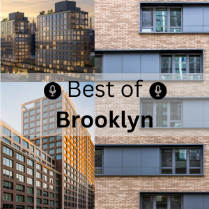 |
In this episode we’re spotlighting the Best of Brooklyn - a celebration of iconic architecture, unique design perspectives and the vibrant energy that shapes this cultural epicenter. Listen now to these inspiring insights from our special guests to hear where innovation meets craftsmanship. |
50 Nevins Street
John Woelfling
Dattner Architects
Front + York
Michelle Wanger
Morris Adjmi Architects
TRANSCRIPT
00;00;00;02 - 00;00;05;13
Doug Pat (DP)
Let's go inside the vault. The design vault.
00;00;05;16 - 00;00;20;26
JW
I think what was special about this project was that the clients were able to generate a lot of input. That forced me out of my comfort zone, think about things in new ways, and take some of the systems and strategies I had in place, but to create something completely different than had been done before.
00;00;20;28 - 00;02;12;18
DP
In this special series, we're unlocking some of the most powerful conversations we've had so far. We're connecting the dots, revealing hidden gems and unearthing insights that might have slipped by. All to spark your next big idea with brick. Whether you're looking for fresh inspiration or innovative solutions, this series is designed to fuel your creativity. So let's dive in.
Hi, I'm Doug Pat and this is Design Vault.
Over the past two decades, Brooklyn has undergone a remarkable transformation, evolving from its historic roots as a commercial and civic hub into a thriving mixed use borough that supports residential, commercial, cultural and community development. Sparked in part by the 2004 rezoning of downtown Brooklyn. The neighborhood has attracted billions of dollars in investment, reshaping its urban fabric with new housing, infrastructure and public spaces.
This wave of growth has fostered a renaissance of architectural innovation, where historic preservation meets modern design and sustainability intertwines with cultural heritage. Today, we highlight three projects that we've previously discussed, which all embody the spirit of Brooklyn's redevelopment: the adaptive reuse of 50 Nevins Street, the historic restoration of 102 Bainbridge Street, and the bold reinvention of a brownstone at the Z House in Clinton Hill.
These projects reflect the dynamic interplay between Brooklyn's rich history and its vibrant future at 50 Nevins Street. John Woelfling of Dattner Architects led the effort to blend historic preservation with sustainable and equitable housing.
00;02;12;25 - 00;03;47;06
John Woelfling (JW)
It was originally designed as a YWCA, as an SRO, a single room occupancy building, so all the rooms were like single bedded rooms. There was a common cafeteria and kitchen and common bathing facilities. So it was like really stacking people in. And this was like an old model of housing people that was, you know, appropriate at a certain time in the city's history, but not really contemporary residential standards.
What we would expect today. So that was kind of the history of this building. You also mentioned the shaving off of the north end of the building, which actually we suspected that through some research, but we didn't really get it confirmed until we got into the building and started doing the demolition and saw, oh, this is where they replaced this column with a different type of steel that was in the original building, it was riveted steel. In the new portion, it was rolled sections. We'd see the back up wall or actually the composite wall in the original building was all brickwork. It was all bonded brick wall. In the new building, in the modified part that happened when they widened the street, it became a terracotta block back up within the finished brick in front.
The window details were different, so it was actually really interesting to have that kind of confirmation and see it once the demo all happened. The building has this legacy of being modified, and I think serving the greater good, the widening of the street and the shaving off of 20ft of the building was done so that there would be this greater public amenity of the subway station. That would would improve the life of all New Yorkers.
00;03;47;08 - 00;03;56;26
DP
Michelle Todd's work on 102 Bainbridge Street in Bed Sty, showcased the complexity of restoring a historic Spanish Renaissance style row house.
00;03;56;28 - 00;04;38;29
Michelle Todd (MT)
It's in the beautiful original historic district of Bedford-Stuyvesant, which is known as Stuyvesant Heights, and it was established as a landmark district in 1971. So this set of buildings, it's literally between Stuyvesant and Lewis on Bainbridge. It's about 14 series of the buildings, and it's at the end row. And there are Spanish style Renaissance buildings that was created by F McCarthy, who was an architect back in 1919.
And the unique thing about these buildings is that it's the only buildings I've ever been in with. It has two staircases inside where there's one in the back and one in the front. So I guess back in those days, they would have the servants come through the back, and then the owners come through the front.
00;04;39;01 - 00;04;41;12
DP
Roughly, what's the square footage of the project?
00;04;41;15 - 00;04;44;08
MT
It's about 1200 square feet.
00;04;44;10 - 00;04;48;03
DP
And what was the scope and the programmatic requirements from the owner?
00;04;48;05 - 00;05;47;00
MT
Well, the original scope and program was that it was in terrible need in regards to existing structure. The parapet was buckling. So on the north facade, as well as the south and west facades, it was just crumbling. They were scared that it was going to fall down in some way. So the whole idea was to fix the parapet and also to fix all of the step cracking within the facade.
But then as we went along, we started to think also, it was a beautiful building of brick in the front, and the original status was that it had stucco on the very rear portion. Once we started to do the renovation was like, you know, we don't really need the stucco. It really looks beautiful with the brick itself. So we started to expose all the stucco, and by exposing all the stucco, we wound up finding out that this particular building, it wasn't brick behind and it was actually wood.
So that therefore became more of an extensive project in which it wasn't just a renovation of the exterior facade, it was now a whole new addition and also an entire new rebuild.
00;05;47;02 - 00;05;58;19
DP
In Clinton Hill, Shane Neufeld of Light and Air Architecture transform a derelict brownstone into the Z House. Named for its dynamic switchback stair.
00;05;58;21 - 00;07;14;25
Shane Neufeld (SN)
There was this idea early on that we sketched of a kind of grand public floor on the stoop level. Basically, they knew they wanted to add to the building horizontally. We weren't yet sure about vertically, but the original building, it was wider than most townhouses, 22.5ft, but it was only 32ft deep. So the addition was necessary in order to function.
Basically. Then the idea of the living space on the parlor floor and with bedrooms above. And originally, as I've done in other projects, I thought of the adult level on the second floor with the kids above. They pushed me to invert this, which created a very interesting programmatic and spatial result. Basically, with the vertical addition on the rear, you end up having a terrace on the top floor of the master bedroom.
I think what was special about this project was that the clients were able to generate a lot of input that forced me out of my comfort zone, think about things in new ways, and take some of the systems and strategies I had in place, but to create something completely different than had been done before. So in that respect, when I first started this project, I thought about it as, you know, Switchback House 2.0.
I like this idea of the switch back as a typology that offers a multitude of spatial outcomes depending on the family's needs.
00;07;14;28 - 00;07;28;01
DP
Each project demanded a careful balance between preservation and innovation. 50 Nevins Street maintained the historical character of its prewar structure while maximizing the density of the building.
00;07;28;03 - 00;08;59;15
JW
So one of the really critical things for affordable housing in most housing, all housing is efficiency. And the efficiency was really driven by the desire to maximize the number of units that we could put here so we could serve the most people. So we looked at that rectangle and where the opportunity was to expand the building horizontally and located our cores, our elevator and our stairs in a spot that worked best for that.
And then really started to figure out where the best units would be located, where the best apartment layouts would be, and in the existing building, it was actually a challenge. We were not going to change the fenestration where the windows are located or the size of the windows. So that really dictated a lot of the apartment placements and the size. New York City has something called light and air requirements for apartments need to have a certain size window for a certain size room, and you can't go below that for both light daylight and ventilation. So the existing buildings layout was determined largely not completely, but largely by the existing fenestration layout. And then we had more flexibility in the new building portion. But that was also a challenge because it was a very limited floor plate.
And it really had to integrate with the existing building. We had corridors that we had to figure out. We placed the elevator in the inside corner where the two buildings meet, because that's a place where you can't really put apartments because there's no windows there. So I think we were pretty clever about putting all the, like, fundamentals and figuring out how the floor plan would come together.
00;08;59;18 - 00;09;10;28
DP
The integration of new structural systems with existing ones highlighted the project's technical challenges, such as underpinning foundations to support the added stories.
00;09;11;00 - 00;10;45;29
JW
So the new foundations were complicated. The existing building foundations were also complicated. When we did this vertical expansion above the existing building I mentioned earlier, the term heroic, and it really was heroic. I mean, when I look back on this, I think, oh my God, what was I thinking? And we actually convinced somebody to do this. We convinced a contractor to do this.
We convinced our client, which you know, there are great clients. I don't want to make it sound like I've deceived them, but it was a really courageous project of both undertaken by all parties. In the existing building, because we built above, there was additional load that we were superimposing on the existing superstructure in that building. We had to brace one of the columns so that we could lower the footing and increase the size of the footing.
And the way we did that was and when I say we, I mean, it's really the contractor that did this. We came up with the concept, but they executed it. There was a huge beam that was spanned from one column to another that supported this column temporarily, that we were going to lower the footing on, and they jacked that beam up and supported that column so that the existing footing that was undersized could be pulled out, excavated further down, and then a new footing could be introduced and an extension of the column.
So gutsy acrobatics to do this and the way they tested, whether that beam, that temporary beam that was put in, whether it separated the footing from the column, was I took a piece of paper and they slipped it between the footing and the base plate of the column to see if it was actually separated. So they wanted to test that, to make sure there was daylight before they pulled out that existing footing phenomenal construction, sequencing and logistics.
It was a gutsy project I'm very proud of.
00;10;46;01 - 00;10;56;04
DP
102 Bainbridge Street required collaboration with structural engineers and landmark authorities to address the unforeseen condition of the original wood framed construction.
00;10;56;10 - 00;11;41;04
MT
So the new wall system was still going back to what was historically done in regards to the rear facade was made out of three widths of brick, which basically is like three layers. And what we had to do was that we had to abide by what the actual once we removed the stucco, what the actual pattern was, because it was a common bond.
The pattern in the front of the house was completely different than the pattern in the back of the house. So once we established that, then we wanted to really make it structurally sound, and we incorporated steel within the wall. So basically you have the three whiffs of brick on the outside. Then you have the steel that was stainless steel that made sure it was resourced sustainably.
And then we have our insulation and then our finishes inside.
00;11;41;06 - 00;11;53;15
DP
The Z House presented an opportunity for spatial experimentation with its double height spaces and green roof, fostering connections between indoor and outdoor environments.
00;11;53;17 - 00;12;37;28
SN
We have solar panels on the roof and a green roof, 100ft² of green roof is required now of new construction in New York on residential projects. If you don't have solar panels, we kind of decided to do both. The solar panels actually came a little later on in the project, but the green roof is integrated into the addition so that actually when one descends down the stair from the second to the first floor, they look out of a window that views out upon the green roof.
And that green roof also, the intention is, over time it grows. It's exotic. It falls down the facade. And so the idea of the brick as a kind of monumental monolithic material that is a counterpoint to the organic quality of the roof itself. Our hope is that they really begin to work together in a lovely way.
00;12;38;04 - 00;12;41;11
DP
How much energy can they generate with the solar panels?
00;12;41;13 - 00;12;47;28
SN
Probably anywhere between 40 to 50%. You know, I think obviously in the winter, not so much, but in the summer a lot.
00;12;48;00 - 00;13;03;22
DP
And that's pretty cool. Across all three projects. Brick served as a cornerstone of design at 50 Nevins Street, contrasting red and light bricks, articulated the old and new sections of the building while maintaining esthetic cohesion.
00;13;03;29 - 00;14;22;23
JW
Yeah, the existing brick we had to undo some sins of the past, add lintels, the repairs that were done previously, not quite sure when they were done with, maybe a little bit less sensitivity to matching the brick and mortar. So that was some of the repair work that we did at the existing building. The existing building also has a base, a very formal base.
It's a very classical design to have that base. So we wanted to that was another one of these affinity points that we wanted with the new building. So we created this base which was a dark grounding brick. That's a Glen-Gery product. It's a Black Hills velour. The velour is the finish on the brick. So that kind of established the base of the building.
And then above that we did a much lighter, more contemporary brick. Also a Glen-Gary product, White Plains velour. Again, the velour is the finish of the texture of the face of the brick. And we did similar coursing. The mortar is very different. The mortar in the White Plains is its own mortar. The existing buildings, mortar repairs were their own mortar, so they would match that building's texture and coloration.
But through a combination of the same brick size, the same coarsening, and also picking up on that limestone detailing this in the existing building, we did kind of created this affinity between the two buildings, so they're definitely distinct from each other, but they're also kind of a family.
00;14;22;28 - 00;14;42;23
DP
Yeah, it's a nice touch. It ties the two buildings together. At 102 Bainbridge Street, the careful selection of historically accurate Glen-Gary bricks ensured the integrity of the restored facade. So I'm curious, in terms of color, you were able to find a brick that you were happy with. You said that matched on the exterior.
00;14;42;25 - 00;14;58;06
MT
The contractor had suggested. He was like, oh, this will be a perfect brick. I did research, it was a Glen-Gary Cushwa Calvert, 52-DD Middle Plantation. That was the one that was selected. And when we put it in place, it was perfect to what was there from 1919.
00;14;58;13 - 00;15;01;20
DP
So do all these row homes, they almost look the same?
00;15;01;24 - 00;16;05;19
MT
They basically all look the same. And the other fascinating thing to do with the project, when we were doing the demo for the wood infill, all the bricks, I learned this like recently from my practice, that the bricks that we were removing that were there, all had the names of the brick companies on there, and you don't see that anymore in which they were actually etched into the brick.
I was like, wow, it's like fascinating. So it was like an archeological project in the same way of doing something better for the building for another hundred years. We basically had to do a whole reconstruction. And that's where Glen-Gary came into play, because what happened too is that on the back of the facade, all the bricks in the building weren't the same.
The bricks in the front of the building were made out of Belden, and it was a different type of color scheme. But then when we removed the stucco in the back, it was a beautiful match with the Glen-Gary Cushwa Calvert Plantation, Middle Plantation, 52-DD. It was a perfect match to it. Again, we had to go back to landmarks to make sure that they were proof of that brick to match what was in the rear facade that was being used.
00;16;05;22 - 00;16;14;23
DP
So what's interesting about the photographs that you sent is that the building looks as though some of these walls were completely taken down.
00;16;14;26 - 00;16;44;21
MT
It was because due to the fact that it was stucco and I'm an architect, is very conscious about the environment, and stucco is something like concrete, and it adds to the carbon footprint. So the whole idea was that this project specifically was to eliminate that process in really being more progressive and more enhancing to the environment. So that's why we didn't use stucco.
We wanted to just expose the beautiful masonry itself. And therefore, by eliminating the stucco, we saw, the building was in need of much deeper repair than we expected.
00;16;44;23 - 00;16;53;28
DP
At the Z House. Brick brought warmth and texture to both the exterior and interior, reinforcing the home's connection to its urban context.
00;16;54;00 - 00;18;23;04
SN
The client had this dream of a masonry rear facade. I did too, I mean, it's what made sense. I mean, masonry is a East Coast material. It is something we see a lot here. The beautiful old buildings, you know, of the northeast are made of brick, many of them red brick. And so that was a theme that came up as well.
The client did have a bit of a dream of this red brick facade, but knowing that this brick would live on the inside as well, esthetically, I felt that a red brick spoke too much of exterior use and would be a kind of too much of a contrast to the type of mood and space we were trying to create on the inside.
A lighter brick reflects light. It bounces light around. It doesn't present itself as a color so much as an opportunity for variations in tone throughout a space. There's so much light in this house that we kind of after some time and looking at many, many different products and many Glen-Gary products, we decided that a white Lightish cream colored brick was the right choice.
And then it came to question, well, how do we get a white brick that has the texture that works both on the outside and on the inside, and doesn't force someone to see that as an issue in one way or the other. And so we went with, in the end, the white velour, which we felt was this perfect middle ground of cream colored was not too white, was not two beige.
It's not too reflective, not too matte, and had a wonderful kind of authentic handed texture to it that I think really helped the house out a lot.
00;18;23;06 - 00;18;26;23
DP
And use a slightly darker mortar right, so we didn't know it's brick. Correct?
00;18;27;00 - 00;18;44;00
SN
We tested it out. So that was the sense do we want the lines to go away? That's always a question you know architects deal with. I think we found something that wasn't too much of a contrast, but very clearly spoke to the manual craft that goes into putting brick walls together.
00;18;44;03 - 00;18;46;24
DP
You guys used masonry on the interior as well.
00;18;46;26 - 00;18;49;28
SN
We did. And those are full masonry bricks on the inside.
00;18;50;00 - 00;18;50;29
DP
So it's load bearing.
00;18;51;06 - 00;19;24;25
SN
Well, we're not using the bricks for load bearing purposes. It is a CMU wall in the addition. But the bricks take up the three and 5/8 inch width, which is I think, really interesting. I think this is again speaks the kind of work that we do is that we looked at tile products. I think Glen-Gary makes tile products too, of some of those bricks, but we wanted it to turn corners.
We wanted it to move. We wanted it to appear fully authentic. And in the end, I think once we had reflected on all the products available, that using the same brick, the same finish was the right move.
00;19;24;28 - 00;19;57;22
DP
These projects reflect the importance of collaboration among architects, clients, engineers and builders. Whether it was addressing structural complexities, navigating regulatory processes, or fine tuning details like window placement and masonry coursing. Each team overcame unique obstacles to realize their vision through their work. John, Michelle and Shane demonstrate how architecture can preserve history, innovate for the future, and create meaningful spaces for contemporary living.
Brick as a material unites these projects, offering timeless beauty, environmental adaptability, and a tangible link to their urban and historic contexts. If you'd like to hear more about each individual project, you can find links to the full conversations in the show notes. If you haven't done so already, make sure to subscribe so you don't miss the rest of this series where we revisit some of the most powerful conversations and unearth insights that might have slipped by all to spark your next big idea with brick.
You May Also Be Interested In
We Can Help With Your Next Project
Discover the latest + greatest in design trends, industry news & pro tips from pros.
For all of your project needs, you’ll find everything you need at a Supply Center.
Let Us Know How We Can Help!
Design Vault Ep. 33 Best Of International
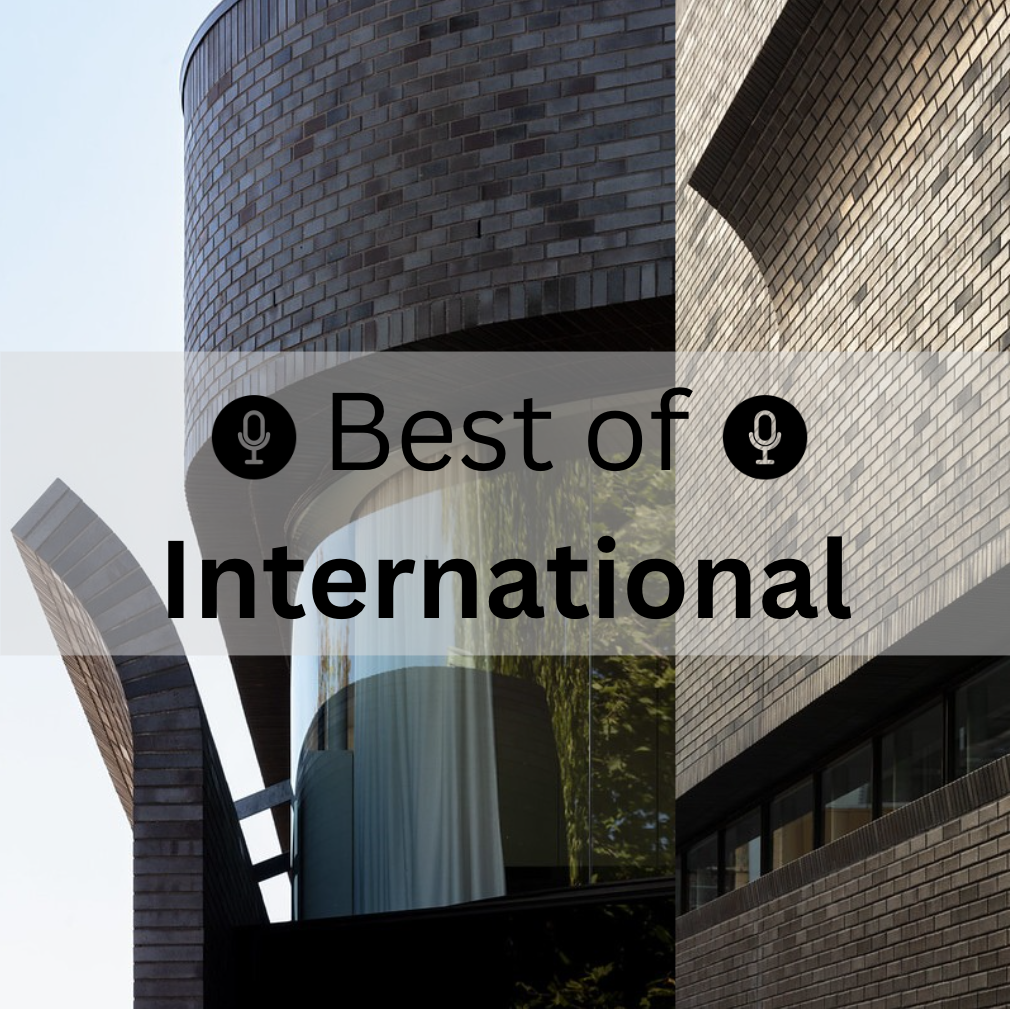 |
In this episode we’re taking you on a global journey through some inspiring international architectural projects. Discover how these featured architects from around the globe are redefining designing in brick. |
Smart Design Studio
William Smart
H-House
Mateusz Nowacki
TRANSCRIPT
00;00;00;02 - 00;00;05;14
Doug Pat (DP)
Let's go inside the vault. The design vault.
00;00;05;17 - 00;00;30;21
Mateusz Nowacki (MN)
They grew up in small villages in southern Poland, where a lot of the typical houses there are just built out of, like, clay brick. One could look at that and say, well, that's really utilitarian and where's the cladding? But to me, I find that really interesting. I'm like, oh, that is the cladding. And how do we kind of represent that in a new way?
Hence, where we landed with the materiality of this project, which is a kind of smoked, darker tone sort of clay brick that ages really well and has this kind of grace and it's timeless quality.
00;00;30;27 - 00;02;13;21
DP
In this special series, we're unlocking some of the most powerful conversations we've had so far. We're connecting the dots, revealing hidden gems and unearthing insights that might have slipped by, all to spark your next big idea with brick. Whether you're looking for fresh inspiration or innovative solutions, this series is designed to fuel your creativity. So let's dive in.
Hi, I'm Doug Pat and this is Design Vault. Today, we travel around the world to examine the architectural vision behind three remarkable projects with insights from William Smart, founder and Creative Director of Smart Design Studio in Sydney, Lorne Rose, principal architect of Lorne Rose Architect in Toronto, and Mateusz Nowacki, architect and designer of the H House in Ontario, Canada. We’ll highlight various aspects of each project, including the architectural design process, construction challenges, and the thoughtful use of brick to blend modern and traditional esthetics.
When working on these projects, each architect faced the challenge of integrating modern design elements while honoring the character and history of their respective contexts. William Smart's Smart Design Studio, located in Sydney's inner city, stands within a conservation area of brick warehouses. William designed the building to reference the industrial roots of the area, while incorporating bold, modern design gestures. The curving and peeling brick facade creates a sculptural and dynamic presence, showcasing an innovative use of brick in a contemporary setting.
00;02;13;27 - 00;03;29;05
William Smart (WS)
So there's an existing warehouse here, and the front strip of that building, which was where the office’s meetings had been adjusted so many times over the past 60 years that it had lost all its integrity. And we demolished that front seven meters and rebuilt that. And then we kept the rest of the warehouse, which was about 80% of the footprint, and restored that.
And that's where that big room is in our studio. And the front strip, which is seven meters wide, has a beautiful brick vaulted facade that almost looks as though it's peeling open. The brick kind of curves outwards and leans downwards, and we worked out a way to lay bricks facing in a downward direction, and peels up again the other way.
And at the top of that three storey structure, we have this apartment building, which is called the four walls that we spoke of before. And so what we tried to do with the project was to use everyday, ordinary materials like galvanized roof sheeting and galvanized steel windows and a very simple brick. But to take these materials and do something extraordinary with them.
So make kind of beautiful sculptural shapes, or to make beautiful load bearing brick folds. So that was one of the primary objectives. And it talks to the history of the area and really relates back in a very sympathetic way to the context.
00;03;29;08 - 00;03;53;14
DP
For Lorne Rose, the Tudor home in Toronto was inspired by a traditional Tudor style house from the turn of the century, but with modernized materials and craftsmanship. Replacing the half timber board work with stone, Lorne created a more durable and refined facade, all the while maintaining the Tudor character through intricate brick patterns like diagonal herringbone and basket weave.
00;03;53;17 - 00;05;23;14
Lorne Rose (LR)
There were some Tudor, a lot of postwar architecture. Toronto was very much influenced by English architecture, especially at the time, but the home that was the inspiration for this one was a much smaller home near Forest Hill Village. You know, where my office is, it was a much smaller home that had beautiful brickwork. And the Mick band was a homage to that house in Forest Hill.
Way to describe it is an orange segment carving. It would have been done out of wood on the original house, and these beautiful brick patterns, which you would see on other homes in Forest Hill village that really caught my eye and nobody really replicates properly these days. In addition to the first floor, as it were, carved, details like that on the old Tudor homes from the turn of the century in the revival of these styles are always left out.
So we really wanted to do it correctly on this home, and the homeowner spent extra money to do it properly and more authentic. Subsequent to that, there were quasi replicas of this house that popped up. People are in Toronto and they see something they want to emulate, but I don't take it as an offense, I take it as a form of compliment.
I didn't invent anything here. I was borrowing from, I have selected borrowing details from architecture styles that I like, and I do it with any style of modern or Georgian or French provincial. I like to use the most authentic details that clients will allow us to afford.
00;05;23;16 - 00;05;48;21
DP
Mateusz Nowacki’s H House located in a suburban area embraced minimalism and functionality. The home's clean, modern lines are contrasted with the strong material palette, where brick serves as a key element in grounding the design. The use of brick in simple linear forms respects the suburban context, while emphasizing craftsmanship and architectural simplicity.
00;05;48;23 - 00;07;00;10
MN
From a style perspective, the house is certainly a deviation from them, like they used to kind of live in a house that was quite ornamented and detailed and things like that was a beautiful house, right? But I think them seeing me continue to work on projects and the kind of projects I was working on, it really started to kind of have an effect on them.
And me coming on home at Christmas and talking about how important natural light is and that kind of stuff. It really had an impact. So they saw that as something that they could kind of work with themselves in terms of how to approach the house. And then on top of that, we looked at references of Eastern European architecture that felt familiar to them in terms of their context, right.
So they grew up in small villages in southern Poland, where a lot of the typical houses there are just built out of like clay, brick and the clay brick is exposed, all the mortar’s exposed, so it's all load bearing. One could look at that and say, well, that's really utilitarian and reflective of the structure of the house and you know, where's the cladding?
But to me, I find that really interesting. I'm like, oh, that is the cladding. And how do we kind of represent that in a new way? Hence where we landed with the materiality of this project, which is a kind of smoked darker toned sort of clay brick that ages really well and it has this kind of grace and it's a timeless quality.
So we looked at those precedents as a reference in terms of where the style of the house itself went.
00;07;00;13 - 00;07;20;00
DP
Each project seamlessly blends modern elements with traditional craftsmanship. A strong emphasis on materiality and detail was evident in all three projects. William's use of brick in the Catenary Vaults of the caretaker's apartment is a striking example of blending contemporary design with age-old techniques.
00;07;20;02 - 00;08;36;08
WS
I've had quite a lot of experience in working with brick, so over the years I've started to understand how to do more joints really well, how to make it kind of work gymnastic so it can do more expressive forms, and it felt like the right material. And then for us, it came down to the point of choosing exactly the right brick and we have two types of brick in our building.
One is called a dry press brick, and that's made about 60km from Sydney to very local and they're beautiful. They're white to they're in the space that I'm in now. They're chalky. They chip easily. They have incredible material quality to them. And because they're on the inside, we can afford to use these more softer bricks and look after them well.
And then on the outside of the building, we used a very durable brick called La Paloma, which is made in Spain, actually, and we wanted to use a black brick on the outside of the building for a bunch of different reasons. But in Australia we don't have the really good clays and my good black bricks. So we had to use the Spanish brick and they made a special profile for us so they were able to customize it, and they're just incredibly strong and durable and look beautiful with the trees in the landscaping that's in this area.
And marry perfectly with the building opposite that I mentioned.
00;08;36;10 - 00;08;55;10
DP
So let's get back to these unique vaults in the apartment. How did you build these? So there's a series of them. I saw some photos. They looked like they were built in one location or perhaps moved, or were they built at the spot they ended up in? And they're also a really unique shape, right? They're elliptical.
00;08;55;13 - 00;11;18;16
WS
Yes. They're all built in situ and how we built them was pretty close to what we imagined at the start. So we made a catenary shaped false curve. So like a hull of a boat sitting upside down, we made a timber plywood form. And then we literally put the brakes on top of that form so that the mortar didn't leak out in between.
We didn't use regular mortar. We used a terracotta tile glue, and we glued the bricks together so that there's no mortar joints. And if you're laying them upside down, that's a good way to do it, because you don't have that problem with the mortar leaking out in an uncontrolled way towards the inside face. We made the timber false work that was all CNC cut and was put together without using any nails.
We worked out that you could make the CNC machine work very hard for you and the CNC cutting is incredible false work because you can make it a perfect shape and it's really fast. They were all cut overnight, delivered in one day, all assembled it within one week. So a very fast process. We laid the bricks across the top and then we put a thin layer of reinforcing mesh over the top of that.
And we sprayed it with 60 mil stick of concrete. Now in that process where all the bricks are glued together and you have this concrete on the outside, the brick itself in this catenary shape doesn't need any support. It will hold itself up. It is the perfect structural shape, and that shape can also be described by or represented by taking a chain and hold it at the two ends that slumps to a catenary shape in tension.
When you invert that and put that up the other way, it stays true to its shape. But it's all in compression, and brick is a great material for compression. It's strong when the forces are loaded on top of it, and the person that made that famous is the Sagrada Familia Building in Barcelona uses catenary vaults everywhere, and Antoni Gaudí is the master of how those elements come together.
We laid bricks on top. We sprayed it with a thin layer of concrete, what we call shock created in Australia. It's a similar way to how you build swimming pools. They dried that off and they left it to dry for a month. And then after that we took it away. So the concrete in that system provides stability, because you could imagine if you make this brick fold, then it's a bit vulnerable when you have kind of a strong sideways force, like a very large wind or a branch or a tree falling on it, it could all fall sideways and topple over.
And then you take it away and it stands up beautifully in this space. It's kind of fun to do all that.
00;11;18;18 - 00;11;32;21
DP
In Lawrence Tudor Home, the thoughtful arrangement of brick patterns and carved stone details brought a level of authenticity and timelessness to the project, enhancing the traditional Tudor aesthetic in a modern urban context.
00;11;32;23 - 00;11;58;16
LR
There were examples that I looked at as well, where the second floor, rather than brick, you could do some of these patterns in stone, but red brick was dear to the owner's liking, and I don't think there was really another option in the sides and the rear of the house there's a stone skirt that wraps around the house, but the rest of the house is broken while many people do a front end of all stone sites and red brick, it allowed us to tie the brick in all the way around the house.
00;11;58;18 - 00;12;08;02
DP
What I think is really pretty when you look at the exterior gables, the half timbered construction has become stone. Talk a little bit about that. And where have you seen that in the past?
00;12;08;04 - 00;12;39;26
LR
There were some examples I've seen in the city, but for the most part, you know, even on a lot of the house since we do that are Tudor, but we'll have a cornice detail. Our winters are harsh, or whether it's harsh or summers or hot, sticky. And we have extremes. The thought of sort of painting wood timbers, have timbers every now and then was not something the homeowner wanted to do.
So we suggested doing them out of stone. There's no maintenance. So we've done that a couple of times just to cut down on maintenance. There are some parts that are wood, but not a lot of this house.
00;12;39;29 - 00;12;48;00
DP
Matisse's minimalist approach to the brick design provided an understated elegance that complemented the home's modern design.
00;12;48;07 - 00;13;42;06
MN
Specifically, I remember for my mother when I said, you know, we're thinking about this kind of clay colored brick and something that looks really natural. She loved that idea. She really never understood why more houses in a kind of contemporary context didn't do that, at least in the context where they live, and to some degree, because the house, you know, in its design, in its formal and massing quality, it can appear really stark compared to its neighbors.
The materiality choices of it are meant to sensitize that approach. So this notion of really conventional brick is meant to appear familiar to kind of the onlooker or to the person that, you know, lives in that home. It has this really timeless quality to it. It's like, I can understand that house because it's made of brick. It's made of a conventional thing that I know that's been around for ages and has its conventional color.
That's the color that brick usually looks like. When you ask a child to draw a brick, they're going to draw you a red brick. Maybe with three quarters if the child is advanced enough. Right. There's this familiarity which helps make the architecture more digestible.
00;13;42;09 - 00;13;47;11
DP
So set up the building materials in general for us because the palette isn't just brick.
00;13;47;13 - 00;13;57;03
MN
Yeah. So the kind of two wings that ground the house at the base are a smoked Tudor velour modular brick. So it has this kind of rusty sort of clay color.
00;13;57;09 - 00;14;02;24
DP
And those colors I would use the word variegated right so we see a series of different colors, that red clay.
00;14;02;24 - 00;14;28;02
MN
Yeah. The specification of the brick itself has a variation in it. It's up to a good bricklayer to make sure they patronize it quite well. But a lot of that is just coming from like the brick. Looks like it's been smoked at its edges and some are more smoked than others, which is where you start to get that kind of differentiation.
And we like that a lot because the house has these really monolithic, large brick volumes. And so the kind of variation, the slight variation in the tone really helped to kind of break that monotony apart a little bit.
00;14;28;06 - 00;14;31;21
DP
Was it hard to find a mason, a good mason?
00;14;31;21 - 00;14;32;26
MN
Yes. It's always hard.
00;14;32;27 - 00;14;33;26
DP
It's crazy.
00;14;33;26 - 00;15;06;21
MN
Yeah. And so this is why, you know, as a studio, we think it's important to kind of collaborate with trades early on because they can help kind of understand or they can help kind of propose ideas about how to get the masonry right at these angles or at the cantilevers that we're proposing, things like that. And then the other materials, we're using a black standing seam metal above.
So conceptually, the volume that hovers above these two things floats. So metal felt more appropriate. And then we're using a composite wood system in between the windows. So that's meant to kind of be a homage to sort of old wooden shutters that kind of peel away from the window itself.
00;15;06;24 - 00;15;08;04
DP
Where did you find that?
00;15;08;07 - 00;15;23;08
MN
It's a product. I think it's based in the States, I can't recall. It's meant to be a veneer, but it's made out of wood fibers that are infused with like fiberglass and resin. Okay, so from a durability perspective, there's no means. So, and it retains its color over time really well.
00;15;23;13 - 00;15;29;04
DP
And you're using steel lintels over these large openings that you're then using this wood infill between the windows.
00;15;29;08 - 00;15;33;12
MN
Correct wood, the main one being the cantilever at the front entry of the home.
00;15;33;14 - 00;15;35;05
DP
So how did you pull that off?
00;15;35;08 - 00;15;54;06
MN
So you know we're looking at brick as a simple material. And it's execution that appears very traditional in the way that we're applying it. But we found moments where we could start to kind of give it a more contemporary execution. And the main one being that cantilever at the front entry, which is just upheld by steel beams that are cantilevered out and transforming their way back to kind of point lower.
00;15;54;06 - 00;15;55;24
DP
So they're tied back into the walls?
00;15;56;00 - 00;16;08;22
MN
Yeah. Correct. And that cantilever holds a terrace on the upper floor. So that dormer above the entry that opens out onto a south facing terrace that you can use. And even in the kind of cooler spring months, because the sun gauges that terrace quite nicely.
00;16;08;28 - 00;16;11;27
DP
Right. And that's a clear glass guardrail up there.
00;16;11;27 - 00;16;13;10
LR
Just a butt joint, no frames.
00;16;13;10 - 00;16;51;17
MN
No frames. Yeah. So that it just it kind of appears really minimal and visually to kind of carry on the notion of this house being an antithesis that's exemplified in this entry. Now, you know, just talking about it. So many of the houses in the context, you know, the entries are these large columnar conditions, you know, with very ornamented roofs and things like that meant to kind of evoke this kind of grandiosity.
And here I think we're trying to evoke a grand door, but we're doing so in a more nuanced way, layered elements, a kind of a structural acrobatic of this cantilever, the brick kind of enveloping you, your eye moving vertically towards that dormer. It's creating that grandeur, but doing so and using kind of tectonic architectural elements.
00;16;51;20 - 00;17;03;27
DP
Each project faced unique construction challenges. William discussed how his team worked closely with bricklayers and engineers to achieve the complex peeling facade and vaulted brick ceilings.
00;17;04;00 - 00;18;38;25
WS
All of the work is in sections, in cross-section, not in plan. So when you look at the building as a floor plan, they're all rectangular rooms on the inside, but in section we have a part of the facade that peels outwards at the top and sort of leans outwards. And we worked out a way to lay the bricks on top of each other almost at 45 degrees.
And we're able to do that with creating a small jig to lay them on. And then we laid up to three courses at once, and then we'd have to leave it for overnight and then lay another three courses the next day so it dried. And then on the bottom part, we lay them over a steel frame. And on that steel frame we had a curved sheet of metal.
So they were laid on to that curved sheet of metal and then tied back using brick ties to that other element that the projected outwards. That's sort of what was done in construction. How we came up with that was to work collaboratively with our bricklayers and our engineers and just sit down on the table, and we knew who we wanted to build the project before we'd finished all the documentation.
And so we're able to sit down with them at a meeting table. And I've kind of said, here's the vision, this is what we want to do. And this is how I thought you might make it, but I don't really know how to lay a brick. Can you help us with this process? And the builders we chose are experts in heritage construction, and they also know a lot about engineering.
So they were able to sit down with their bricklayers and myself and our structure engineer, and we workshopped it together. And in a few hours we worked out how to do that. And then they went away and did it on their own lawn.
00;18;38;25 - 00;18;50;17
DP
Lorne and his team also had to work closely with skilled masons to ensure the intricate brick and stonework met the high standards required to replicate traditional Tudor craftsmanship.
00;18;50;20 - 00;19;36;26
LR
At the time, I was dealing with a gentleman named Isaac Raposo from King Masonry. Now he had an idea. We worked with Isaac for years at King Masonry and other companies he worked at. He's passionate about brick and stone. So he said to me, Lorne, I got this special brick that's being used in university in the States, and it's Glen-Gery brick and it's 85% Shenandoah and 50% called 53DD that's being used at a university.
It had a nice tonal range. Some fired bricks in there. So it wasn't all flat coloring, a great deal of variation on the brick. And I said, great, let's do it. Isaac was instrumental in suggesting that brick and had other clients that have used a similar mix.
00;19;37;04 - 00;19;46;22
DP
So were there any unique construction details using masonry or brick on the home? Anything that you had never done before? Anything that you do a lot?
00;19;46;25 - 00;21;11;14
LR
This was the first time that I used the stone boards and so to speak, I have to bring and it was the first time, I believe, that I had these different brick patterns on a house, so it was challenging for the Masons. I remember calls about, how do you want to deal with this? Even on the stonework, we had some smoother blocks, but I wanted them chiseled with different patterns on them.
Really authentic stuff. Didn't want perfectly aligned joints. I wanted it a little bit, I call it messy, but when it's done perfectly linear, you can spend the money on a real stone. It does look real because it's so perfectly laid up. Bellies were put on a lot of the stones chipping the edges off. It's a little bit of a messier joint, you know?
I like to call it a rock joint. I was particular about the laying of the stone brick and quite happy with the way it turned out. The chimneys are quite detailed with different patterns as well, and limestone caps. One of the things I like to do is put superior clay chimney pots on jumbo ones. One of the details I loved and traveling in England is they would have many chimneys, and different clay pots on top of each.
Normally on our homes we put two of the same. I wanted to do something a little more British and mix them up. So each chimney has two different pots on it just for fun.
00;21;11;17 - 00;21;15;24
DP
For Mateusz, the design approach was driven by constructability.
00;21;16;02 - 00;22;29;25
MN
From a challenge perspective, I think the biggest one is one that surrounds the way in which I approach all my projects, which is buildability. With that, I mean, I try to find a way to create really interesting and engaging architecture using really conventional methodologies. So this is a stick frame house that limits its use of steel. And yet we see cantilevers and floor protrusions and things like that.
It's like, how do we get there if you're not building a full house out of steel and largely like my kind of interest in that was trying to make engaging and good architecture available to both clients and contractors at a better price in a way that feels more approachable from a building standpoint. And because with this house, my father being the contractor working on it, I knew inherently how he likes to build things and what his limitations are as a builder, I use that as a framework within which to start thinking about the design, thinking about the tectonics, thinking about really strategically where we're using more costly steel, where we were using larger expanses of glass, but also where we were tightening them up.
And so though the house looks like it's tectonically a lot more maybe complex than it looks, if you peel all of it back to the bones, it's no different than all the neighbors’, which are just typical conventional stick build houses with wood trusses.
00;22;30;03 - 00;22;34;19
DP
So a lot of thought went into, I would imagine how much this thing was going to cost?
00;22;34;21 - 00;23;21;28
MN
Certainly how much it was going to cost, and just the approach to how it was going to be built. So I remember, you know, when we were working through the construction documents on the project, having weekly conversations with the contractor and with trades that were involved from the early onset of how do we want to actually make this thing materialize?
How do we want to build this thing? Like, you know, how is this beam going to sit, what kind of post this is going to sit on and almost working through it with a really solid understanding of structural engineering, without going right to the consultant and asking him what to do. Like we had this really intimate relationship with how this thing was going to be built and in a way that sort of harkened back to the agrarian structures that it's influenced by.
Was the individual who owns that property is going to come in and look at the timber he has and build it himself. And we're sort of creating a modern interpretation of that approach in some degree.
00;23;22;00 - 00;24;20;15
DP
Reflecting on the design and construction of these three projects Smart Design Studio, the Tudor Home in Toronto, and the H House, several key themes emerge. Each project masterfully integrates traditional craftsmanship with modern design innovation. The architects William Smart, Lorne Rose, and Mateusz Nowacki emphasize the importance of collaboration throughout the process, working closely with craftsmen and construction teams to overcome challenges and bring their vision to life.
The use of brick as a versatile material is central to all three projects, whether it was to honor the history of a site, recreate the intricate patterns of a Tudor Revival, or enhance the minimalist esthetics of a suburban home, brickwork was reimagined to meet contemporary needs without losing its timeless appeal.
You May Also Be Interested In
We Can Help With Your Next Project
Discover the latest + greatest in design trends, industry news & pro tips from pros.
For all of your project needs, you’ll find everything you need at a Supply Center.
Let Us Know How We Can Help!
Design Vault Ep. 32 Best Of College Campuses
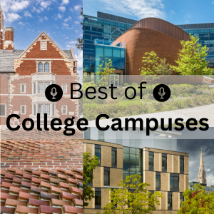 |
From iconic brick facades to cutting-edge design, discover how campuses blend tradition with innovation. Don't miss the chance to hear from top architects from HDR, BCJ, and David M. Schwarz Architects on what makes these spaces both timeless and inspiring. |

TCS Hall
Carnegie Mellon
Brendan Iribe Center
University of Maryland
Vanderbilt University
TRANSCRIPT
00;00;00;00 - 00;00;05;12
Doug Pat (DP)
Let's go inside the vault. The design vault.
00;00;05;14 - 00;00;25;16
Steve Knight (SK)
It's a very faithful rendition of what's known as Collegiate Gothic. It is very much in step with this long established tradition of higher education. And that goes back to the church in Europe and then institutions like Oxford and Cambridge. And then it comes over to the states with institutions like Harvard and Yale, who are doing very much the same thing.
00;00;25;16 - 00;00;29;00
SK
They were trying to identify with this established tradition.
00;00;29;03 - 00;01;58;21
DP
In this special series we’re unlocking some of the most powerful conversations we've had so far. We're connecting the dots, revealing hidden gems, and unearthing insights that might have slipped by all to spark your next big idea with brick. Whether you're looking for fresh inspiration or innovative solutions, this series is designed to fuel your creativity. So let's dive in.
Hi, I'm Doug Pat and this is Design Vault. Today, we explore the intricate process of college campus design with insights from Steve Knight of David M. Schwartz Architects, who led the design of Nicholas Zappos College at Vanderbilt University, Kent Suhrbier of Bohlin Cywinski Jackson, who oversaw TCS Hall at Carnegie Mellon University, and Simon Trumble of HDR, the lead designer for the Brendan Iribe Center at the University of Maryland. We’ll highlight various aspects of each project, including the architectural design process, construction challenges and the thoughtful use of brick to blend modern and traditional esthetics.
When working on college campuses, you often have to find balance to respect traditional campus aesthetics while incorporating modern design elements. Steve discussed the eclectic collection of buildings, including a range from Victorian to collegiate Gothic style at Vanderbilt.
00;01;58;27 - 00;02;59;08
SK
The campus itself, it's a really beautiful green garden-like setting. It does have the classification of being an arboretum because of the number of unique specimens of trees one finds there. The architecture is quite eclectic. Like most campuses, there's a kind of a historic heart of Victorian era buildings and some collegiate gothic buildings as well. And then it sort of evolves over time.
I think what's most interesting about the site is kind of a two-sided nature to it. So on one side is West End Avenue, which is a major East-West thoroughfare that connects with downtown Nashville, is sort of the public face of Vanderbilt. So the colleges were a real opportunity, just sort of enhance the university's image to the outward community.
And then on the other side, the opposite side is a very opposite kind of condition. It's a series of very low scale residential structures that house the Greek community. So several houses, each one is a fraternity or sorority. So we had to respond to very different contexts on each side of the building.
00;02;59;10 - 00;03;04;06
DP
Simon reflected on the neo Georgian influences at the University of Maryland.
00;03;04;13 - 00;04;17;19
Simon Trumble (ST)
The campus master plan has defined certain areas as historic and historic buildings that you need to stay within context with and other areas as moving beyond that historic into a we'll call it a new historicism, for lack of a better word, because this was the new gateway and because of where it stands, it was a building that was not fully confined.
However, we put on ourselves the fact that we are in a neo Georgian campus and how do we want to think about it? We've pushed the lines on that. But the handful of elements that come together from that in these neo Georgian buildings are always the white columns. We walk through our building, it's all white columns and there and then places those white columns go from standing very simply straight up to being pulled and leaning as they face the future and the future campus growth and that's kind of how we thought about it.
The brick is used, it's on the floor, and then it turns up the walls in places and it becomes the auditorium itself. And the auditorium spins, it's almost a rock in the river and the campus and the buildings spin around it. The landscape spins off of that rock. The auditorium is the anchor from which everything works.
00;04;17;22 - 00;04;23;24
DP
At Carnegie Mellon, Kent pursued innovative, yet contextually sensitive design.
00;04;23;27 - 00;05;36;12
Kent Suhrbier (KS)
The one thing that then really influenced the design of the building was meeting a kind of very wide floor plate that could accommodate sort of larger laboratory spaces, research spaces, in addition to lots of perimeter office and workspaces. And so we did two things to make that happen. We pulled all the core services for the building kind of to the west of the site instead of locating kind of building core in the middle of the floor plate in a traditional developer building.
This is an asymmetrical core where we pull everything to one side and free up the floor plate. We then cut a big connective series of stairs and interlocking spaces through the center of the building that bring daylight into the center of the building and kind of create a heart between all these various tenants. That also gave us some ability to have a relationship between all the tenants within the building so that they can see each other, experience what's going on with each other, but not be in each other's business.
Because this is a building where you have different research groups, lots of intellectual property that needs to be kept safe between both public and academic groups. And so lots of visual transparency with controlled boundaries.
00;05;36;15 - 00;05;38;25
DP
So the site, is it rectangular?
00;05;39;02 - 00;06;21;05
KS
The site was a much larger quadrant where we master planned for both this building as a sort of phase one, this 88 or 90,000 square foot sort of phase one. And then there's an idea of a connective plaza and paseo that would connect north south through the site. And then there's a phase two project that was developed kind of through a schematic level that's about 190,000 square feet that's adjacent.
It needed to be a very efficient plan. So it starts as a rectangle and then it begins to inflect and kind of reflect some of the views on the site in terms of beginning to bend and open to some of the view corridors and solar orientation that's on site.
00;06;21;07 - 00;06;24;15
DP
Each project sought to blend the old with the new.
00;06;24;17 - 00;07;47;20
KS
One of the challenges with this building was the area that we had to build was a long, narrow strip that runs north south, which then means we have long east and west facades, which from an environmental strategy is the opposite of what you want. And so we let that then start to influence the fenestration. And that's a little bit where this folded or triangular elements came from because we began to think, Look, we need something vertical that's going to shade the windows, right?
They happen just to the south of every window and this kind of code system that we created. And then how do we make them a shape that can catch the light so that as the sun moves around the building all day, it creates shade. But it also then can just be a plane that flashes with this kind of brightness at certain times during the day?
And so we started with the idea of the just the form, and that came out of, yes, the digital models, the physical models, getting everyone to buy into that as an idea. And then to be honest, the CM and the owner wanted to do those elements out of precast. They had it in their head that that was the right answer.
So, you know, instead of being too bullish about it, we said, well, let's mock up both. So we worked with technical folks on the bricks side to get the shape right and get pieces that we can mock up. And then we mock up and precast and everybody looked at it and said, The precast is terrible, let's do the break.
00;07;47;22 - 00;07;50;28
DP
And did you use steel lintels then for those parts?
00;07;51;00 - 00;08;33;19
KS
One of the things that was a great challenge. So the building continuous, we're leaving angles that everything is sitting on and we kind of stacked the deck against the precast because the precast had to hang from additional steel, whereas we were able to get the brick shape to stack just on the regular mantle. So it wasn't meant to be manipulative, but it was meant to be economic.
And we were able to come up with a way where we could keep the same material and offset some of the cost that comes from doing a custom. And these are large brick shapes. These are 16 inches long by about 9 inches deep. And so it's one shape, but it's a lot more substantial than a modular brick. But we were able to offset some of that by just how we were holding it up.
00;08;33;22 - 00;08;47;20
DP
Again, the brick really alters the scale of the building. I mean, I would imagine precast these massive panels on the facades versus doing these very pretty finely tuned brick masonry panels.
00;08;47;22 - 00;08;50;19
KS
I'm glad it ended the way it did.
00;08;50;21 - 00;09;14;02
SK
It's a very faithful rendition of what's known as Collegiate Gothic. It is very much in step with this long established tradition of higher education that goes back to the church in Europe and then institutions like Oxford and Cambridge, and then it comes over to the States with institutions like Harvard and Yale, who were doing very much the same thing.
They were trying to identify with. This established tradition.
00;09;14;08 - 00;09;27;07
DP
Really makes perfect sense. Absolutely. So were there any specific buildings that you can recall that you guys were looking at the tower? Looks like it could have been pulled from the facade from a church in Europe, right? I mean, sure.
00;09;27;07 - 00;10;15;08
SK
We're very eclectic in our approach. We spend a lot of time looking at examples in books. We try to visit places in person, and that was a really important tool at the outset of this project is we actually took members of the client team on a little whirlwind tour of residential college examples around the country. Some examples that we look to for the tower would be the Harkness Tower at Yale.
Slightly more atypical one that we did look at. It would be the Nebraska State Capitol. And I think one feature that we quoted from that one is towards the top of the tower. As it starts to step in, you'll see what we call a little lantern, a little limestone lantern on each of the four corners. That's a common type feature in this style of architecture. When you're creating a tapered tall form like this, We thought it worked very well.
00;10;15;11 - 00;11;09;28
ST
Really. Interestingly, there was a lot of discussion early on that we would go from rhino to construction straight forward. So there are bent and curved steel tubes. There was a lot of discussion with the contractor that they would literally do almost a CAD cam type of situation just using the electronic design drawings to go and construct the building.
However, they did more of a hybrid with that. So we have curved steel studs backing up that brick and those curved steel studs are designed straight from the computer, so then they are shaped and placed a more regularized steel frame, although it has some curvatures as well, also coming straight from the computer. And so those are brought together in order to then layout the auditorium and then to provide backup for the brick and then to work from there.
00;11;10;00 - 00;11;13;04
DP
Wow, what a great way to do it. The only way to do it.
00;11;13;11 - 00;12;34;03
ST
It's doable otherwise, but the reality is the time to do it today is not the same. And you would shy away from doing certain things because it will take too long. We have 22 different curves. You might break that down to five or four and you have two different corners and work from there with the gentler bend. It doesn't make sense, but when you see it in plan, the auditorium itself warps in order to allow the courtyards to re match up from the old computer science building to the new computer science, and then to have a staircase that wraps up to a second floor terrace from which you can access the second floor of the main building.
But you also have this garden space. Again, we talk a little bit about nature and the studies looking at the screen and then being able to go outside. In nature, we have three gardens, we have the great gardens, we have the rooftop on the second floor garden, and then we actually have another garden on the very rooftop called the Reese Park.
And that was a gift, so to speak, from Brendan Irib and Andrew Reece to their buddy who had passed away. And it's got a little gallery up there as well as the garden space then gives to the campus, now, one of the greatest views that they could possibly have, and that gets used all the time for donor meetings, special guests, what have you.
00;12;34;06 - 00;13;09;27
DP
A strong emphasis on craftsmanship and detailed design work was evident across all three projects, whether it was the intricate brickwork, the carefully planned facade systems, or the custom elements within each building. Attention to detail was crucial in achieving the final architectural outcomes. So I read that approximately 30% of construction materials were sourced locally. 30% of the building materials contained recycled content and 75% of construction waste was recycled or repurposed. Is that all correct?
00;13;10;00 - 00;13;48;28
KS
That is, even though we were again trying to work fast and economically there was still a mandate to make a building that was healthy and that would achieve a LEED gold certification. And so we targeted many of these things. And then in some ways with the materials, what we would do is target a combination of what are some of the really significant things, and then can we find local sources for some of the really big pieces of the building.
So the terracotta comes from just over the border in Ohio and the brick in this building is all brick from up at the Hanley plant. So 60 miles from here, just northeast of where I'm sitting now.
00;13;49;00 - 00;14;28;13
ST
And, you know, we have another layer in that brick facade, which is a sort of design element playing up, really showing algorithmic design work in there. It's almost like as if somebody break the bricks and they pull and they fall back into the wall. They almost look like they're falling out, wind blown and in movement. This is in the auditorium and it's a little design feature, really showing off algorithmic design.
You really wouldn't notice the fact that the curvatures has had to be figured out that way or the wood paneling had to be figured out that way. That doesn't show. But that this was a way of really showing and playing with the tool, but using regular brick.
00;14;28;15 - 00;14;30;16
DP
So none of the bricks were custom.
00;14;30;18 - 00;14;32;28
ST
None of the bricks are unbelievable.
00;14;33;05 - 00;14;36;01
DP
And how many different Glen-Gery bricks did you guys use?
00;14;36;04 - 00;15;27;05
ST
The original is a mix of three different bricks, but it's a basically a neo Georgian mix and it's the campus mix that they've had on that campus. The brick was a big debate because when we started to think about this sort of rock in the landscape, we played around with a lot of different materials and we were looking at metal, we were looking at stone, we're looking at precast.
There was other ways to think about it. We started to come back to a precast brick and we came back to regular brick masonry construction. Done the original way. We have some brick lintels up there that are about 3 to 4 feet. Big. Those were if you want really custom detailing to pull that off. But in general, it's the Georgian mix for the campus and it made sense to anchor the campus in its history, so to speak.
00;15;27;07 - 00;15;58;17
SK
Southern Indiana is limestone country, Indiana limestone. It's where the stone was quarried and it's where it is still fabricated. To this day. It is grand tradition. It goes back to the mid 1800s. It had its heyday in the early 20th century with when just imagine the proliferation of limestone buildings one finds in any great city in the U.S. And then it gradually tapered off from there after the war in particular.
But there are still a few very dedicated fabricator firms that do the what they call the cutting.
00;15;58;25 - 00;16;04;27
DP
It had to have been hard to find somebody with so few people doing this kind of this level of detail work.
00;16;05;04 - 00;16;17;24
SK
Well, there's one firm we've worked with on almost all of our projects.They're stil,l this is what they do. They are perfectly set up to do it, Bybee Limestone. We know them very well. We love them and they know us and they love us too.
00;16;17;24 - 00;16;37;26
DP
Yeah, it's stunning. So did brick solve any particular design challenges for the architecture for the client? I mean, you touched a little bit on the color, on the exterior and the feel of the architecture, right? We talked about the fact that you make this building all limestone. You got a problem. I mean, it's just a monolith.
00;16;37;28 - 00;17;42;03
SK
Yeah, well, it's a very warming material. It's a very appropriate in particular, the way it's used here for what is essentially a residential place. It's a very approachable, it's a very durable material. Obviously. And sustainability is very important. We think one of the most important aspects of sustainability is building very consciously using resources very consciously and very wisely, and building something that will hopefully be around for a very long time.
This building will be around for a very long time. We always want our buildings to have a really rich palette of materials, and that's true of the interior and of course, the exterior. So here the palette is a combination of brick, carved Indiana limestone and then an accent stone, which is called Crab Orchard. It's actually a stone that's native to Tennessee.
And we thought that was very appropriate to sort of weave in a local material that one finds in and around Nashville. The brick in particular is really interesting because we knew we didn't want a stark reed of just one color, right?
00;17;42;03 - 00;17;44;09
DP
Like if the building was all limestone?
00;17;44;09 - 00;18;06;02
SK
Was all limestone, right. And even within the brick itself, it's not just one brick. It's actually a blend of three bricks. And we did lots of mock up panels with the help of a very patient Mason in a very patient local brick distributor who gave us about an acre of their brickyard to do all these different experiments.
00;18;06;02 - 00;18;07;06
DP
Wow. That's so cool.
00;18;07;06 - 00;18;41;29
SK
We tried different blends and we ultimately settled on a blend of three bricks for the college, and then we further augmented that with what we call decorative bond detailing. So if you look closely at some of the details, you'll see brick that's fashioned into basket weave patterns, sawtooth patterns. What's known in England is diapering, which is creating a sort of a diamond checkerboard pattern.
And we use different bricks for that as well. They tended to be iron spot bricks that are really beautiful because they catch and reflect light in different ways depending on how the sun is hitting them.
00;18;42;02 - 00;18;58;04
DP
All three projects faced unique challenges during construction to control costs, while ensuring the integrity of the design can explain how significant design adjustments actually benefited both the project's budget and its aesthetic coherence.
00;18;58;06 - 00;19;55;23
KS
We would price kind of really almost every 2 to 3 months during design and in some cases make some fairly dramatic shifts in terms of what we were doing, whether it was restocking, you asked about zoning, the building could have been taller and actually started off a story taller and we kind of restacked it and made it more compact specifically to create some economies.
And then that had some opportunities for us too because we were able to create the kind of think tank penthouse on the top, which isn't a full floor. And then all of our mechanicals are kind of stitched into that from a massing standpoint. So we could get a lot of both economy, but also just this is a building that you see from across the ravine.
We didn't want to weave all the mechanical equipment and all these things kind of fully exposed up on our roof. So it was a way of really stitching it into the building and making it part of the intentional mass of the building instead of an accidental, no offense to our engineers, piece on top.
00;19;55;25 - 00;20;12;04
DP
Well, it's something that happens on most pieces of architecture. I mean, that's just where do the mechanicals go? Simon reflected on the challenges and debates surrounding the unique brick curvature of the Brendan Iribe Center’s auditorium.
00;20;12;06 - 00;21;15;00
ST
The curve on the brick was a lot of debate. When we worked on this early. We looked at an egg sitting in the landscape. We were thinking of that egg. The curvature is both in the bottom as well as the top and we spoke with a lot of brick experts on doing, I'll call it the counter curve, the bottom half of that curve.
And in that discussion we would have to use seismic anchors to really hold the back. And there was a lot of discussion about whether we really have to invite quibbling into this or if we could follow the curvature of the bill. At the end of the day, I think we chickened out just a little bit. We took it, I'll call it from the belly line straight down and from the belly line above as the curve.
Our thought was within the auditorium. We could light that bottom space, so we'd put a curved light at the base and really have that belly kind of light up. And so the egg would sort of glow from the base. We do have that at the top as well. It solved a lot of other little issues, as you say.
So it took the detailing down a notch.
00;21;15;02 - 00;21;27;07
DP
An innovative construction technique was used for the Nicholas Zappos College at Vanderbilt University, where the team found a clever way to streamline the installation of the building's ornamental chimneys.
00;21;27;10 - 00;22;03;14
SK
One of the details that makes the college's really fun and interesting are these ornamental chimneys that you find on the roof. And the contractor hit on a really interesting idea because in particular after the previous college where they did not do this, they elected to construct the chimneys on the ground wall and then hoist them into place with the tower crane that allowed them to advance construction on the roof without tying up a huge amount of roof area with scaffolding and preventing them from drying in the building. It was just a much easier erection process down on the ground.
00;22;03;16 - 00;22;06;19
DP
You just have boiler flues going through these things.
00;22;06;19 - 00;22;10;29
SK
They're vents, they're flues. So they do serve a functional purpose as well.
00;22;11;02 - 00;23;54;20
DP
I think that's a wonderful touch. You wouldn't expect to see these chimney masses on a building like that. They really kind of set it apart. Reflecting on the design and construction of the Nicholas Zappos College at Vanderbilt University, TCS Hall at Carnegie Mellon University, and the Brendan Iribe Center at the University of Maryland, several key themes emerge.
Each project balances tradition and innovation, blending the historical context of the respective campuses with modern design elements. The architects Steve Knight, Kent Suhrbier and Simon Trumble emphasize the importance of collaboration through the process, working closely with clients and construction teams to navigate complex challenges and bring their vision to life. The use of brick as a primary material in various forms, whether to echo collegiate Gothic tradition, create rhythmic facade patterns or blend into a neo Georgian context, showcases how this timeless material can be reimagined to meet contemporary re needs.
The overarching takeaway from these projects is the power of architecture to create meaningful spaces that honor the past while embracing the future, ultimately enhancing the academic environments they serve. If you'd like to hear more about each individual project, you can find links to the full conversations in the show notes. If you haven't done so already, make sure to subscribe so you don't miss the rest of this series where we revisit some of the most powerful conversations and unearth insights that might have slipped by all to spark your next big idea with brick.
You May Also Be Interested In
We Can Help With Your Next Project
Discover the latest + greatest in design trends, industry news & pro tips from pros.
For all of your project needs, you’ll find everything you need at a Supply Center.
Let Us Know How We Can Help!
Design Vault Ep. 31 Brendan Iribe Center with Simon Trumble
ABOUT THE ARCHITECT:

|
As a Design Principal at HDR, Simon has curated an extraordinary career spanning over 28 years, propelled by an unwavering commitment to capturing clear, simple, and audacious ideas and metamorphosing them into refined design solutions for intricate and technically demanding building types. He has played a transformative role in propelling the designs to unprecedented heights of excellence. By nurturing a culture of innovation and fostering boundless creativity, Simon has emboldened design teams worldwide to transcend conventional boundaries and achieve extraordinary outcomes. |
|---|
ABOUT THE PROJECT:
The Brendan Iribe Center, on the campus of the University of Maryland, is a 215,600 square-foot, six-story instructional and research facility with complex, specialized labs that support augmented reality and artificial intelligence, robotics, programming and is also the home of the 300-person Antonov Auditorium.
The building encompasses an image of technological advancement while preserving it’s neo-Georgian heritage on campus with its unique use of brick and bonds patterns.
On the interior wall of the Computer Science and Engineer Center, the brick is conducted in such a divine way that it appears as if it’s moving. The pattern signifies movement and information flow, leading it to achieve forward-thinking and technological innovation.
The material selection of two popular Glen-Gery molded brick colors, Georgian and 53-DD, worked perfectly for the Computer Science and Engineering building to blend in a while standing out on campus. The Brendan Iribe Centers is an excellent exhibit of preserving tradition and history while finding creative ways to be innovative and popular to spectators.
Brendan Iribe Center
University of Maryland
TRANSCRIPT
00;00;00;02 - 00;00;05;12
Doug Pat (DP)
Let's go inside the vault. The design vault.
00;00;05;14 - 00;00;37;06
Simon Trumble (ST)
It was a building that was not fully confined. However, we put on ourselves the fact that we are in a neo Georgian campus. And how do we want to think about it? We've pushed the lines on that. But the handful of elements that come together from that in these neo Georgian buildings are always the white columns, the brick is used, it's on the floor, and then it turns up the walls and places and it becomes the auditorium itself and the campus and the buildings spin around it. The auditorium is the anchor from which everything works.
00;00;37;09 - 00;03;38;27
DP
This is my guest, Simon Trumbull. I'll share more about him shortly in this episode from the Design Vault, which highlights Simon's project, the Brendan Iribe Center for Computer Science and Engineering in College Park, Maryland. The Brendan Iribe Center for Computer Science and Engineering in College Park, Maryland, is designed for work in virtual and augmented reality computer vision, robotics and computing platforms.
The university describes the new building as a reimagined kinetic hub for the campus. The building is both inwardly and outwardly focused, connecting the university with a new innovation district and is easily visible from its prominent location. The dynamic building plan is comprised of two main components: a six story instructional and research space, and a 300 person auditorium joined by a connector.
The main feature of this building is a large glass facade characterized by an inventive curtain wall system that controls solar gain while creating the optical illusion of movement. Interestingly, the campus architecture happens to be deeply rooted in a classical neo Georgian architectural tradition. For this reason, Brick was used in a number of ways as common wall sections and knee walls, parametrically modeled wall patterns and as the main exterior feature of the Antonoff Auditorium.
Hi, I'm Doug Pat and this is Design Vault. Simon was educated in the United States, Mexico and Italy and holds a Bachelor of Design and Master of Architecture from the University of Florida. He's currently a design principal at HDR with a career spanning almost three decades.
His experience extends across an array of large scale technology, intricate projects that span the globe. Among the many buildings Simon has been involved with, he's been the lead project designer on jobs such as the Inova Center for Personalized Health Research Building in Falls Church, Virginia, the USACE’s Baltimore district East Campus Building Four in Fort Meade, Maryland. The USACE’s Baltimore District Defense Intelligence Agency Headquarter Annex Command and Control Facility in Fort Belvoir, Virginia.
And the project we'll discuss today, the Brendan Iribe Center in College Park, Maryland. At the core of his design philosophy lies the art of distilling complexity to its essentials. He's committed to capturing clear, simple and adventurous ideas, developing them into refined design solutions for technologically demanding building types. Simon is a registered architect, LEED accredited professional and a member of the AIAA.
So welcome Simon, it's nice to have you with us today. So tell us a little bit about HDR. Now I know it's a large office. Where is the office that you're located? What's the size of the firm? How long has it been around and what type of work do you do?
00;03;38;29 - 00;05;21;22
ST
HDR has been around since 1917. We're a very old engineering backed company and it started out in Omaha. The office I'm in, we like to call it the Washington DC office, but really we're in Arlington, so pre-Civil War, we would have been DC. At that time, in 1917, the engineering based company Hennessy, H.H. Hennessy was the leader of the office and it started out as a water and electrical service to that area of the country, grew from there to add civil and then architecture services around the thirties and then really bloomed in the fifties to around the time 1700 or so employees. Today we’re in countries around the world.
We're about 200 plus offices and I think about 12 and a half thousand employees with still the largest aspect of it being the engineering company, transportation, aviation, full services architecture is about 15 to 20% of the company. And in general, because of this engineering background, because of this engineering focus, we stick mainly to very technical, sophisticated engineering, heavy buildings, and hence why you see some of the work that we have.
It's a particular focus. Health care isabout 45%, 43% of the work we do in general. And then science and technology picks up about 20%. And then from there it's a plethora of different types of work, again with an engineering bias to that particular work.
00;05;21;24 - 00;05;32;20
DP
And yet these are really beautiful buildings. I drive by the Penn Pavilion once a week down in the city. You guys design that, right, that big red curvilinear building?
00;05;32;22 - 00;05;35;10
ST
Yes, that goes way back. Actually.
00;05;35;10 - 00;05;36;03
DP
It's stunning.
00;05;36;08 - 00;06;15;05
ST
Yeah. The office has really made a push over the last 20 years to bring how we think about buildings, the idea of buildings to the forefront. Because when you start thinking about the engineering aspects of building, it's very straightforward. These are the issues, these are the facts. Here's how we develop it. But when you bring architecture, you bring a bit of poetry to it.
How do we want this to operate? How do we want this to provide for the future? How do we want people to work within it? Iribe’s a great example of that, how that comes together, both for the campus, for the facility, and then, you know, for the client itself.
00;06;15;12 - 00;06;32;16
DP
Yeah, it's a beautiful building. So to back up a second here. So I said you've been practicing as an architect for almost three decades, but 30 years we kind of laughed about that. Tell us how you ended up at HDR and what kind of experience do you have before that? And currently at HDR, if there was a before that.
00;06;32;18 - 00;08;09;14
ST
It's an interesting story. I'd like to call myself a retread because when I came out of school I joined a company called Cooper-Lecky and Cooper-Lecky is fairly famous for having worked with Mylan to do the Vietnam Memorial. Kent Cooper was Saarinen's project architect on the Dulles Airport. So he comes through that lineage of things and they ended up doing the other one that people might know is the Korean Memorial.
They were the project architects doing that, again, coming out of Vietnam. That company got bought out by another company called CUH2A. CUH2A today became the sort of S&T backbone to HDR. So there had been a purchase there in between that time. I spent about five or six years with Smith Group here in DC. So it's interesting because all of that ties together, at Smith Group I was mainly focused on workplace buildings downtown DC, renovation down to the National Cathedral. There was an 18 car underground bus parking terminal. Another thing. So again, almost every engineering background type building for that, it's a beautiful installation. If you go there today, you have no idea that there's about 18 busses parked below ground there and 550 cars or so parked there.
So, you know, I come out of things like that. The Constitution Center, which was the renovation of the largest office building in DC, again with Smith Group. And then I came back to CUH2A which became HDR and have been here ever since.
00;08;09;16 - 00;08;10;28
DP
You're clearly enjoying it.
00;08;11;00 - 00;08;13;06
ST
Yes, but apparently I'm getting old.
00;08;13;09 - 00;08;19;16
DP
You don't think so until you look in the mirror in the morning.
00;08;19;18 - 00;08;21;00
ST
Right. Exactly.
00;08;21;02 - 00;08;25;10
DP
So let's dig in here and talk about the project. How did your office get the project?
00;08;25;13 - 00;11;20;02
ST
Well, so this is even a stranger one. The head of design for HDR Brian Kowalchuk had been called to come to the university. We had done the physics building on the university. I was the lead designer on that one as well. And they had a donor or possible donor in Brendan Iribe, and they wanted to talk through ideas for what's possible.
So Brian met with Brendan on and off for about a year, doing designs and talking through projects and design ideas for how to do a project and to get Brendan excited and focused on helping the university. At the time, this is back in 2016, Brendan then decided to give the university a donation to build this university or build a school.
He gave them a $31 million donation and Michael Antonoff I don't remember the number, but I think it was around $5 or 6 million also donated and it was about the time that interest then passed away from a bicycle accident. So all of this kind of came together. Brendan had been invited back. He had just finished designing Oculus goggles and was fresh off of selling this to Facebook in 2014 for the small sum of $2 billion.
And this is 2014. So the university, of course, very happy to talk with him, invited him back. He, Andrew Reisse came back to the university and took a tour and realized that this was the same computer science facility that they had gone to when they were students years ago. No difference, no changes, no upgrades. And matter of fact, he ended up using a restroom that was broken that they tried to stop him from using, but he needed to use the restroom.
He just couldn't believe the state of the facilities. And here Silicon Valley is drowning in money and in need of high quality students. So he and Andrew Reisse looked at each other and said, Well, how much can it cost to build a school? We should do something about this. And he was thinking $2 million or so, $4 million, but ended up giving $31 million and talking others into it when this all came around, everybody was so excited to do this.
The teachers had gotten together and donated $1,000,000. I'd never heard of this before. The teachers got together and pulled money. Brendon's mom put in a million or so out of her own pocket. He talked other friends into giving a little bit here and there, and when the state saw this, the state was very, if somebody is putting up money, they'll back it.
So they came in and this basically turned the wheels and made it all happen. And then the university found a site and that was really what kicked us off. Brendan wanted to bring Silicon Valley to the east. And how do you do that?
00;11;20;05 - 00;11;41;17
DP
Well, it's pretty impressive. You know, my wife went to school there many years ago and that campus needed a lot of work. This whole neo Georgian thing stylistically, you know, there was a lot to be done there. And recently we've had some friends’ children who are going to school there. And they said the campus is spectacular. When I saw the images your building, I was blown away.
I mean, they're really doing some beautiful architecture there.
00;11;41;19 - 00;12;43;15
ST
The architecture around that campus has really taken leaps forward, not just our building, but some of the other buildings are coming around there. We're sort of in the tech and innovation part of campus. They've designed different zones and they still have their historic core that neo Georgian architecture, fundamentally that underpinnings of neo Georgian still there. And that's affected our building as well.
How we think about it, white columns, brick walls. But what we did was sort of a blended reality. We've pushed and pulled these pieces together and we've created an inside outside that most previous neo Georgian buildings don't really have. You go to classrooms and then, you know, dispel knowledge to each other. But you can turn and look and you go from seeing the blackboard, so to speak, to seeing the outside, this is the old traditional way of teaching, used to sit under a tree and have a discussion.
So we go back to those times, even though today we're in VR headsets and using technology at a different level.
00;12;43;17 - 00;12;50;01
DP
That's a great analogy. So let's back up a little bit. Tell us a little bit about the site. How did they find room on campus for this building?
00;12;50;08 - 00;12;59;21
ST
Well, the university decided on the site at the front of the campus, and when they did, they said what we want to do is design a gateway building.
00;12;59;21 - 00;13;01;28
DP
Is this down on Route one?
00;13;02;00 - 00;16;41;06
ST
This is right off of Route one near the old guard gate. So there's a guard gate that has been moved into position previously. If you see the two in scale, one absolutely just devours the other, One said a person scaled, the other is a six story building with, you know, 16 foot floor to floor. It's in a 25 foot first floor.
So we're talking about a very large space. But they wanted to create a gateway to the campus. That was the charge from the university. The charge from Brendan was how do we unlock the emotion of these students? And then the charge from, so to speak, ourselves is how do we create a knowledge hub, a place where everybody wants to come, they want to stay, but they want to exchange information.
You really learn better one on one that you do sitting with the teacher. It's when you start teaching each other that you really learn. And so we're bringing all these charges together. The campus had given us an old parking lot site, the parking lot for the previous computer science building. It's still there, by the way, but the parking lot for that building.
And when we got the site, started looking at it and started to do designs across US 1 is a new innovation hub that's being built, sort of partnerships with businesses. And then the other side from our site is the old campus, the heart of the campus. So we kind of created a building that essentially was a line that bent from the grid of the campus, looking back into the heart of the innovation campus, looking to the new innovation hubs that are coming.
And that has basically a view to them. We call those the reset zones. These are almost free spaces, but they're knowledge exchange spaces that happen vertically up the building. And those two sides. One of the other things we did was towards that entrance of campus. The building rides us up. It does that for two reasons. It's on columns.
It floats above the landscape, but it's really two reasons for it. Half of that land they gave us is a flood plain, couldn't build on it. So we have a fairly large program and all of a sudden we have half the site, literally half the site. We had to be a little bit inventive about it. And so the core of the building sits over that flood zone and, you know, serendipity to that, that space is also one of the sort of gathering hubs that people come to. Now. It's almost like being under the shade tree. They use it for events that students break out into that space and that breakout space flows into the building where there is also a little bit of a stadium seating zone that just provides these different types of environments where people can decide where they want to go, how they want to focus and use it for different types of events.
The whole ground floor is designed to be explored and used for different scale either university events, private events, and it's used all the time on that floor too. But facing the gatehouse. So facing the entrance of campus, so to speak, are the High Bay labs. And those High Bay labs are in basically open glass areas. They've got robotics.
They're doing, say, unmanned aircraft type things. They've got huge doors. They can bring in vehicles, whatever they might be doing in those, there's about four or five of them and they're 24 hours a day. So at night, there are lanterns and guideposts for the campus itself and for the students to both come and see what's going on. But a reminder, the University of Maryland is doing things and going places. It's alive.
00;16;41;09 - 00;16;58;05
DP
So I'm curious. We'll talk a little bit about the building stylistically. So it's clearly contemporary. Did you have any directives regarding style when you got started? Did they say, Hey, we definitely want a contemporary building with all of these neo Georgian pieces of architecture around.
00;16;58;08 - 00;18;24;22
ST
The campus Master Plan, which is one of the better master plans I have seen and I've worked with. I'm sure there's some others, but it's quite brilliant, you can go download it for yourself. It's a great example of how to do things. Has defined certain areas as historic and historic buildings that you need to stay within context with and other areas as moving beyond that historic into a we'll call it a new historicism, for lack of a better word, because this was the new gateway and because of where it stands, it was a building that was not fully confined.
However, we put on ourselves the fact that we are in a neo Georgian campus and how do we want to think about it? We've pushed the lines on that, but the handful of elements that come together from that in these neo Georgian buildings are always the white columns. We walk through our building, it's all white columns in there, and then places those white columns go from standing very simply straight up to being pulled and leaning as they face the future and the future campus growth.
And that's kind of how we thought about it. The brick is used. It's on the floor, and then it turns up the walls and places and it becomes the auditorium itself. And the auditorium spins. It's almost a rock in the river and the campus and the buildings spin around it. The landscape spins off of that rock. The auditorium is the anchor from which everything works.
00;18;24;25 - 00;18;45;04
DP
And we'll talk about that in just a second. So I'm curious about the project restrictions. So you guys clearly had a flood zone issue. What were the zoning requirements? You talked a little bit about historical requirements and then the university versus the client. How did you guys work within all that and how long did it take to kind of meet all of those directives before you were building?
00;18;45;06 - 00;20;14;02
ST
So this is about a one year design process. So if we say we spend about a year in discussions to think about the building to really work through developing a program that made sense for both the building and the campus, and then to then develop and work with the site, because once we found out actually that it was half the site was gone, there was a lot of discussion of other sites.
And so we actually did some test fits and some design work for sites across the street, for sites in the green space that's there, argued heavily that we should not be touching that site, that green space should be seen as sacred to the campus. Everything should support it and surround it. And we came back to our site and had to think inventively about how to deal with this floodplain.
And I think once we started to anchor onto that, the two computer science buildings really working around a courtyard again, it's a courtyard that's blended into our building and it started to make a lot of sense. There were other issues: the power needs for the building, the water control, for the building. So there's a lot of other things that happen.
Parking areas got cut off, so circulation and access needed to be developed. But we went through all of these different challenges in isolation with the goal of creating the building where it is as a gateway and the building where it is in relationship to the other campus computer science buildings.
00;20;14;04 - 00;20;30;02
DP
So the building plan is really unique. And when I was reading about this building, it mentioned parametric digital modeling. So you clearly use computer modeling for the form of this building and plan. And then ultimately for at least one of the facades on the interior, one of the walls and the interior.
00;20;30;04 - 00;21;33;28
ST
We use it in a couple of ways. The brick itself is actually laid out using parametric tools. I'll explain that a little bit more. The brick on the Antonoff Auditorium, the plan arrangement, it's 22 different curves to make that elliptical shape for the auditorium. The auditorium shape comes out of some of the acoustic design for the room. So it's a visual classroom more than it is a traditional auditorium.
So there are huge screens up there. So the visual access, as well as the stadium kind of seating for that used a little bit. And I say just a little. The majority of that was used for the wall panels to design the wall panels that are inside, and those take cues, The University of Maryland's mascot is the Terrapin turtle.
And so the diamonds on the shape of the back of that turtle were used as a kind of kickoff cue for how we did the wall panels inside. That is a sort of Chevron shape that cascades curves and wraps around that auditorium on the inside.
00;21;34;04 - 00;21;45;18
DP
Wow. That's a really neat idea. So how does a contractor lay out a building plan with all of those ellipses? How does that work?
00;21;45;20 - 00;22;40;13
ST
Really interestingly, there was a lot of discussion early on that we would go from Rhino to construction straight forward. So there are bent and curved steel tubes. There was a lot of discussion with the contractor that they would literally do almost a CAD cam type of situation just using the electronic design drawings to go and construct the building.
However, they did more of a hybrid with that. So we have curved steel studs backing up that brick and those curved steel studs are designed straight from the computer, so then they are shaped and placed, a more regularized steel frame, although it has some curvatures as well, also coming straight from the computer. And so those are brought together in order to then layout the auditorium and then to provide backup for the brick and then to work from there.
00;22;40;16 - 00;22;43;19
DP
Wow, what a great way to do it. The only way to do it.
00;22;43;26 - 00;24;05;20
ST
It's doable otherwise. But the reality is the time to do it today is not the same. And you would shy away from doing certain things because it'll take too long. We have 22 different curves. You might break that down to five or four and you have two different corners and work from there with the gentler bend. It doesn't make sense, but when you see it in plan, the auditorium itself warps in order to allow the courtyards to re match up from the old computer science building to the new computer science, and then to have a staircase that wraps up to a second floor terrace from which you can access the second floor of the main building.
But you also have this garden space. Again, we talk a little bit about nature and the studies looking at the screen and then being able to go outside. In nature, we have three gardens, we have the great gardens, we have the rooftop on the second floor garden, and then we actually have another garden on the very rooftop called the Reisse Park.
00;23;44;14 -
ST
And that was a gift, so to speak, from Brendan Iribe and Andrew Reisse to their buddy who had passed away. And it's got a little gallery up there as well as a garden space, then gives to the campus now, one of the greatest views that they could possibly have, and that gets used all the time for donor meetings, special guests, what have you.
00;24;05;22 - 00;24;09;29
DP
So what was the CAD program that you guys used? Was it Revit?
00;24;10;02 - 00;25;15;12
ST
Our backbone for everything is Revit. On the design side, our backbone has become Rhino and then grasshopper scripting in there to do some of the algorithmic work that we have. So just getting back to the curvature of the brick, because we have a curve in plan, but we also have a curve in section, that brick is skinnier or together it's closer together at the top than it is in the middle.
It's a belly in the middle and so the layout, the curves, what we wanted to do is to not have a bunch of cut brick. And of course we have to have every 30 feet or so an expansion for the brick. And so the expansion is laid up, tied together with the curves, but tied together with the brick module so that the brick module is defined such that we have a half brick or a whole brick throughout those curvatures along the section.
So that's where using grasshopper scripting a little algorithmic work helps to do something that I don't think we could normally do without a tremendous amount of planning work.
00;25;15;14 - 00;25;27;11
DP
Yeah, I would imagine the coordination on the job was really something else. So how many people were on the team and you were clearly leading it? Were there a number of PMs or 1 PM or how did it work?
00;25;27;13 - 00;26;59;06
ST
There was a PM and an Assistant PM. We talked for a while about separating the main building from the auditorium itself. The auditorium was almost a project on its own, I think that got debated about above my pay grade and rejected. I still think it might have been the right way to go with about five designers, I would say working on the building, both interior exterior and the auditorium.
We have some specialty spaces within the building. We have about four project architects and three interior designers working on it. So what would we end up with there? 12 or 15 people or so working on the project fairly consistently and then pulling in some folks to help with a couple of gurus and scripting algorithmic design that really help.
And you know, we have another layer in that brick facade, which is a sort of design element playing up, really showing algorithmic design work in there. It's almost like as if somebody break the bricks and they pull and they fall back into the wall. They almost look like they're falling out, wind blown and in movement. This is in the auditorium and it's a little design feature, really showing off algorithmic design.
You really wouldn't notice the fact that the curvatures had to be figured out that way or the wood paneling had to be figured out that way. Doesn't show that this was a way of really showing and playing with the tool, but using regular brick.
00;26;59;08 - 00;27;01;11
DP
So none of the bricks were custom.
00;27;01;13 - 00;27;03;22
ST
None of the bricks are custom.
00;27;04;00 - 00;27;06;26
DP
Unbelievable. And how many different Glen-Gery bricks did you guys use?
00;27;06;29 - 00;27;59;24
ST
The original is a mix of three different bricks, but it's basically a neo Georgian mix and it's the campus mix that they've had on that campus. The brick was a big debate because when we started to think about this sort of rock in the landscape, we played around with a lot of different materials and we were looking at metal, we were looking at stone, we're looking at precast.
There was other ways to think about it. We started to come back to a precast brick and we came back to regular brick masonry construction done the original way. We have some brick lintels up there that are about 3 to 4 feet big. Those were, if you want, really custom detailing to pull that off. But in general, it's the Georgian mix for the campus and it made sense to anchor the campus in its history, so to speak.
00;27;59;26 - 00;28;07;20
DP
Excellent. So did you guys learn anything interesting or new? Was there something that came up for you that was like, wow, this is something I've never dealt with before?
00;28;07;22 - 00;29;11;25
ST
The curve on the Brick was a lot of debate. When we worked on this early. We looked at the egg sitting in the landscape and we were thinking of that egg. The curvature is both in the bottom as well as the top. And we spoke with a lot of brick experts on doing I'll call it the counter curve, the bottom half of that curve.
And in that discussion, we would have to use seismic anchors to really hold the back. And there was a lot of discussion about whether we really have to invite quibbling into this or if we could follow the curvature of the bell. At the end of the day, I think we chickened out just a little bit. We took it, I'll call it from the belly line straight down and from the belly line above as the curve.
Our thought was within the auditorium. We could light that bottom space, so we'd put a curved light at the base and really have that belly kind of light up. And so the egg would sort of glow from the base. We do have that at the top as well. It solved a lot of other little issues that you say. So it took the detailing down a notch.
00;29;11;27 - 00;29;17;05
DP
I'm sure. As you're talking about all this masonry, Do you guys ever have any challenges finding the right mason?
00;29;17;05 - 00;30;10;16
ST
I would say yes. What's happening today? I'll call it The Art of Work. And this is maybe a product of us as architects, us as a building system. We want less craftsmen and more builders, I’ll use the word we. The old days of craft is really moved to the factory more now than it is in the field.
We don't allow that in the field. We don't have control of it in the field. We're not sure about it in the field. And so I think finding brick masons who can do this in the field is a really difficult job. That's what scares us off from doing it more than anything else. And that's what drives the cost up a little bit more than anything else.
At the end of the day, it's a simple job. It's a job that requires precision. The precision part is what's difficult, not that the job is difficult.
00;30;10;19 - 00;30;32;13
DP
Very interesting. Yeah, I ask that of everyone. I think it's probably 75 / 25%. In my experience, it's really challenging to find a great mason, somebody that can do a good job. They don't need a whole lot of hand-holding. We put together some tests in the field and then we get rolling. It's not always easy. So I understand.
00;30;32;15 - 00;30;41;24
ST
Yeah. I think today that the notion of craft, those that do it are very, very special. Those that are carrying it on are in demand.
00;30;41;26 - 00;30;44;29
DP
Right? So you get the right mason, you got to wait for them and you got to pay for them.
00;30;45;06 - 00;31;31;14
ST
You have to wait for them and you have to pay for them. We tend to do it in smaller places than the whole building or the larger buildings, but I think that's the holdup in a sense. They want to dom they the masons, the mason company, want to do very straightforward buildings. They get in there, knock it out, and they go, But it's not Well, it touches us poetically, so to speak.
It's not what moves people. You know, at the end of the day, when we talk about sustainability, the greatest sustainable work is the work that's loved because people take care of it. The stuff that we toss away is because it's manufactured. It's simple, there's no caring, no love to it. And so we create that garbage by what we do, and that's something we should be very particular about. Think hard about.
00;31;31;17 - 00;31;55;04
DP
What I was just about to ask you for some wisdom, but it was right there. Well, the things that are done really well are taken care of. I love that. That is so beautiful. So you've been an architect for a little while. Based on what you know today about being an architect, do you have any words of advice for your younger self or even young architects just getting started in the business?
00;31;55;07 - 00;32;50;18
ST
Oh good question. When I started out, I wanted to be a car designer and I went to design school. And the design school I went to taught with principles of architecture. And so I fell in love with that aspect of it. I think today a lot of young people, there has to be a bit of a labor of love.
And I think what happens today a little bit is we think we have a degree and we think we've learned it and we haven't. You've just opened the door to possibilities. And so you need to be a consistent learner and go after it. You need some sort of love or some sort of passion to do that. And I think you need to find that and to find that growth.
You said, I've been in this business for 30 years. I have 60 or 70 more years of learning that I need to do. I know that there's so much more to learn and I’ll keep pushing.
00;32;50;20 - 00;33;00;07
DP
Yeah, that humility is really important in any business, but in this specifically, we have to be really good at a lot of things to be a good architect.
00;33;00;11 - 00;33;00;26
ST
100%, yeah.
00;33;00;28 - 00;33;08;11
DP
So Simon, it's been great to speak with you today. Thank you so much for your time. Where can people go to learn more about HDR and yourself?
00;33;08;14 - 00;33;33;25
ST
Well, I would suggest HDR Architecture. You can look up the Arlington studio if you'd like, but better yet, I think just look at the work that's done. There is a plethora of work that the company does, so HDRArchitecture.com would be where I suggest everybody to go can always type in my name Simon Trumble and you'll run into me so happy to talk with you.
00;33;33;27 - 00;33;37;12
DP
Your buildings. The HDR work is really stunning.
00;33;37;19 - 00;33;59;18
ST
I thank you very much. I think it's a big push that HDR has been doing. We're focused on improving what we do. We come at it as the HDR group. It's not so much about me or somebody else. We come here to serve our clients and to do something a little bit more than what they had thought possible.
00;33;59;20 - 00;34;02;12
DP
Well, thank you very much Simon. This has been great.
00;34;02;14 - 00;34;07;11
ST
Thank you, Doug. Appreciate it.
You May Also Be Interested In
We Can Help With Your Next Project
Discover the latest + greatest in design trends, industry news & pro tips from pros.
For all of your project needs, you’ll find everything you need at a Supply Center.
Let Us Know How We Can Help!
Design Vault Ep. 30 TCS Hall with Kent Suhrbier
ABOUT THE ARCHITECT:
|
Kent Suhrbier is a Principal in Bohlin Cywinski Jackson’s Pittsburgh studio. Kent’s approach to design values evocative environments that maintain a thoughtful sensitivity to the natural environment and the communities they serve. His work ranges from civic facilities and museums to centers for engineering and innovation, corporate headquarters, and university laboratories. The core theme to this diverse experience is his commitment to crafting spaces that define new paradigms, as has been the case on projects like the Frick Environmental Center and Carnegie Mellon University’s ANSYS Hall and TCS Hall. As a designer who cares deeply about promoting a more diverse, talented next generation of designers, he has a continuing role as an Adjunct Professor at Carnegie Mellon University. |
|---|
ABOUT THE PROJECT:
Carnegie Mellon University built TCS Hall, which is a new academic building on Forbes Avenue at the western edge of its campus. The project aimed to allow for future expansion and create connections between the campus and the nearby community.
It was designed to accommodate both private and university users, providing flexible spaces for collaboration while respecting the need for privacy. The finished project, an 88,000 square foot LEED gold certified facility, was done in collaboration with Tata Consultancy Services. The building houses the Institute for Software Research, the Master of Science in Computational Finance Program, the Center for Business Engagement and the TCS Think Tank, all of which promote academic research, innovation and professional development.
The partnered brickwork drew inspiration from the original Horn Postle campus architecture, reflecting the economic significance of brick as a building material in Pittsburgh. This was combined with terracotta and glass to create a balanced, contemporary aesthetic. Various colors and coursing a brick appear across the elevations, such as running bond, stacked and soldier. The brick walls subtly undulate as they mix with flat, dark window bars that dance across the facade.
TRANSCRIPT
00;00;00;03 - 00;00;05;13
Doug Pat (DP)
Let's go inside the vault. The design vault.
00;00;05;16 - 00;00;44;27
Kent Suhrbier (KS)
The one thing that then really influenced the design of the building was meeting a kind of very wide floor plate that could accommodate sort of larger laboratory spaces in addition to lots of perimeter office and workspaces. And so this is an asymmetrical core where we pull everything to one side. We then also cut a big connective series of stairs and interlocking spaces through the center of the building that also gave us some ability to have a relationship between the all the tenants within the building so that they can see each other, experience what's going on with each other, but not be in each other's business.
00;00;44;29 - 00;03;45;00
DP
This is my guest, Kent Suhrbier. I'll share more about him shortly. In this episode from the Design Vault, we highlight Kent's project, TCS Hall at Carnegie Mellon University in Pittsburgh, Pennsylvania. Carnegie Mellon University built TCS Hall, which is a new academic building on Forbes Avenue at the western edge of its campus. The project aimed to allow for future expansion and create connections between the campus and the nearby community.
It was designed to accommodate both private and university users, providing flexible spaces for collaboration while respecting the need for privacy. The finished project, an 88,000 square foot LEED gold certified facility, was done in collaboration with Tata Consultancy Services. The building houses the Institute for Software Research, the Master of Science in Computational Finance Program, the Center for Business Engagement and the TCS Think Tank, all of which promote academic research, innovation and professional development.
The partnered brickwork drew inspiration from the original Horn Postle campus architecture, reflecting the economic significance of brick as a building material in Pittsburgh. This was combined with terracotta and glass to create a balanced, contemporary aesthetic. Various colors and coursing a brick appear across the elevations, such as running bond, stacked and soldier. The brick walls subtly undulate as they mix with flat, dark window bars that dance across the facade.
A cost effective approach was taken to create the rhythmic facade pattern using the logic of binary base code to develop the esthetic modules. Hi, I'm Doug Pat and this is Design Vault. Kent Suhrbier holds a Bachelor of Architecture from Carnegie Mellon University and is a fellow of the AIA. He's also a principal at Bohlin Cywinski Jackson’s Pittsburgh studio.
His work for them includes civic facilities, museums, centers for engineering and innovation, corporate headquarters and university laboratories. The core theme of his diverse experience is his commitment to crafting spaces that define new paradigms, as has been the case on projects like the Frick Environmental Center and Carnegie Mellon Universities ANSYS and TCS halls. His approach to design values, evocative spaces that maintain a thoughtful sensitivity to the natural environment and the communities they serve.
Kent has spent many years teaching the practice of architecture and is deeply committed to mentoring and nurturing the next generation of designers. He's currently an adjunct professor at Carnegie Mellon University. So welcome, Kent. It's nice to have you with us today. So tell us a little bit about balance, a Bohlin Cywinski Jackson studio.
00;03;45;02 - 00;04;30;09
KS
That's a pleasure, Doug. So we're a national practice with studios across the country. Our Pittsburgh studio has been here for little more than 45 years, and it's always been located in the center of downtown Pittsburgh. And similar to kind of all of our groups, works on a blend of typologies in terms of buildings. So we do everything from residential to multifamily.
But at the core of a lot of our work is our university buildings and university projects. And we've been fortunate in the Pittsburgh region to have a very long relationship with Carnegie Mellon that goes back to originally the software engineering Institute and then the Intelligent workplace. And then in more recent years, working on the work with ANSYS Hall and now TCS Hall.
00;04;30;16 - 00;04;36;22
DP
And this is a big firm. So you guys have studios across the United States. Where are they and what's the overall size of the business?
00;04;36;24 - 00;05;04;05
KS
We're not that large. We are about 100 people and we're located in studios in Seattle, San Francisco, Pittsburgh, Philadelphia, and Wilkes-Barre. We started in Pennsylvania. We still have a strong presence in Pennsylvania, but we also, over the years, have created quite a strong studio in Seattle. All the studios develop really about this idea of craft. And so each one kind of has settled in that nature in their place.
00;05;04;07 - 00;05;07;11
DP
So you've been an architect for some time over 30 years, right?
00;05;07;14 - 00;05;09;06
KS
Yes.
00;05;09;08 - 00;05;15;08
DP
Time flies. So tell us a little bit about your experience as an architect. Have you always worked for BCJ?
00;05;15;11 - 00;05;29;06
KS
I worked for BCJ early in my career and then went and had my own practice for a number of years while I was teaching and then had an opportunity to come back to BCJ in the Pittsburgh studio about ten years ago. And we've been at it ever since.
00;05;29;08 - 00;05;32;09
DP
And have you taught anywhere other than Carnegie Mellon?
00;05;32;12 - 00;05;37;18
KS
No. Lots of critiques and reviews, but most of my teaching has been based at CMU.
00;05;37;21 - 00;05;43;01
DP
So let's dig in here and talk about the project. So how did your office get the project?
00;05;43;03 - 00;06;30;02
KS
We were working currently with the university on ANSYS Hall. The university had gone down a path with a slightly different project. It was not working for the combination of the university and the private partner, and so they had decided to actually stop that project and take a different direction. And that's when we were brought in, which was a fantastic opportunity, but also meant that we were in the position of having to work very quickly because this was a project where once you change direction, everybody wants to hold the schedule, hold the original parameters for the work and the project.
And so that put some additional pressures on the work. But at the same time, I think really brought the team together to focus in a way that was actually really advantageous.
00;06;30;04 - 00;06;46;26
DP
That's interesting. One of the most important things we do as architects is manage the client's expectations, right? So you get that project and then you've got to say, Well, we're going to move very quickly as quickly as we can, but we're going to end up spending a little bit more time than you might think getting rolling here.
00;06;46;29 - 00;07;23;09
KS
Yeah, and there was certainly that in the planning and what I think it meant is some of the things happened in parallel. More things were probably run in parallel than you might do on a traditional project and process, which I think actually then allowed us a little bit of freedom to do some experimentation with the materials. We had a very good construction management partner who was on board at the same time we were, which on a project like this where you're moving quickly and you have a fixed budget is essential because every decision has to be made in the context of design, budget and schedule.
00;07;23;11 - 00;07;26;21
DP
So could you give us a little history of the location?
00;07;26;24 - 00;09;03;18
KS
Sure. The location of this, it really drove and I think opened this the opportunity for this project to kind of have the character that it does. As you stated, it draws on the traditional Horn Postle tan & buff brick that defines most of Carnegie Mellon's campus and its original. It's a campus that was developed around 1905 that was a design competition, essentially in a traditional Beaux Arts style.
And then it's evolved with a whole series of much more contemporary buildings throughout the 100 and some years since then. And this specific building is on a brownfield site. Pittsburgh is defined also by these very deep ravines. We have a very deep topography to the city. And so the site for this project is actually on the other edge of the ravine from the main campus.
It's sort of the first building of a new quadrant that is actually at the fringe, kind of between the edge of Carnegie Mellon and the University of Pittsburgh. They share a boundary between each other along this kind of eastern edge of Carnegie Mellon. And so what that meant is we could use the material to tie it to the campus.
But in terms of stylistic, but there was also this drive from both the university and from the private partner with TCS keys to make this something very nontraditional. So this was a task of how to use brick in ways that are not historic or traditional in any way. So leverage the material, but not necessarily alter the details.
00;09;03;20 - 00;09;06;15
DP
So the client knew this was going to be a contemporary building.
00;09;06;22 - 00;09;10;16
KS
They did. I think we were fortunate in that they were insistent.
00;09;10;18 - 00;09;19;01
DP
Well, they chose your firm. It makes perfect sense. So what was the scope and programmatic requirements for the project?
00;09;19;03 - 00;10;45;10
KS
So in your intro, I think you hit most of the stakeholders and there's even a couple more since then because there were some spaces that weren't even fit out when we were doing the building, but it needed to be a very kind of flexible, open floor play. The one thing that then really influenced the design of the building was meeting a kind of very wide floor plate that could accommodate sort of larger laboratory spaces, research spaces in addition to lots of perimeter office and workspaces. And so we did two things to make that happen. We pulled all the core services for the building kind of to the west of the site instead of locating kind of building core in the middle of the floor, played in a traditional developer building. This is an asymmetrical core where we pull everything to one side and free up the floor plate.
We then also cut a big connective series of stairs and interlocking spaces through the center of the building that bring daylight into the center of the building and kind of create a heart between all these various tenants that also gave us some ability to have a relationship between the all the tenants within the building so that they could see each other, experience what's going on with each other, but not be in each other's business.
Because this is a building where you have different research groups, lots of intellectual property that needs to be kept safe between both public and academic groups. And so lots of visual transparency with controlled boundaries.
00;10;45;13 - 00;10;49;09
DP
So the building plan, so the site, is it rectangular?
00;10;49;16 - 00;11;31;13
KS
The site was a much larger quadrant where we master planned for both this building as a sort of phase one that's 88 or 90,000 square foot sort of phase one. And then there's an idea of a connective plaza and paseo that would connect north south through the site. And then there's a Phase two project that was developed kind of through a schematic level that's about 190,000 square feet that's adjacent to it.
You know, it needed to be a very efficient plan. So it starts as a rectangle and then it begins to inflect and kind of reflect some of the views on the site in terms of beginning to bend and open to some of the view corridors and solar orientation that's on site.
00;11;31;16 - 00;11;40;23
DP
Right? So at least in the lower plan, if I recall the plans correctly, there's almost like a diagonal which is cut into that first floor plan. Is that correct?
00;11;40;25 - 00;12;00;14
KS
Correct, yeah. So we started off in with a simple plan. The way we would describe it is we almost want the kind of site forces the views, the kind of the way you move around the site to then begin to push and pull on something that starts very simple, but then can have some more complex geometry to it as it gets pushed and pulled.
00;12;00;16 - 00;12;11;09
DP
So that brings us to project restrictions. So what was the zoning like on this site? Were there any restrictions in terms of the height or the shape of the project? Setbacks?
00;12;11;12 - 00;13;07;01
KS
Yeah. I mean, I don't know any of us have found that magical site where there aren't those we'll all look forward to when we find it.
The site. Had a few issues and that it was a brownfield site. It was a former gas station site. So you can imagine the fun that brings to some of the initial site work. But that also gave us some opportunities to kind of take some parking in underneath the building once we had to kind of over excavate and clear out part of the site.
It's right on the side of the ravine. So from a planning standpoint, we could push the building kind of right up to the tree line and right against the side of a very steep hill that did take some really good coordination with the construction manager. And this is a group, Mascaro, who is regional here but does really a fantastic job and was willing to kind of cooperate on figuring out how then to stage essentially all the facade work while hanging off the side of a hill.
00;13;07;03 - 00;13;10;09
DP
So how long did building review take with the city?
00;13;10;14 - 00;14;12;25
KS
So this one was fairly to finish our zoning question, they're both related. The zoning restrictions on the site are more comprehensive as part of a kind of institutional master plan. This is one of the benefits of working with the university clients is they in some ways create their own zoning within their institutions. So there were some restrictions. The setbacks were predominantly this idea of being adjacent to the hill.
It's along a very busy city corridor. Forbes Avenue and this is an area where we wanted to pull out very closely to the street and kind of hold the urban edge. But we also then had to be very careful in how to do that. And you see, like in the plans, that is reflected by undercutting the lower story so that there's more pedestrian flow, more movement kind of at the lower level, and then pulling the upper levels two through four out towards the street and then again stepping back at the top to create an outdoor green roof and terrace That's part of the think tank at the top floor.
00;14;12;27 - 00;14;23;04
DP
So let's talk a little bit about what I mentioned in the intro. This idea of using binary code to design the exterior elevations. Am I reading that correctly?
00;14;23;06 - 00;15;52;10
KS
Yeah, it was part of it, although my computer science friends would probably tell me that our coding is terrible. But there was an economy to this building that we were also looking to maintain in terms of its budget. And so we were exploring ways where we could create a systematic language of parts for the exterior that could be very expressive but also be very predictable and very manageable in terms of the number of parts.
And so by kind of going back to binary and saying let's just focus on two modules and let's really just break this up over the facade and let's look at how that might then create a facade that's very articulated and very rhythmic, partially because on the inside of the building we needed to accommodate both open workspace, but we also needed to accommodate the potentiality for lots of enclosed offices.
And what we didn't want is a kind of fixed grid necessarily on this facade. This is a space in an edge that I think everyone early on just really wanted to have something that was a little bit more dynamic that would shift with the light. And that's kind of where some of the detailing came in later. So we started basically just saying let's create a, you know, in a and a be a zero and a one, and then let's look at how we can begin to map those over this facade in a way that you can have a very regular plan on the inside, but an exterior that is perhaps a little more articulate.
00;15;52;12 - 00;16;06;20
DP
So you have these modules that you're imagining on the exterior and once you had those parts, you take a look at the plan and the form followed the function of what was going on on the interior in a way.
00;16;06;22 - 00;16;10;05
KS
Yeah, those two in our world push and pull on each other.
00;16;10;07 - 00;16;14;19
DP
Of course. Absolutely. Ever since Louis Sullivan and before him.
00;16;14;19 - 00;16;17;12
KS
Yes.
00;16;17;14 - 00;16;37;18
DP
So let's talk a little bit about the parameters for the building materials. So I read that approximately 30% of construction materials were sourced locally. 30% of the building materials contained recycled content, and 75% of construction waste was recycled or repurposed. Is that all correct?
00;16;37;20 - 00;17;17;04
KS
That is, you know, even though we were, again, trying to work fast and economically, there was still a mandate to make a building that was healthy and that would achieve a LEED Gold certification. And so we targeted many of these things. And then in some ways with the materials, what we would do is target a combination of what are some of the really significant things, and then can we find local sources for some of the really big pieces of the building.
So the terracotta comes from just over the border in Ohio and the brick this building is all brick from the Hanley plant. So 60 miles from here, just northeast of where I'm sitting now.
00;17;17;06 - 00;17;45;21
DP
So the brick facades to describe them. So you've got these flat plains of brick masonry on the facades on various elevations, and then you have these almost triangular protrusions which occur across the facade as well. Did you guys do a series of three dimensional drawings in the office? Did you work in BIM software? Did you model this thing in 3D and then show it to the client and then ultimately mock it up in the field? How did that work?
00;17;45;23 - 00;19;37;22
KS
Yes, yes, and yes, we do work entirely in them and we use that for what it's really good at. We also build a lot of physical models. And so all these projects we will build a series of physical models of varying scales as well. And so whether it's studying the patterning and the kind of decoding of the facade, we would start there.
And then as we develop, it will increase the scale of some of these models. One of the challenges with this building was the area that we had to build was a long, narrow strip that runs north south, which then means we have long east and west facades, which from an environmental strategy is the opposite of what you want.
And so we let that then start to influence the fenestration. And that's a little bit where this folded or triangle other elements came from because we began to think, look, we need something vertical that's going to shade the windows, right? They happened just to the south of every window and this kind of code system that we created. And then how do we make them a shape that can catch the light so that as the sun moves around the building all day, it creates shade.
But it also then can this be a plane that flashes with this kind of brightness at certain times during the day? And so we started with the idea of the just the form, and that came out of, yes, the digital models, the physical models, kind of getting everyone to buy into that as an idea. And then to be honest, the CM and the owner wanted to do those elements out of precast.
They had it in their head that that was the right answer. So, you know, instead of being too bullish about it, we said, well, let's mock up both. So we worked with technical folks on the brick side to get the shape right and get pieces that we can mock up. And then we mocked up some precast and everybody looked at it and said, The precast is terrible, let's do the brick.
00;19;37;24 - 00;19;41;00
DP
And did you use steel lintels then for those parts?
00;19;41;02 - 00;20;25;00
KS
One of the things that was a great challenge, so the building was continuous. We're leaving angles that everything is sitting on and we kind of stack the deck against the precast because the precast had to hang from additional steel, whereas we were able to get the brick shape to stack just on the regular mantle. So it wasn't meant to be manipulative, but it was meant to be economic, and we were able to come up with a way where we could kind of keep the same material and offset some of the cost that comes from doing a custom.
And these are large brick shapes. These are sixteen inches long by about nine inches deep. And so it's one shape, but it's a lot more substantial than a modular brick. But we were able to offset some of that by just how we were holding it up.
00;20;25;02 - 00;20;39;05
DP
Yeah, the brick really alters the scale of the building. I mean, I would imagine precast this massive of panels on the facades versus doing these very pretty finely tuned brick masonry panels.
00;20;39;07 - 00;20;40;18
KS
I'm glad it ended the way it did.
00;20;40;24 - 00;20;46;28
DP
And so I'm curious about software. Just as an aside, you guys are on Revit?
00;20;47;04 - 00;20;48;10
KS
We are Revit based, yeah.
00;20;48;12 - 00;21;04;19
DP
We were talking before we got rolling that you had been on Mac. Now you’re PC. I don't know much about either. I'm on ArchiCAD and have been on ArchiCAD for 25 years. Where you guys on a different software before you switched over to Revit and therefore a different operating system?
00;21;04;22 - 00;21;36;20
KS
We for many years were MicroStation and then we were AutoCAD by fairly early on we drove into Revit for a good portion of our work. Being able to work three dimensionally is just so important. We do use a lot of rhinoceros or rhino where we nest that in our Revit models as well for more complex geometries, things like that.
And so actually when we're modeling whole brick facades, often we'll use some of these other solid modeling tools just because they're a little more flexible in terms of their conceptual work.
00;21;36;22 - 00;21;40;06
DP
So what was the size of the team that worked on the project?
00;21;40;08 - 00;22;07;16
KS
It would vary from a little bit over time. We work in a non departmental way where we pull the team together at the beginning of the project and our intent is that most, if not all of that team stays intact through the construction of the project. So a building of this type, we'd have maybe three or four people kind of fairly dedicated, partially to move very quickly from kickoff to construction was really only about nine months.
And so we had to hustle.
00;22;07;18 - 00;22;10;19
DP
So yeah, that sounds really squeezed.
00;22;10;25 - 00;22;37;07
KS
One of the things that we do plan on is we take a very active role through construction in terms of just staying very engaged in the process. We have a construction manager who's we've already been partnered with for a year. We will make sure that it's a very collaborative process through construction. Well, we do talk about the idea of craft, and craft for us is part design, part how we document but a lot of it is the things that other people are doing, which is putting the whole thing together.
00;22;37;09 - 00;22;38;16
DP
Was the project bid?
00;22;38;19 - 00;22;43;09
KS
It was a GMP, so they would bid packages of it as part of that.
00;22;43;11 - 00;22;45;17
DP
Does the construction manager help with that?
00;22;45;19 - 00;22;47;16
KS
They do, they manage that process?
00;22;47;19 - 00;22;59;11
DP
I'm completely unfamiliar with that process. I do high in residential and I haven't ever worked with a construction manager, although my peers have for certain. That's just not something I've been exposed to.
00;22;59;14 - 00;24;04;07
KS
It depends on the quality of your construction manager, but if you have a good one, you do have some ability then to manage costs kind of all the way through. We would price kind of really almost every 2 to 3 months during design and in some cases make some fairly dramatic shifts in terms of what we were doing, whether it was restacking.
You asked about zoning, the building could have been taller and actually started off a story taller and we kind of restocked it and made it more compact specifically to create some economies. And then that had some opportunities for us to because we were able to create the kind of think tank penthouse on the top, which isn't a full floor.
And then all of our mechanicals are kind of stitched into that from a massing standpoint. So we could get a lot of both economy, but also just this is a building that you see from across the building. We didn't want to leave all the mechanical equipment and all these things kind of fully exposed up on our roof. So it was a way of really stitching it into the building and making it part of the intentional mass of the building instead of an accidental no offense to our engineers piece on top.
00;24;04;10 - 00;24;22;28
DP
Well it's something that happens on most pieces of architecture. I mean, it's just where do the mechanicals go? So did your team learn anything interesting through the design and construction process? Something new for you guys? Something unusual?
00;24;23;01 - 00;25;18;05
KS
I'll start with the positive. We didn't do these large, full scale mockups, and especially when you have a design idea that is so systematic, right, where you're saying, Let's do this one thing and let's do it, we'll make two patterns and we're going to repeat it. The ability to kind of mock that up and debug it and get all the kinks worked out of it before you get up on that, hanging off the side of the ravine, was key, that was just an essential piece because as much as you think it through, as much as you model it as much as you are sure you have it worked out, the sequencing and the constructive ability always has one or two surprises for us. And so, you know, I think that was a really great part of the process. In many ways, it's an owner who's willing to say, Yeah, let's buy a mockup and let's have everyone try this before we get up on the building. That was a really essential one, just because we were able to kind of eliminate so many issues that repeat hundreds of times across its facade.
00;25;18;06 - 00;25;30;00
DP
So that's great. So, Kent, you've been an architect for a while, as we've established, based on what you know today about being an architect, do you have any words of advice for your younger self or even architects just getting started?
00;25;30;02 - 00;26;26;20
KS
There's maybe two things that I share with our group here that I still try to live by, and one is always stay curious, you know, if you can set out each day to learn something new, no matter how long you've done it, if it's a year or two years, 30 years, that's the best thing you can do. One to keep it engaging and to keep it what you believe in.
And then you're constantly improving. One of the things I used to ask of all my students and I still ask of all of our team here is I am good with everybody setting out to make every mistake once and as few as you can twice, because then you're actually learning. If you're trying and you're kind of stretching, you're going to make some mistakes and that's okay.
And that's it's a tricky profession to say that in. I get that right. But it's also, you know, when you have a studio environment, you have peers and you have all these checks and balances. So there's ways to do that. And we still practice that way where we set out to make mistakes, but we're out to learn.
00;26;26;23 - 00;26;36;08
DP
Yeah, I love that. I mean, hey, you can make mistakes. Everybody makes him make that mistake one time. Learn from it and don't do it again and do your best not to do it again, right?
00;26;36;08 - 00;26;41;19
KS
Yeah. Then we're going to have to talk.
00;26;41;21 - 00;26;51;15
DP
Well, Kent, it's been great to speak with you today. Thanks for your time. Where can people go to learn more about Bohlin Cywinski Jackson and yourself.
00;26;51;15 - 00;27;08;25
KS
Probably the best place to start is just at our website with most of our socials and everything else link through there. And we've got some blogs there and all kinds of current things that are going on with the firm where we're hiring some of our new work looks like and that's just. www.BohlinCywinskiJackson.com
00;27;08;27 - 00;27;11;20
DP
Well, thank you very much, Kent. It's been really nice meeting you.
00;27;11;25 - 00;27;16;19
KS
Likewise. So thank you
You May Also Be Interested In
We Can Help With Your Next Project
Discover the latest + greatest in design trends, industry news & pro tips from pros.
For all of your project needs, you’ll find everything you need at a Supply Center.
Let Us Know How We Can Help!
Design Vault Ep. 29 29 Huron with Vicente Quiroga
ABOUT THE ARCHITECT:

|
Vicente is a project manager with over 10 years of experience and a diverse portfolio encompassing various building typologies, the restoration of historic structures, complex interior layouts, and both public and private work. He is currently managing the construction administration of 1 Huron—a 266,000-square-foot multifamily building with ground-floor retail and a generous package of high-end amenities located along the East River within Brooklyn’s Greenpoint neighborhood. Based on his involvement in the design of the project, Vicente has an intimate understanding of New York City's building codes and requirements related to waterfront development and building within flood zones. |
|---|
ABOUT THE PROJECT:
The building is defined by 2 13 story towers connected by a shared lobby whose step forms narrow on the higher floors. The two tower massing maximizes unobstructed views across the East River, taking advantage of its exceptional waterfront location. Due to the building's location in a flood zone, Morris Adjmi coordinated closely with consultants to provide active flood protection solutions such as deployable flood barriers, temporary stairs, flood vents and flood resistant glazing at storefronts. Located within the building's podium, many of the Huron's amenity spaces fall within the design flood elevation, including the indoor pool. Flood resistant glazing within these spaces maintains transparency. The building's glass and steel towers reflect Greenpoint's industrial heritage, while the rough brick podium is inspired by the materials and scale of surrounding warehouses. The heavily gridded facade is comprised of a window wall system featuring I-beam profiles on the pillars.
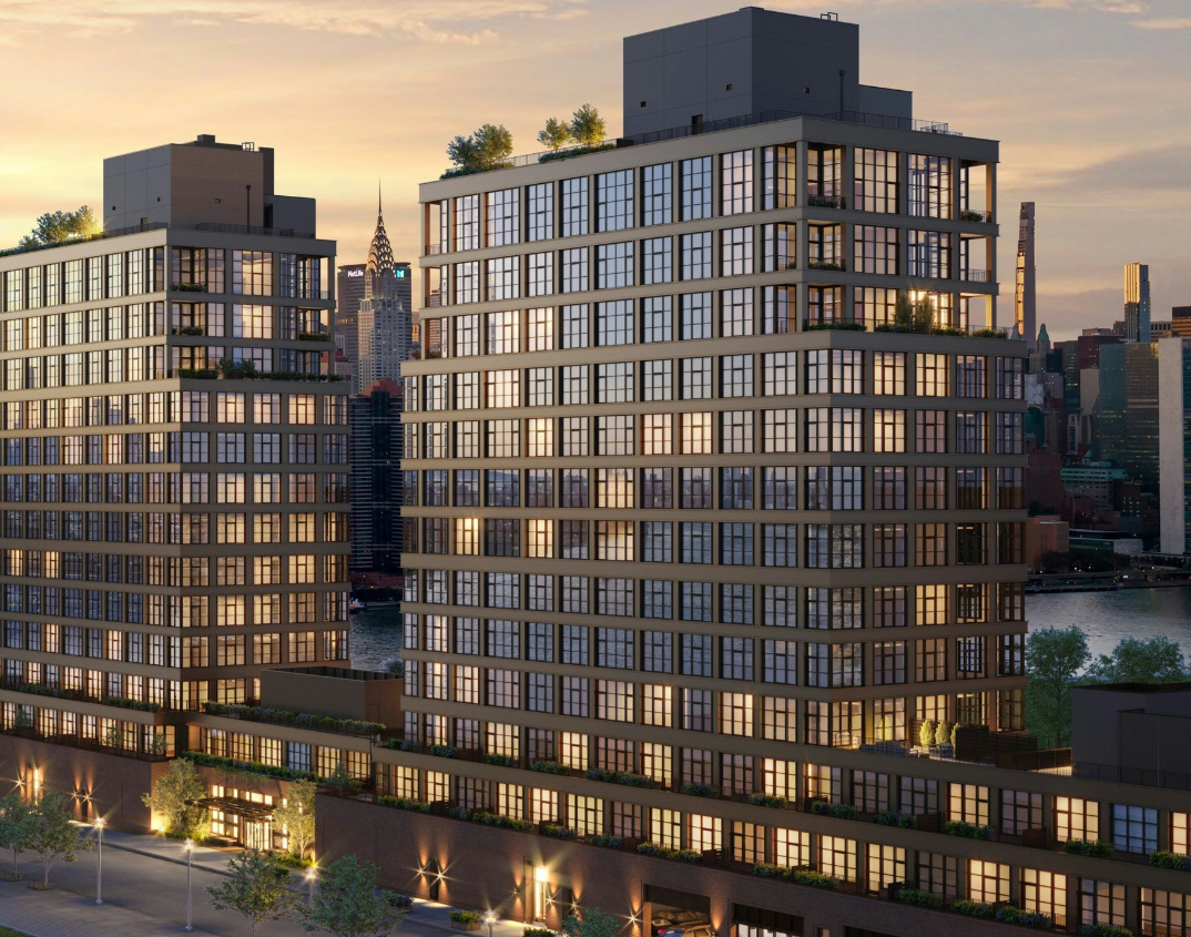
TRANSCRIPT
00;00;00;02 - 00;00;05;10
Doug Pat (DP)
Let's go inside the vault. The design vault.
00;00;05;12 - 00;00;31;14
Vincente Quiroga (VQ)
We actually decided early on that we would adopt the one story podium and also set back sooner than we actually needed to. It increases the lighting there allows for breezes that blow through. It also allows for multiple outdoor terracing to happen. So those units that aren't particularly high and don't have the same views can step out onto your terrace and see the water.
And so really maximizes the value and effectiveness and the quality of those spaces.
00;00;31;16 - 00;01;05;23
DP
This is my guest, Vicente Quiroga. I'll share more about him shortly. In this episode from the Design Vault we highlight, Vicente’s project 29 Huron in Greenpoint, Brooklyn. The Huron is a mixed use multifamily 13 story 266,000 square foot building with ground floor retail and high end amenities. In order to account for the narrow site geometry and flood zone, multiple massing schemes were studied with an objective to maximize height and floor area distribution and prioritize views.
The building is defined by 2 13 story towers connected by a shared lobby whose step forms narrow on the higher floors. The two tower massing maximizes unobstructed views across the East River, taking advantage of its exceptional waterfront location. Due to the building's location in a flood zone, Morris Adjmi coordinated closely with consultants to provide active flood protection solutions such as deployable flood barriers, temporary stairs, flood vents and flood resistant glazing at storefronts. Located within the building's podium, many of the Huron's amenity spaces fall within the design flood elevation, including the indoor pool. Flood resistant glazing within these spaces maintains transparency. The building's glass and steel towers reflect Greenpoint's industrial heritage, while the rough brick podium is inspired by the materials and scale of surrounding warehouses. The heavily gridded facade is comprised of a window wall system featuring I-beam profiles on the pillars.
Hi, I'm Doug Pat and this is Design Vault. Vicente is a registered architect and project manager at Morris Adjmi Architects in New York City. He holds a Bachelor of Arts in Architecture from New York University and a master of architecture from the City College of New York. He has a diverse portfolio encompassing various building types, such as historic renovations, interiors, hotels, art exhibition spaces, educational facilities and high end residential buildings in the Northeast, the United Kingdom and Spain.
Vicente also has a broad and unique understanding of New York City's building codes and requirements related to waterfront development and building within flood zones. He's currently managing the Construction Administration of 1 Huron on a 266,000 square foot multifamily building along the East River in Brooklyn's Greenpoint neighborhood. Prior to joining Maurice and me, Vicente worked on public restoration projects for the New York City School Construction Authority and the New York City Department of Design and Construction.
So welcome, Vincente. It's nice to have you with us today. Now, for those of you listening who have not heard our interview with Michelle Wagner from Morris Adjmi during the first season. Vicente, could you tell us a little bit about the firm? So where are you guys located? What's the size of the firm? How long has it been around and what kind of work do you do?
00;03;38;11 - 00;04;12;25
VQ
We're based in New York City, near the financial district and Wall Street. We also have a New Orleans office as well, because Morris is originally from there. So we have a broad practice, decades of experience, really working first in New York, and particularly in landmark districts and contexts as well as broadening that to sort of a national practice and also very holistic practice involving urban design, placemaking architecture, interiors, furniture and art services.
The New York office is approximately 70 people, and I think we have about 10 to 20 people in the office as well.
00;04;12;27 - 00;04;18;07
DP
So how long have you been with Morris Adjmi? How long have you been a registered architect and what do you do there?
00;04;18;10 - 00;04;58;00
VQ
So I've worked for about six years there and I've been a registered architect for 12 to 13 years in practice. Prior to that, over 15 years of experience since graduate school. So my role is project manager and flex project architect position, just really responsible for anything and everything to do with the project from client management, coordination, staffing, everything, being accountable for the project throughout the life of it.
And this one in particular has been special because, you know, in a large practice you often inherit projects or people come and go. This project for me has been involved since day zero through completion, so it's very special to me.
00;04;58;07 - 00;04;59;16
DP
And how long has it been?
00;04;59;19 - 00;05;10;24
VQ
Started in 2018, so, you know, approximately five or six years. Some of that was due to the pandemic. There is some slow down pausing during that time where it would have sort of completed a little bit faster.
00;05;10;27 - 00;05;18;03
DP
So most architects at Morris Adjmi are with one project the entire way through and are working on other jobs at the same time.
00;05;18;09 - 00;05;31;02
VQ
Everyone's multitasking. I myself have about six projects actively in different stages of a construction administration or schematic and design development as well. We like to flex our brain.
00;05;31;05 - 00;05;33;02
DP
And how do you like being a project manager?
00;05;33;09 - 00;06;04;25
VQ
It's good. It's a very challenging role because you're juggling practical logistics as schedule and staffing and the finances, but you're also deeply involved with building the client relationship and trust and working with the team to get to the milestones of the project and deliver what you're trying to do, but also take a higher view and really emphasize what are we trying to do here?
What is the objective from a practical standpoint to meet their needs of the project, But also what is the design move? What's the inspiration? What are we trying to do and maintain that throughout the life of the project, which isn't easy?
00;06;04;27 - 00;06;08;14
DP
No, it's not. And how big is the team for the Huron Project?
00;06;08;21 - 00;06;41;06
VQ
It's ebbed and flowed. At some points you have ten people during extensive documentation process. During CA, I think we have about five people. It's particularly because it has extensive interiors. We've staffed sort of an architecture team as well as an interiors team, and then they also have taken on the furnishings and art for the project. So we have over 30,000 square feet of interior amenity with pools and meeting rooms and kids rooms, as well as some outdoor activities where we also collaborated with the landscape architects. So there's a lot of things going on.
00;06;41;09 - 00;06;43;06
DP
And how did your office get the job?
00;06;43;08 - 00;06;59;03
VQ
Well, we were selected from a RFP process with the client. They had tried to develop it into a different solutions in the past and weren't very happy with those studies. So they approached us in a feasibility concept phase to sort of see what they could do as of. Right.
00;06;59;06 - 00;07;00;27
DP
And did you guys know the clients?
00;07;01;00 - 00;07;27;12
VQ
We knew them. It's really our first project with them. We've heard of them before. The client is interesting in that they have a range of experiences of multifamily and hospitality projects in their portfolio and they're also client. That's up for a challenge. You know, the site dimensionally was challenged, the site conditions in terms of remediation of the industrial sites and also its waterfront access, those are all challenges to the design that they were up for.
00;07;27;14 - 00;07;33;25
DP
So tell us a little bit about the history of the location of the site. What was going on there before you guys got there?
00;07;33;28 - 00;08;39;17
VQ
The history of the site, you know, it's a long, narrow site. Our building massing is 100 feet in the north south direction. It's over 500 feet in the east west direction. So it's very distended and lengthened and narrowed. The original site was a one story warehouse, which was kind of the context of the neighborhood. I lived in that neighborhood many years ago, and that was the context.
The context is changing primarily because in a sort of Bloomberg era, there was a zoning plan, but then the 2008 crisis stalled those plans, and it took a while for that increased zoning and development to come to fruition. And so we were part of that increased zoning for the site. In terms of the massing, we wanted to take a sense of the character that was there and honor that.
Not all the projects that we see built really take that into account. And we were thinking, what is the context now and what was the context in the past? So we really thought about selecting a one story podium and selecting Brick as the foundation for that, and also being practical about the openings and where they're located.
00;08;39;20 - 00;08;45;24
DP
Right. So that's a good segue to my next question. So what was the scope and the programmatic requirements for the project?
00;08;45;27 - 00;09;00;14
VQ
For a residential project to build as of right and the emphasis for the target population would be families. So large units, lots of two bedroom and three bedroom units, a lot of outdoor access and the views because of its waterfront proximity.
00;09;00;17 - 00;09;25;13
DP
Yeah, the site is unbelievable. And you guys really take advantage of just about everything out there. It's a great project. So let's talk about the design. So first let's talk about the building stylistically. So to me it looks a lot like a very contemporary warehouse space, right? So there's lots of glass. It almost appears lantern like in the photos that I saw at dusk. It's beautiful.
00;09;25;16 - 00;09;53;28
VQ
The choice of materials was very specific. The neighborhood has a unique grid orientation to the world, and so it captures the light in the sunrise and sunset, in particular. The brick we chose to be a rough, molded brick with a dark mortar and the metal panel has a mica flake to it that captures the light and changes throughout the day.
So sometimes it looks orange and copper. Sometimes it actually looks bronze toned and it has a chocolate sienna undertones to it.
00;09;53;28 - 00;10;05;23
DP
I noticed that in the photographs that the metal definitely takes on a bunch of different colors. So let's back up a little bit. Let's talk about the project restrictions, zoning, any historical requirements for you guys?
00;10;05;26 - 00;10;56;16
VQ
So the site isn't within a landmark district, but as our office really emphasizes context in our practice. So even when there's not those kind of historical restrictions, we like to start there and say, what does it want to be? And so we actually decided early on that we would adopt the one story podium and also set back sooner than we actually needed to.
First, to take a cue from that one story warehouse context, but also how that kind of massing relates to the street and the experience of the street. It increases the light and air and allows for breezes to blow through. It also allows for multiple outdoor terracing to happen. So those units that aren't particularly high and don't have the same views can step out onto your terrace and see the water.
And so really maximizes the value and effectiveness and the quality of those spaces.
00;10;56;19 - 00;11;05;22
DP
So let's talk a little bit about the building and plans. I'm assuming it's along because the lots a long rectangle, the building matches that although it steps back.
00;11;05;24 - 00;11;47;08
VQ
It steps back immediately after the first story. The first story is about 17 feet in height. And so there are some very high ceiling experiences there, ranging from 12 to 14 foot ceilings within the amenities alone. And that also gave us the room to deal with some of the flood constraints as well. Being that the site is adjacent to the East River the predicted flood zones right now are anywhere from 5 to 6 feet above grade. So that was a challenge and a constraint early on where we had to coordinate. We certainly decided we weren't going to excavate because of the high water table. So some of the functions that you would put in the cellar, we put a grade, but we often had to elevate the critical services six feet above where you normally would place them.
00;11;47;10 - 00;11;54;05
DP
So I'm curious, when you're digging that close to the water, do you get a lot of water, a lot of groundwater coming in when you're creating your foundations?
00;11;54;05 - 00;12;22;21
VQ
Yes, you do. Yes. Early on there was a lot of pile driving very deep anywhere from I would say 30 or 40 feet down. And those piles were linked up with large caps, pile caps and then mat foundations at the towers. The slab itself, because of, you know, you have to think more like a boat or a bathtub.
The slab itself was anywhere from 24 inches to 18 inches thick at various points throughout it. And it has to resist uplift.
00;12;22;23 - 00;12;28;07
DP
That's really interesting. So when you're driving piles and there's a lot of bedrock, how do you do that?
00;12;28;10 - 00;12;47;14
VQ
The nature of the historic waterfront is often landfill, so a lot of it is just trash or sediment over 200 years people just dump things in the river and it created a new shoreline, which was often the case, as you see in lower Manhattan as well. So we knew that we were going to have to go deep to hit rock.
00;12;47;20 - 00;12;50;29
DP
So you're driving the piles then 25 or 30 feet.
00;12;50;29 - 00;12;51;18
VQ
Exactly.
00;12;51;18 - 00;12;52;09
DP
I got it.
00;12;52;09 - 00;13;48;10
VQ
Yeah. And another challenge relating to the waterfront edge is we had to deal with actually coordinate with a marine architect because the edge condition was failing and we needed to remediate it. So we coordinated a new driving a new sheet edge along the shore to create that. The site actually is interesting in that it has a natural cove condition that other areas along the waterfront don't.
And so we recreated that in the remediation. But we also worked with the landscape architect to create this. We're obligated by zoning that create a setback for public access on the site. So they really leaned into that curved cove condition that's set back and stepped it down to the water gradually from grade and incorporated eco concrete blocks that have various pockets that allow kind of tide pool action to happen.
And so we thought about breaking down the shoreline a little bit and not just a hard edge.
00;13;48;12 - 00;13;57;21
DP
It sounds really interesting. I mean, when somebody owns a piece of property like that and it's really sitting on debris, in many cases, it's kind of unusual.
00;13;57;24 - 00;14;34;06
VQ
I mean, we tried to find opportunities to maximize the value of the site. With the two tower strategy. We put lots of valuable floor area up high and took advantage of the views. We made double the amount of corner units that you could have by having a two towers. We also separated them over 100 feet apart so that the West Tower really gets out there in front of other buildings that it's alongside.
The East Tower is set back for the east to kind of get around other buildings that could obscure it. And we were actually surprised at how good the views are as it was being built. We knew it was going to be good, but it actually turned out to be better than we anticipated.
00;14;34;09 - 00;14;41;08
DP
It's really beautiful about the design as the corners are opened up then to become porches, right? Terraces, is that correct?
00;14;41;10 - 00;15;04;06
VQ
That's right. This is part of that is a response to some zoning constraints is at a certain height you also had to step back in multiple directions. And one of the things that we like to do is incorporate our balconies into the building facade and not just look like appendages. So we really took advantage of that setback rule and created these covered protected balconies.
Also, it's quite windy, so that coverage helps screen it a little bit.
00;15;04;08 - 00;15;08;14
DP
So an open terrace meets the setback requirements then?
00;15;08;21 - 00;15;09;04
VQ
Yes.
00;15;09;07 - 00;15;13;25
DP
Wow, that's really interesting. So did you guys max out the building height then?
00;15;14;01 - 00;15;36;14
VQ
Yes, we had a R six zoning. We were adjacent to R eight. So there's some taller buildings in the surrounding area. But we did try to sort of maximize it. Part of also with the flood zoning, when you have extreme water table situation, you are allowed to increase up to a certain height. So we were able to utilize the various zoning restrictions to our benefit.
00;15;36;17 - 00;15;39;19
DP
So how long did the building review take with the city?
00;15;39;26 - 00;15;57;14
VQ
Well, certainly just even the public park portion we started in 2008. It probably took a year and a half to two years alone. At the same time, we were overlapping with our design and documentation, so it probably took another two years to really finish all the documentation.
00;15;57;17 - 00;16;09;00
DP
So let's talk a little bit more about the parameters for the building materials and the use of masonry, which from what I can tell from the photos is at the base and then the circulation tower, is that correct?
00;16;09;02 - 00;17;40;06
VQ
The circulation towers are actually stucco with a color to match the metal panel facade. They were really thought of as almost like a concrete massing for the podium. We selected a Glen-Gery Brick that was a molded modular brick. It has orange undertones and some brown tones as well along its finish, and it's a bit city, and we specifically selected it for its character.
It has texture, it catches the light in an interesting way. It's a very practical brick. And so we tried to think about just in the same way that we thought about the rest of the massing and even some of the interior design elements is to marry a practical industrial esthetic that was indigenous to the neighborhood, but also elevated and make it a bit of a luxurious esthetic as well as a hybrid.
So we selected the brick, we selected a dark mortar and did simple moves with the design in terms of let the program and the adjacencies define where those openings wanted to be, because again, 500 feet, we weren't over doing the modulation of that. We really wanted it to say this is where the windows want to be based off of the function of the plan.
And when we knew where those openings would be, we also decided upon simple detailing, corbelling of 1 to 2 inches stack stretcher, bond patterns, soldier brick patterns, which would have been indicative of the kind of twenties, thirties or earlier warehouse context. You know, again, just trying to tie it back to what would have been if it had been built 100 years ago.
00;17;40;08 - 00;17;50;25
DP
Well, I noticed there's a really pretty detail where you're setting the masonry back from the facade to create a reveal for the headers and for some of these openings.
00;17;50;28 - 00;18;03;17
VQ
Yes. And it creates a lot of interplay of light and shadow along the facade. And that was always thought about, you know, how do you deal with such a long facade that would have a lot of opacity to it, but create interest in that opacity.
00;18;03;19 - 00;18;05;17
DP
So did you guys draw the building in BIM?
00;18;05;17 - 00;18;06;17
VQ
Yes.
00;18;06;24 - 00;18;07;29
DP
You guys work in Revit?
00;18;08;04 - 00;18;10;12
VQ
Yeah, we're predominantly a Revit office.
00;18;10;14 - 00;18;19;08
DP
So the studies that you did initially, did you guys draw the whole building in 3D and then show the clients and so they got to see the model? Or did you guys build a physical model too?
00;18;19;10 - 00;18;43;16
VQ
We always start with the Revit process because it has its advantages, sort of quick moves and early viewing studies as well as planning. We did some early models, for the sales we did a full scale model of the whole building as well as the interiors. There's actually a drawer that pulls out of the base of the model and you can see all of the amenities articulated, which is incredible.
00;18;43;18 - 00;18;51;25
DP
Again, I'm curious how large of a set does a project like this create? How many pages just for architecturals?
00;18;51;27 - 00;19;11;26
VQ
That was always a challenge for the documentation was the East West Towers had their own articulations. Between the architectural division and the supporting engineering divisions, we had four volumes of documents just on drawings alone, and I want to say the architectural volume was easily 100 sheets or more unto itself.
00;19;11;28 - 00;19;24;27
DP
Another detail I really like is the exterior facade. So you made the piers and to some extent the floor slabs as they’re exposed on the exterior. It's not really a slab, it looks like steel. It's a really pretty detail.
00;19;24;29 - 00;19;50;24
VQ
Yeah, it's a simple C channel profile that's in ACM, Aluminum Composite Metal panel, and it's an open range screen. We really worked with our facade consultants and structural to simplify the detail as much as possible and maximize the windows. You know, again, this project, by its site positioning and daylighting it wants big windows. So we wanted to coordinate that with slab covers and the column covers.
00;19;50;26 - 00;20;01;15
DP
So could you give me more of an idea of how that open rain screen works? I mean, when I'm looking at the exterior photographs does not look like a rain screen at all. I mean, it looks like an enclosed system.
00;20;01;17 - 00;20;35;18
VQ
The profile clips the slab edge and tacked on to a fin that is part of the window wall extrusion. And that sort of stabilizes the top and bottom relationship and sets the datum for every floor and at every joints we leave it open behind that paneled system is a mineral wall assembly and waterproofing behind that and at the open joints, we coordinated with the shops to return the finish and bend, partly to stiffen the profile, but also finish it off and create a sense of closure.
00;20;35;20 - 00;20;40;20
DP
And what would be the advantage of doing a rain screen versus doing a closed system there?
00;20;40;22 - 00;20;56;05
VQ
It was more practical from an installation and sequencing standpoint and also just maintenance, you know, tall buildings, having to deal with caulking and repairing it later. It's a challenge and you have to think about that for clients’ maintenance. You know, it's a real concern.
00;20;56;07 - 00;21;32;06
DP
Yeah. I'm just getting myself familiar with rain screens. I'm behind residential work and we did a rain screen for my most recent home in New York State and was a real education. It's such an interesting system and I would say I think I tested on it for some CE units that I took maybe a couple of years ago and I thought, Wow, this is a really interesting idea where the facade is actually wide open in some ways and water's allowed just kind of move through it, dry back out again.
You're eliminating a lot of challenges long term by using rain screens.
00;21;32;08 - 00;22;01;14
VQ
I actually have an extensive experience from my school construction authority days of working on rain screens that we often would take existing schools that are 100 year old buildings that were solid wall assemblies, and we found water infiltration. We would take back the finish to the back up and create narrow cavity drainage plains with brick or precast or GFRC elements.
It's definitely in my wheelhouse to work in that context.
00;22;01;17 - 00;22;19;29
DP
It makes perfect sense to allow a wall to dry out rather than capture water behind the facades. All right. But it took us hundreds of years to figure this out. Very interesting. So you guys drew the building in BIM. You have the 3D model. How long have you guys been working in Revit?
00;22;20;01 - 00;22;22;00
VQ
15 to 20 years at least.
00;22;22;03 - 00;22;34;21
DP
Again, I'm kind of curious as an offshoot to this discussion. When you hire people, do you hire people who do not know how to use Revit? Maybe they've used Micro Station or they use ArchiCAD or AutoCAD and then you train them.
00;22;34;28 - 00;23;20;13
VQ
It's ever more common for them to have experiences these days. I actually didn't know Revit when I started, and that was a learning experience for me. You know, it has its pros and cons, you know, if you're an old school CAD person, but I value its ability to, you know, you move a wall, it moves everywhere. You don't have to constantly track that element.
And also when we're doing design options for large complicated projects, thinking about, well, what if the window appears or this dimension or that dimension, we can iterate and quickly deploy changes, you know, especially this day and age where you're dealing with value engineering, they come back with bids, you say, it's got to come out of somewhere. It's an important tool to be able to pivot and retool the design, adapt the design to accommodate these requirements.
00;23;20;15 - 00;24;10;27
DP
It's a really good point for those of you who don't know what BIM is, it's building information modeling, so you're giving lots of information up front to building parts like walls and plan, for example. And initially, at least in my experience, it takes a lot longer to draw something in the beginning, but you've got all that information in there.
So Vicente is explaining that what happens is when you need to make a change, the change is really quick because you're just changing one thing out of a series of pieces of information that you've already kind of filled in. So BIM has really changed the business over the last 15, 20 years. So do you guys learn anything interesting through the design and construction process? Maybe something you'd never dealt with before in terms of details or dealing with the client or the?
00;24;10;27 - 00;25;39;01
VQ
GC Well, certainly that flood design is evolving. We came up with some strategies that even the rules have changed since we started this project. So it's constantly evolving target and some of the forecasted flood elevations have changed across time. So that's something that's an ever evolving discipline of knowledge and thinking about active systems versus passive systems. You know, this building relies on a mixture of passive and active systems, some that the building is set up or either elevated spaces or the wall assemblies set up to resist water, the force of water in other elements, it's relying on staff.
We're trained to deploy solutions that are either barriers or stairs to reduce that access throughout the building. And that's a big challenge with any project that's in a flood zone is egress, space planning services and also mitigating cost. The developer and the clients and the residents ultimately will want to experience these views. But those views are difficult if we're anticipating flooding.
Nobody wants to have windows that are six feet off the ground. We were selective in where we put our efforts and said these areas are going to have the views. We're going to coordinate flood resistant glazing there. The same thought process at the commercial retail and lobby. You know, the places that it mattered. We wanted to maximize the glass. In other areas, we dialed it back down to really use opaque assemblies to articulate the design.
00;25;39;04 - 00;25;42;16
DP
So I mentioned deployable flood barriers. What is that?
00;25;42;18 - 00;26;21;26
VQ
I think of them like Lincoln Logs. Well, there's a range of options out there, but they are often aluminum extrusions that gasket together and stack along channels and they'll go to whatever height that is necessary. They often have back bracing or steel or aluminum sections. Those elements either are built into the facade already or tie back into anchor points that really transfer the loads to the structure.
It's a very complicated interaction and coordination of the design that you want these facade protection elements, the superstructure and waterproofing, you know, it all has to work and it takes a lot of effort.
00;26;21;28 - 00;26;25;28
DP
So what happens to that barrier when there is a flood? Do they break away?
00;26;26;00 - 00;26;27;17
VQ
They resist. They act as a wall.
00;26;27;17 - 00;26;28;21
DP
Resist. Okay. Yeah.
00;26;28;22 - 00;26;39;05
VQ
Normally they're stored in a closet until they're needed. The idea is if you have notice of an impending storm or hurricane, then you would deploy them in advance of the storm.
00;26;39;05 - 00;27;06;01
DP
Thus deployable. Yeah. Interesting. So Vicente, you're a relatively young architect. I say that because at one time I was a young architect and I used to tell my students that you were considered young at 40 or 50. I'm now 55, so please don't be offended by my comment. But based on what you know so far, do you have any words of advice for your younger self or even young architects like yourself just getting started, Not just getting started, but getting started.
00;27;06;08 - 00;27;41;19
VQ
I think curiosity and a willingness to learn a variety of things. Architecture is an interesting creative discipline because there's a lot of rigor and science and technology and law backed up into that knowledge. But it's also trying to solve a problem. You have to really embrace the learning curve of that and learning things that you may not have mastery of, but your organizing, those various constraints and knowledge is into a solution.
And I think that's, if you're enthusiastic and go with it and embrace it, I think you get a lot out of it.
00;27;41;22 - 00;27;57;05
DP
Yeah, I totally agree. I like to tell people architecture is a field where you have to know a lot about a lot. It's as simple as that. So, Vicente, it's been great to speak with you today. Thanks for your time. Where can people go to learn more about Morris Adjmi Architects and yourself?
00;27;57;11 - 00;28;05;26
VQ
You can go to MA.com, our website. You can also check out The Huron Instagram. You can also visit the site. It's a beautiful building.
00;28;06;02 - 00;28;08;18
DP
Yeah, it's a great project. Well, thank you very much, Vicente.
00;28;08;22 - 00;28;12;23
VQ
Thank you.
You May Also Be Interested In
We Can Help With Your Next Project
Discover the latest + greatest in design trends, industry news & pro tips from pros.
For all of your project needs, you’ll find everything you need at a Supply Center.
Let Us Know How We Can Help!